The main concept of the design of the YAMAKAWA Rattan showroom by
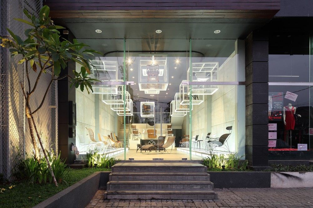
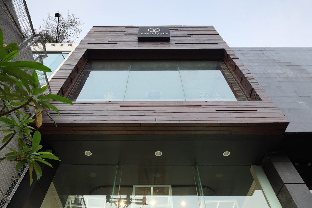
Sidharta Architect is to let people experience the product in a different way. People from the street will see the fa
çade of the building as a two storey mass with a hanging cubical on the first floor, and other products displayed behind frameless clear glass on the second floor. More images and architects’ description after the break.Courtesy of Sidharta ArchitectInterior Concept
As you come into the first floor, the architect wanted to make it look like a gallery. The products become an artwork on an acrylic platform at the wall on both sides while we come into this level. We will also find the rotating acrylic box – white painted steel framed – hung by a conveyor system. This box will rotate in a set time, displaying any product which allows the visitor to look at it from several angles. So back when we see Yamakawa from the street outside, we’ll see the product display constanly changing on this rotated box.
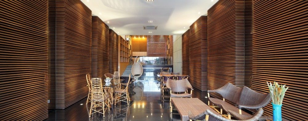
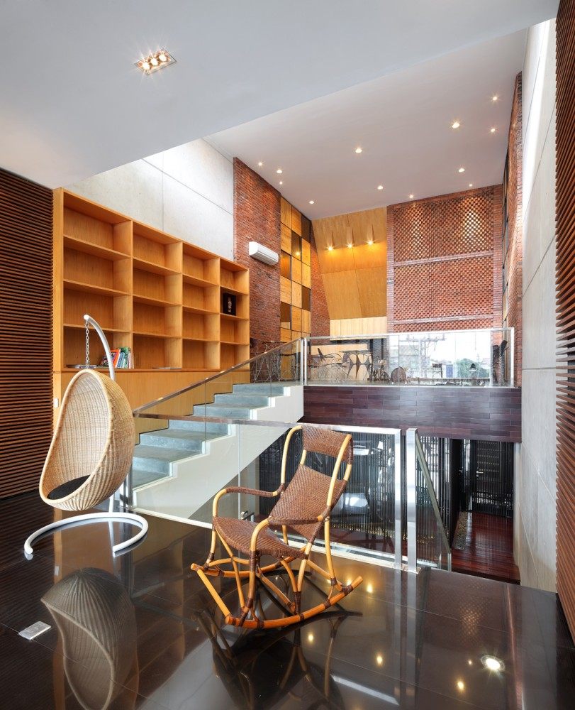
Courtesy of Sidharta ArchitectBehind the reception is the display stairs and it goes to the 2nd floor which is divided in two and you’ll pass the back office area and restroom in the mezzanine. At the second floor, you’ll experience the ambiance and layout to be more like a living room or dining room. In here, people can sit and try the product with a warm atmosphere in wooden touch at the wall side. The idea is to make all the products become the main attention and the interior to become more simple with an unfinished / natural-look on the material to highlight the products.
Courtesy of Sidharta ArchitectThe third floor of this building is a food and beverage area displaying dining chairs and dining tables. In addition to the design of the floors, the architect used materials such as the cement floor, exposed brick, precast concrete and wood to deliver a pure atmosphere where the product becomes the main attention of this showroom.
Architect:
Sidharta Architect
Location: Kemang Raya,
Jakarta,
Indonesia
Principal in Charge: Marcello Sidharta
Project Team: Marcello Sidharta, Aryo Basuki, Adjie Dewantoro
Interior Design: Sidharta Architect
Main Contractor: Tan Sie Siong
Land Area: 141 sqm
Building Area: 279 sqm
Design Year: 2009
Construction Year: 2009-2010
除了图片,设计师的设计理念也很重要,所以简单的翻译了一下,方便大家理解{:2:}
建筑师Sidharta对于YAMAKAWA Rattan展示厅的主要设计概念是通过一种不同的方式来让人们体验了解其产品。站在路边,人们可以看到建筑的外立面由两层结构组成,二层是一个悬挂的立方体,其他产品展示在一楼无支撑的透明玻璃的后面。更多的图片及建筑师的描述将在后续表达。
当你进入一楼的时候,设计师想要营造出美术馆长廊的感觉。家具产品被放置在墙两边的亚克力平台上,犹如艺术品一般。我们也会发现顶面旋转的亚克力盒子,白色漆钢框架,运用传送带系统悬挂在空中。这种盒子会在一个特定的时间旋转,可以让参观者从多种不同的角度来观察。所以当我们退回到外面的街道时,将会看到产品在这个旋转的盒子里不断变换着它的展示角度。
在接待台的后面是展览用的楼梯,从这个通往二楼的楼梯上去,你将会路过后面的办公区域和夹层间的休息区。二楼的布局和气氛更像是起居室或餐厅。在这里,人们可以坐下来体验家具,木制的墙面也给人们带来了温馨的氛围。这个想法主要是想重点突出所有的家具产品,并在室内材料的选取上尽量简单,运用了原始的自然的材料来达到强调产品的效果。
建筑的三楼是食品和饮料区域,在这里陈列了一些餐椅和餐桌。除了对楼层的设计外,建筑师还用了诸如水泥地面,外露的砖块,预制混凝土和实木的材料来传达出一个纯粹的氛围理念,即家具产品是这个展示厅最瞩目的主角。


