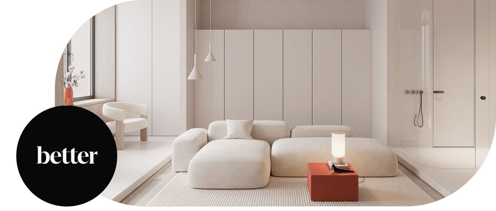
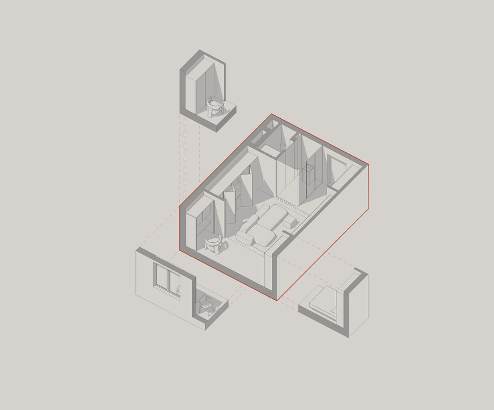
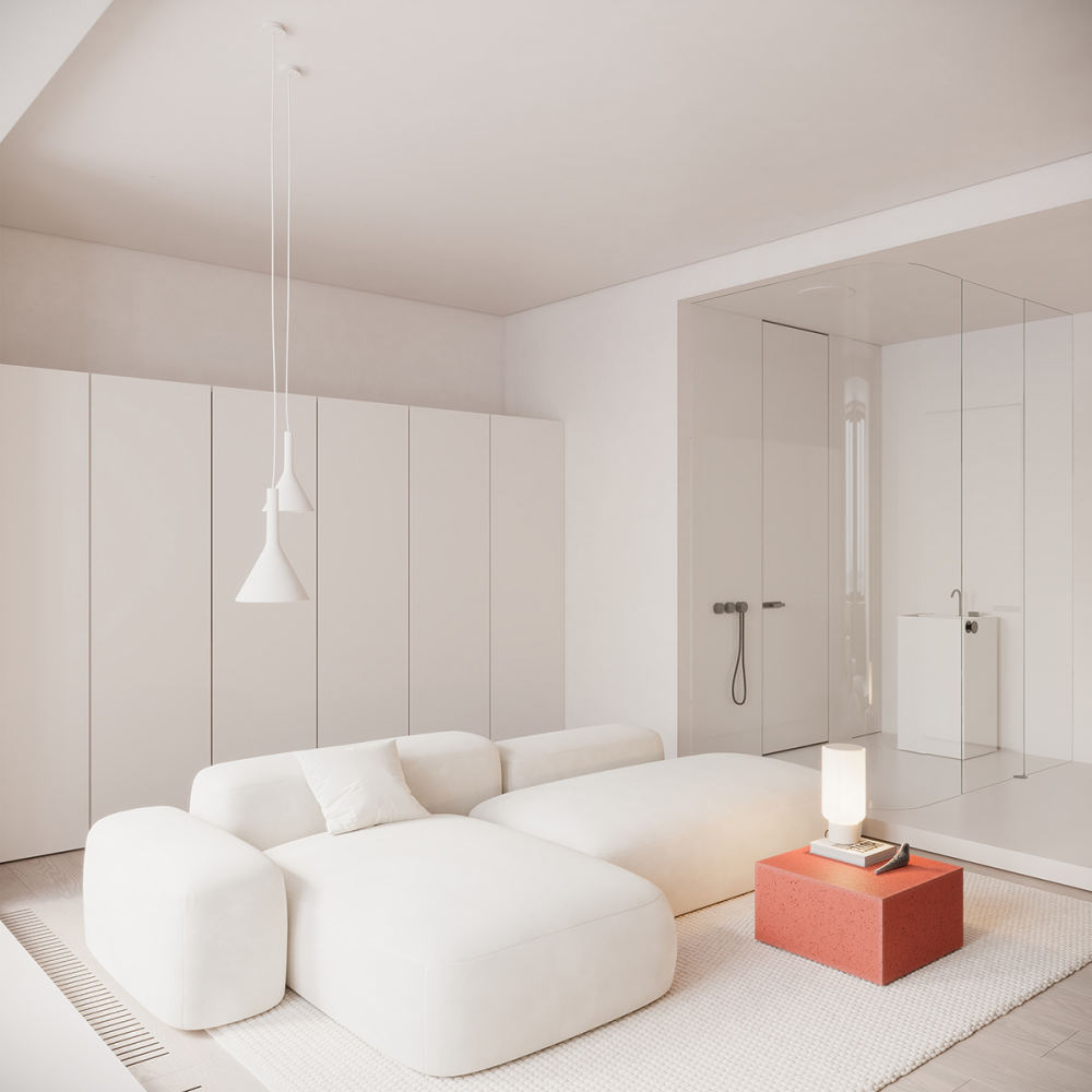
 All-in 30.0m²Type: private apartmentStatus: in progress Location: Oktyabrskoe Pole, MoscowProject year: 2021— May I have a living room, dining room, work room, master bedroom, and indoor garden? — No way! No indoor garden, we replied. And we created everything else. In our new project, we wanted to emphasize the minimalism and spaciousness of the interior, so we used the bare essentials to create a simple and uncluttered space based on multi-zoning and compositional unity. And yes, it was a 30 square meter space. The zones flow into each other, merging into a single whole while satisfying the owner's individual needs. One of the principles of the work was visual simplicity and functionality, as well as the use of a concise palette of colors and materials.


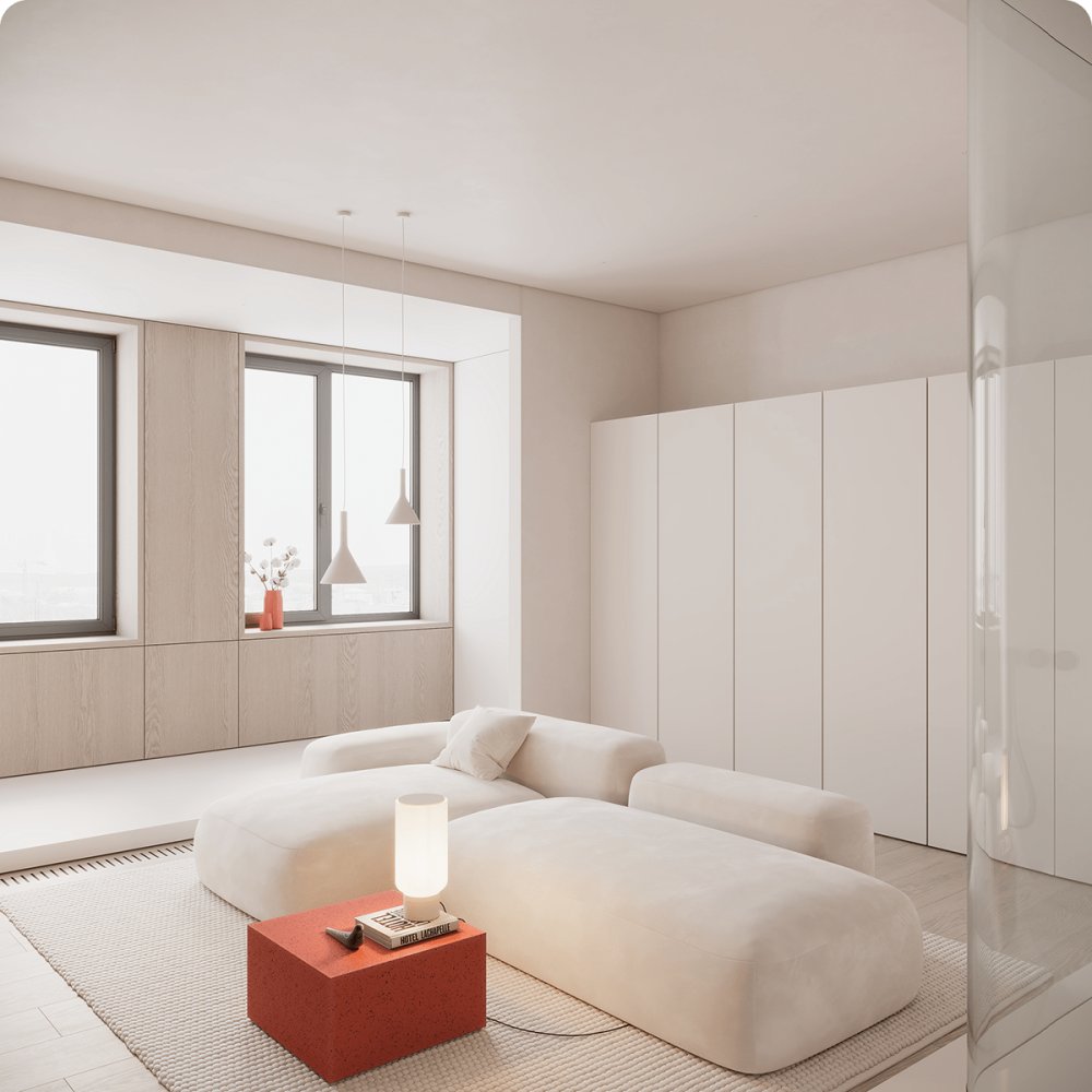
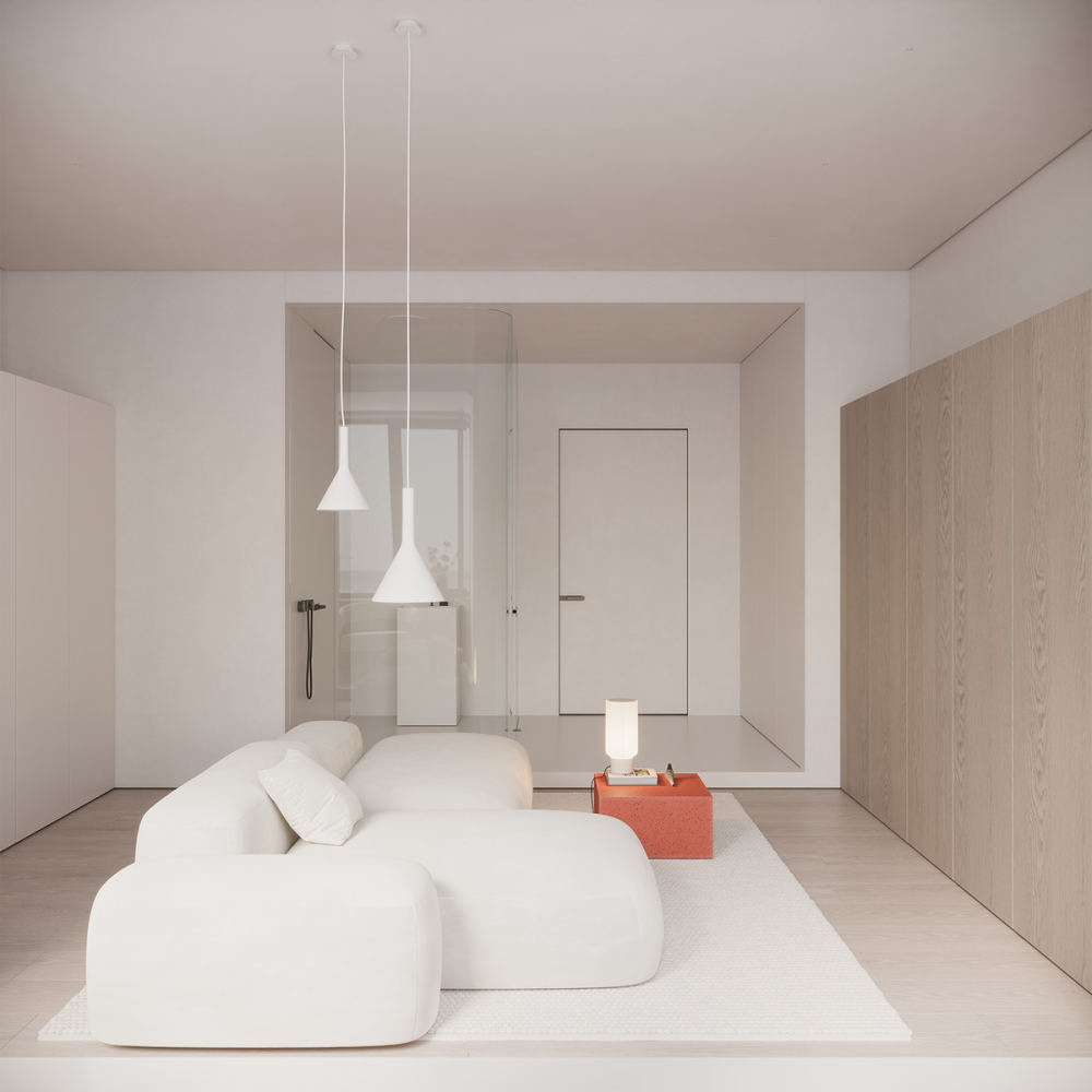
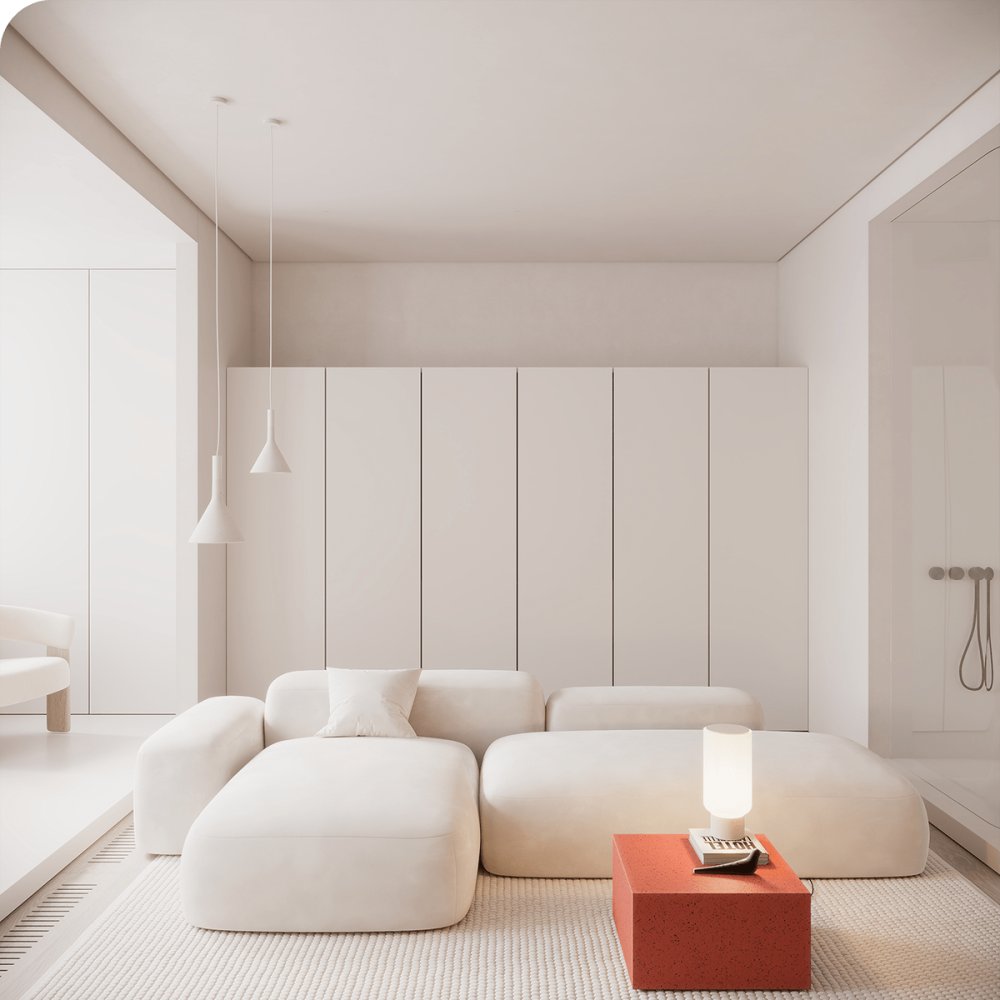
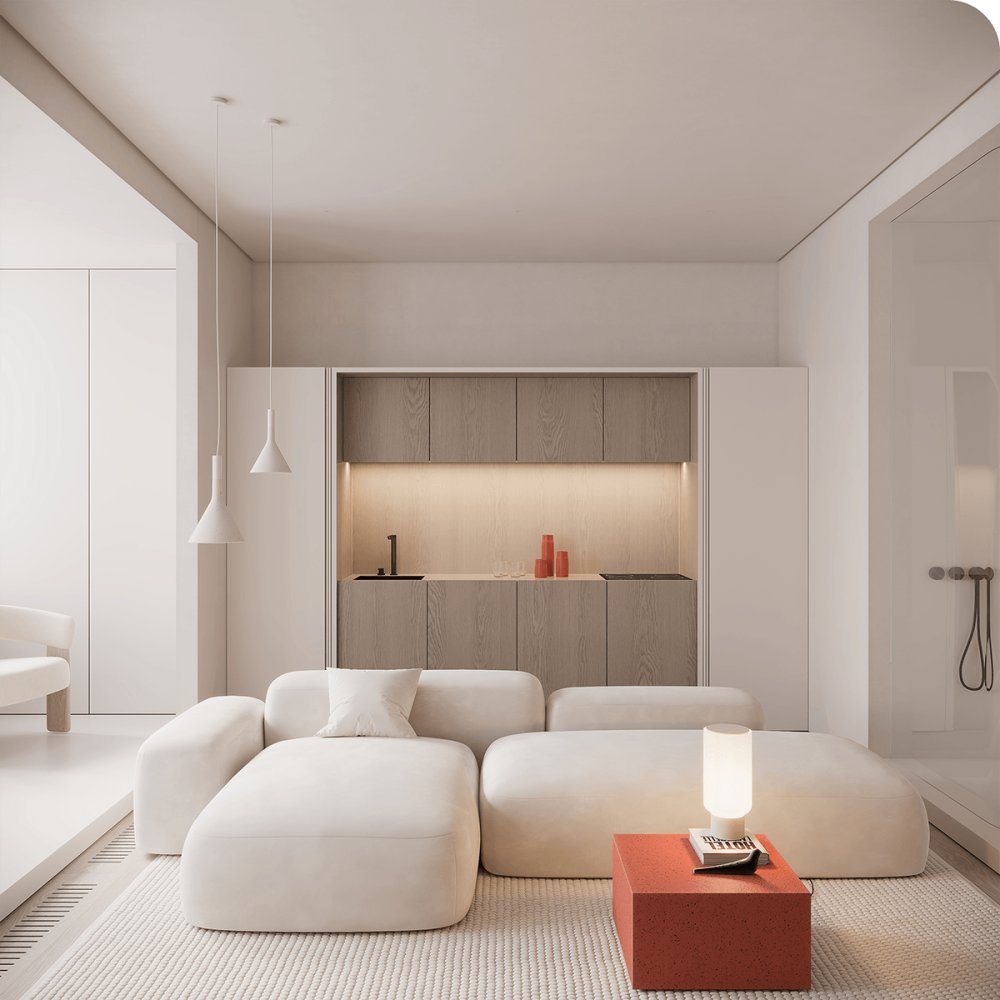
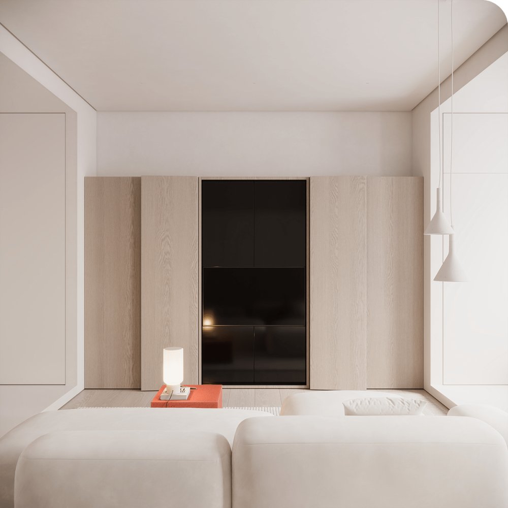
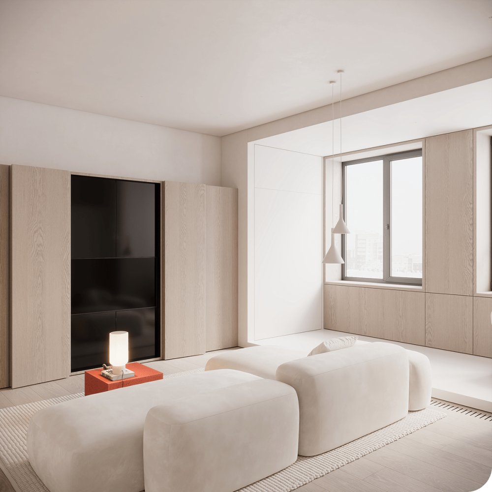
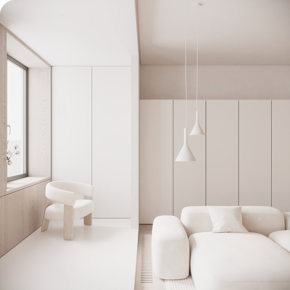
 Living Space Despite its compact size, the living room and kitchen feel roomy. This effect has been achieved by hiding all the necessary functional elements.

 Hidden by the coplanar fronts, the kitchen unit in wood and the TV area mirror each other. The play of textures in these volumes helped to set off the pure white, which was the basis for the decoration of the whole apartment.


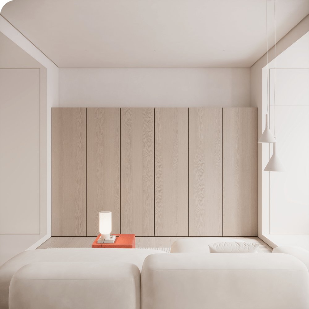
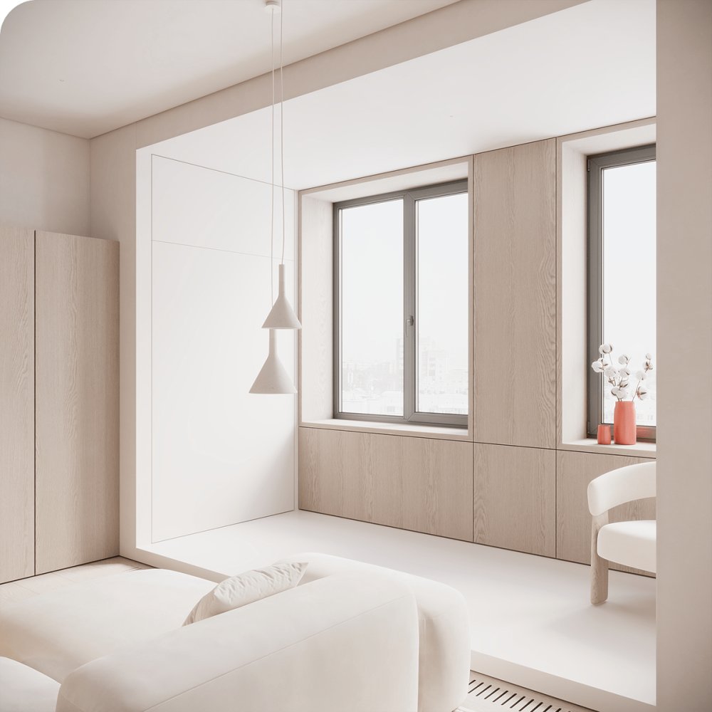
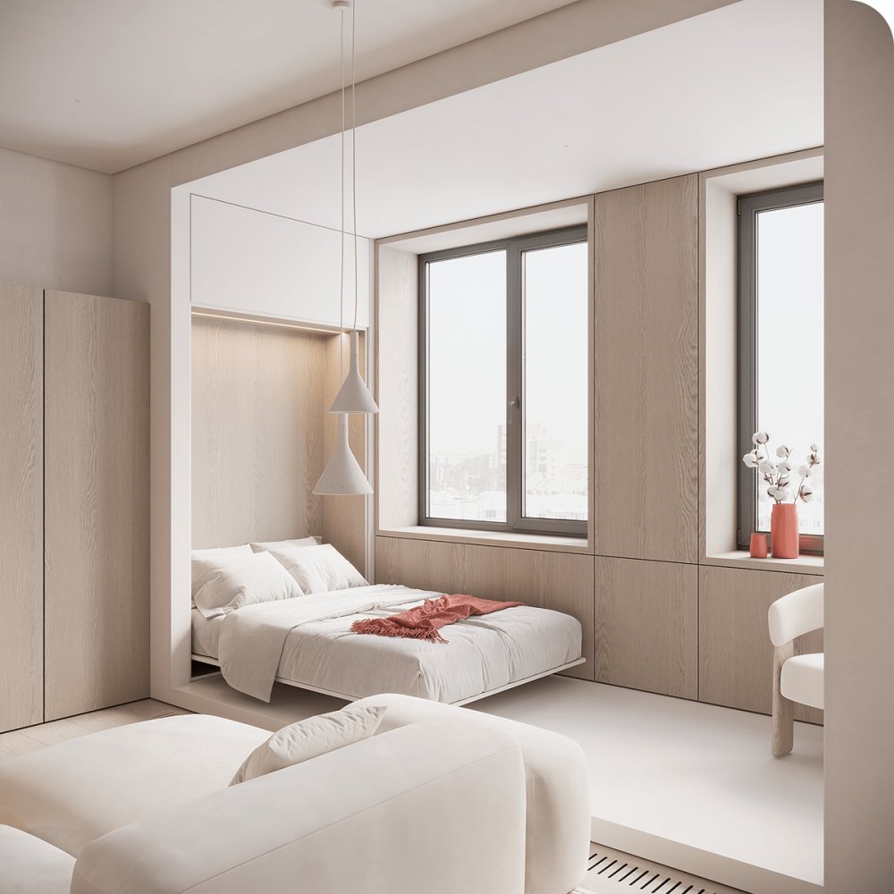
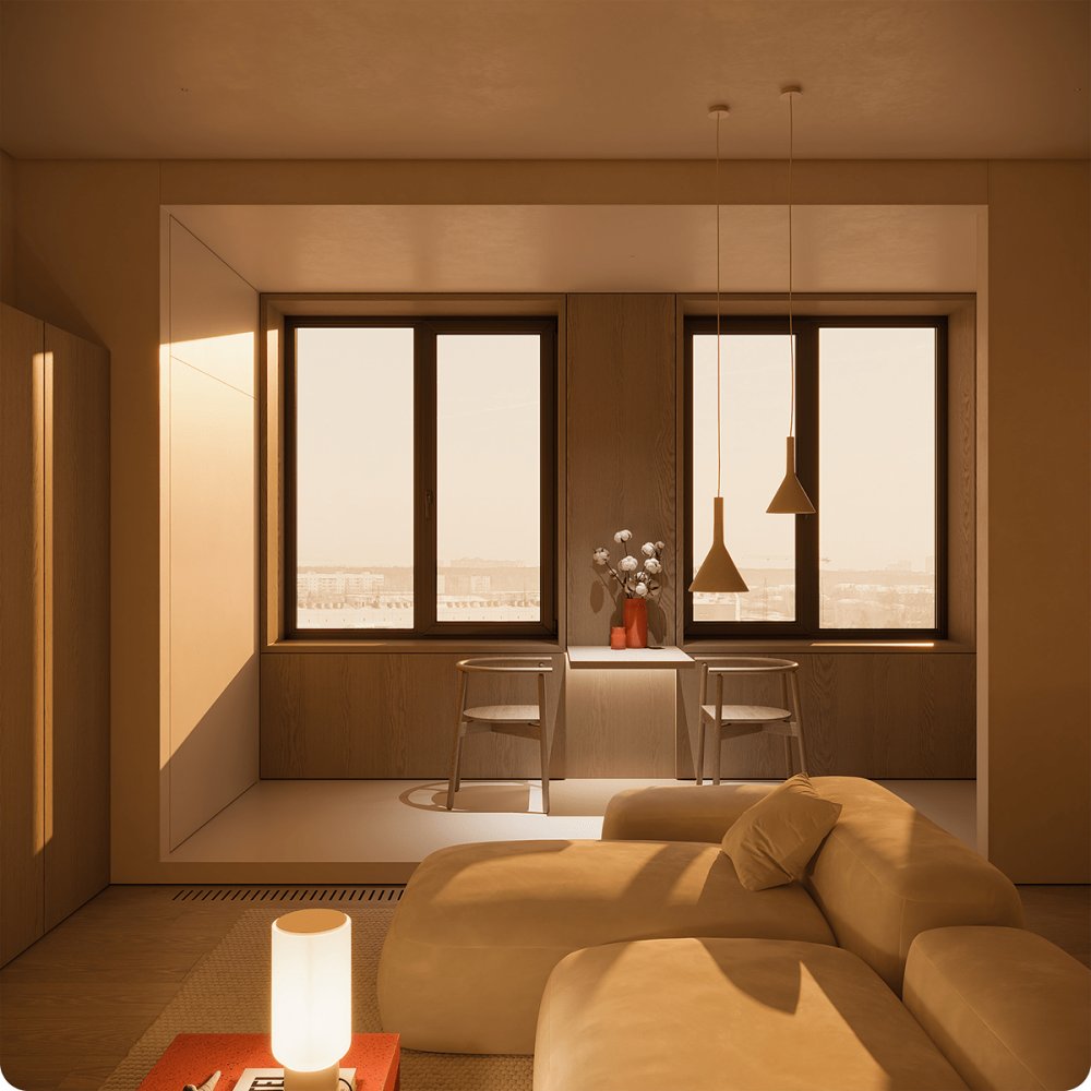
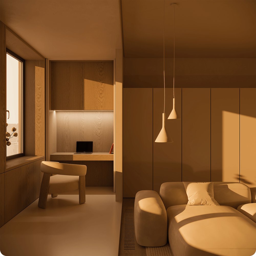
 Sun Porch The Sun Porch combines three functions: sleeping, eating and working, and it becomes another hot spot in the apartment, in line with the lifestyle of the owner.

 Since the bed belongs to the common area, the idea was to hide it completely and avoid resembling the classic image of a bedroom.


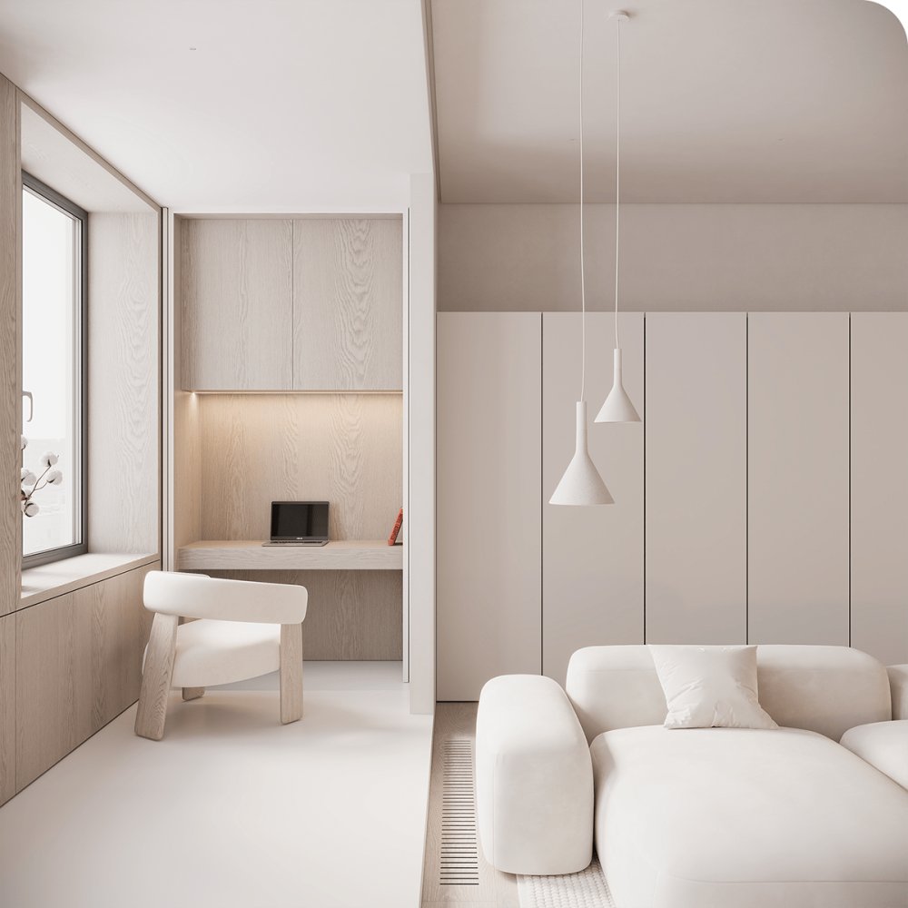
 Like many areas of the house, the working area is hidden by coplanar fronts. It is quite modest and laconic, since the owner does not have to spend hours and hours at home to work on it. You can solve personal and professional problems here.


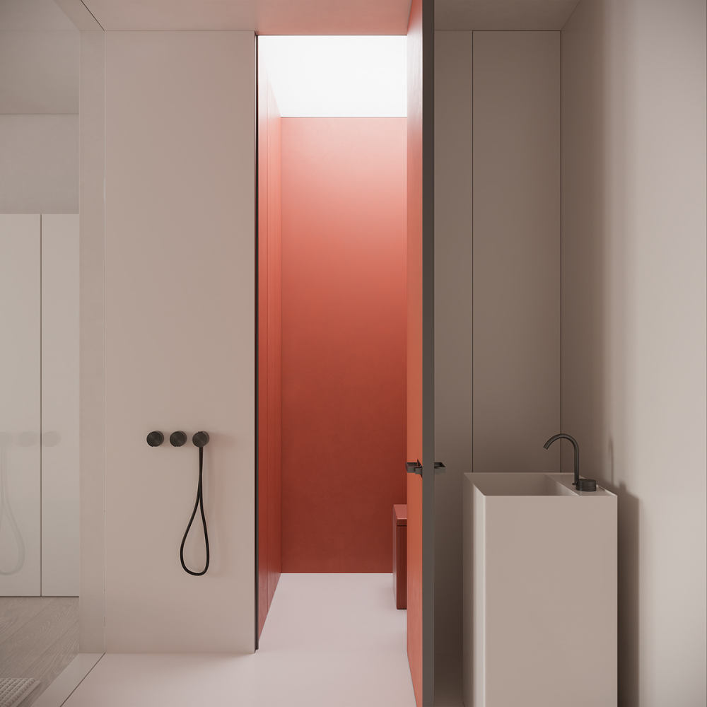
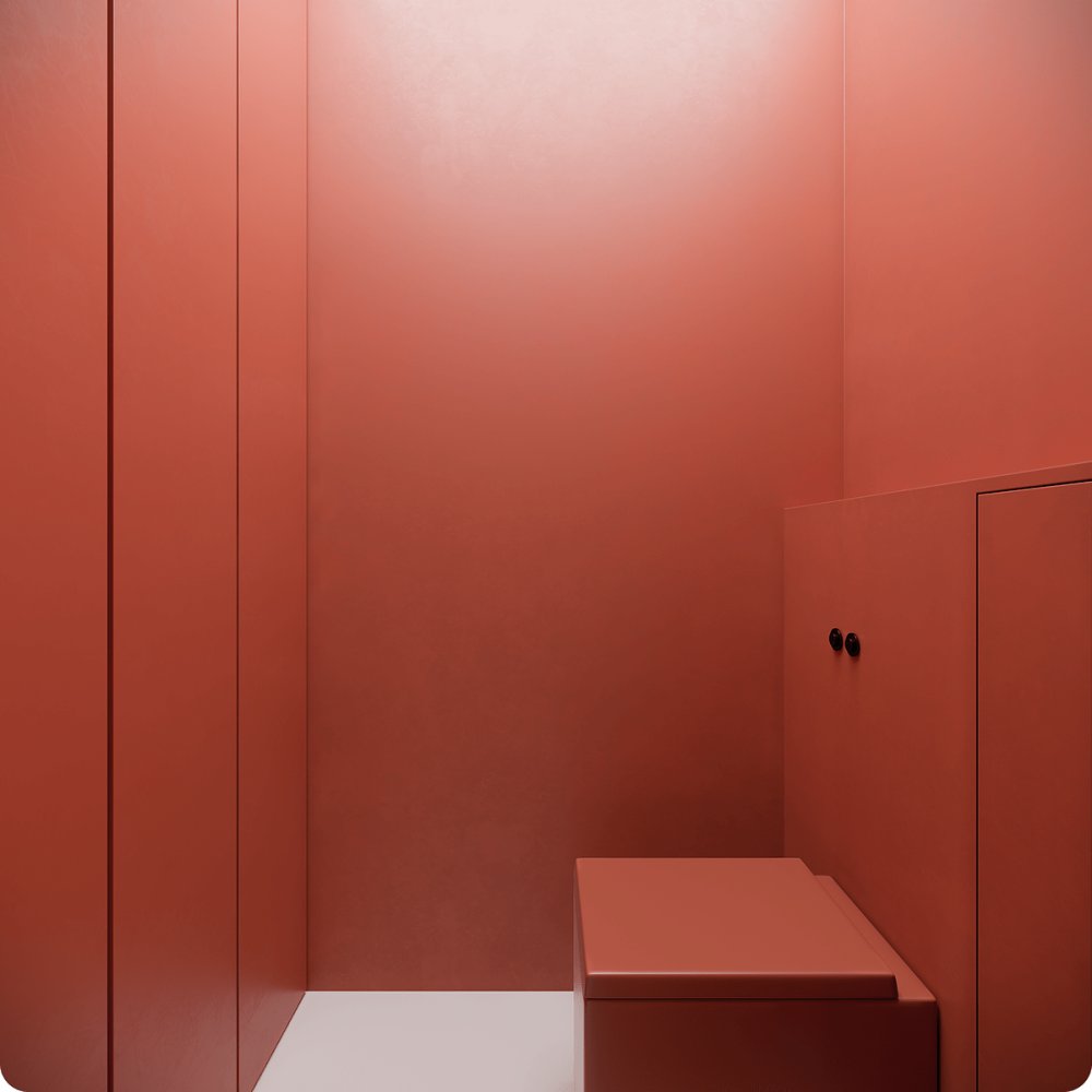
 WC There is shower behind a transparent partition and if you think this is not intimate enough - don’t rush into conclusions. The glass has a function to getting matte, which you can turn up any time, to add the necessary privacy. Habitual items of bathroom with a mirror were placed into built-in wardrobe. Toilet and small utility block, which are hidden behind door, became an accent due to the bright color of the walls, echoing the coffee table in the living room.


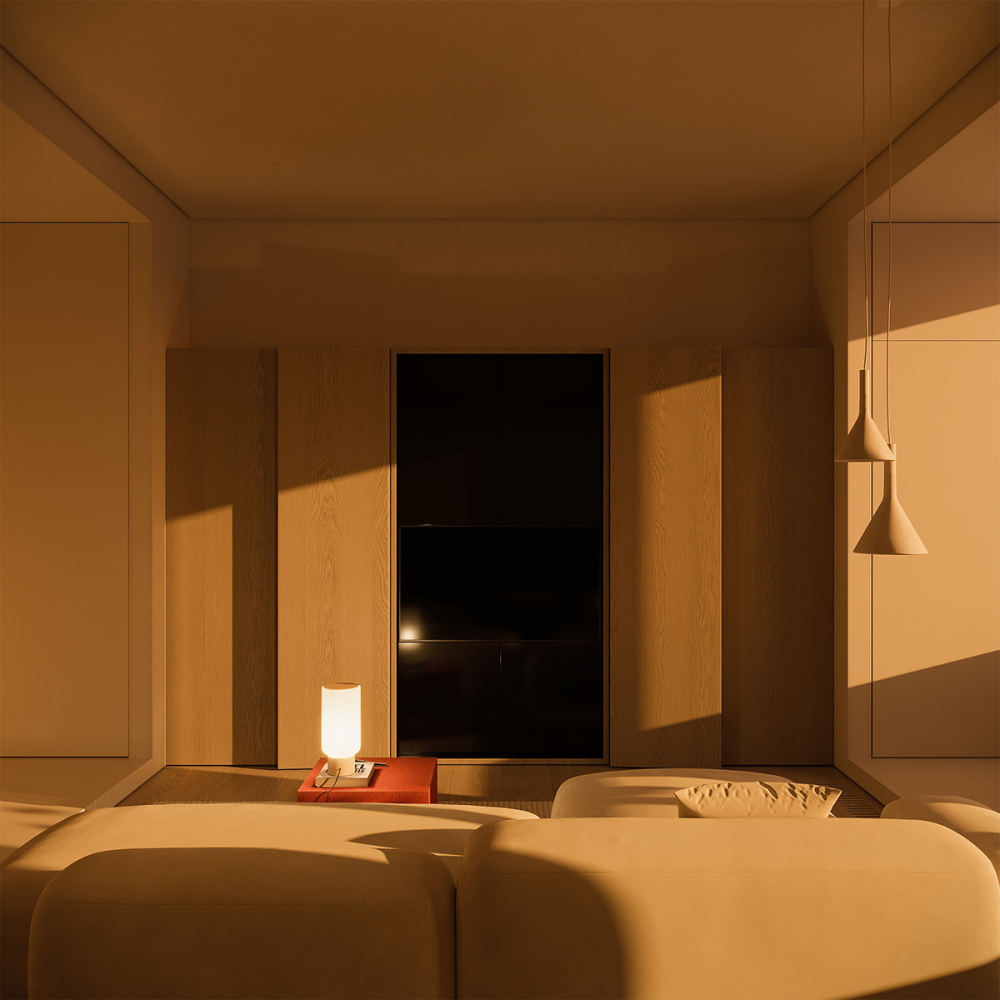
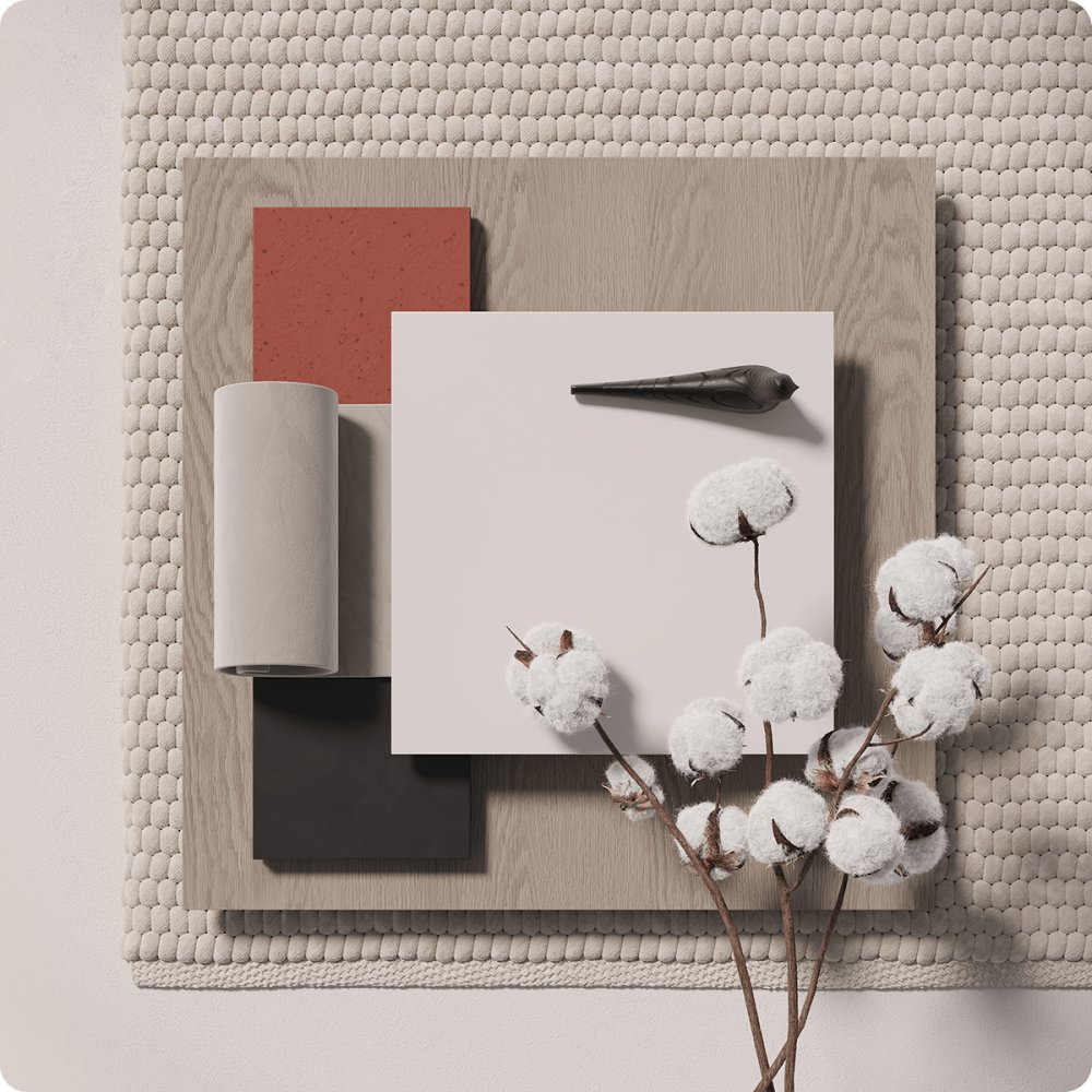
 The Materials A clean palette characterizes the color scheme of the apartment. Against the light background, the texture of the wood, red accents in the furniture and decorations stand out. With different lighting, the apartment becomes an art space.
 Installation— Here I suggest a plastic skirting board, a suspended ceiling, overhead lighting, a battery in the loggia instead of a table... I did not wait until the end of that sentence before shaking hands with the contractor proposed by the customer and starting the work with our team. The finishing phase is underway at the time of publication (June, 2023).make your .0m² betterDesigners: Viktor Vasilev, Maria LeshchevaContact us: hello@better.archi, +7 (995) 900-01-40
- 转载自:behance
- 作者:原文作者
- 图片@原文作者
- 语言:英语
- 编辑:序赞网
- 阅读原文
|

 发表于 2024-2-21 08:26:40
