十九世纪末至二十世纪中期,现代主义热潮兴起。从城市街道、自然村落到海岸岛屿,从私人住宅到公共咖啡馆,知名艺术聚集地及聚会场所激发了无数艺术家的创造力。
开放、友好是当时欧洲咖啡厅的关键词。
The late 19th to mid-20th century saw the rise of the modernist wave in Europe. From urban streets to rural hamlets, from coastal islands to private homes and public cafes, well-known artistic hubs and meeting places ignited the creativity of countless artists. 'Open' and 'friendly' were the key features of European coffeehouses during that time.
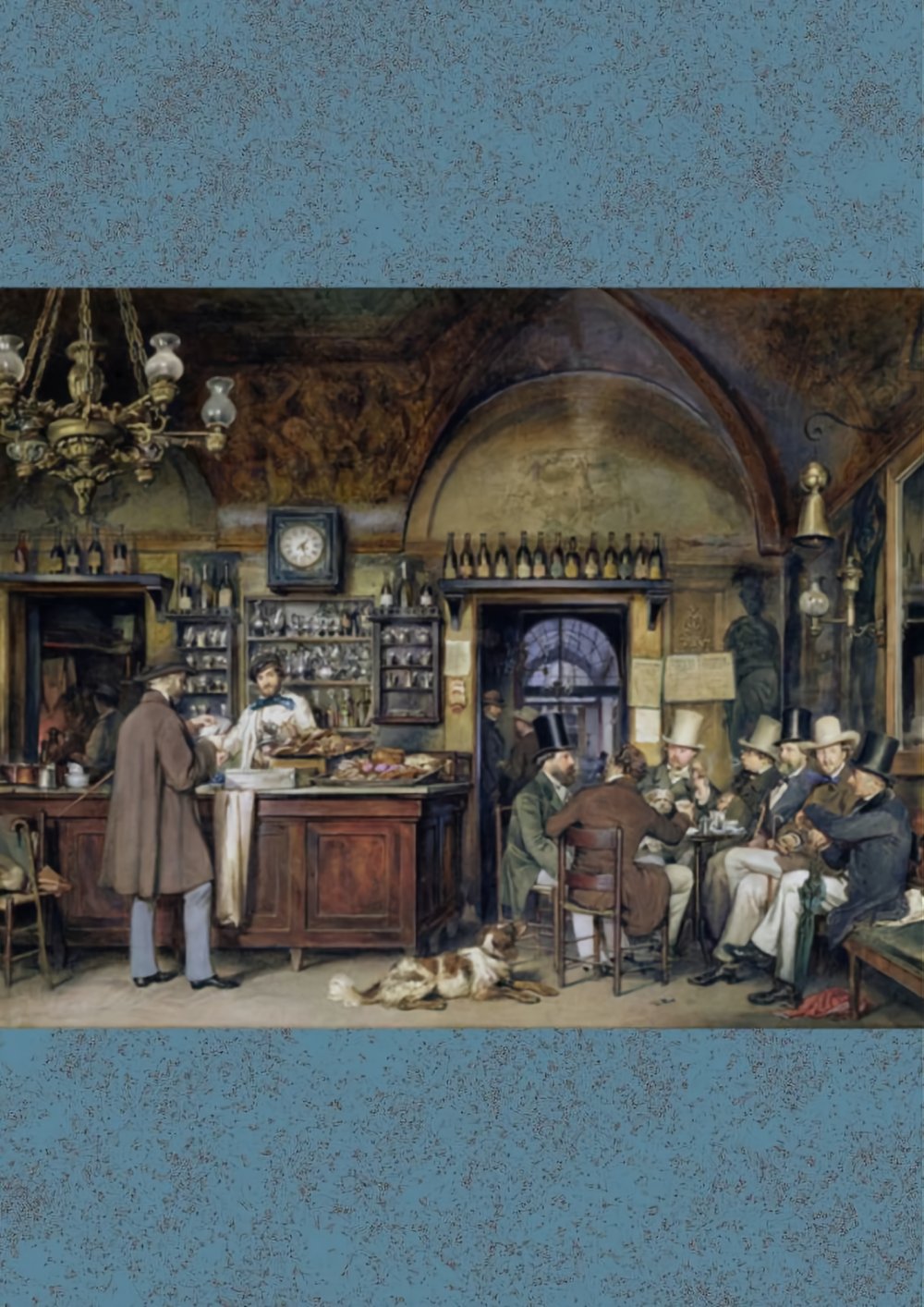
《包豪斯宣言》格罗皮乌斯(文本)/ 1919年
2023年,ido & Friends咖啡出现在云南昆明街头.
正如品牌名“ido & Friends”,品牌业主期待这个空间,不仅是品味不同产地、不同风味的咖啡厅,还是不同领域的人们聊天交流的会客厅。这样的开放包容的品牌理念,正如现代主义的典范——包豪斯。
In 2023, ido & Friends Café emerged on the streets of Kunming, Yunnan. Just like its brand name, "ido & Friends," the brand's owner envisions this space to be more than just a café with diverse coffee offerings from different origins and flavors. It's also intended to be a meeting place where people from various fields can gather, chat, and engage in conversations. This open and inclusive brand philosophy is reminiscent of the ideals of modernism, much like the Bauhaus movement.
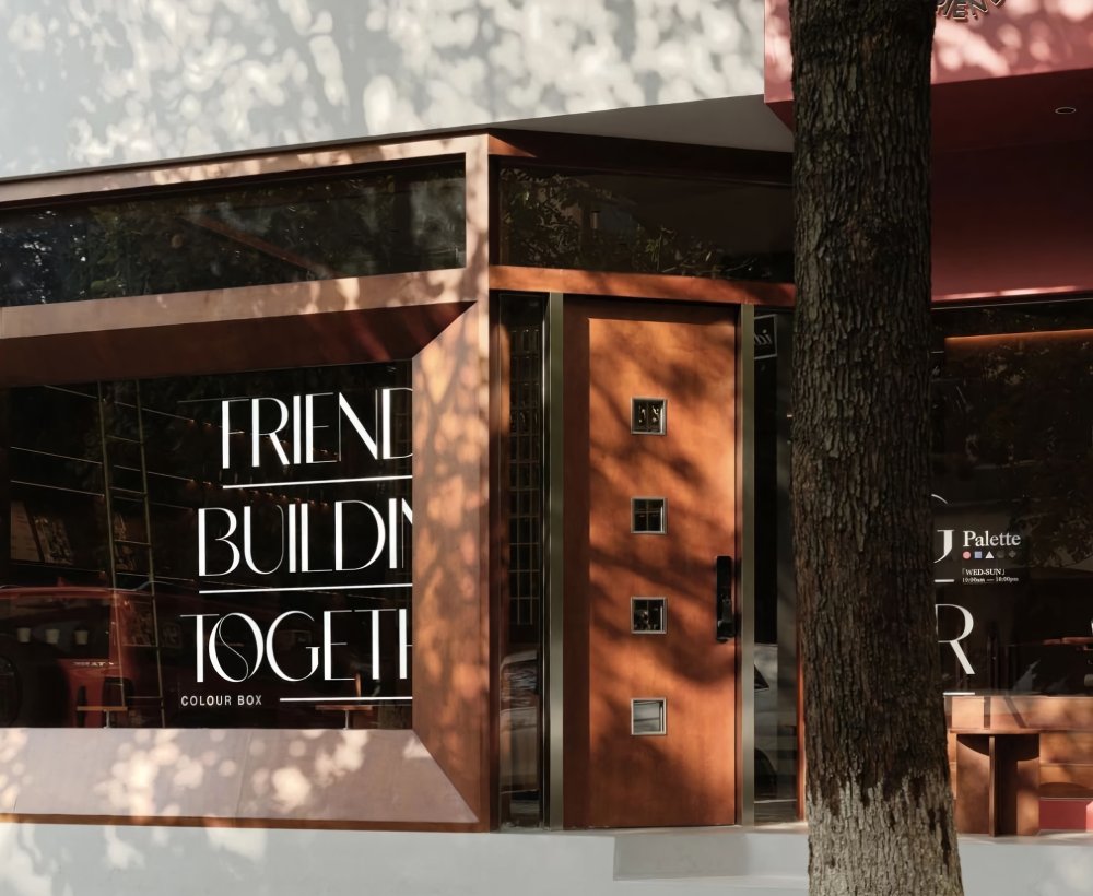

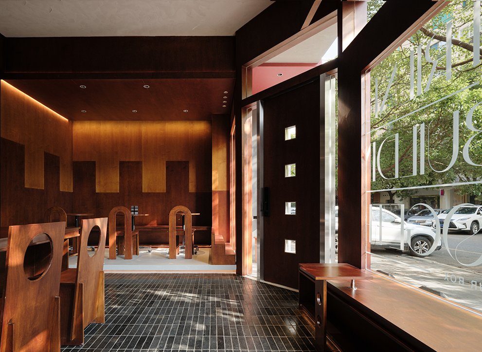
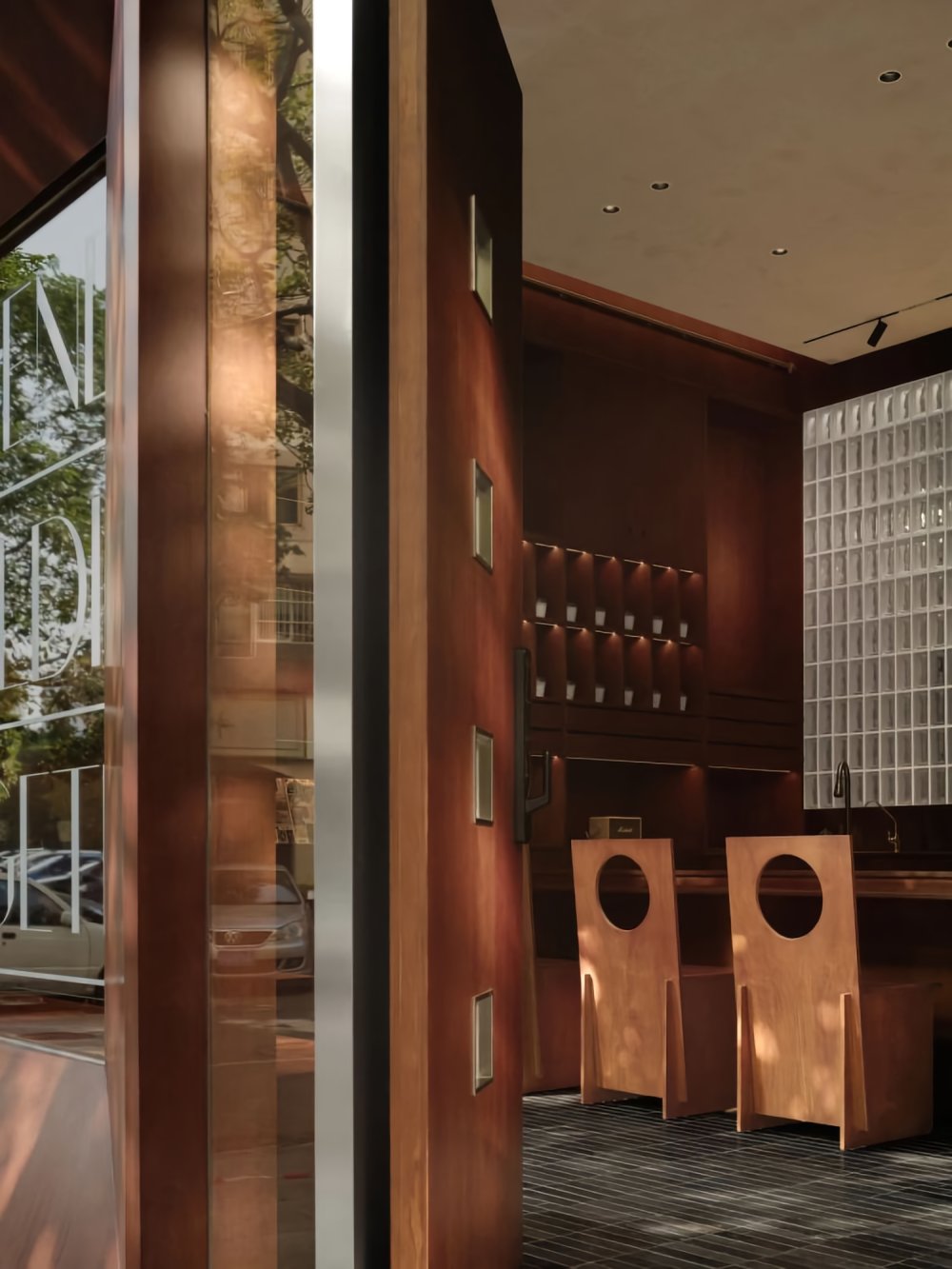
开放和包容的态度从建筑外立面开始呈现,玻璃幕墙将街道与空间的视野相连,后退的侧开门让出了一角空间,这一角空间可以是喝咖啡的外摆区,也是来往行人的休息区。
The open and inclusive attitude is evident from the exterior design of the building. The glass façade connects the street to the interior space, and the recessed side doors create a corner space. This corner space can serve as an outdoor coffee seating area and a resting spot for passersby.

沿玻璃墙布置的低矮木椅,能容纳下多人就坐,沿玻璃墙布置方式空出宽裕的走道空间。定制茶几是长椅的跳脱元素,茶几上镂空圆圈呼应对面的椅子,与此同时,给长椅增加了一丝纵向的变量。
Low wooden bench are arranged along the glass wall, providing seating for multiple individuals. This arrangement along the glass wall leaves ample space for a walkway. The customized coffee tables serves as contrasting elements to the bench, with hollow circular patterns on the tables echoing the chairs across from them. At the same time, they adds a touch of vertical variation to the bench.
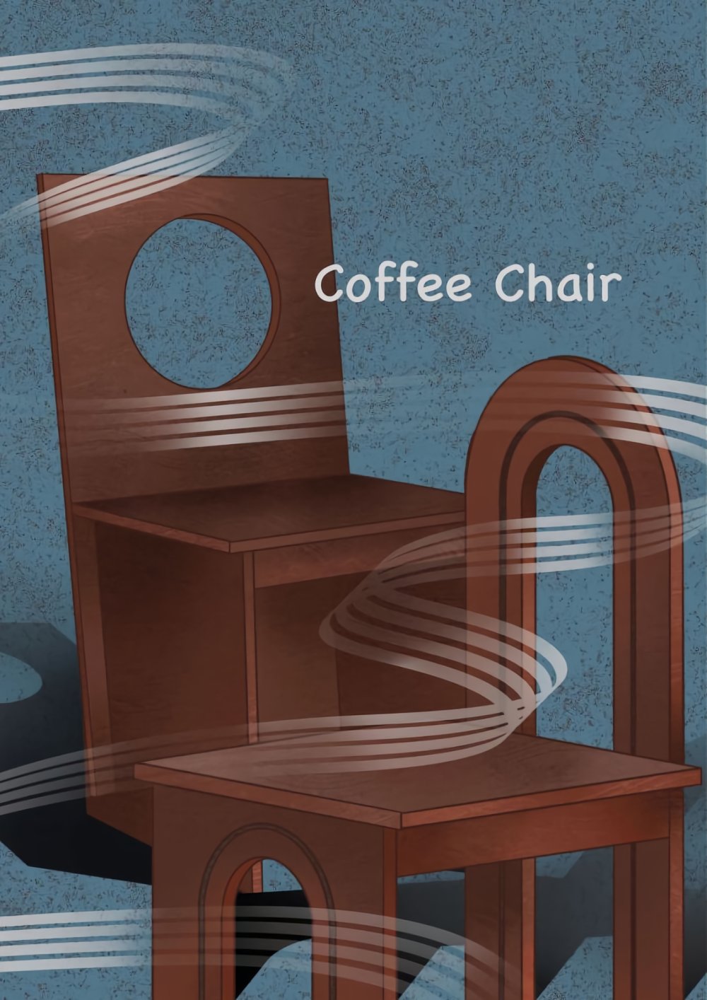
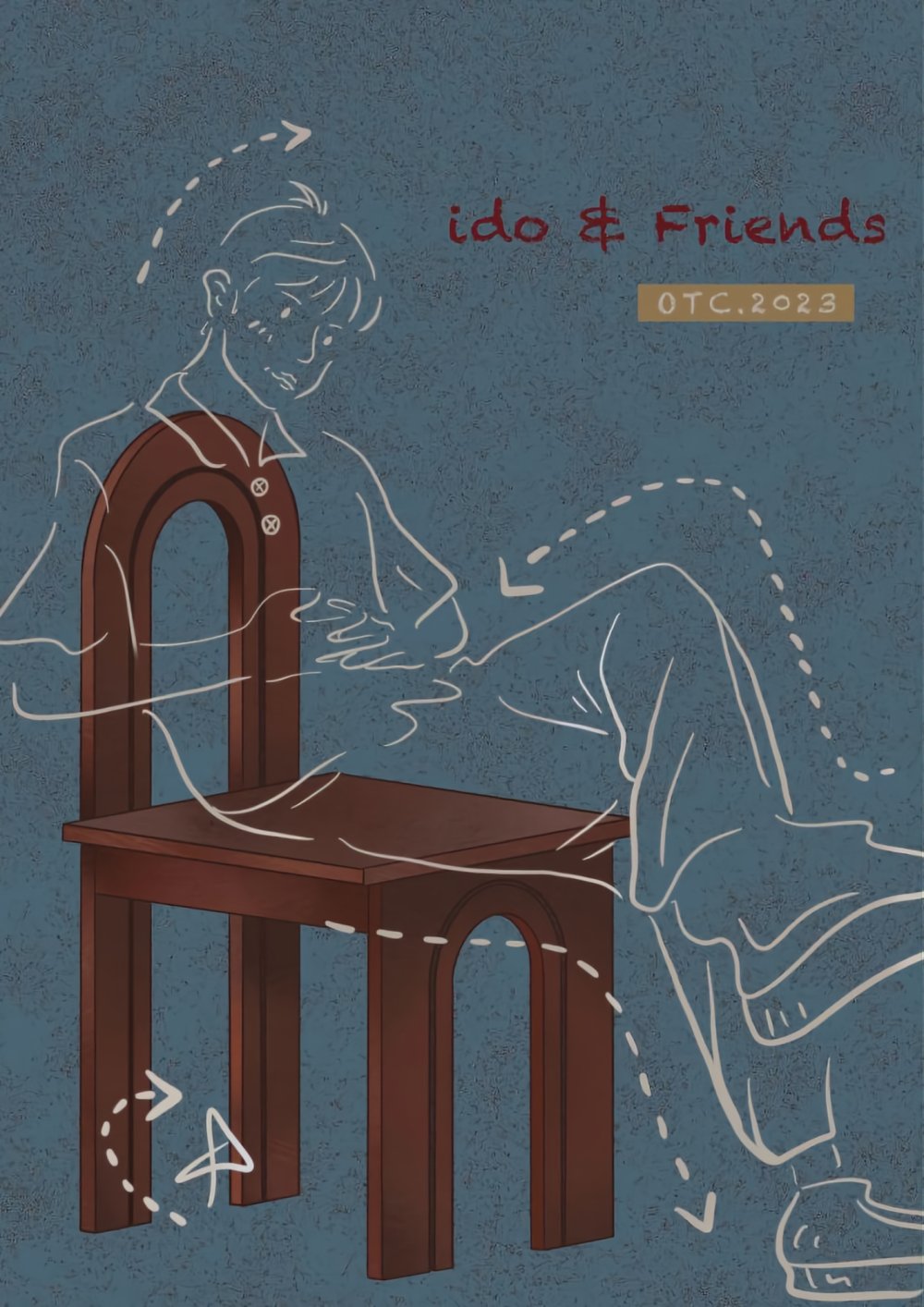
Coffee Chair 画稿
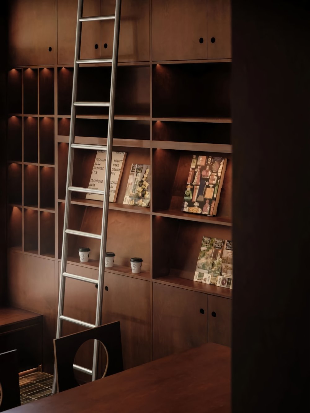

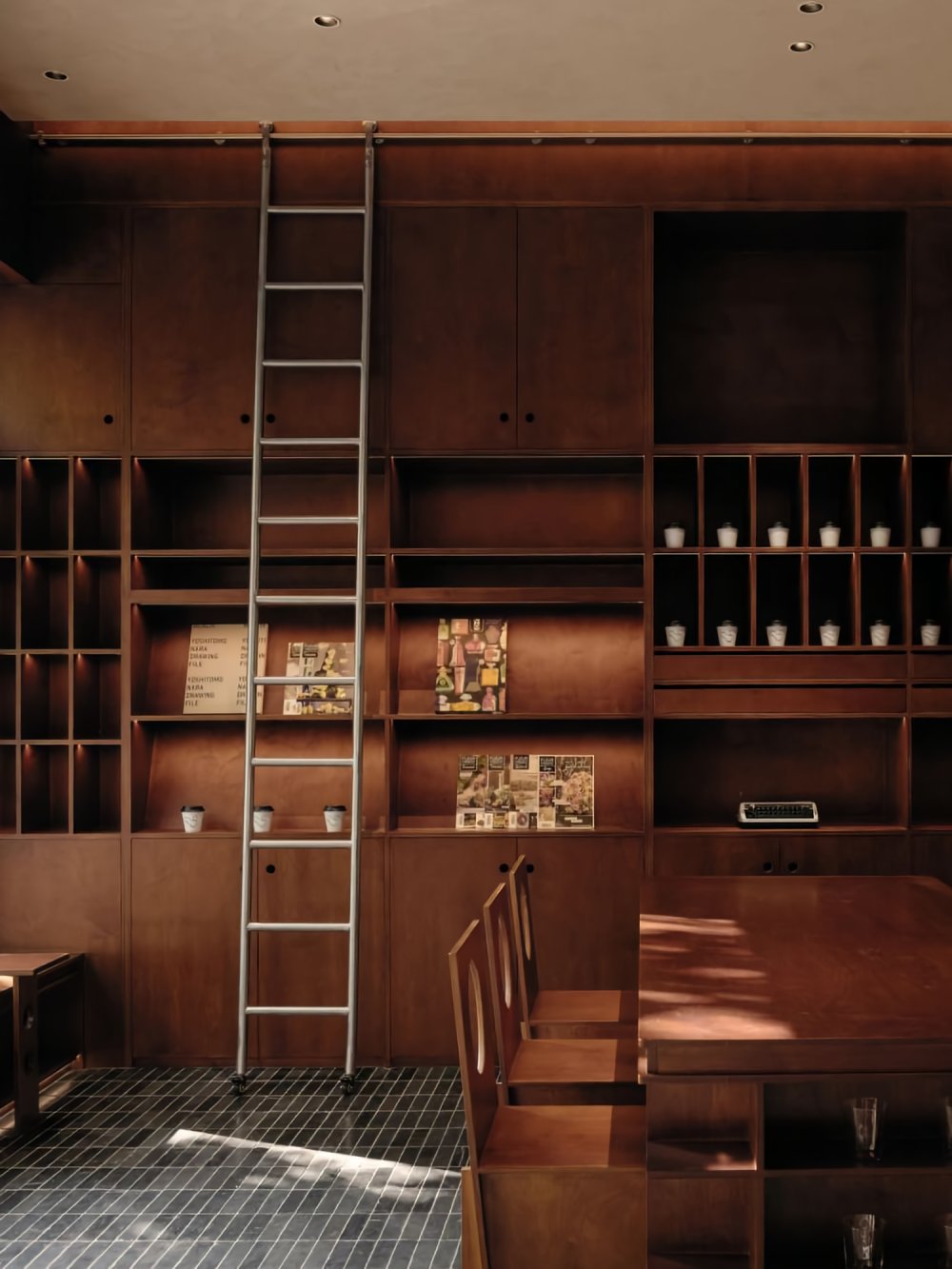
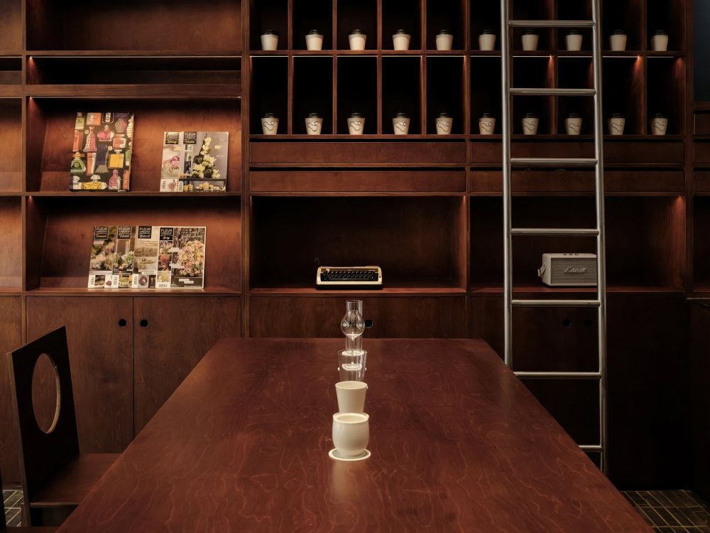
空间一侧也是用同样的木材做的展柜,三层分级的木制展示柜,能放置咖啡杯、杂志、音响等各种杂物,金属移动滑梯,让顾客和咖啡师拿取物品变得轻松、便捷。
On one side of the space, there is a display cabinet made from the same type of wood. It's a three-tiered wooden display case that can hold various items such as coffee cups, magazines, and audio equipment. The metal sliding mechanism makes it easy and convenient for both customers and baristas to retrieve items.
摆放在柜子上的书刊、杂志为来访的人们打造了一处精神角落,在散发着咖啡的空间,邂逅一本好书,遁入另一个美丽新世界。
The books and magazines placed on the cabinet create a tranquil corner for visitors, offering a mental retreat within the coffee-scented space. Here, one can discover a good book and escape into another beautiful world.



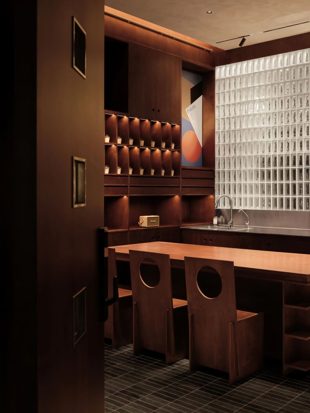
玻璃砖墙将空间柔软地划分开来,向外的一侧是客人们品尝特调咖啡的区域,向内的一侧是供数字游民办公的区域。设计师希望人们除了能在ido & Friends咖啡品尝到美味的咖啡之余,也能在这里一起踏上创意之旅,在友好的交流中激发了无数人的创造力。
The glass brick wall gently divides the space. On the outer side, there's an area for guests to savor specialty coffee, while on the inner side, there's a workspace for digital nomads. The designer's intention is for people to not only enjoy delicious coffee at ido & Friends but also embark on a creative journey together, inspiring countless individuals through friendly interactions.

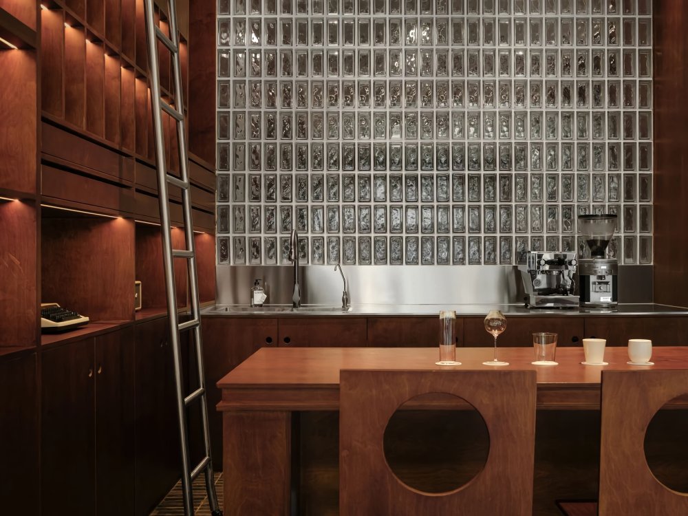
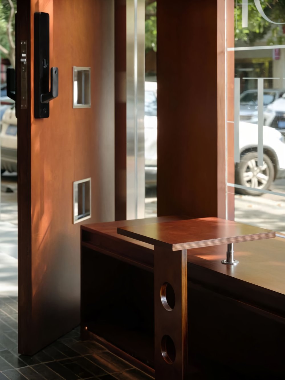
划分功能分区的方法除了横向的玻璃砖墙以外,设计师还对办公空间进行整体的纵向抬升。
In addition to the horizontal glass brick wall for functional zoning, the designer also elevated the entire office space vertically as a method of dividing the areas.
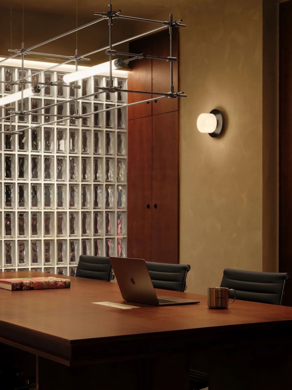
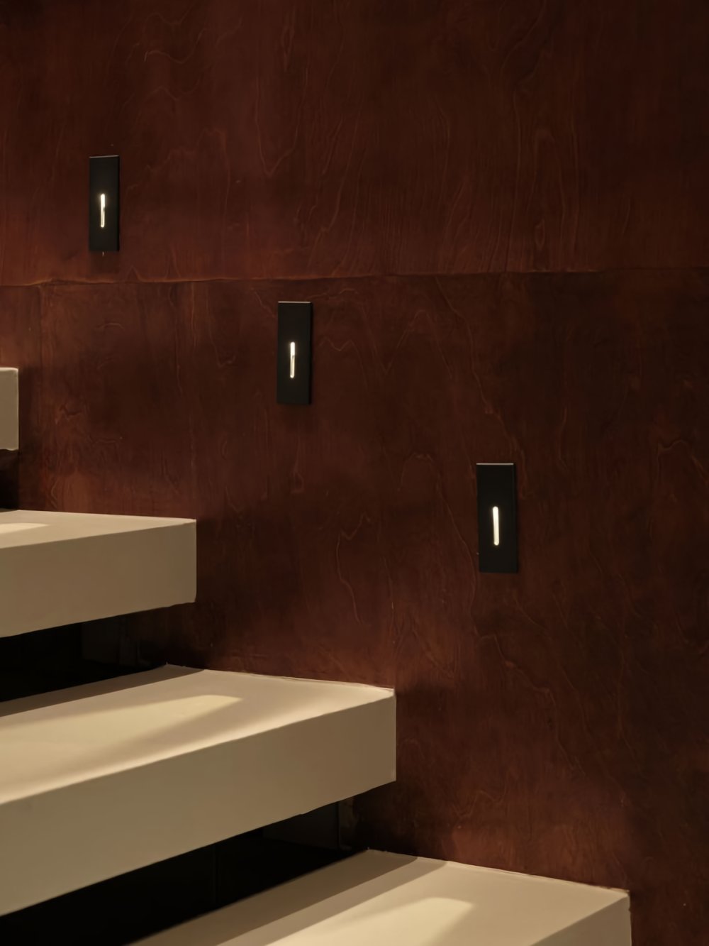
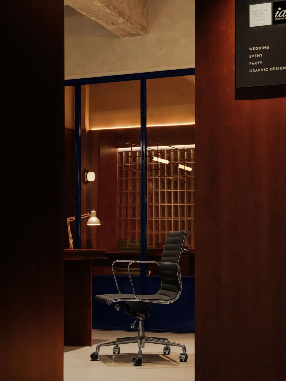
石质台阶结合玻璃砖墙,划分出较为私密的办公空间。该空间也对到访的客人开放。极简一字型马扎灯带来均匀的光线,冷静但又温暖。横平竖直的管线和书柜、玻璃砖形成了视觉上的呼应。
The combination of stone steps and the glass brick wall delineates a relatively private office space while remaining open to visiting guests. The minimalist linear desk lamp provides uniform lighting that is both calm and warm. The horizontal and vertical pipelines, along with bookshelves and glass bricks, create a visual harmony in the space.
靠玻璃砖墙部分有一个闭合的柜面,日常杂物都可以收纳至此。另一部分为开放式书柜,简单的框架可以容纳多种语言,既可以放置日常办公的文件,又可成为打印复印的操作台。
Adjacent to the glass brick wall, there is a closed cabinet surface that serves as storage for everyday items. Another part features an open bookshelf, with a simple frame that can accommodate various materials. It can hold daily office documents and also serve as a printing and copying station.
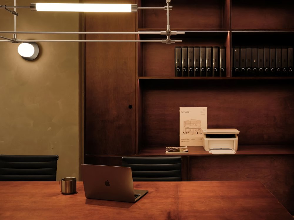


除了在复合的空间功能上,呈现鼓励不同领域交叉合作的包豪斯精神,设计师也在设计手法和设计风格上尝试呈现包豪斯精神。
In addition to incorporating multifunctional spaces, the designer also aimed to embody the Bauhaus spirit in design techniques and styles, fostering collaboration across different fields.
空间的色彩并不多,咖、黑、白等中性色彩是空间的主要颜色,这种色彩选择体现了简约和几何的原则,同时也强调了色彩的纯粹性。
The color scheme of the space is intentionally limited, primarily featuring neutral colors such as coffee, black, and white. This choice of colors reflects the principles of simplicity and geometry while emphasizing the purity of color.

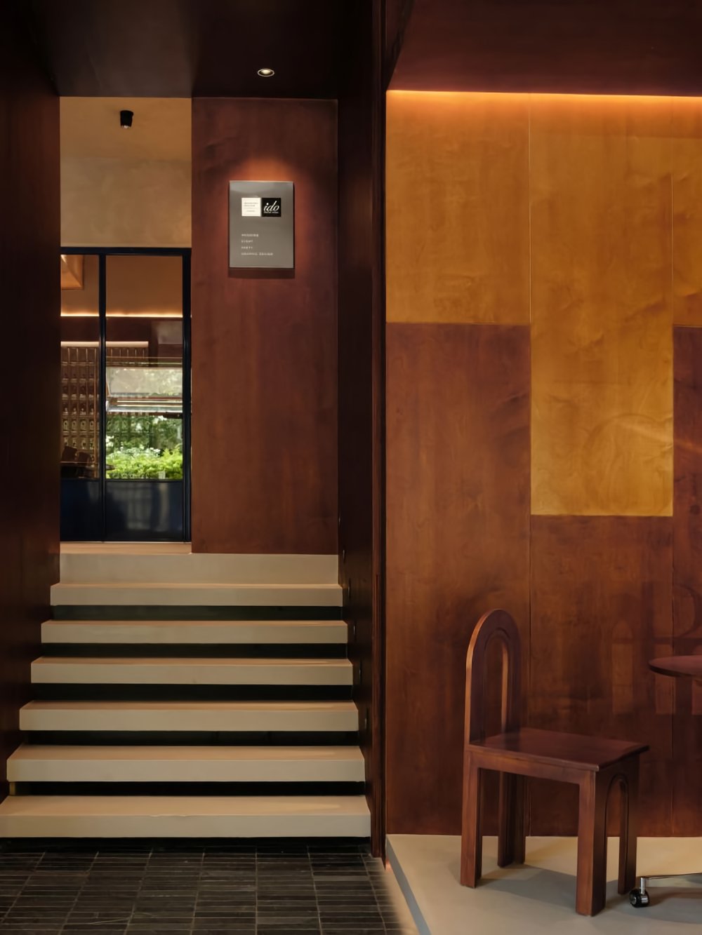
深浅不一咖色木板相互咬合,正如包豪斯里强调的平坦块面。自主研发的椅子灵感来自于包豪斯字体的“A”,明确的几何形状,强调了几何构成和形式感。
The varying shades of coffee-colored wooden boards interlock with each other, akin to the emphasis on flat surfaces in Bauhaus design. The self-designed chairs draw inspiration from the letter "A" in the Bauhaus font, featuring distinct geometric shapes that highlight geometric composition and form.
选一个闲适的午后,在洒满阳光的咖啡店喝着咖啡发呆或是安静办公,让思绪穿越到二十世纪中期,神游到巴黎、威尼斯、巴塞罗那,与艺术家们聚集在一起,争论、探讨彼此的作品、周围及远处的世界。
Selecting a leisurely afternoon, within the sun-kissed ambiance of the café, indulging in sipping coffee and daydreaming, or working quietly, offers a passage for your thoughts to traverse back to the mid-20th century. You can transport yourself to cities like Paris, Venice, and Barcelona, where artists congregated, engaged in lively debates, and delved into each other's works, all while contemplating the world both near and far.


滑动查看

- 项目名称:ido&Friends咖啡店
- 项目地点:云南省昆明市
- 项目面积:70平米
- 设计团队|AURORA DESIGN 艾洛设计
- 主案设计|杨雪婉
- 设计时间:2023.3月
- 完工时间:2023.6月
- 施工落地|重塑空间
- 公司官网|www.aurora22design.com
- 项目摄影师:言隅 纳信

杨雪婉
AURORA DESIGN 品牌创始人
曾获奖项: 2020中国设计星全国12强、安德马丁年度推荐设计师、2022包豪斯奖、2022GFDAWARDS全球未来奖等。
AURORA
艾洛设计 / AURORA DESIGN 是一家针对空间设计的高级室内设计机构,致力于打造共情消费者的态度美学空间,并诠释当下消费体验趋势所在。
本着「创造幻想的美」的设计理念,历经多年品牌服务与项目落地 ,对固有品牌业态的重新诠释,为婚纱摄影空间定制、商业零售、独立 /连锁餐饮迭代 、展厅空间、高端住宅、艺术装置等领域的精英客户提供全面极致的设计顾问服务。
- 转自:寸匠
- 图片©AURORA DESIGN
- 编辑:序赞网
- 阅读原文
|