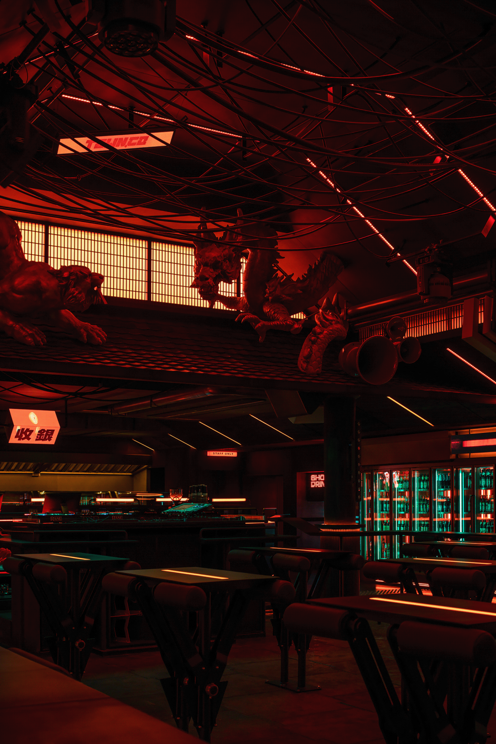
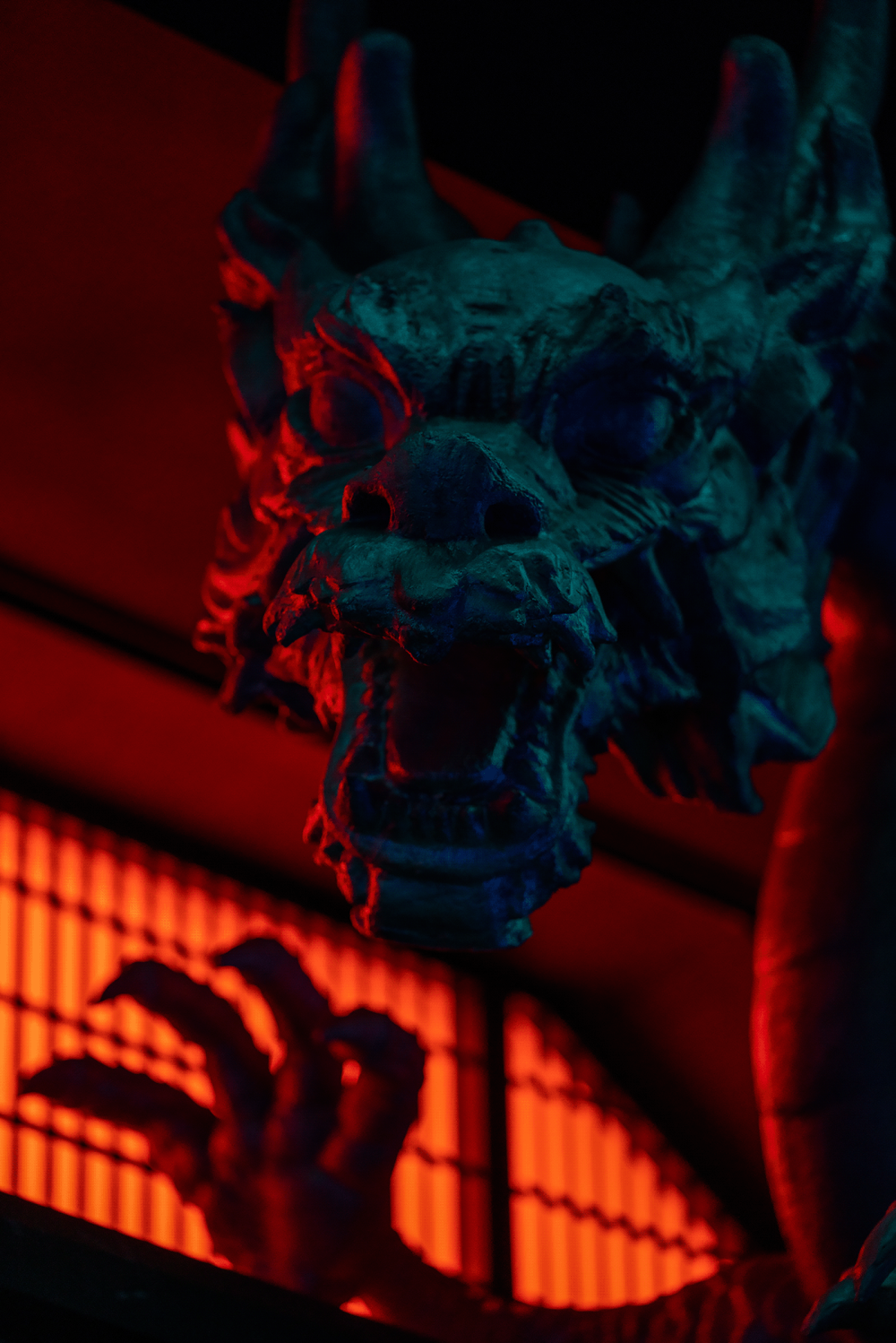
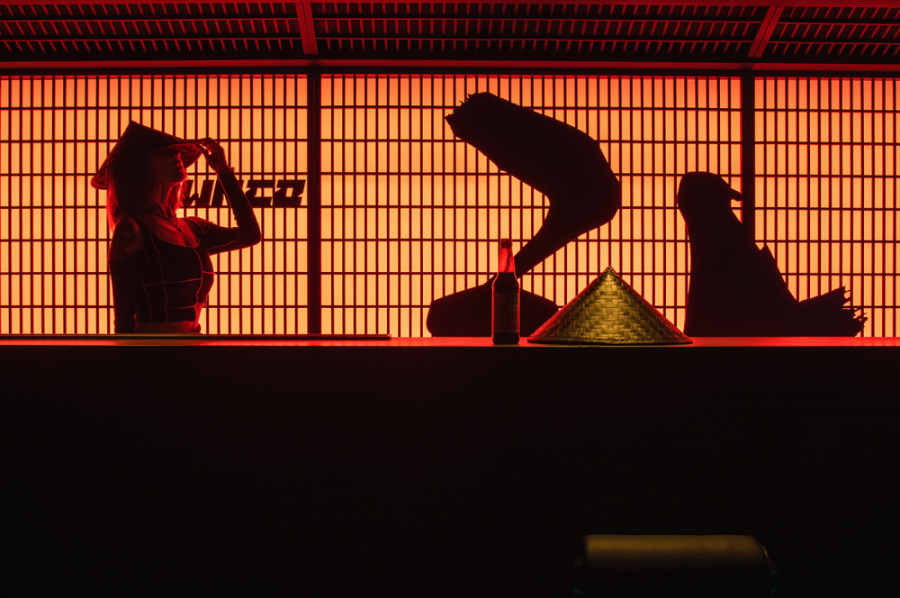
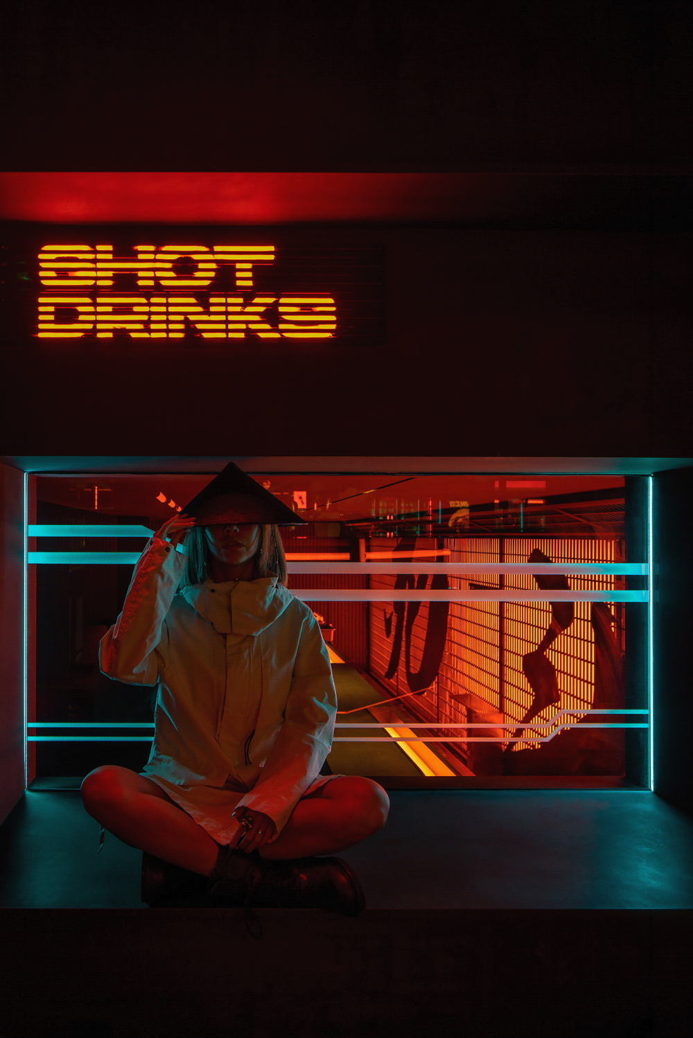
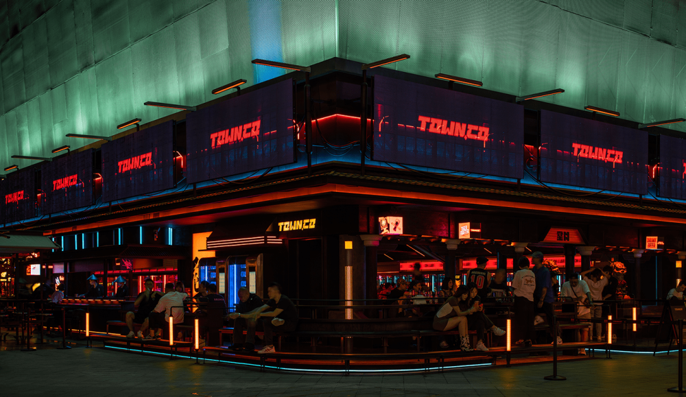
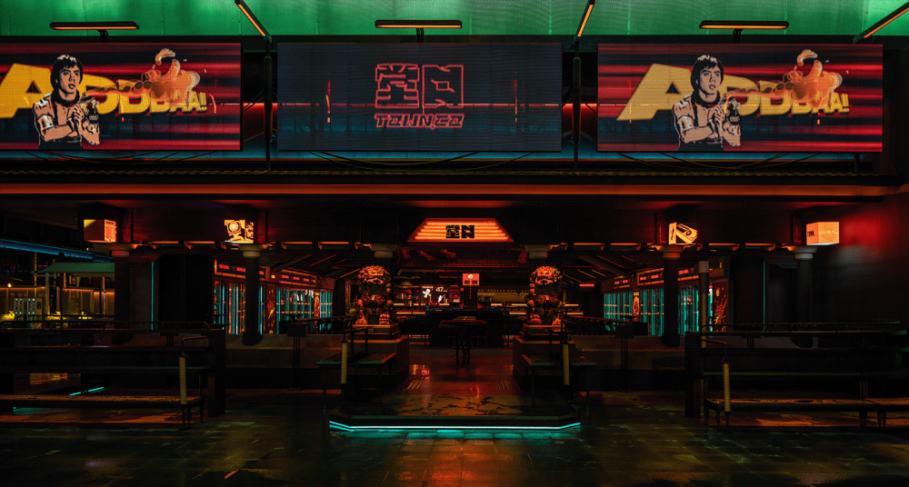
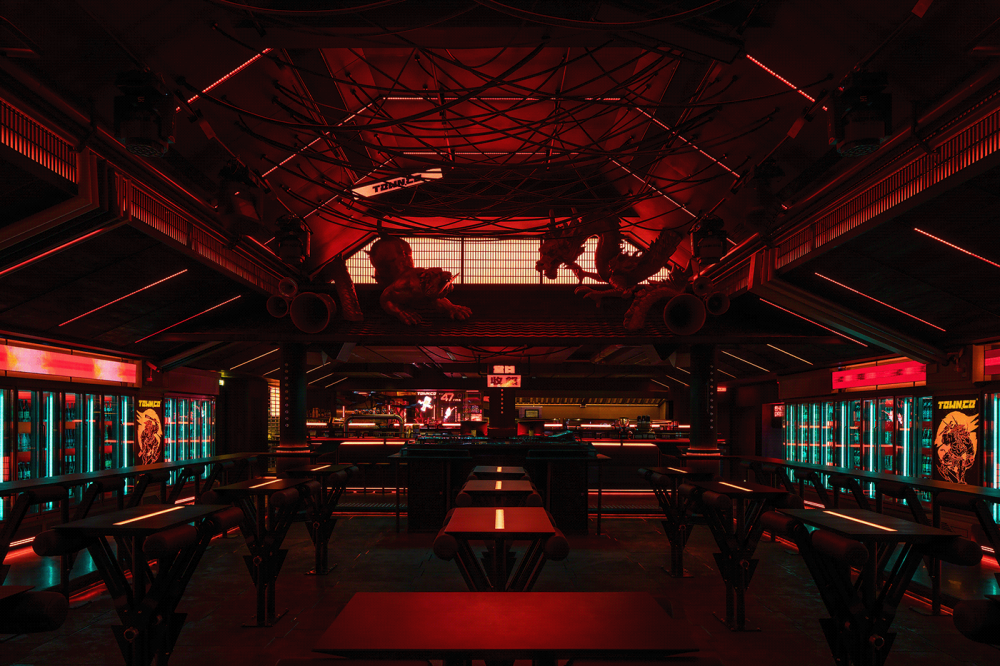
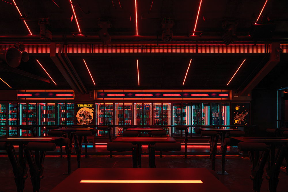
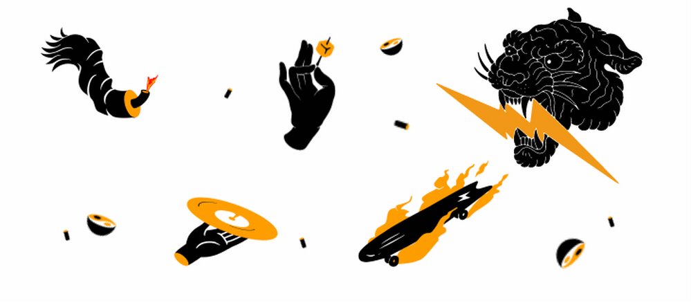
平面设计以「龙|虎」两个极具东方意味的代表元素作为核心视觉表现,将饮酒、炼丹、捻串等元素谐趣化作为辅助插图排版,跳脱出传统插画表现突出主KV的方式,使每一个图标层级平等,令其独立呈现时有单独表达的含义,并列排版时依据位置关系传达另一些趣味。相斗的龙虎头戴斗笠,手持球棒和扳手,既是争堂口江湖游侠也是滑板机车乐园里表现自我的年轻人,相较之下的电光火闪共同营造了堂口空间设计调性的赛博感,契合整体项目关于“传统文化在未来社会保留状态”的设计概念。The graphic design takes the two representative elements of "dragon and tiger" with great Oriental meaning as the core visual expression, and takes the fun of drinking, alchemy, twist string and other elements as the auxiliary illustration layout, which jumps out of the way of traditional illustration performance to highlight the main KV, so that each icon has equal levels and has a separate meaning when presented independently. And in parallel typesetting, it conveys other interests according to the positional relationship. The fighting dragons and tigers wear hats and hold bats and wrenches, which are not only the rangers fighting for TOWN.CO, but also the young people who express themselves in the skateboard and motorcycle park. In contrast, the lightning flashes together create a Cyberpunk sense of tonality in TOWN.CO space design, which is in line with the design concept of "the traditional culture will remain in the future society" of the whole project.


