美国 | Ducera Partners | 办公 | 金融 | 2021 | Ted Moudis Associates
- 客户:Ducera Partners,
- 面积:29,089 sqft
- 年份:2021
- 坐落:New York City, New York, United States,
- 行业: Financial / Investments,
- Ducera Partners, a leading investment banking advisory practice, engaged Ted Moudis Associates for the design of its Manhattan office located on the 36th floor of 11 Times Square. The new office, comprising 85 open workstations and three private offices set across 29,089 square feet, supports the firm’s rapidly growing team. Ted Moudis Associates implemented a modern and mirrored interior design concept, following Ducera’s directives to create a welcoming, front-of-house zone for clients and a bright, open workspace for staff while showcasing 360-degree views of the surrounding cityscape.
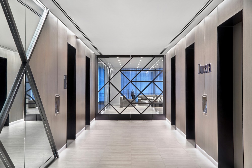
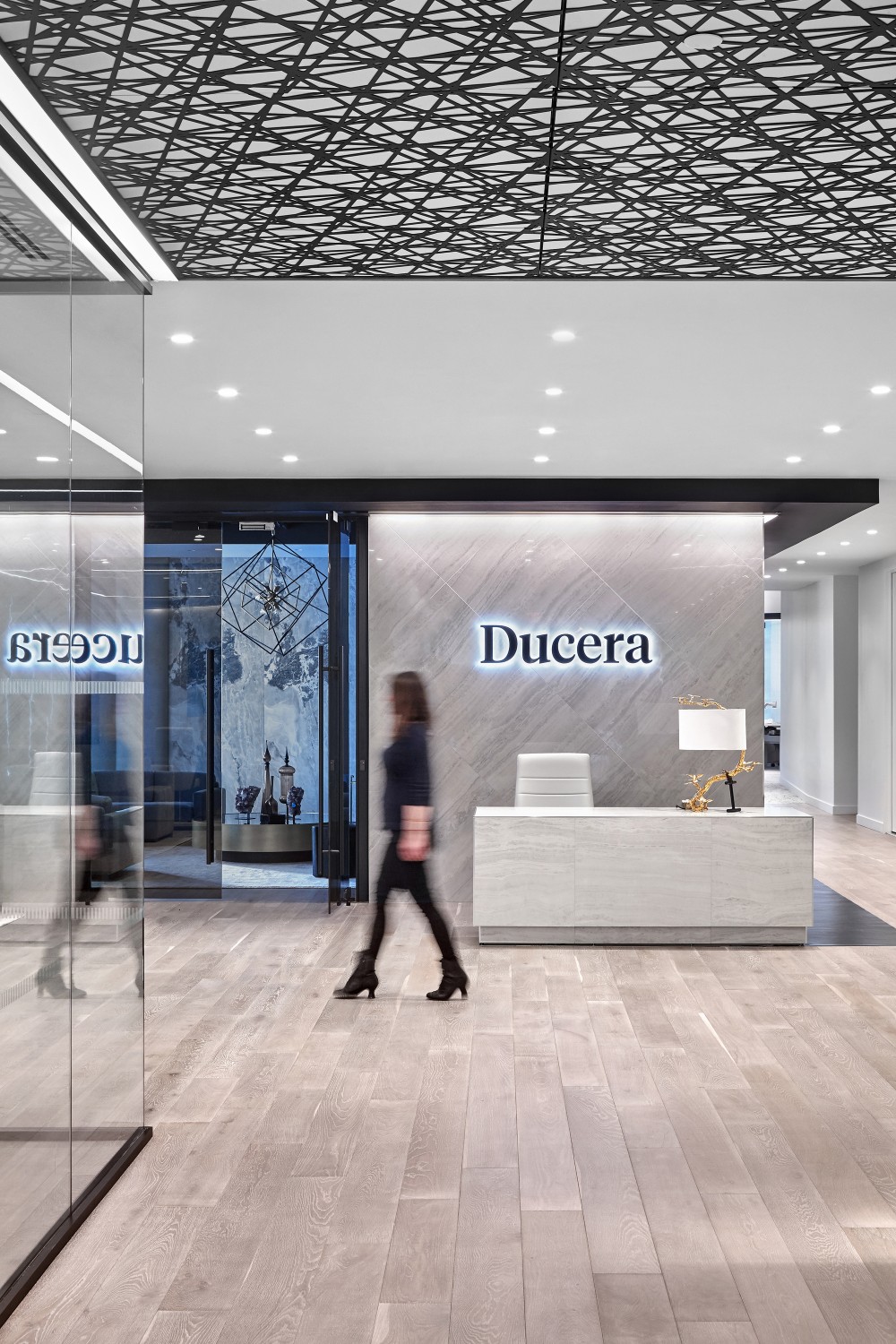
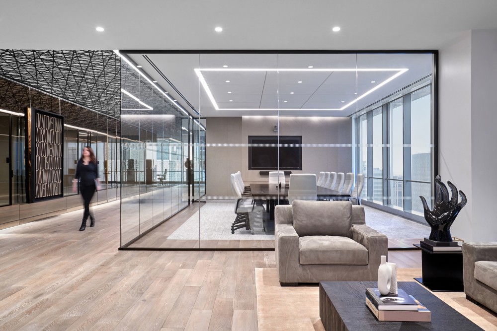
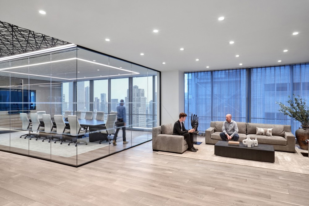
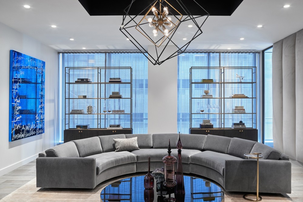
- An elegant, understated lobby greets visitors and staff with warm wood colors and stone selected for its soft tone, complemented by a dramatic lighting scheme. Drawing inspiration from the interlocking geometry of the Ducera logo, Ted Moudis Associates designed an oversized decorative front door referencing the company’s brand. A patterned, mirrored wall echoes the door design and reflects light throughout the lobby and a simple reception desk converts into a bar, enabling the expansive welcome area to double as a social event space. Beyond tinted glass doors, a private lounge with a circular seating area, upholstered walls, and an additional bar provides an intimate venue for informal client meetings.
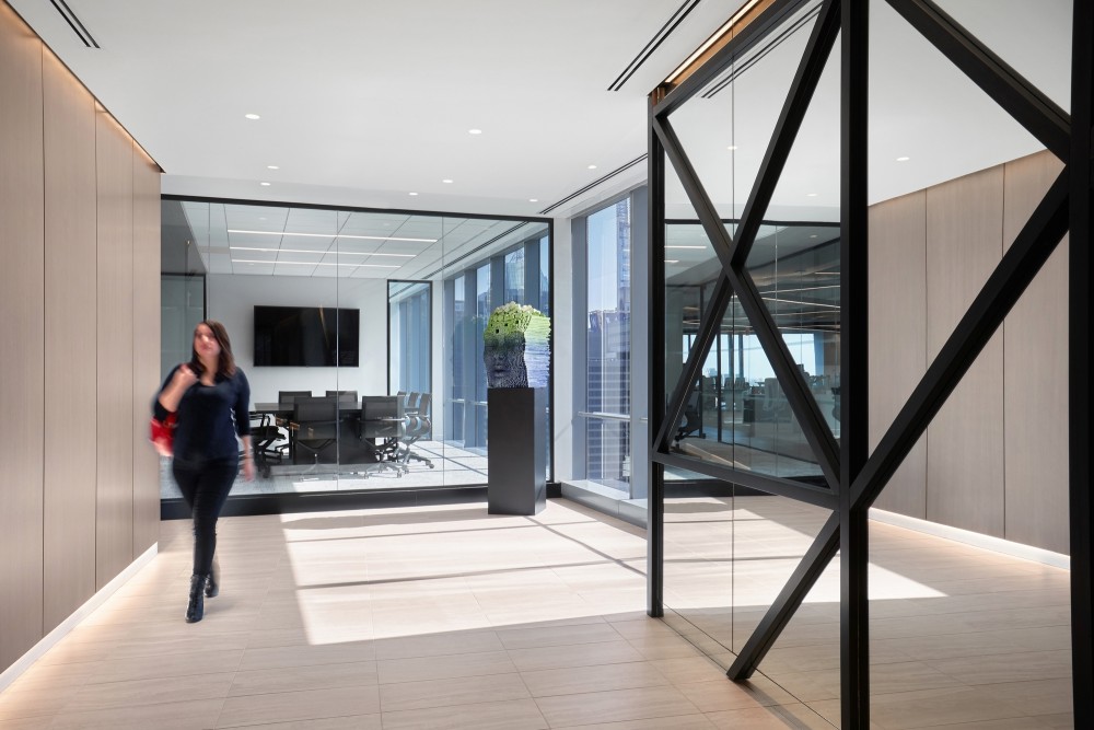
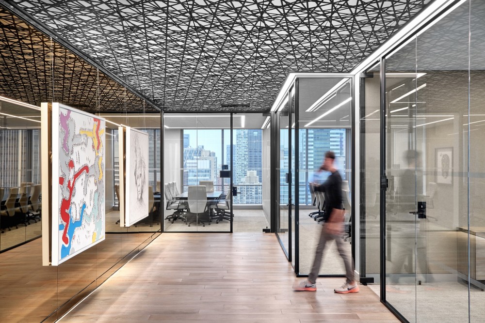
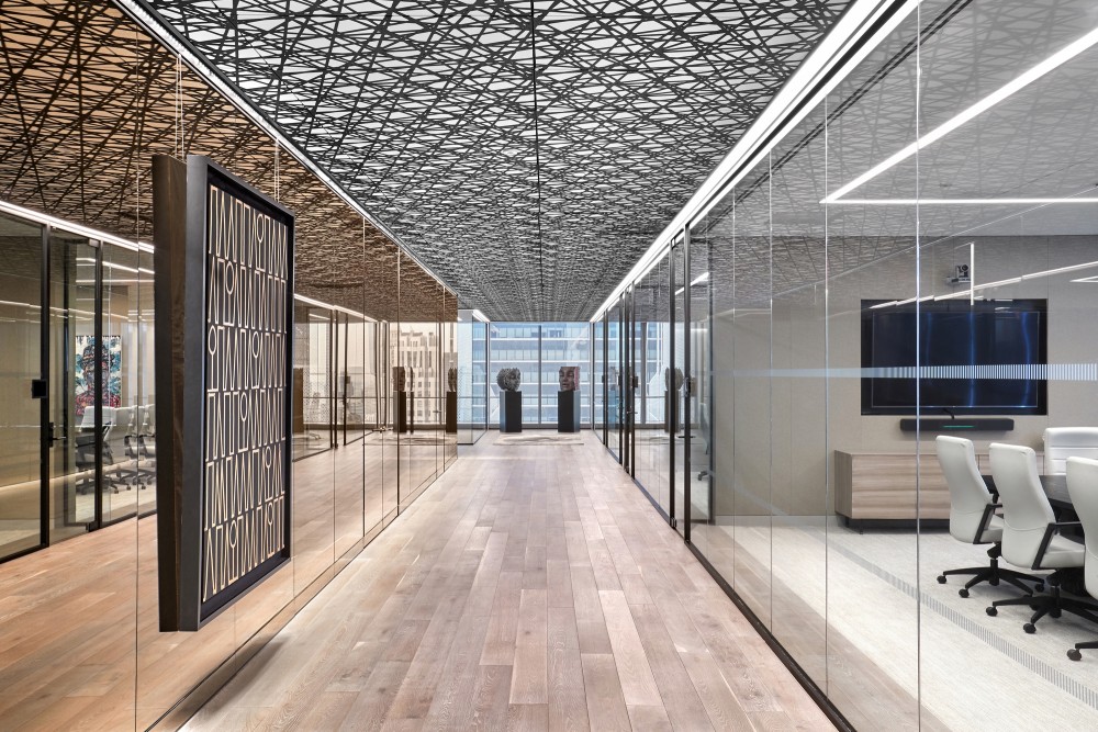
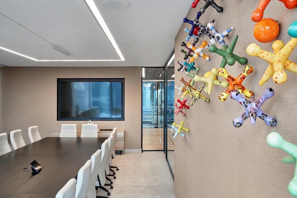
- Designed for client comfort, conference rooms feature a monochromatic palette of grey-toned wood, café au lait-colored leather, blackened wood conference tables, tailored ivory fabric panels, and woven carpet. Tinted glass walls throughout the conference center reflect the striking city views visible from each of the conference rooms. A dramatic ceiling pattern further alludes to the Ducera logo and reflects throughout the mirrored walls, creating the impression of an uninterrupted space. The client’s extensive modern art collection, strategically showcased along the mirrored interiors, appears to float in space.
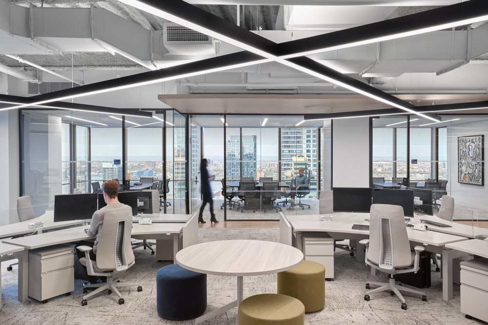
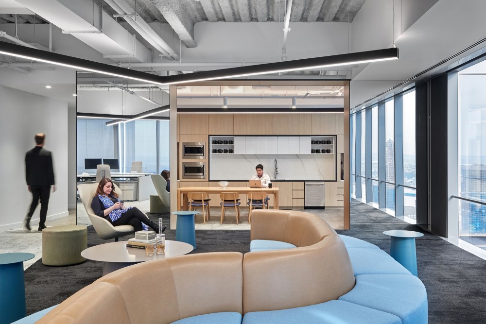
- The workspace is likewise designed to emphasize the surrounding city views. Ted Moudis Associates selected 120-degree workstations to maximize collaboration, promote movement, and encourage a friendly environment in contrast to the refined, corporate atmosphere of the client-facing zones. A jade-tinted exposed ceiling maximizes the height and volume of the space and features black linear lights, a continued subtle reference to Ducera’s geometric logo and brand identity.
15 Images | expand for additional detail
- 转载自:Office Snapshots
- 语言:English
- 编辑:序赞网
- 阅读原文
|

