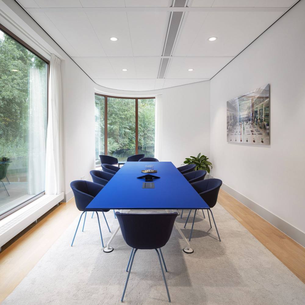
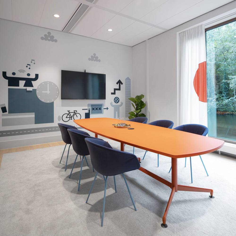
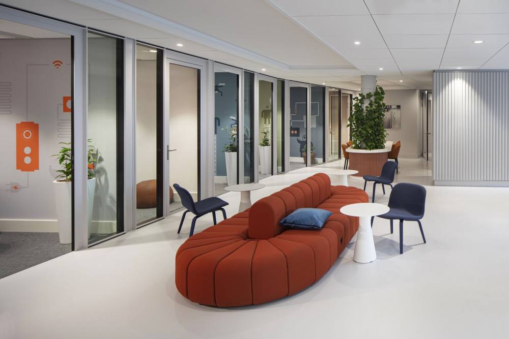
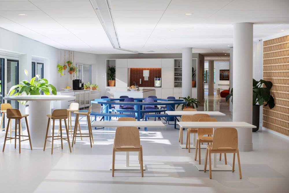
 Hollandse Nieuwe designed an eye catching space for the Osborne Clarke law firm offices in Amsterdam, Netherlands.
Osborne Clarke are a law firm averse to the traditional appearance that usually characterize their profession. Osborne Clarke are an organization that challenges, inspires, innovates and creates. And so when considering their own offices, the workplace needs to continue their unique professional attitude and reinforce the pillars of their corporate culture. The Cerius and Hollandse Nieuwe team were asked to manage the development process, with Cerius responsible for the timing, budget and quality assurance and Hollandse Nieuwe responsible for designing an appropriate and inspiring interior. Sustainability and a workplace that actively contributes to fun and relaxation were key to Osborne Clarkes requirements.
The office building is located near the Nieuwe Meer in Amsterdam and is unique in being the first location in the Netherlands to offer a suitable parking space to the PAL-V, the world’s first commercially available flying car. Having analyzed the building and studied Osborne Clarke’s organization, culture and corporate values, Hollandse Nieuwe were able to develop a clear and simple workplace concept that could both resonated with the company and the chosen building. In organizing the office interior, optimally supporting different work processes was a priority. In addition to traditional workplaces for concentrated work, a number of spaces have been implemented for collaboration between different disciplines and departments.
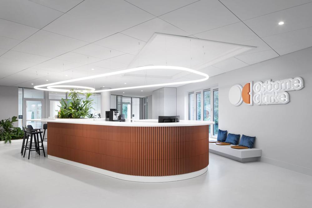
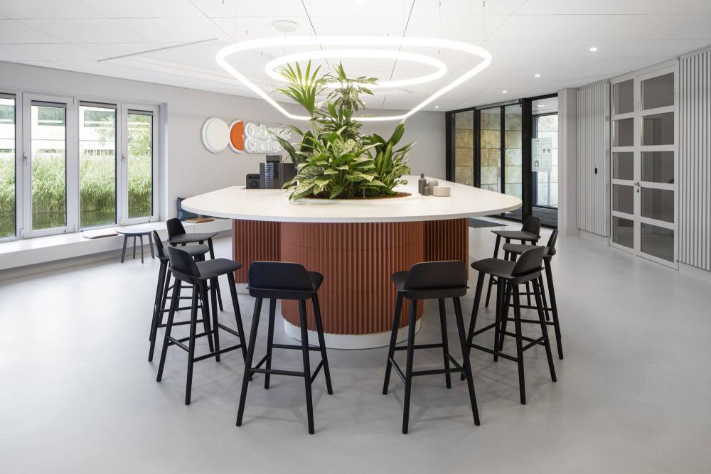
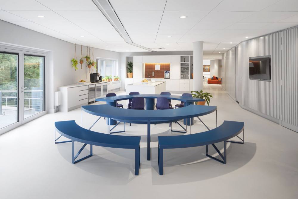
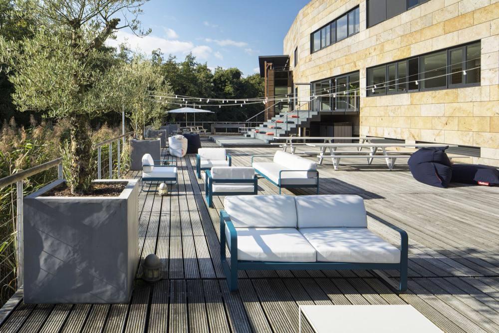
The restaurant was developed to also be able to house large events and the reception area was conceived as a large informal bar. The outside terrace is well suited to get-togethers and Friday drink events but can also serve as an outside ‘office’, for presentations and collaboration. For extra relaxation you can easily step from the veranda onto the Osborne Clarke Standup Paddle board, for a quiet, calming tour of the lake.
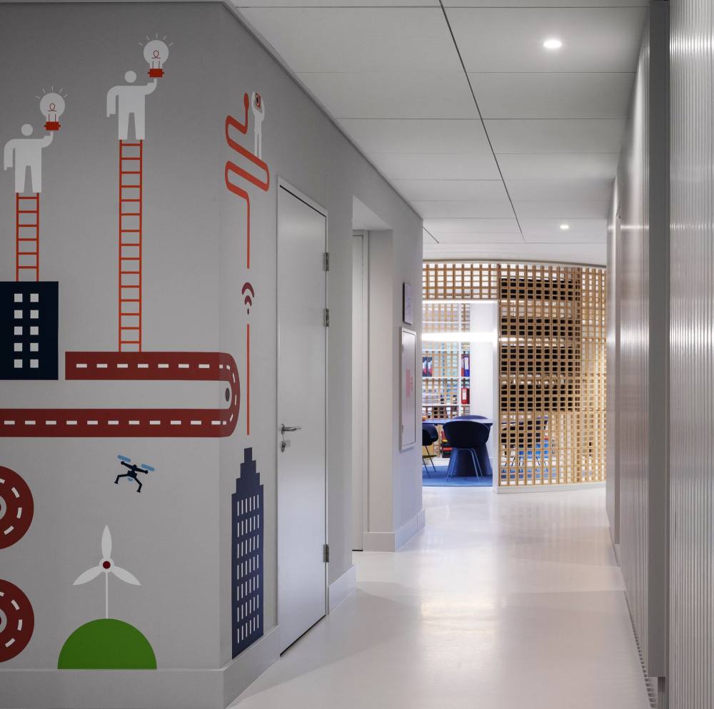
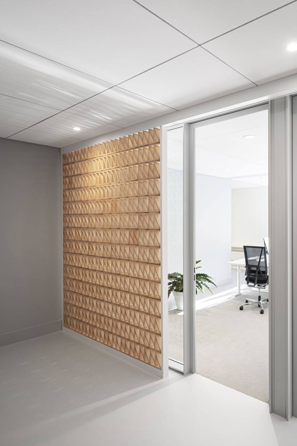
The finished interior is clear and easy to read. Originally, the interior finishes were heavy and dark. In developing the visual concept, it was decided to leave much of the structure and construction intact, to meet the sustainability goals of using as little new materials as possible, but what remained was given a new light grey finish. This fresh colour foundation acts as a backdrop to the more colourful elements that take inspiration from Osborne Clarke’s own house style. This includes the use of some surprising and sustainable materials, including cast ceramic bricks, to create a rich, lively and attractive world.
Deciding to develop layering between the building and materials, textures, colors and the graphic elements was an important point of departure. The solutions needed to evoke the colours used in Osborne Clarke’s corporate identity whilst also being unexpected, surprising, versatile and durable. By applying ceramics as an aesthetic accent, in walls and within furniture, instead of as a constructive material, the interior gained its own unique and specific quality, which was one of the goals of the project. The creation of large, round ceramic elements, on the ground floor and throughout the office, generated a surprisingly warm and homely quality that exudes craftsmanship and an eye for detail. The round shapes also contrast beautifully with the sleek and simple architecture qualities of the building.
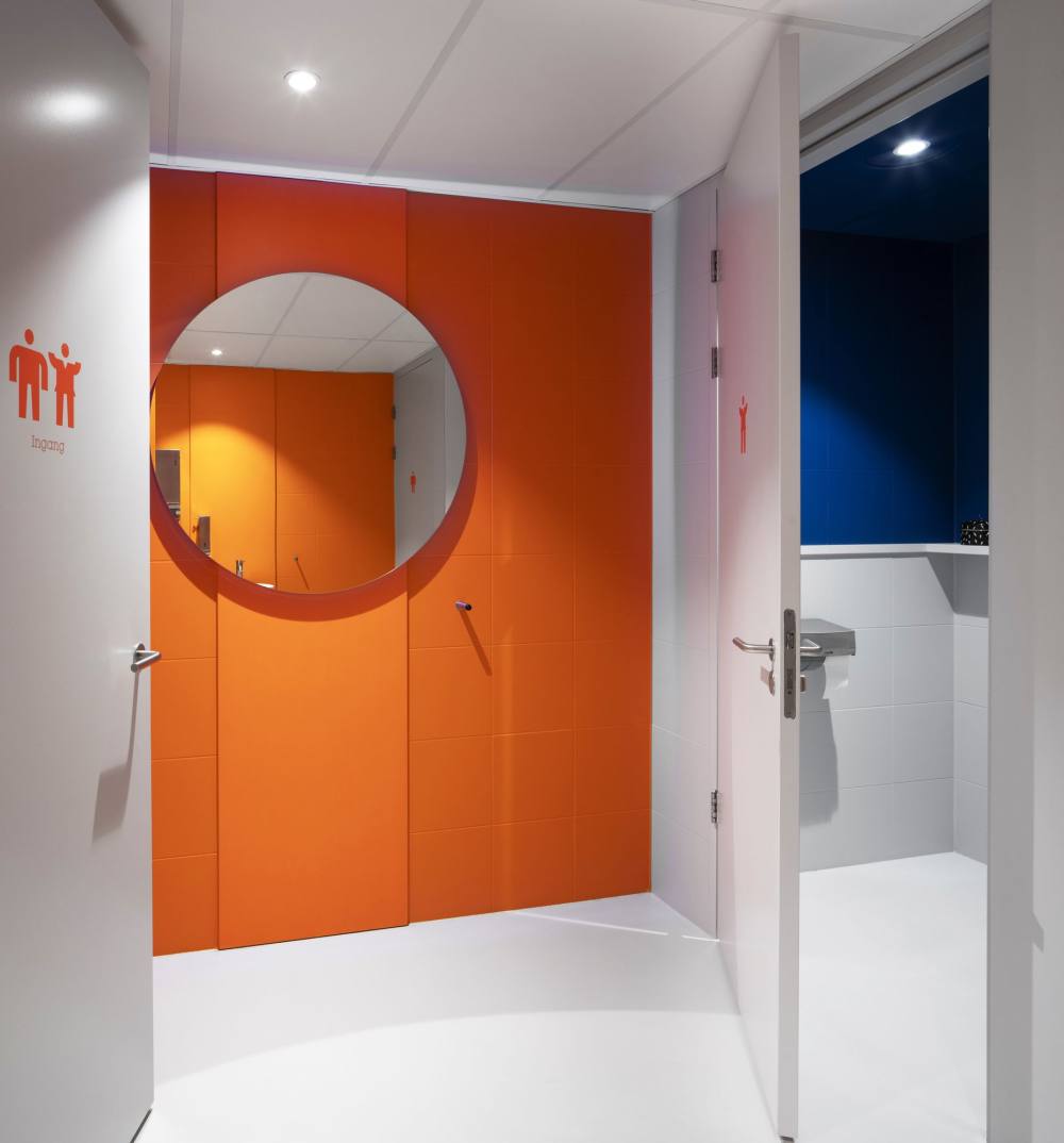
The graphical layer was developed from Osborne Clarke’s own global standard. This layer adds colour texture, wayfinding and a sense of place to specific areas, with a standard graphic solution still to be developed for the workplace’s new gender-neutral toilet. Moving up to the first floor, we see perforated ceramic walls that provide closed office spaces privacy but still allow a visual connection to the rest of the floor.
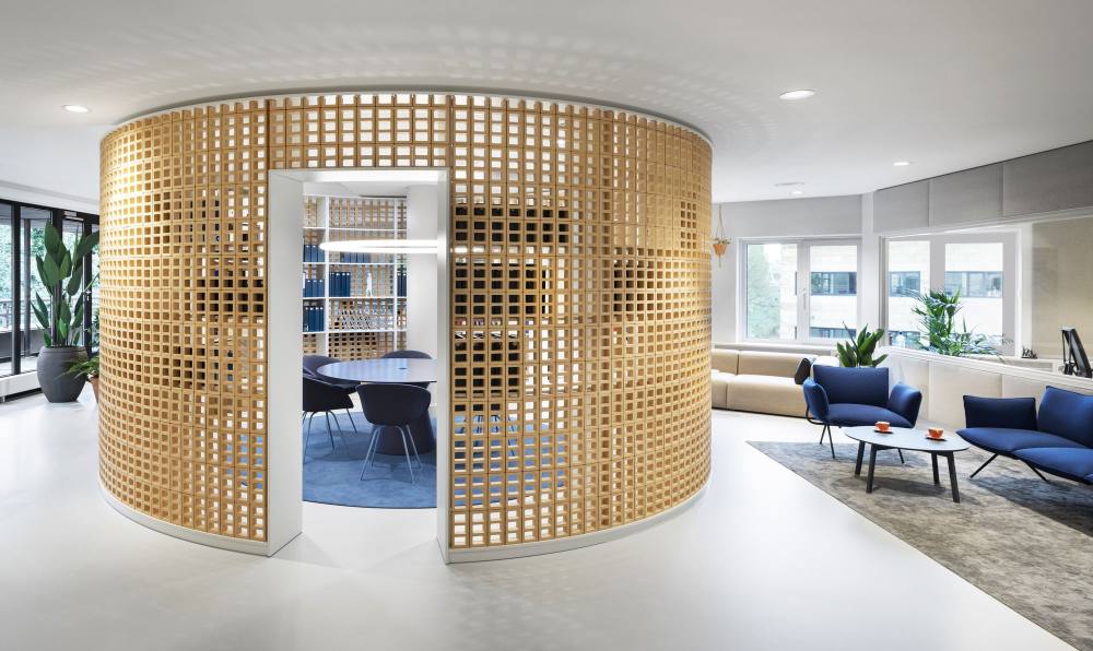
The library is centrally located on the second floor. This is a large cylindrical space also defined by perforated ceramic bricks. This multifunctional space is the intellectual heart of the office and can easily be transformed into a meeting or work space. The cylindrical shape acts as a natural divider and defines the different types of workspaces around it.
Thanks to an intensive collaboration between all parties involved, the new Osborne Clarke office has become a personal, daring, natural, sustainable and functional interior where our client feels completely at home.


- 设计:Hollandse Nieuwe
- 客户:
Osborne Clarke, - 面积:24,756 sqft
- 年份:2020
- 坐落:Amsterdam, Netherlands,
- 行业:Law Firm / Legal Services,
- 转载自:Office Snapshots
- 语言:English
- 阅读原文
|

 发表于 2020-12-17 19:12:03
