Houses, Los Angeles, United States- 设计师:The LADG
- 年份:2020
- 摄影:Saam Gabay, Injinash Unshin
- Project Team:Claus Benjamin Freyinger, Andrew Holder, Trenman Yau, Anthony Chu, Kenji Hattori-Forth, Remi McClain, See Hong Quek, Jonathan Rieke, Morgan Starkey
- City: Los Angeles
- Country:United States
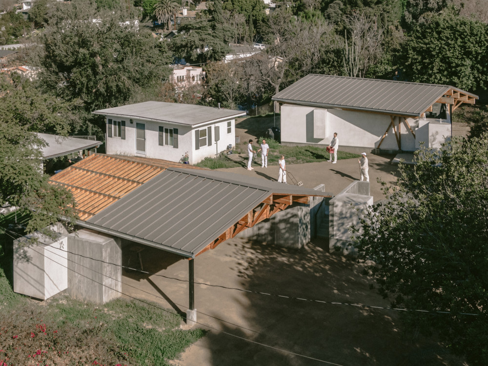
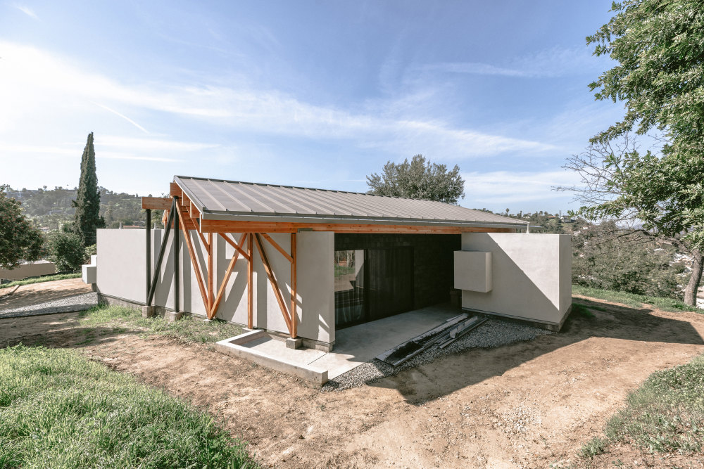
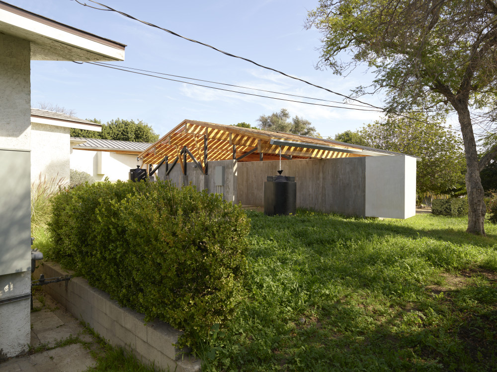
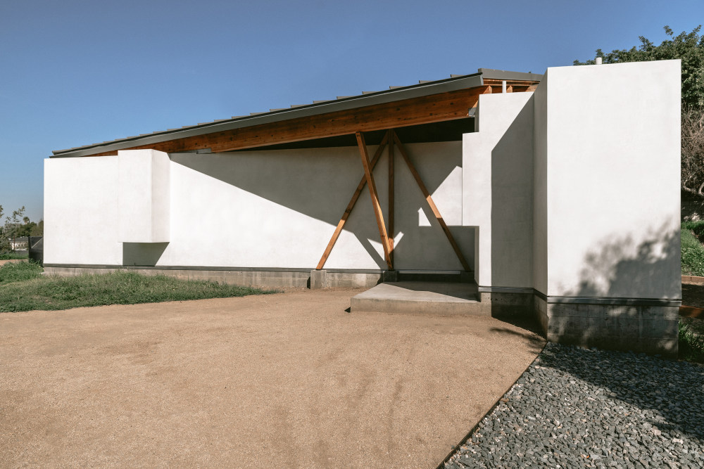
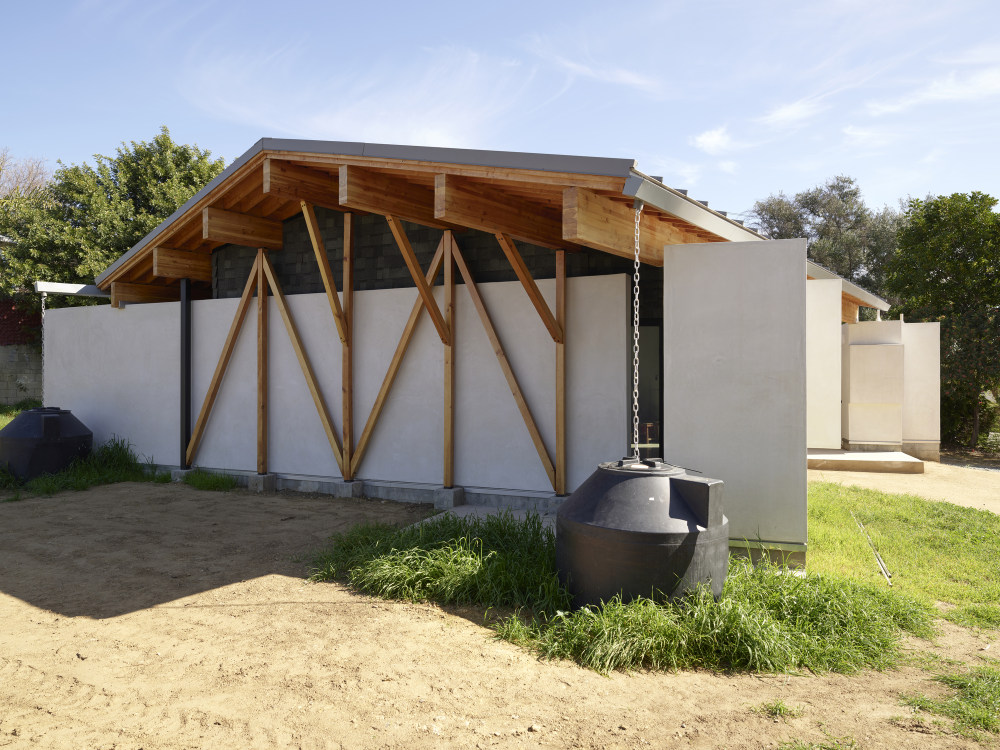
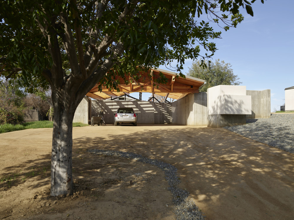
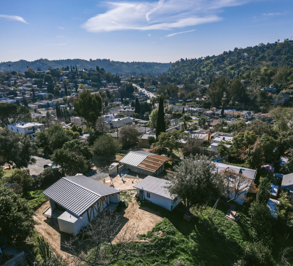
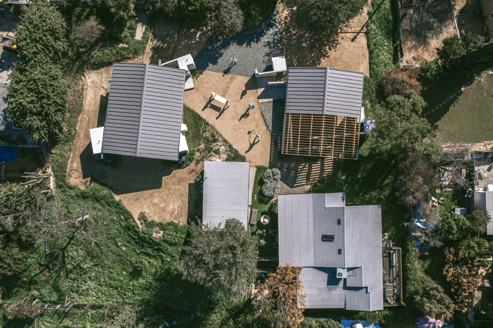
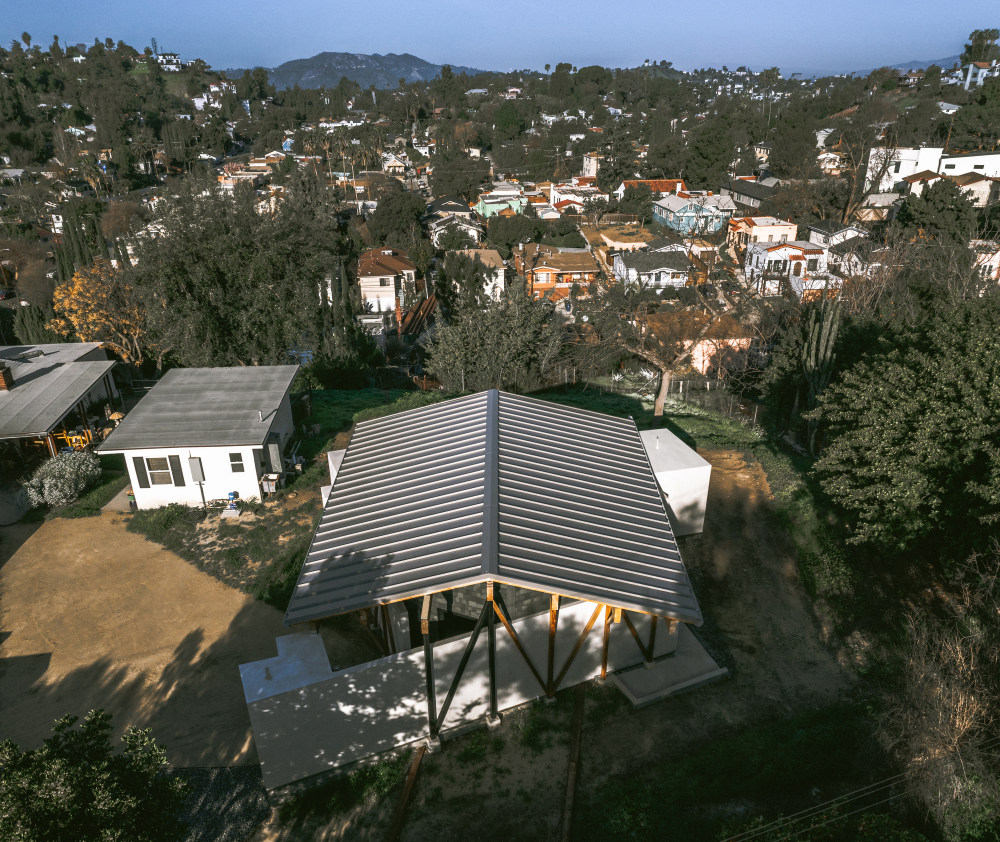
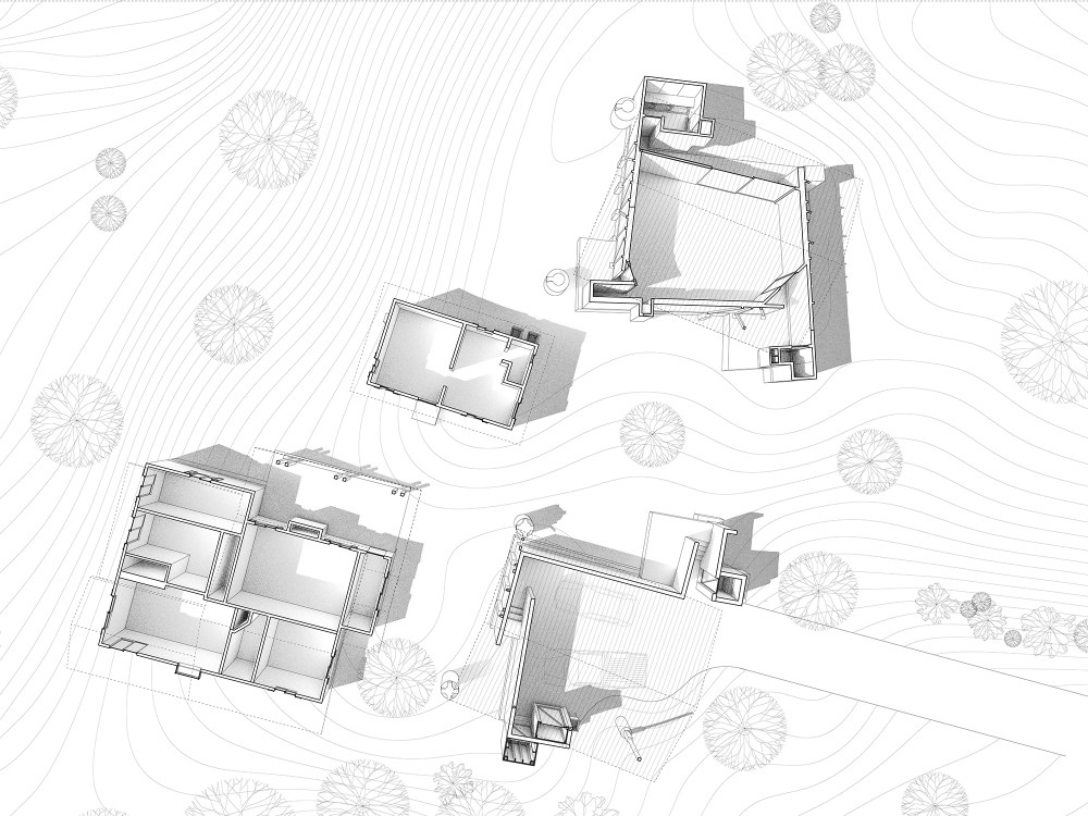
- 设计师描述 | Designer description: House in Los Angeles 1 is a multifaceted art studio and residential compound for a pair of professional visual artists, a painter, and a photographer. The project comprises an addition to the clients’ existing mid-century home, a guest house that provides studio space for their work, and dedicated structures for exhibitions and events during which guests can move seamlessly between indoor and outdoor space. Situated in the middle of a deep residential block in Los Angeles’s Highland Park neighborhood, the compound’s four structures are joined to the street by a long drive and scatter fluidly across the expansive half-acre hilltop lot, redefining traditionally compact, front-facing suburban architecture across Los Angeles.
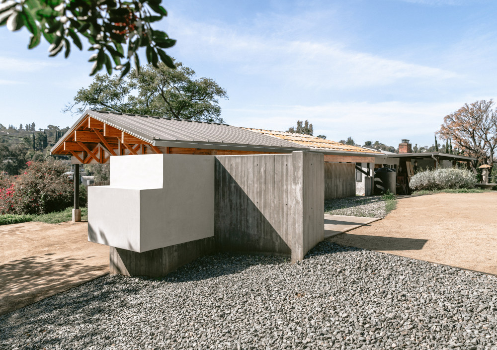
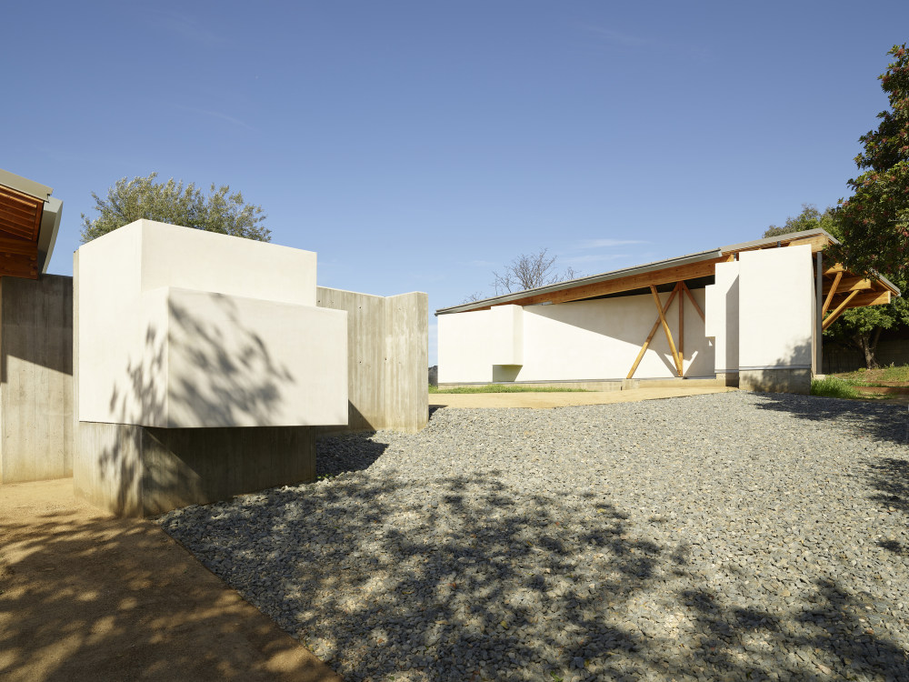
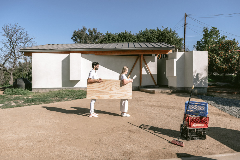
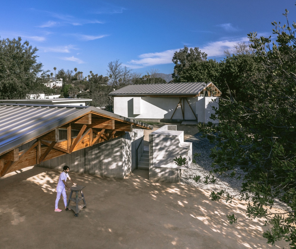
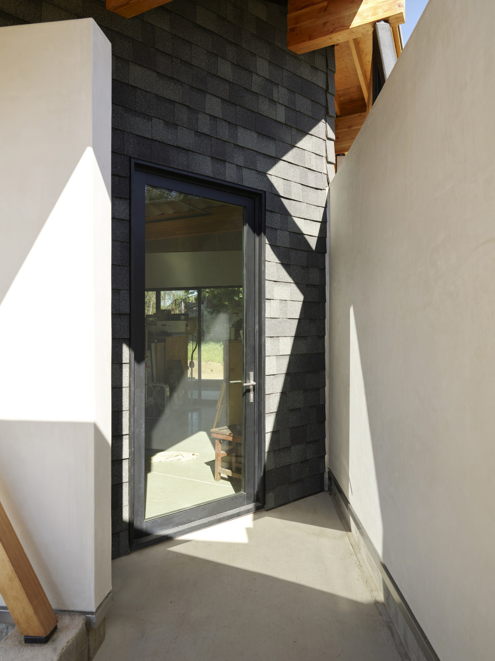
- Visually, the various structures are connected by a collection of freestanding walls that were inspired by the site’s existing ranch house—particularly the way it evoked mid-century, post-war “dream homes” designed by Los Angeles architect Cliff May. “May’s residential designs are remarkable because of the way walls and interior elements appear to float free on the ground plane, without simply reiterating the boundary of the roof above,” says Andrew Holder, co-founder and co-principal of The LADG.
- Across the site, the assembly of walls take primacy in the design, while the interiors become almost by-products. The result is a matrix of covered structures and walls that extend well beyond them, delineating outdoor corridors and dynamic, versatile spaces for en-plein-air work and social interaction.
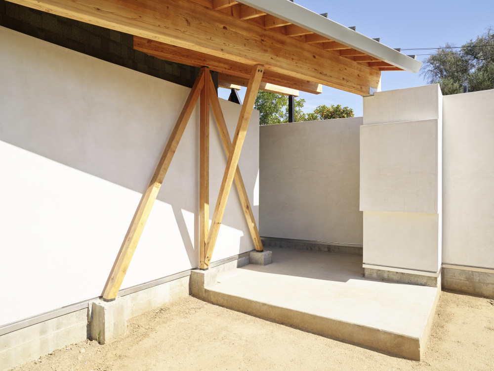
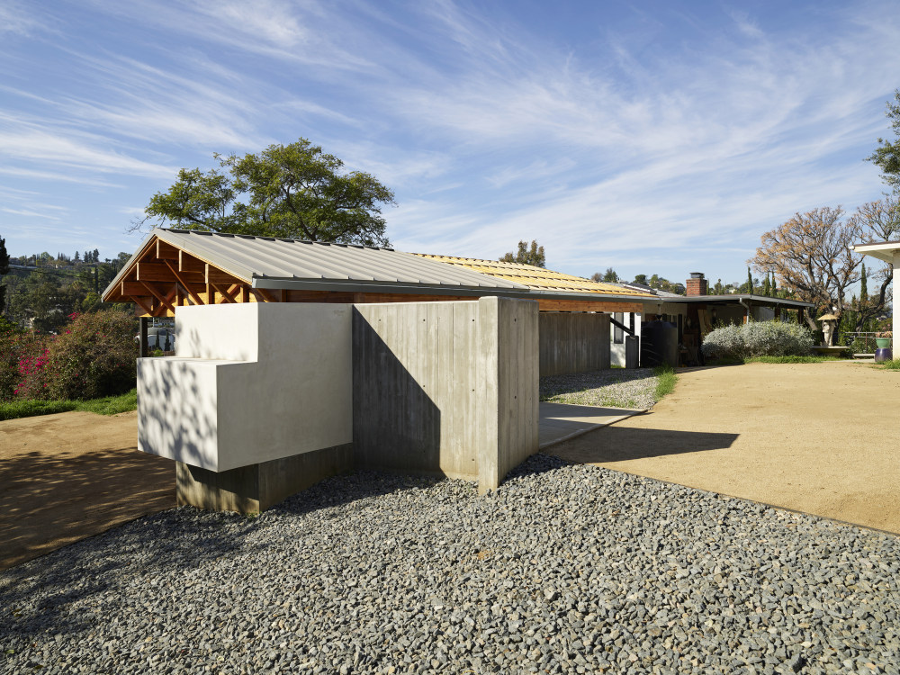
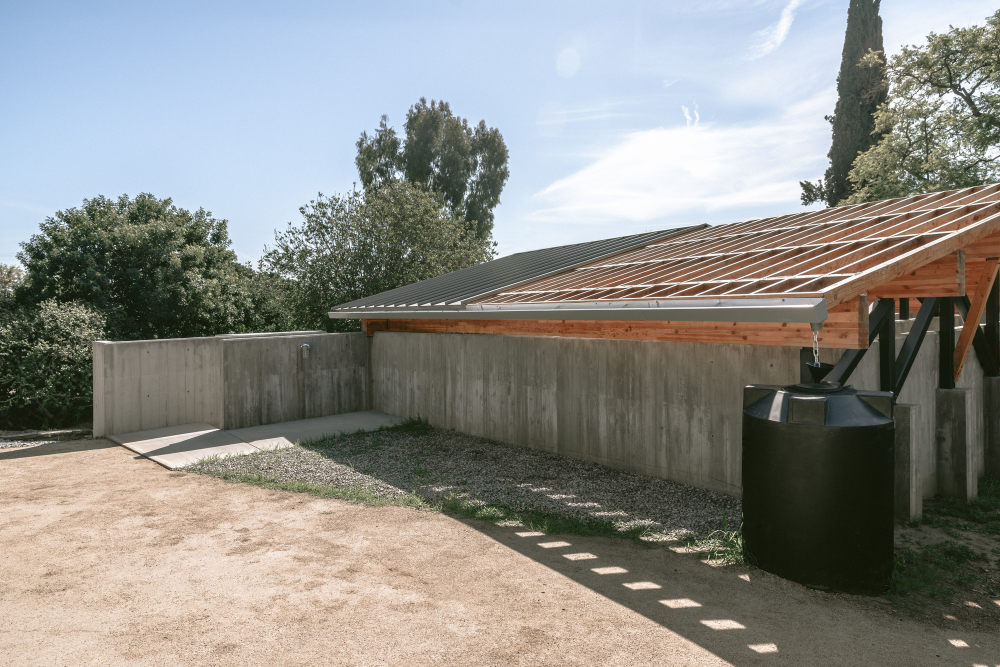
- For some walls, The LADG borrowed from the plan of May’s designs for his Long Beach tract home development, which emphasizes walls that serve varied functions. Within House in Los Angeles 1, they are arranged across the site to imply interiors, albeit interiors that can be interpreted as extending in all directions. Several walls stretch beyond the bounds of interior space and are packed with storage and utilities like a bathroom, an outdoor shower, large canvas storage, and equipment storage.
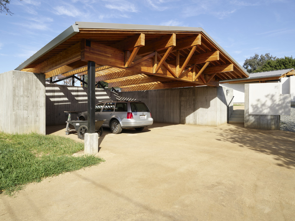
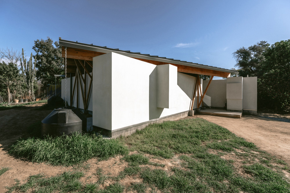
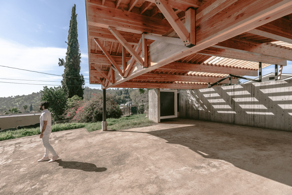
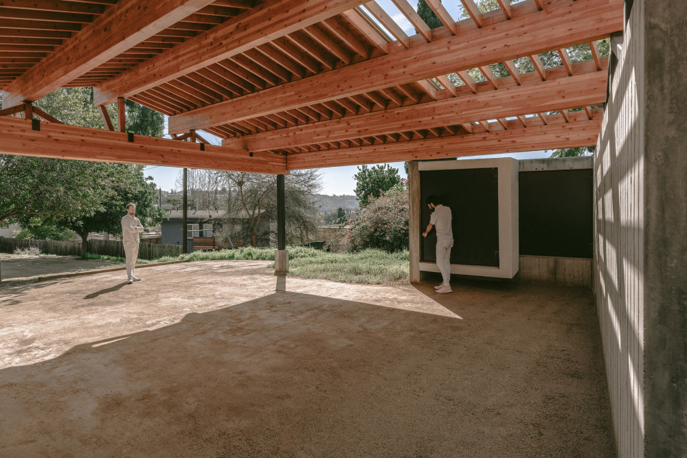
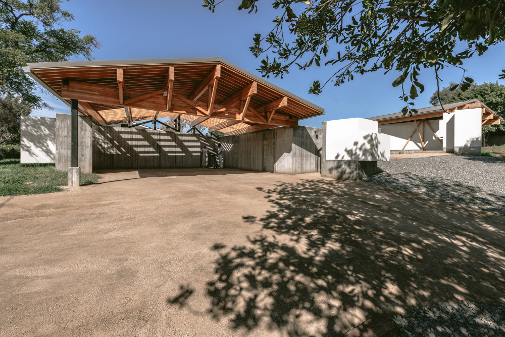
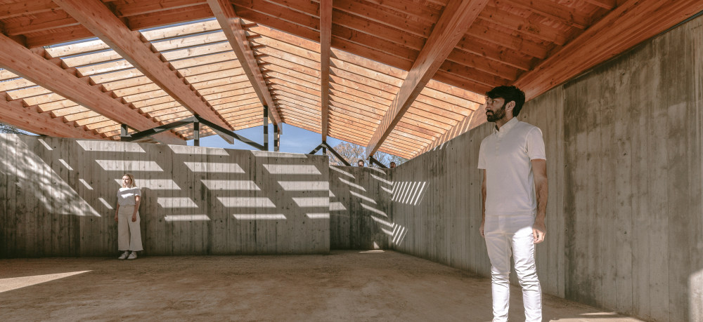
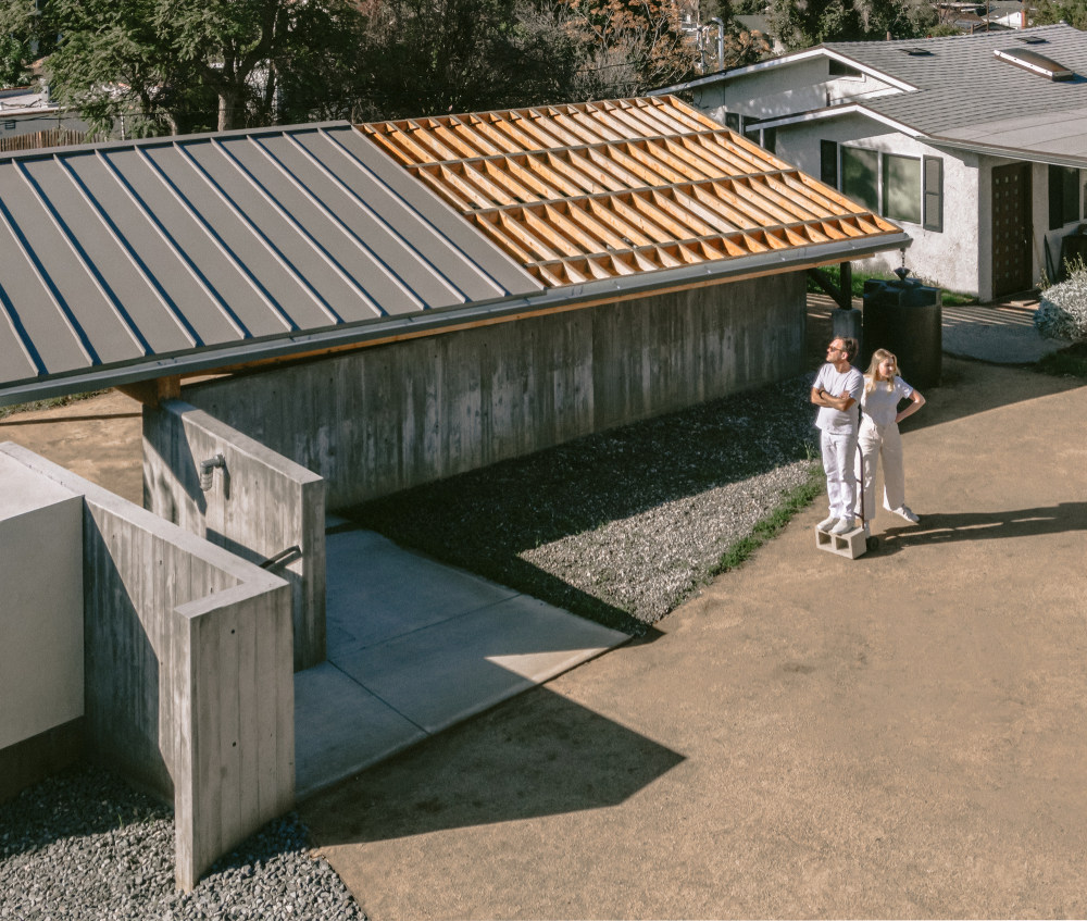
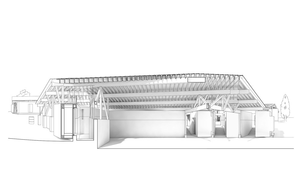
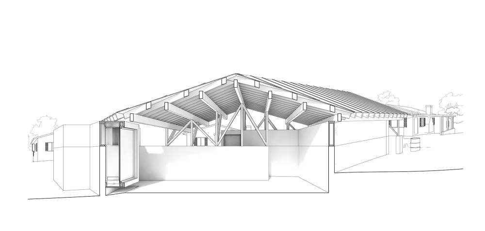
- Roofs across House in Los Angeles heighten this sense of expansive interiority. They are placed loosely atop the arrangement of walls to shelter the guest house, studio, and a carport/event space, with the eaves also covering nooks and recesses at almost every edge. The arrangement reorganizes the property (inclusive of the original home) into nine bays, each of which is assigned a different activity: studio, courtyard, carport/event space, garden, guest house, courtyard, garden, porch, and main house.
- The extreme looseness of the plan is the defining feature, turning the entire site into a series of rooms that stand-alone between a smattering of walls, unbound by rooves and disconnected as if standing in a field. As a result, reciprocal relationships emerge between spaces that may be out of view of one another, on opposite sides of a wall. The crenellation in a wall for the bathroom sink and vanity in the studio building, for instance, could be used as a shelf for garden tools when considered from the courtyard side. This reciprocity exists throughout, with little jogs in the compound’s surfaces serving a mundane, programmatic function on one side, and some kind of sculptural, more spontaneous role on another. This versatility responds to the specific desires of the clients as well as, more generally, to the casual indoor-outdoor lifestyle to which Angelenos aspire.
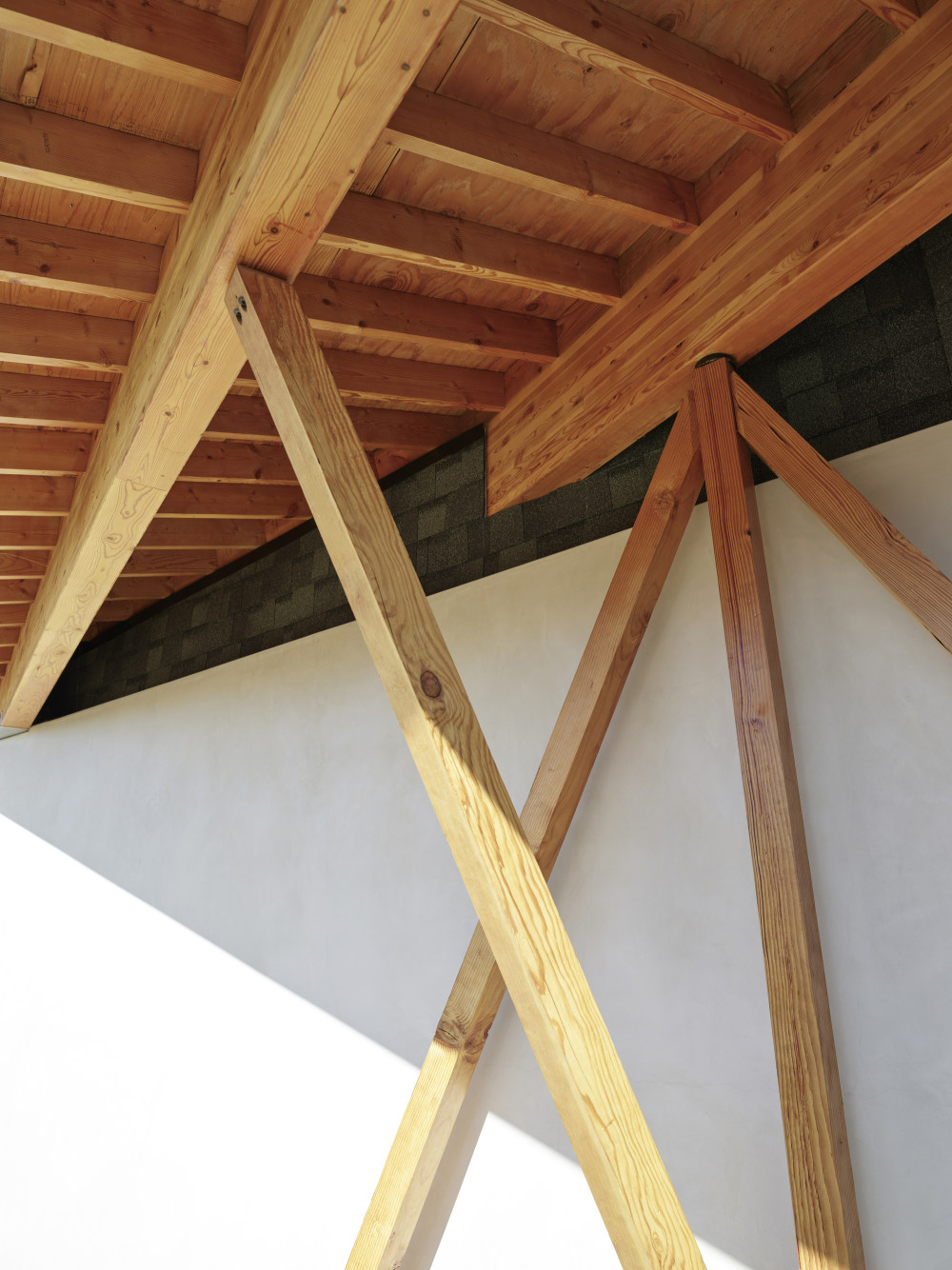
- The architecture of House in Los Angeles 1 mirrors this casual approach with apparently loose construction techniques and unassuming materials. The lowest portions of the buildings are made of poured-in-place concrete, with a vertical wood grain patterning from the boards used in the construction process. Above this, the walls are white smooth troweled stucco, while roofs are erected with Last-Time metal.
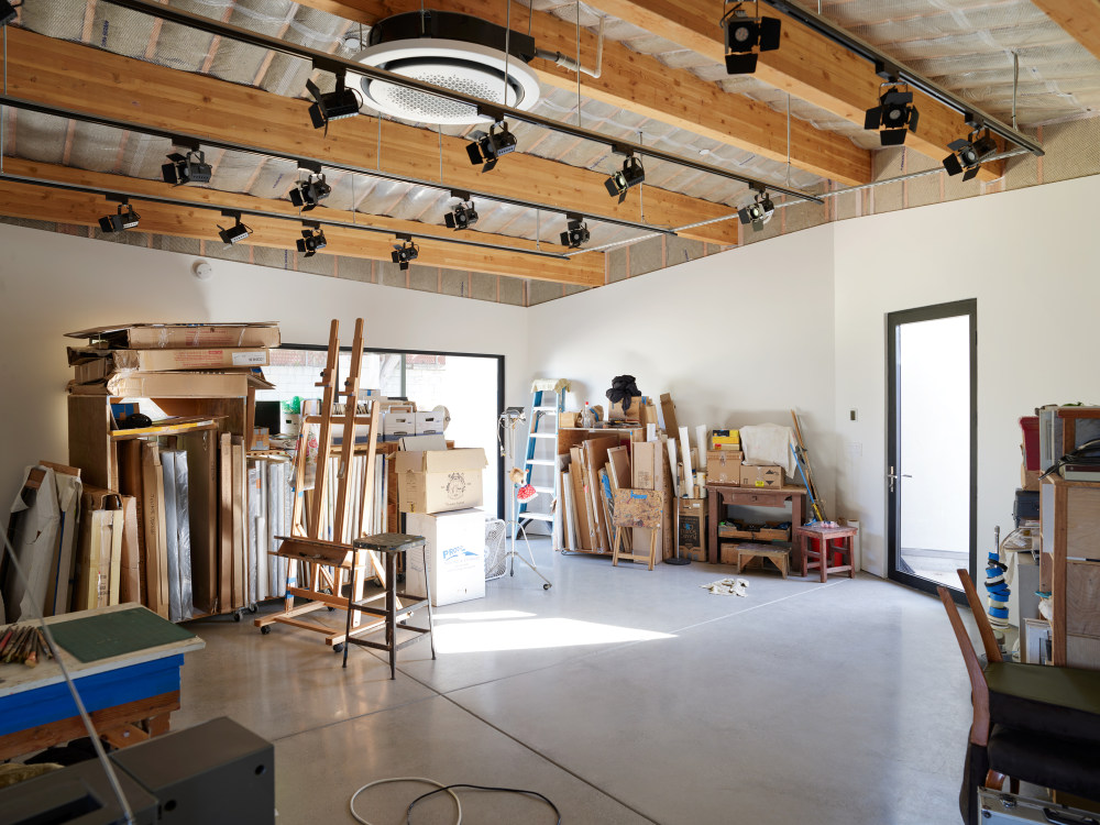
- Inside, surfaces are equally unassuming and reveal the process of making, reflecting the compound’s function as a flexible space for making and showing art. Within the studio, a skin of drywall sits atop exposed studs, affording the client plenty of white wall surface for painting as well as exhibiting finished work for studio visits. “The finish of the studio tries to make surfaces available for the client to use and modify,” says Holder. The ceiling’s exposed beams can also be used to suspend a studio lighting grid, as well as support other features, like shelving, as needed. The darkroom is similarly clad in minimally finished plywood panels, which the client can use and modify flexibly.
- This approach, which fuses adaptability and durability, extends to the landscape, where the clients will host art openings and events in the courtyard between the carport and studio, as well as accept and release deliveries of art. Native grasses will be planted in the rear-most yard behind the studio, and yard furniture will accumulate ad-hoc over time as the clients discover the places they enjoy spending parts of their daily routine.


- 转载自:Archdaily
- 设计师:The LADG
- 分类:Houses
- 语言:英语
- 阅读原文
|

 发表于 2020-10-15 21:05:42
