Mixed Use Architecture, Houses, Mapo-gu, South Korea- 设计师:a round architects
- 面积: 293 .0m²
- 年份:2019
- 摄影:Brique, Jooyoung Kim
- 负责建筑师:Changhyun Park
- 设计团队:a round architects, Yoonji Cha
- Structural Engineer:Eun structural engineering
- Mechanical Engineer:Codam engineering
- Telecommunication Equipment:Codam engineering
- Landscape :Anmadang the lab
- Interior :Anmadang the lab
- Construction:Jium CM Corporation
- City:Mapo-gu
- Country:South Korea
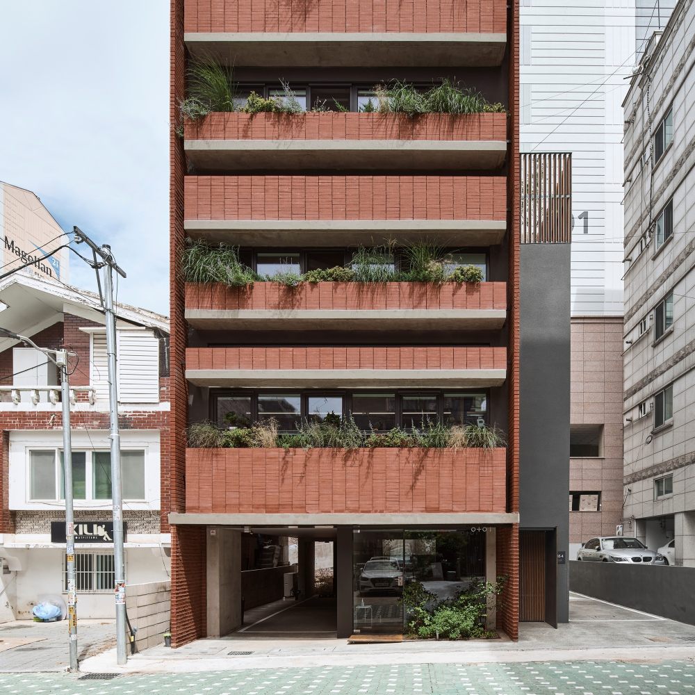
- reminder of memory and phenomenon - On first visit to the land, there was a large magnolia tree that had existed in the alley for a long time. In the warm weather, magnolia tree was blooming, and the petals blown by the wind came out to meet us until the entrance to the alley. People passing by in front of the building take a short break under the shade of a tree, and during lunchtime, office workers gather under a tree to talk. Although The magnolia tree itself disappeared, but only the image of the tree was hoped to continue through the past and the present. The freshness of past alleys where trees existed and images of flowers were projected to the elevation of the building to continue the memory in a different way even after that new buildings will be built.
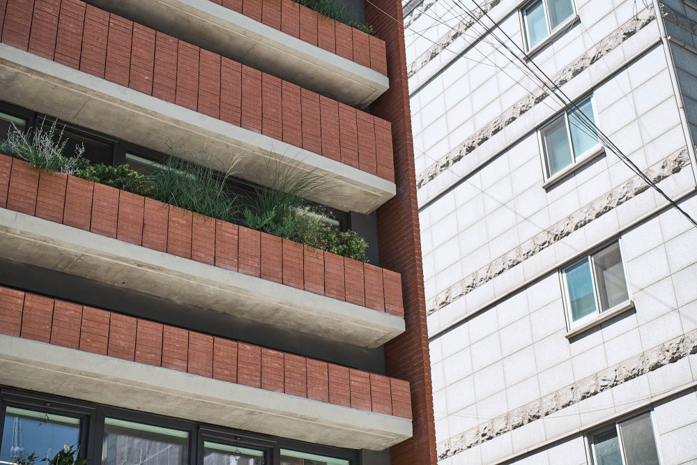
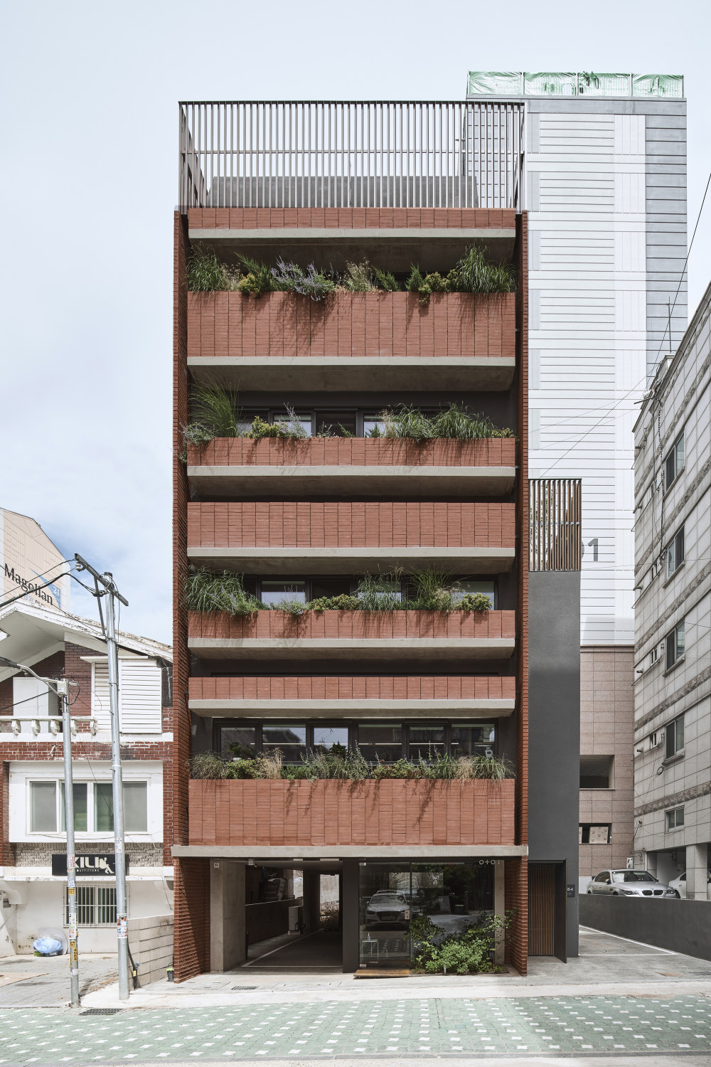
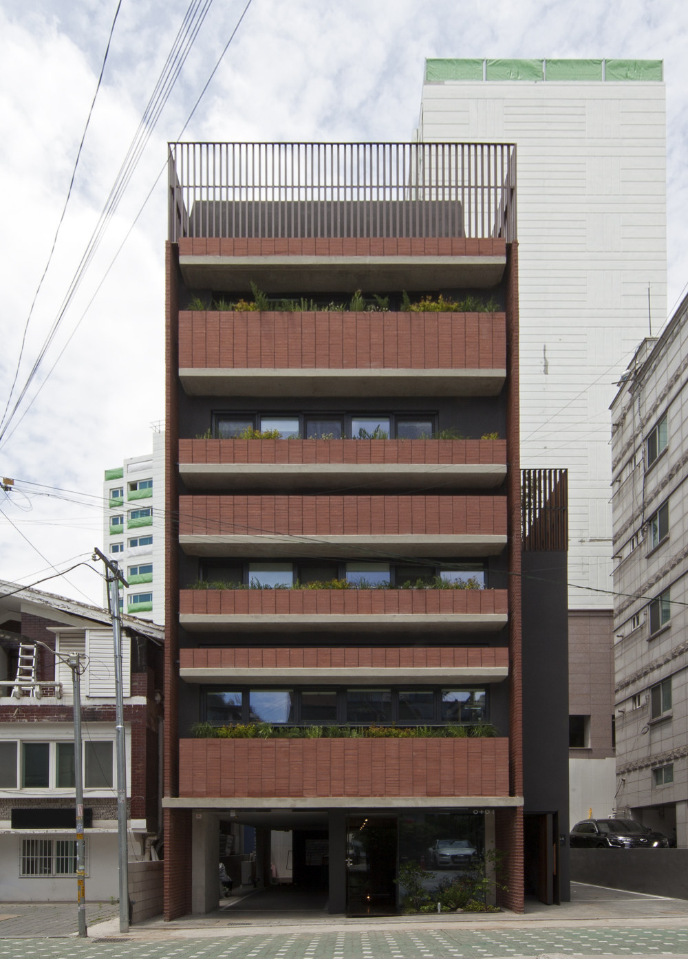
- I thought that it was more appropriate to continue the behavior and atmosphere that took place on the road at that time than the conceived form felt in the past building. It is more important that the past seasonal changes and greens, shade and comfort, and various actions taking place in public spaces are connected in the future. For the finishing of the material, the red brick used in the past building was selected, and the first floor elevation facing the road gave the maximum sense of openness, while the plants near the road were planned in more detail.
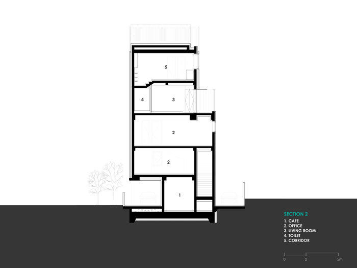
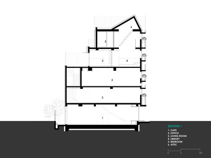
- Various approaches are available for the functions of the first floor of the building, but a function that is open and accessible to many people is assumed and planned. By using the semi-basement space of the old building, it is planned as a lower ground floor to solve the frustration caused by the narrow area. Elevation is composed of a plant box that obscures the division of the floor, and the vegetation that reveals the season and time is placed in between, offsetting the cold image and connecting it with the refreshing memories of the past.
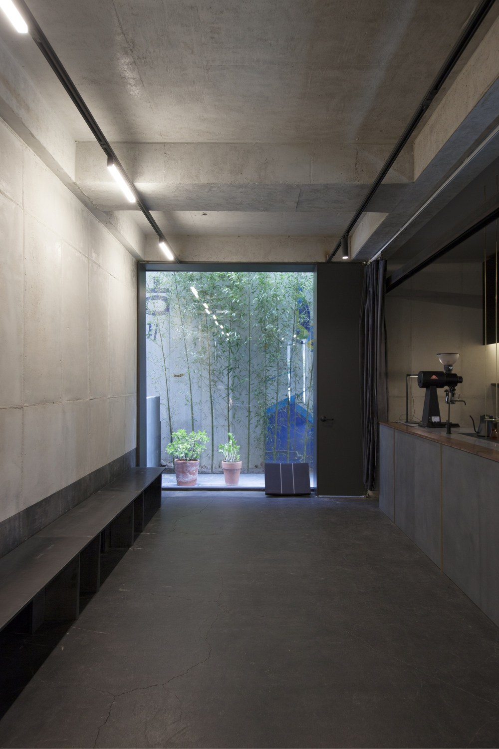
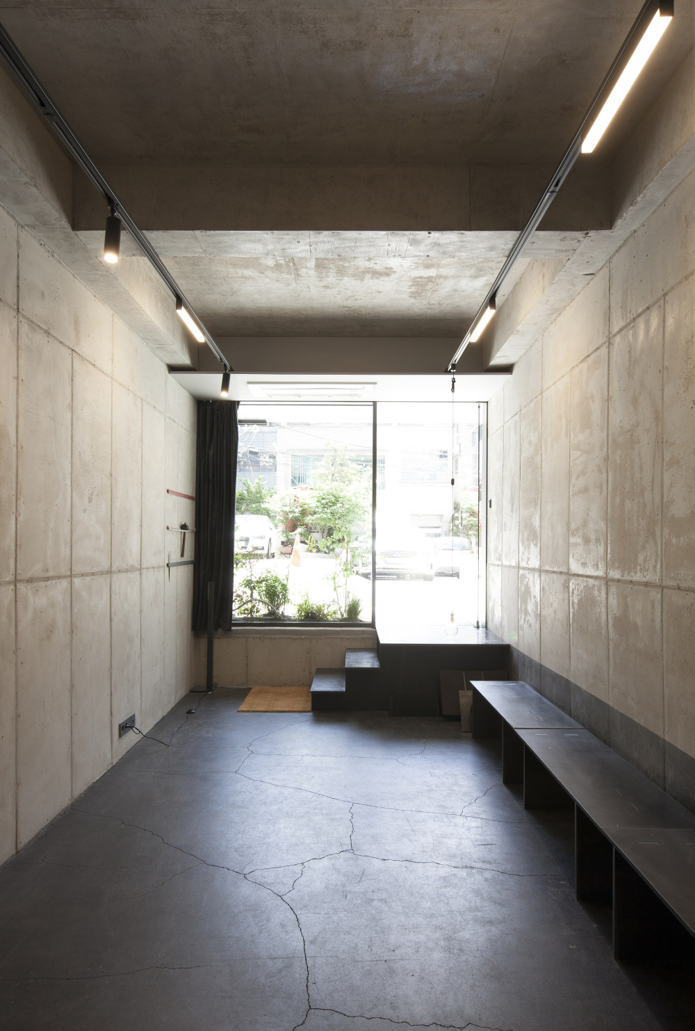
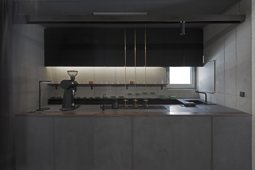
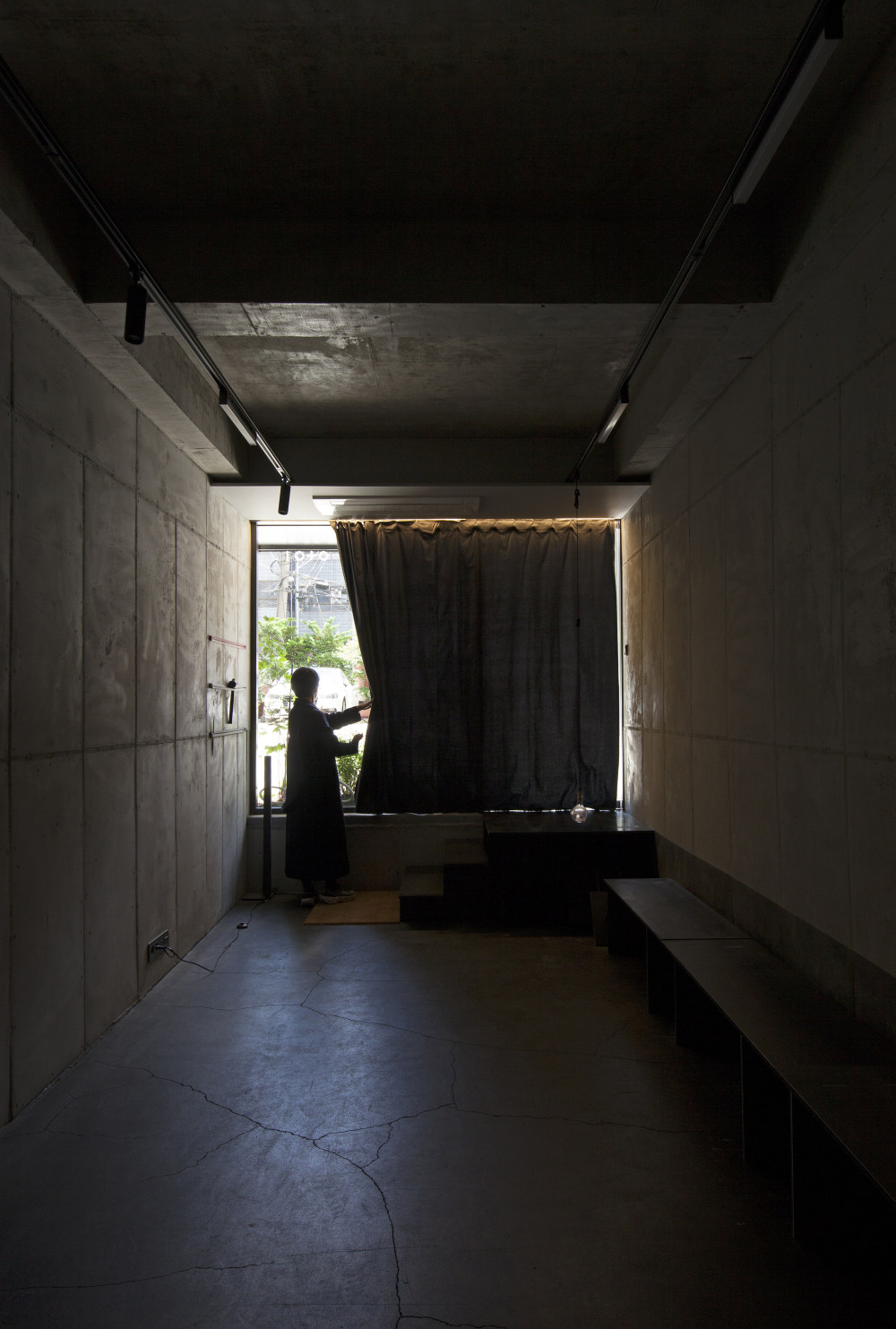
- Sense of depth - The contrast between light and shadow in a continuous horizontal plane gives a sense of depth, in materials, time to capture stories through various changes and images depending on the viewing distance, and contrast between darkness and light in the interior space. It was planned to feel the psychological effect.
- Elevation - These days, the facades of buildings seen from the road are increasingly smooth. It hides the properties of the material as if it slides into a thinner and more transparent material. The city's memories are gradually being erased by the smoother facade and space. Instead of such smoothness, we talk in a way that reveals the curvature, texture, and properties of materials. When a shadow is created by creating a curvature in the elevation, depth is created, and new possibilities are created in between. In the elevation, in order to further emphasize such a sense of depth, both corners of the uneven elevation were thinly treated with bricks of the same material to contrast. And in the dark space inside the facades of different sizes, plants and windows showing movement and change are located.
- Material - Brick: Various changes are made according to the way one brick is used, and each role is assigned. Materials were used in a methodology that reveals various characteristics depending on the location used, such as general bricks, plain joints of the same color as bricks, joints giving various textures according to light, and bricks using cross-sections in half.
- Terraco: Terraco's dark color reacts sensitively to the angle of light. Unlike bricks, there is no joint of materials, so it is read in one form. The black elevation seen from the large road maximizes the building's impression with the effect of the east side and the low angle of incidence from the west side, and expresses various textures.
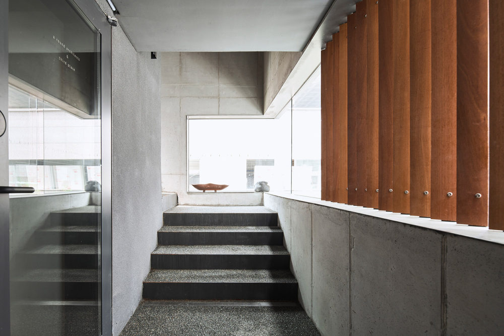
- Wood: The wooden louver expresses visual shielding and semi-space according to direction. Different patterns and colors express natural warmth and convey the depth of time.
- Small Gravel with resin : A combination of several colored small gravels creates a single side. From a distance, it is one color, but as the distance gets closer, the combined pebbles reveal their color and express their expressive power according to distance.
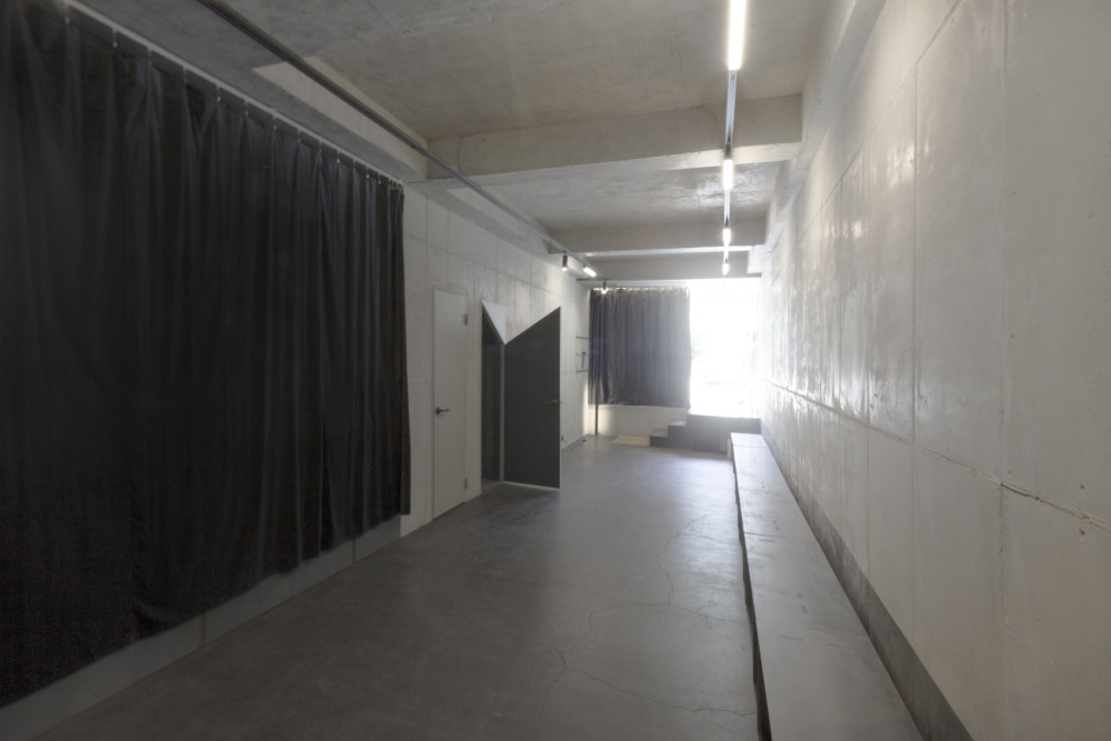
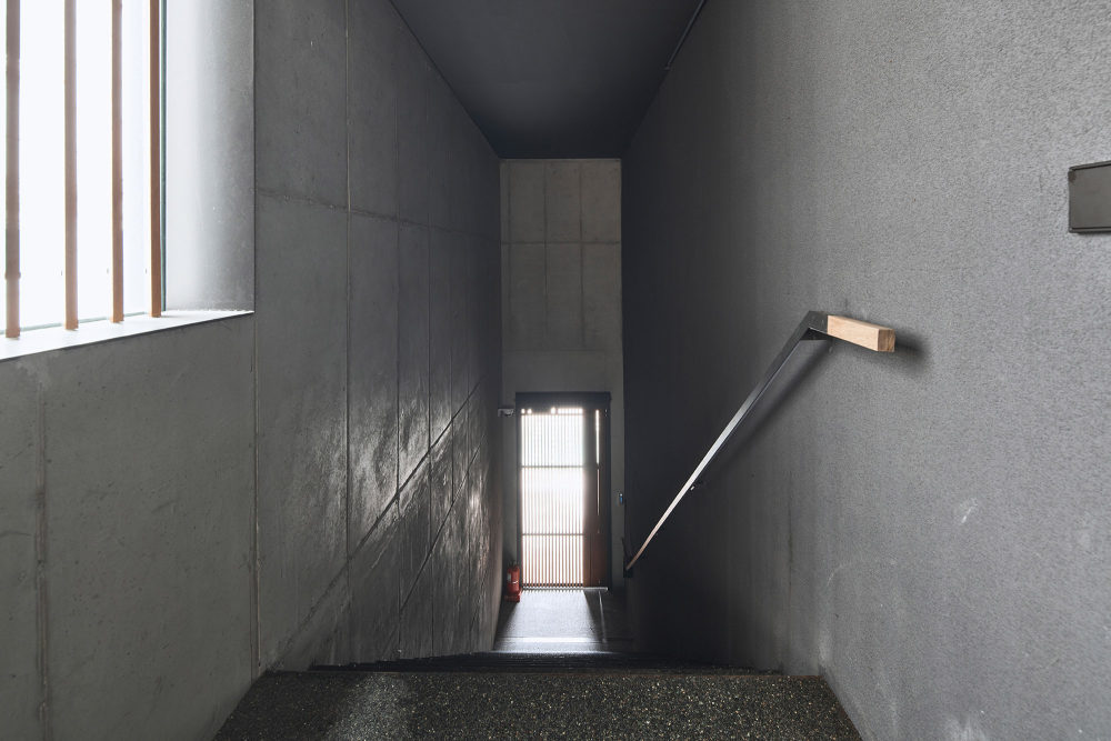
- Public space - The reason why cities and buildings have become less interesting these days is to look out for the dark areas. Spaces without shadows, only light. A space without darkness also makes the advantages of light disappear. We try to control the psychological length inside the building. When burying from the outside into a building, the space with the eaves begins with a size that can be directly with the body. The gate has a gap between the interior and slightly reveals the space to be experienced next. The space that enters the upper door is a dark and high cold space. This sense of space psychologically annoys and begins to climb while looking up at the light at the end of the stairs. In addition, it guides you to want to go faster.
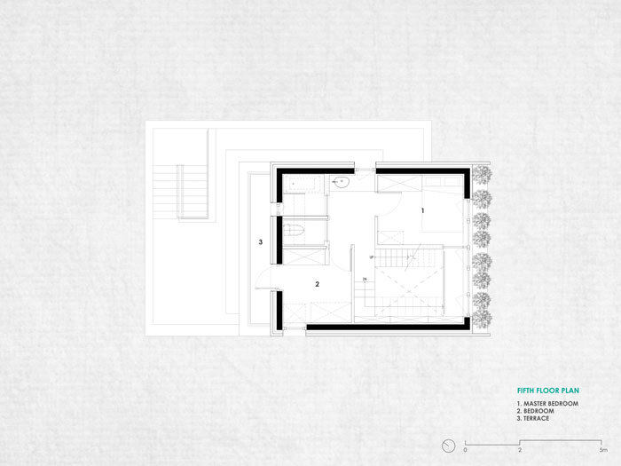
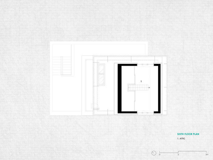
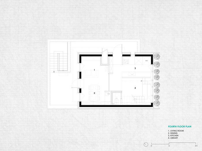
- The disconnection in the hallway contains a function for connection. The end of the dark and long corridor space connects the next space with light and shadow, with the outside through the window. If you go up the entrance on the 2nd floor, there is a space. Even to this point, it is a space where you think your place is inside. When you go up the corridor, the sky slightly approaches the boundary between the inside and the outside. When you go up half a floor, there is an entrance to the third floor, and the moment you look at the next staircase, you feel yourself outside. Upon reaching the last landing, you enter a semi-space with high wooden louvers along with the 4th floor and connect to the outer courtyard on the 4th floor. This process is a device that psychologically and spatially adjusts the length of the climb to the fourth floor to make the distance feel shorter.


- 转载自:Archdaily
- 设计师:a round architects
- 分类:Mixed Use Architecture
- 语言:英语
- 阅读原文
|

 发表于 2020-10-8 14:31:37
