Adaptive Reuse, Market, Japan- 设计师:Ryusuke Nanki
- 面积: 131 .0m²
- 年份:2018
- 摄影:Yasu Kojima
- 建造商: AutoDesk, Panasonic, Adobe, KIKUSUI, Runon, Trimble, Yodo Kogyo
- 设计团队:Ryusuke Nanki
- 业主: Dai Shibata(Country Market Company Limited)
- Engineering & Construction:Takahashikensho, Masahiro Takahashi
- Logo Design:Kazunori Kawagoshi, Satoshi Kohno
- Food Supervisor:Yukikazu Watabe
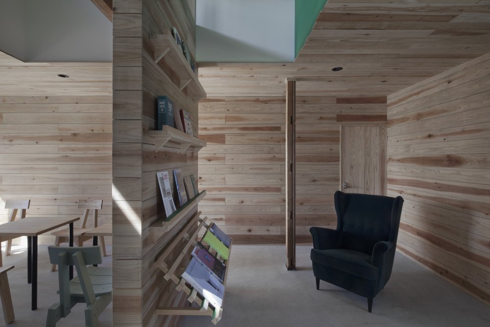
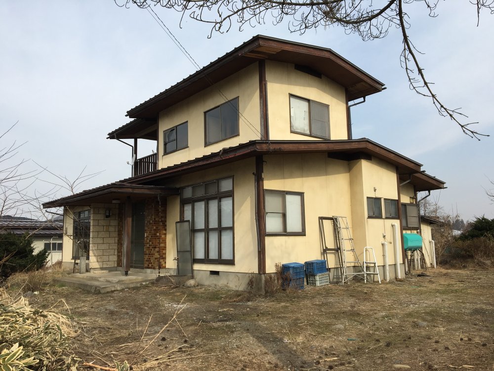
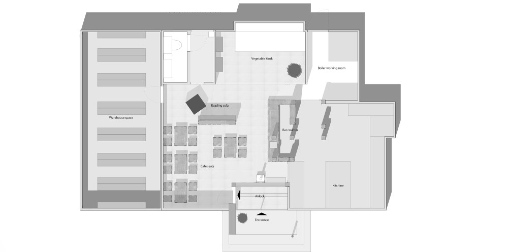
- 设计师描述 | Designer description: The “Yobitsugi” Approach to Renovation: Melding Past, Present, and Future. For a unique approach to renovation, consider the following case study with Country Market. As a restaurant and purveyor of fresh produce, Country Market sought to convert a two-story residence into a commercial storefront, replete with an active garden for raising crops.
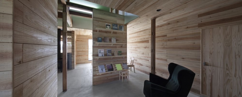
- Preservation is a common feature of bespoke renovations. In most cases, architects will capitalize on the strongest architectural elements of an original structure, leveraging these details to enhanced effect in the remodel. However, the building in question offered few distinctions. A run-of-the-mill residence, the property was already some 30 years old, consisting of an unremarkable floor plan and aged materials. Furthermore, the impetus for renovation itself was merely a matter of post-facto logistics. Zoning laws prevented a new build on the site and dictated that utilization of the extant architecture was a pre-requisite in readying the structure for commercial use.
- Ultimately, we opted for what could be described as the “yobitsugi” approach. Borrowed from the Japanese pottery tradition, the term “yobitsugi” refers to a method of repairing broken pottery with an intentional emphasis on heterogeneity. When a vessel chips, the craftsman will deliberately patch the damaged portion with non-conforming parts from other pottery, drawing attention to the damage through contrasting patterns that go beyond the purview of repair to impart a new, unique sense of individuality. Applying this mentality to the architectural realm, the goal was to create a dynamic atmosphere, incorporating the old wood and sense of space with bold, individual patterns and colors.
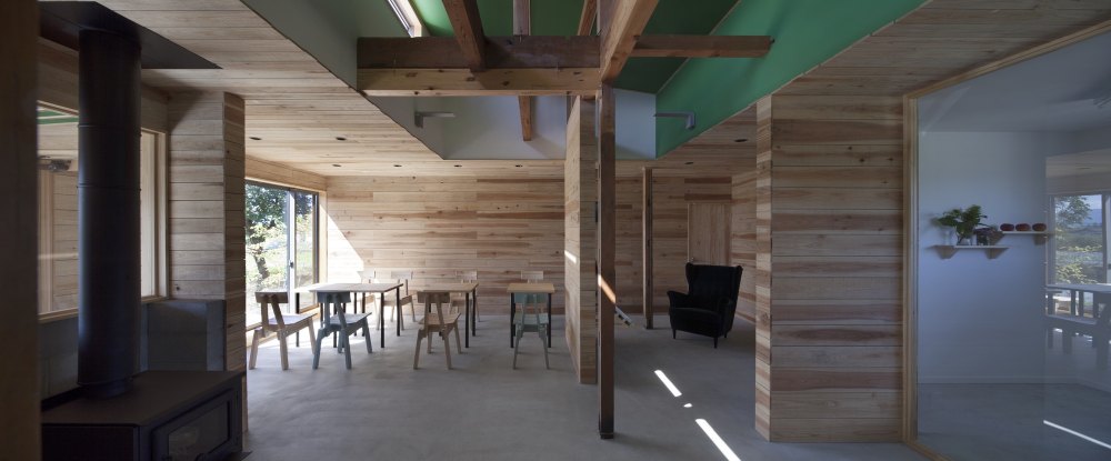
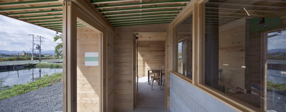
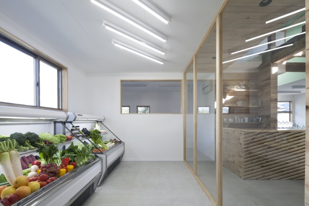
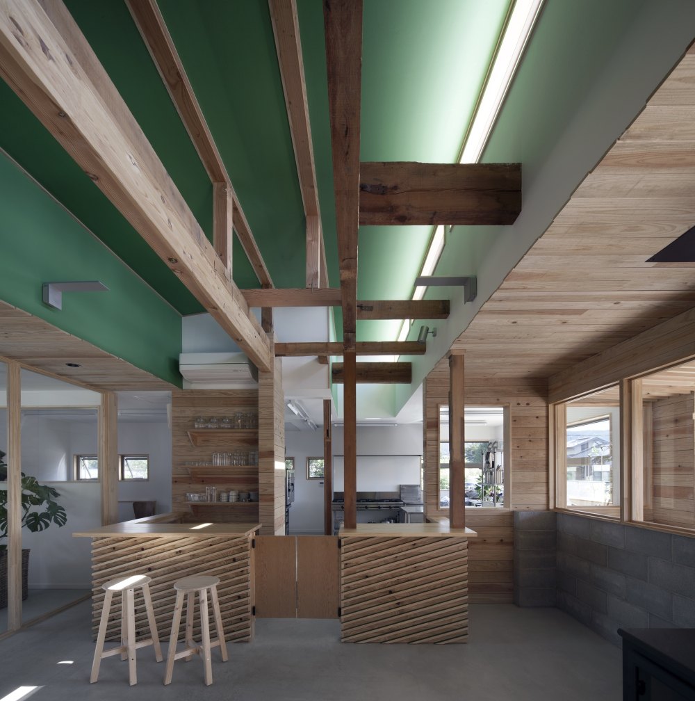
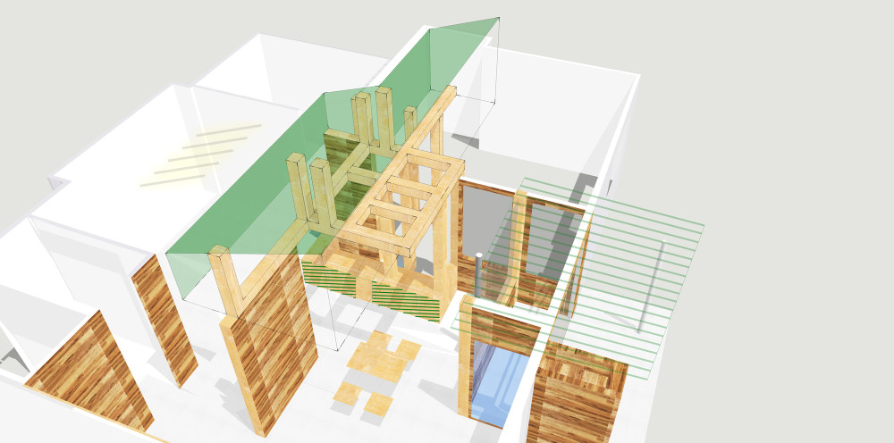
- For example, the second floor was cleared to provide an open, high ceiling. A distinct green color palette facilitates the shop’s conceptual design focal point, echoing a verdant, light-filled forest. Featuring a combination of old and new lumber, the open stairwell provides a sculptural accent, bathed in soft greenish-light. Louvered entryway detailing was painted to reveal green stripes depending on the viewer’s vantage point, and the ceiling in the fresh produce section outfitted with fluorescent lighting angled to correspond with the logo. These flourishes orchestrate a dynamic visual effect throughout the ceiling and open stairwell area. Notably, the design also showcases a contrast between old materials and new objects, such as the counter-top connected to old beams (which had to be preserved due to structural considerations.)
- We believe that renovation encompasses more than simply replacing the interior/exterior with new and pristine material. Rather, as this project demonstrates, renovation can also encompass an organic outgrowth based on daily discoveries over the course of construction. By embracing the spontaneity and responding in turn with a bold sense of individual identity, this project attained a higher synergistic level, filled with unforeseen innovation.


- 转载自:Archdaily
- 设计师:Ryusuke Nanki
- 分类:Market
- 语言:英语
- 阅读原文
|

 发表于 2020-9-7 08:57:34


