Houses, House Interiors, Russia- 设计师:Alexey Ilin architects
- 面积: 210 .0m²
- 年份:2015
- 摄影:Dmitry Chebanenko
- 建造商: AutoDesk, FAKRO, GIRA, Buderus, Stella, Willeroy & Boch
- Lead Architect:Alexey Ilin
- 景观设计:Ilya Mochalov
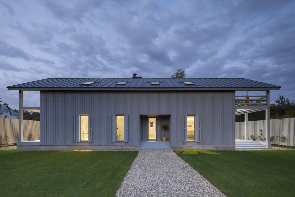
- 设计师描述 | Designer description: The cottage is made entirely of wood, inside and out, and the natural self-sufficiency of this material became one of the key themes of the design. The structure is also made of wood. Of course it is made from local wood, still the most affordable building material in Russia.
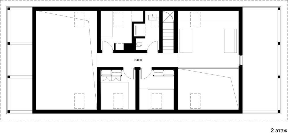
- The cottage's layout is in the shape of an elongated rectangle, and the architect has placed it crosswise and in the middle of the rectangular plot, setback from the fence at the minimum distance dictated by standards. In this way, the ten acres are visually split into two non mutually-dependent areas: a small front garden and a yard in the back. Facing the cottage is a small guest house and a tidy tool shed camouflaged by a fence.
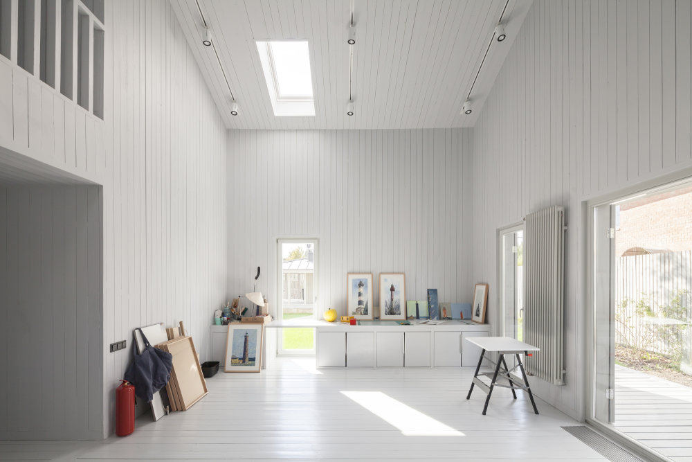
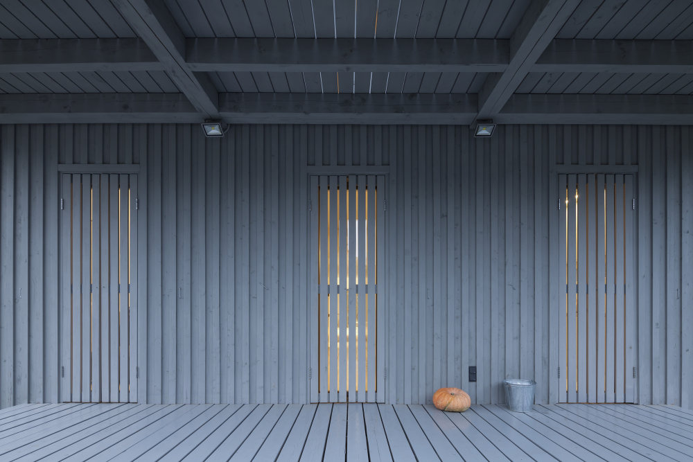
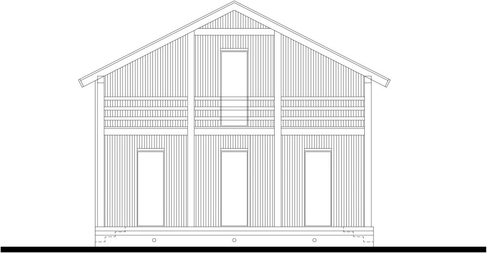
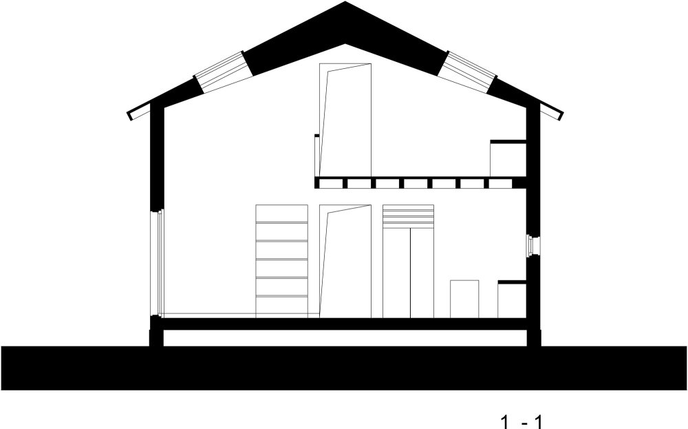
- The main house has two floors, but from the majority of perspectives this cannot be seen. This is due to the fact that almost all of the top-level areas are illuminated by skylights, while the slope of the gable roof is minimal. Under the overhang on the main facade, the completely blank wooden surfaces are visually striking upon entering the plot of land, and even more so from the street, creating a feeling of a totally introverted volume. Also magnifying this image are the shutters, which for all windows are made from the same wood as the facades, and painted in the same light gray color.
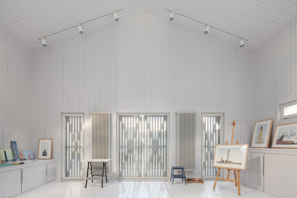
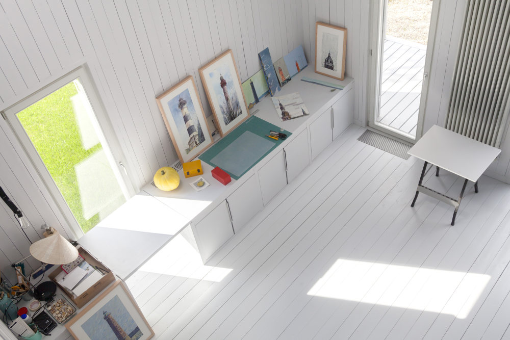
- The shutters snugly close all openings. In such an enclosed form the house would have looked like a perfect parallelepiped, if not for the terraces at both its ends and the deep square niche of the main entrance (the glazed door also has shutters). The internal layout of the house is built along the intersection of two axes: placed longitudinally are the living room and studio, each facing its own terrace, and crosswise is the entrance hall and the staircase located in front of it. Directly opposite the front door there is a small window looking out into the garden: even from the street this effective viewing opening is clearly visible. The themes of a monochrome design for the facades and the openness / closeness was meticulously developed in all the interiors of his home as well.
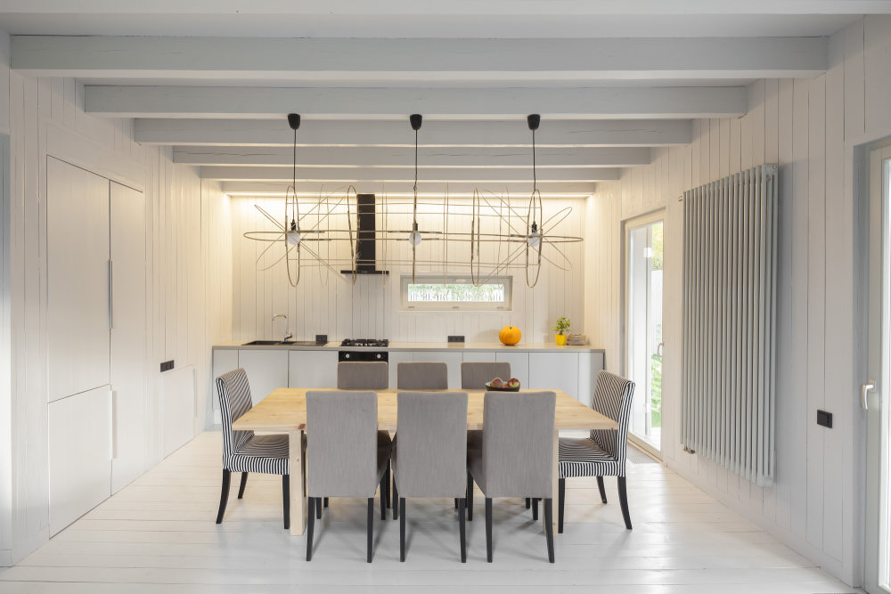
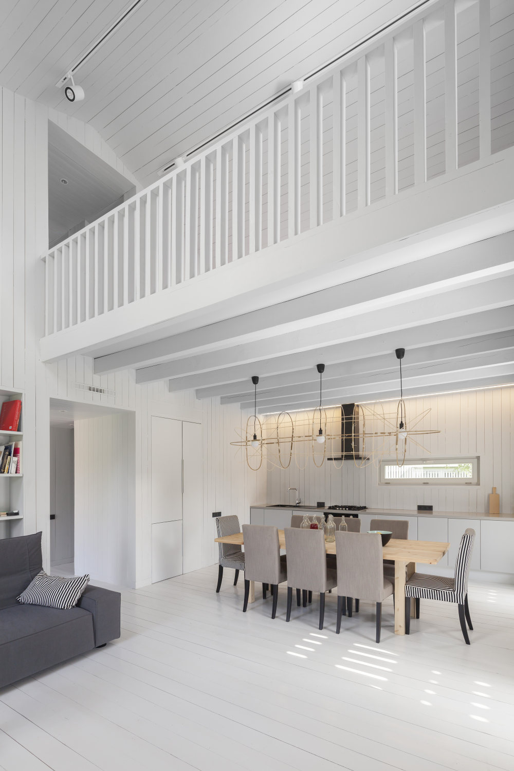
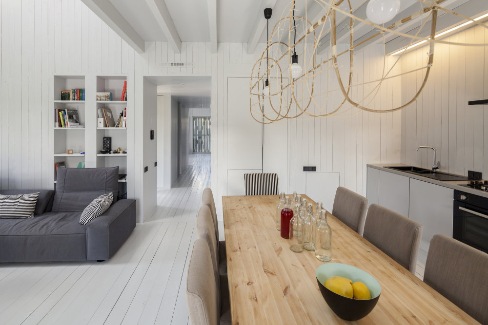
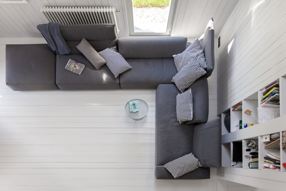
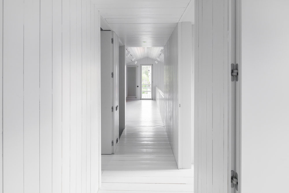
- There is no cabinet furniture, only built in, serving as a visual continuation of the walls. This technique allowed for the even quite modest in size bedrooms to appear spacious, while emphasizing to the best effect the dimensions of the living room and studio. The most difficult part in the practical implementation of this design was joining the boards of the walls, floor, and ceiling without using traditional fastening corners which are deemed essential for moldings, planks and cornices of any wooden interior. In this house all such junctions have been taken care of with the use of specially-prepared angled bars. As for the interior's palette, the finishing in all the rooms is the same gray (only a few shades lighter than the one used for the facades), working as a perfect backdrop for the rare colored accents, such as the orange couch or the yellow flowerpot.


- 转载自:Archdaily
- 设计师:Alexey Ilin architects
- 分类:Houses
- 语言:英语
- 阅读原文
|

 发表于 2020-8-22 18:28:21
