科梅塔黑色健身俱乐部(Kometa Black Fitness Club)YoYo Bureau 设计
Fitness Club, Sports Interiors, Moscow, Russia- 设计师:YoYo Bureau
- 面积: 3000 m²
- 年份:2019
- 摄影:Ilya Ivanov
- Arquiteta Responsável:Maria Yasko
- Project Visualization:Nikita Tikhonov
- Architectural Graphics:Maria Yasko, Dmitry Shilyaev
- 业主:Kometa Black
- Chief Engineer:Aleksandr Mikhailov
- Brand And Communication:Firma agency, Creative director: Alex Malybaev
- Equipment: Life Fitness
- 设计师描述 | Designer description: This interesting location is situated at the very center of Moscow. Our idea was the place needed something special. The -1st floor of the Neglinnaya Gallery shopping mall is a complex and ambiguous space with chaotic structure; it lacks daylight, but this also creates a certain mystery. We decided to keep the natural atmosphere, but emphasize the depth of it and make it more vibrant and alive.
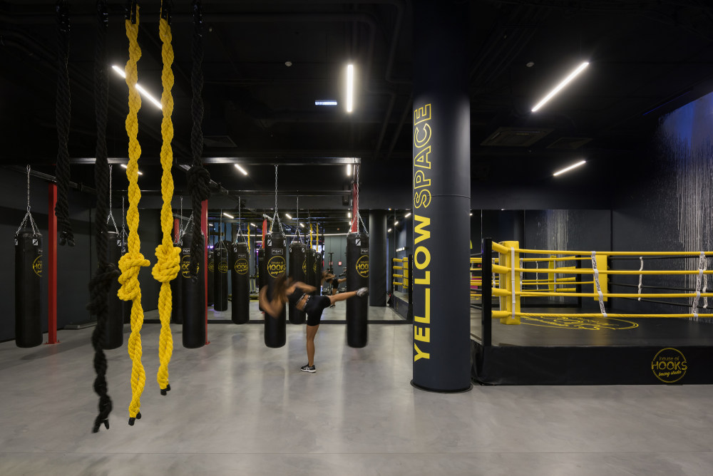
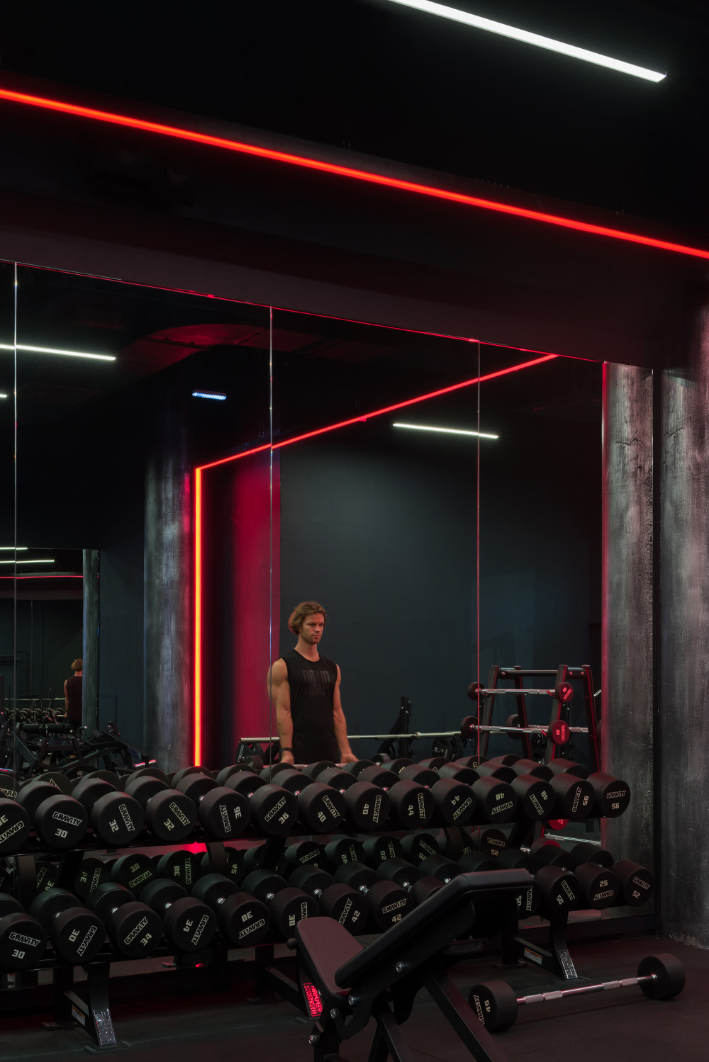
- The client wanted the atmosphere to be casual, close to a nightclub esthetics, where the track of time is lost and where it is equally possible to exercise or just relax – that was the pitch and the global idea. Additionally, due to the space being relatively large, they wanted to break free from the concept of “gym”. The owners are already organizing various social activities and parties, engaging with artists. We probably do not yet know ourselves the full potential of this place to open up and react to people’s wishes.
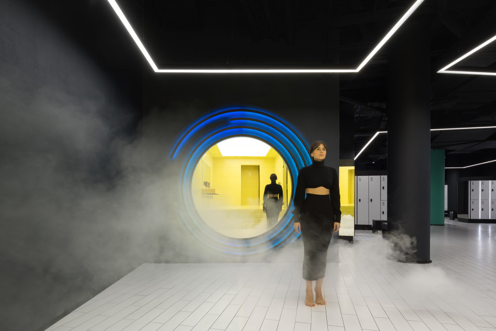
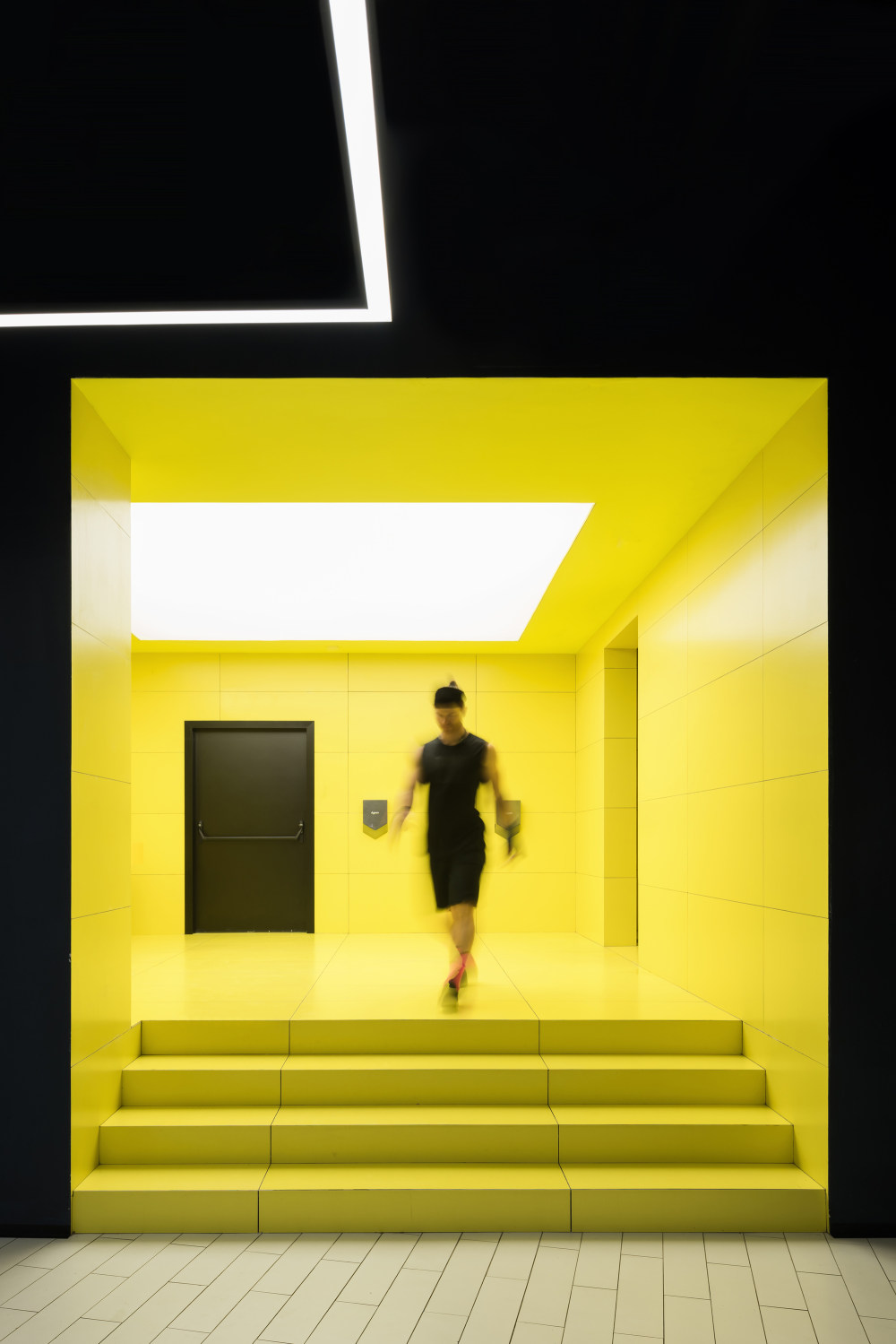
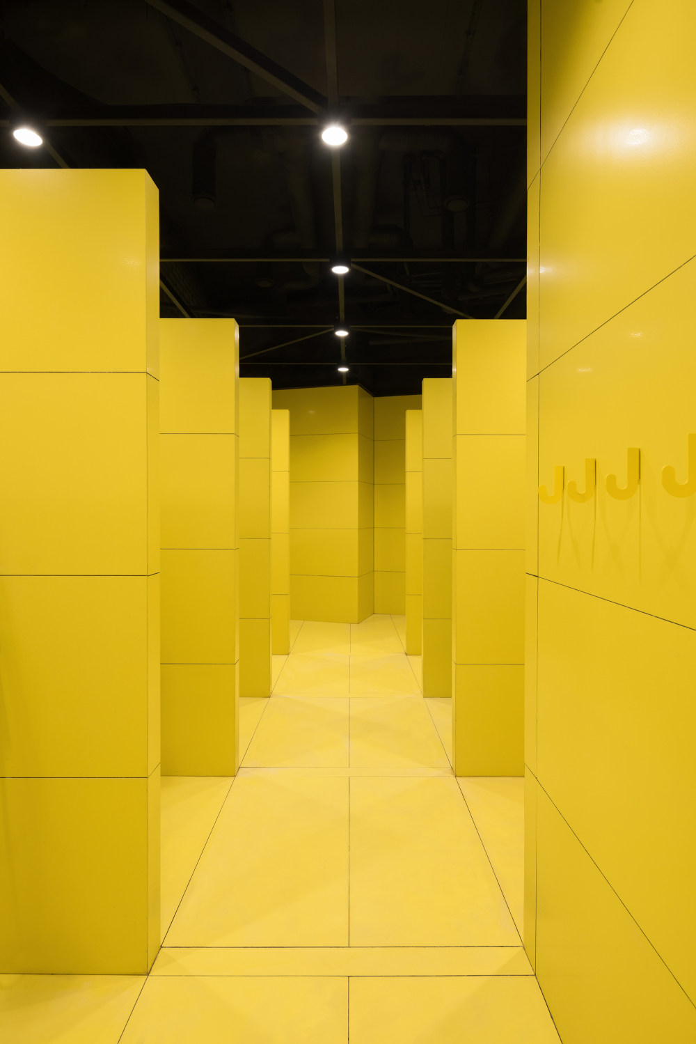
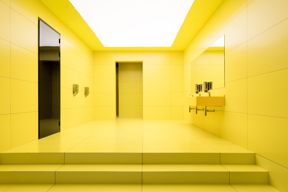
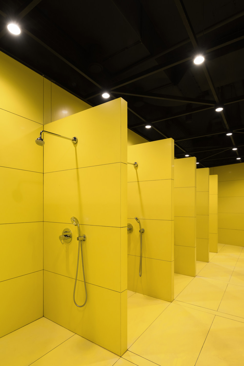
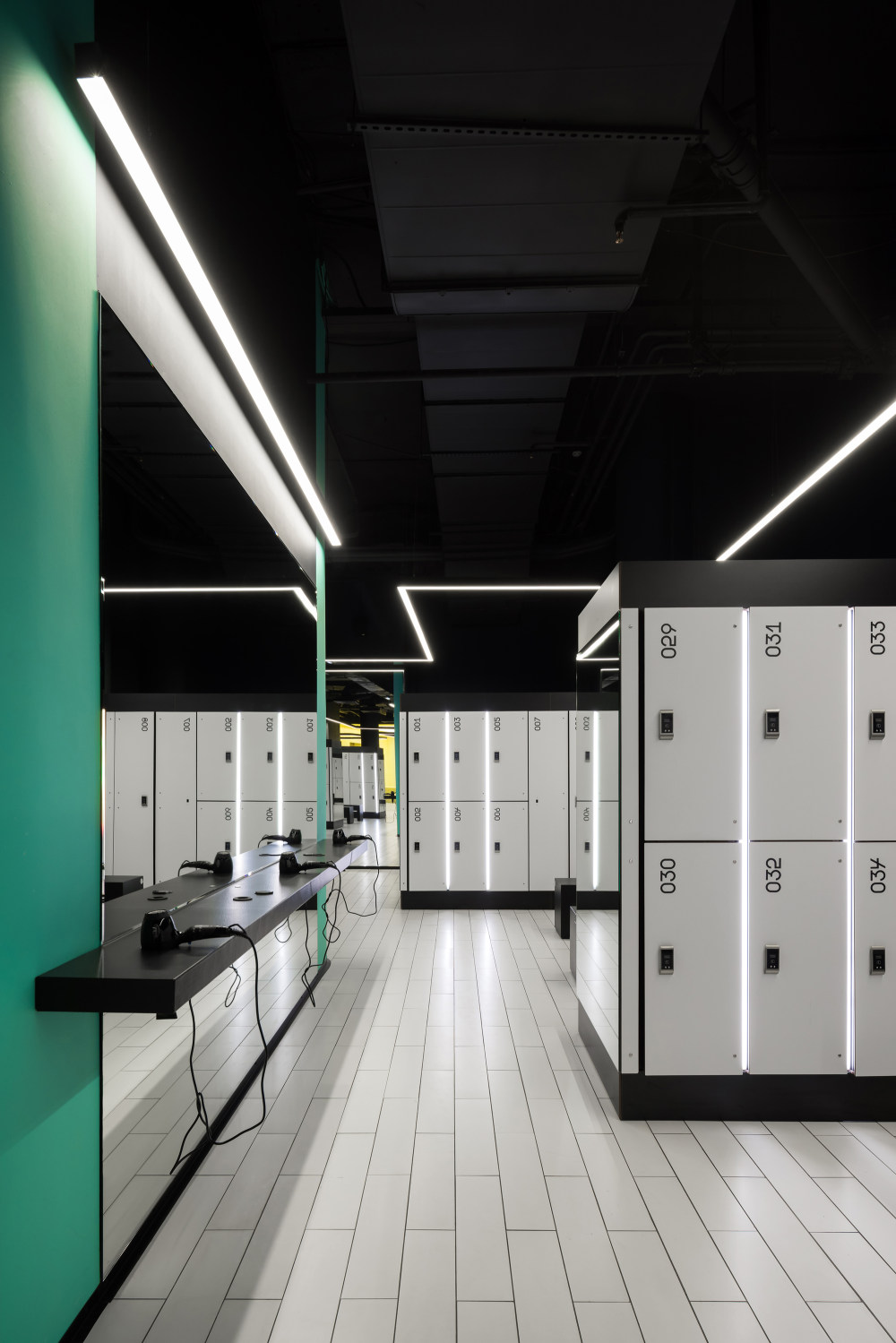
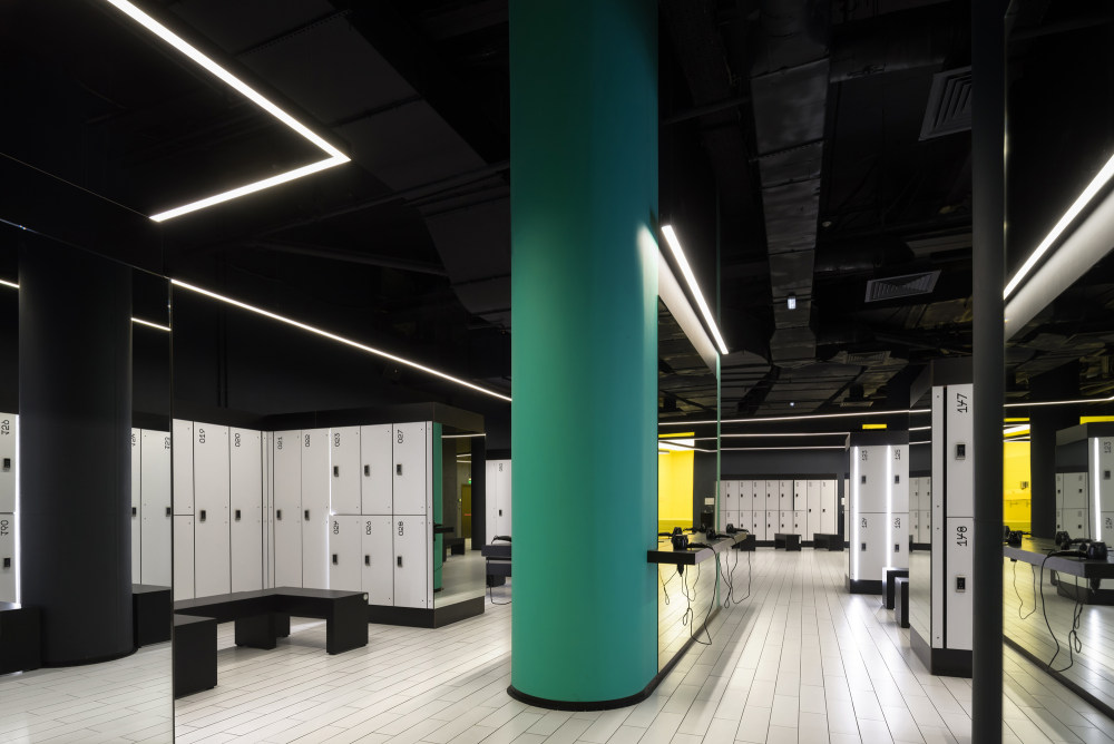
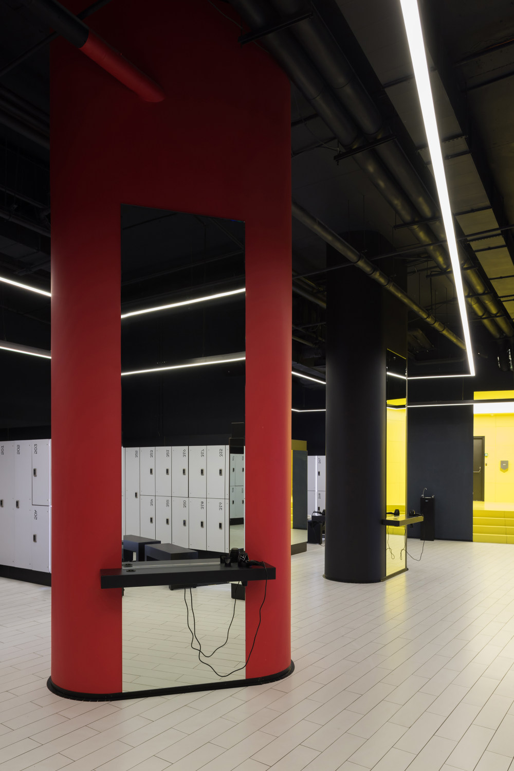
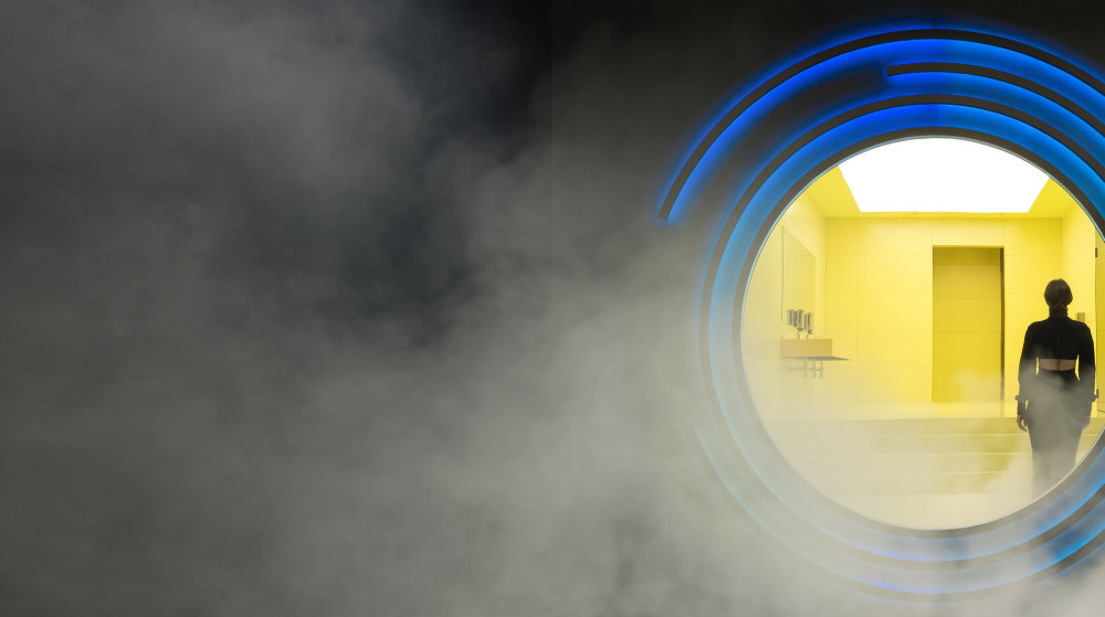
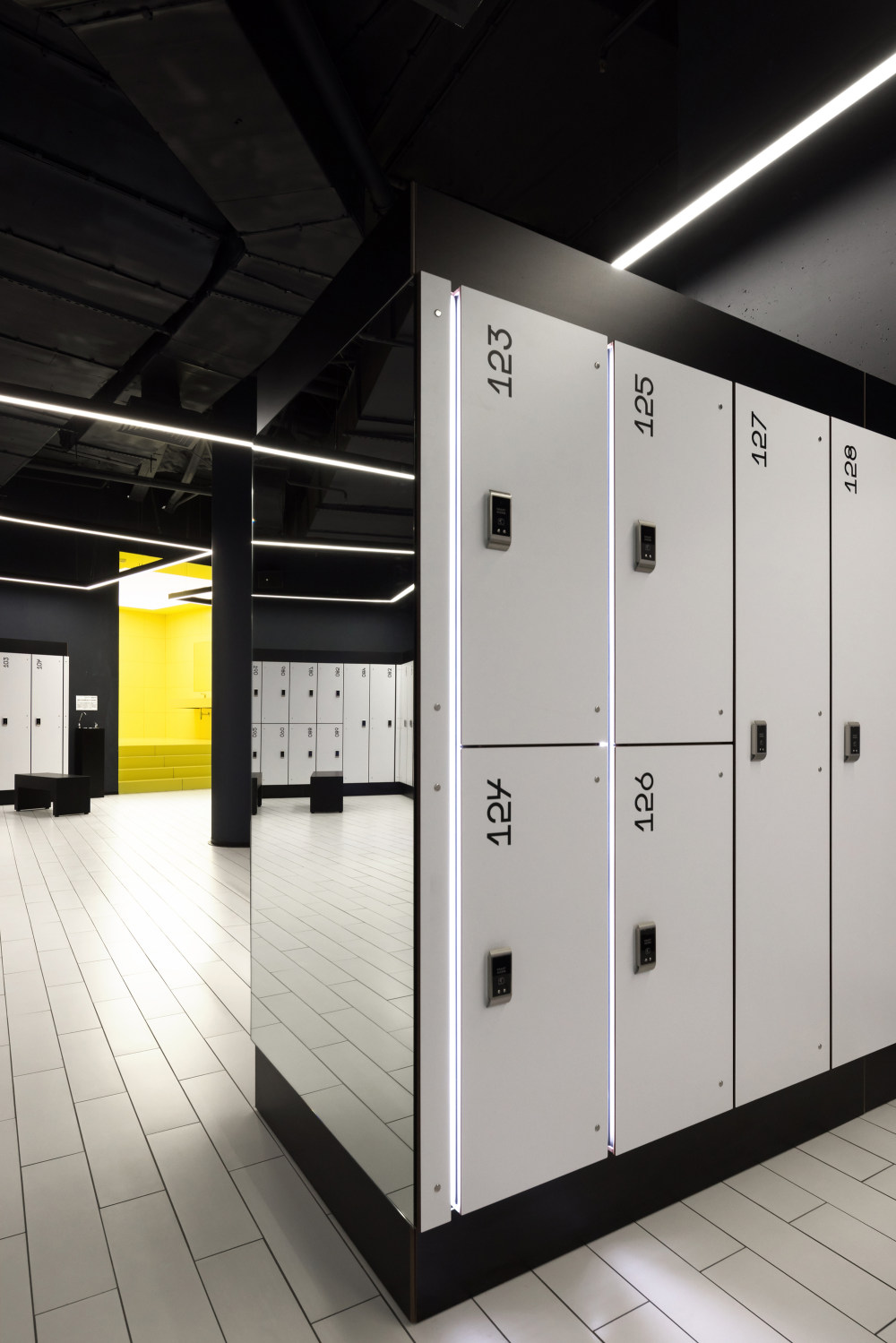
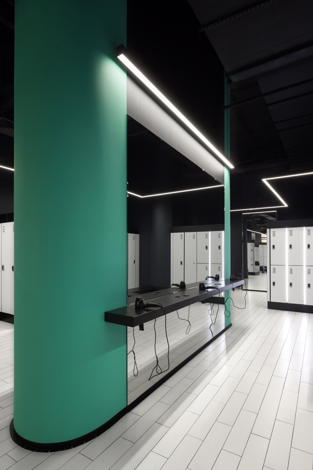
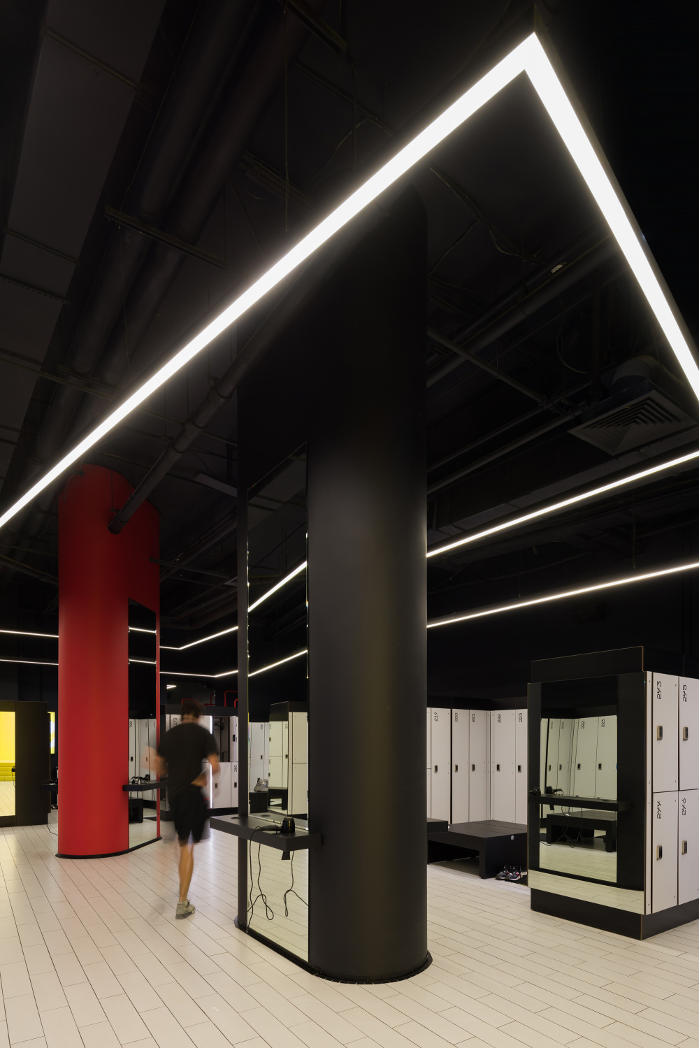
- The changing rooms contrast with the main space. Going into the gymnasium itself, a person is put into a more energetic, even slightly aggressive, environment, which causes them to change from a calm mood to a more excited one. It was important for us to give a client the opportunity to recreate, center themselves and pass the time with maximum comfort, both before and after exercise. For this reason, the changing rooms are well-lit, spacious, with comfortable islands at the room centers, organized around support pillars, and with striking accents, like a large round mirror with frame that pulsates and changes colors.
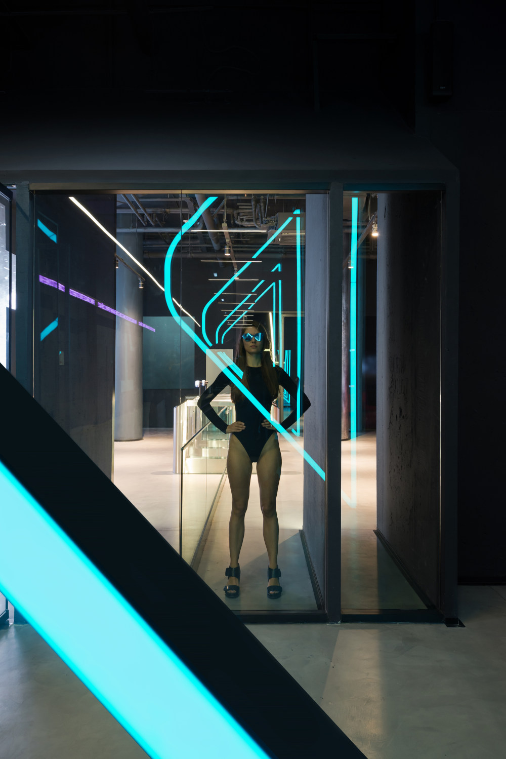
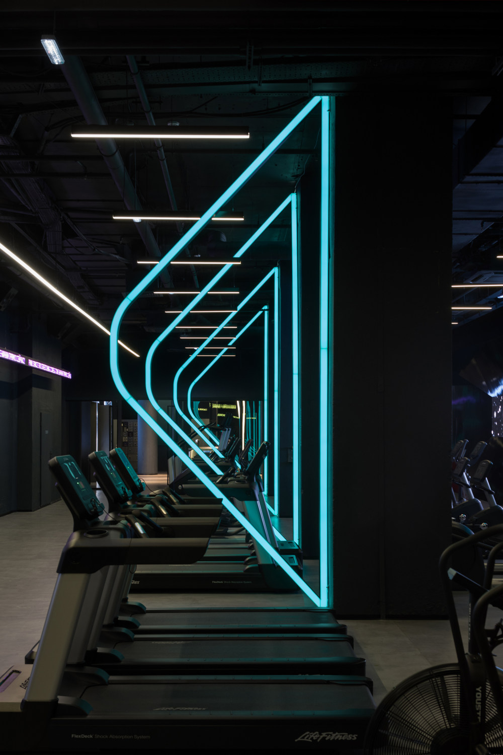
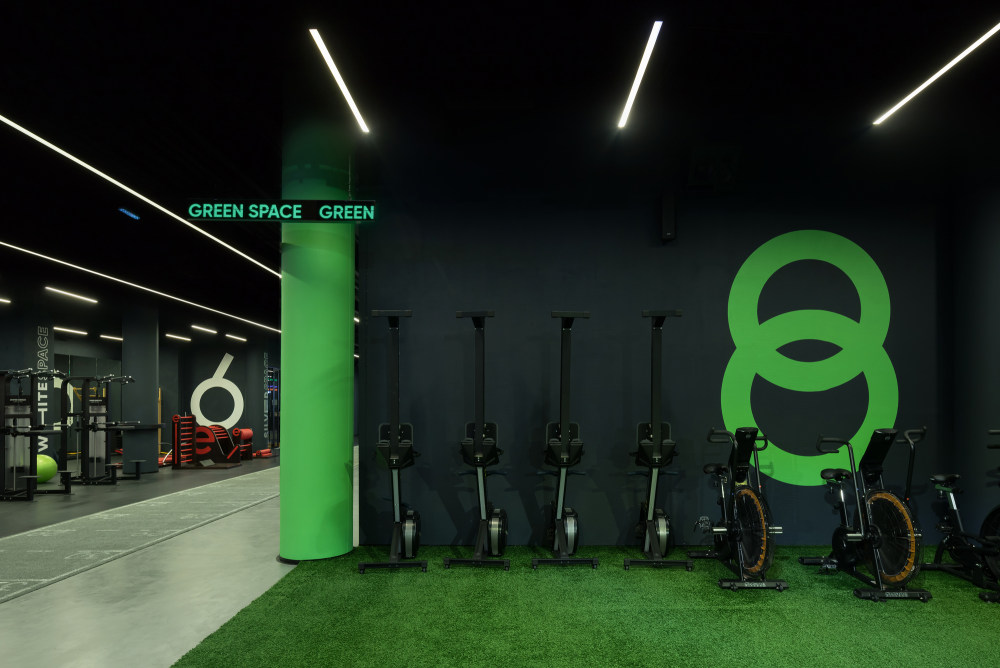
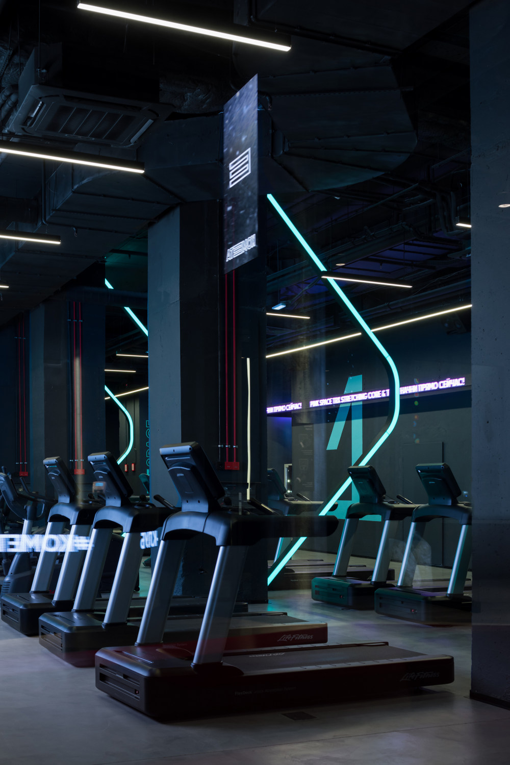
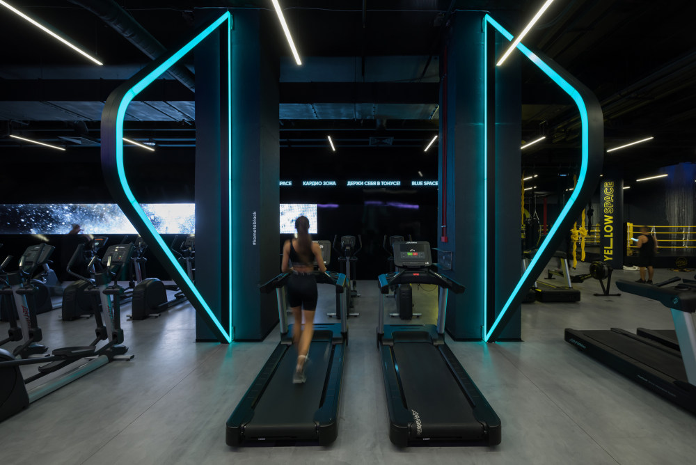
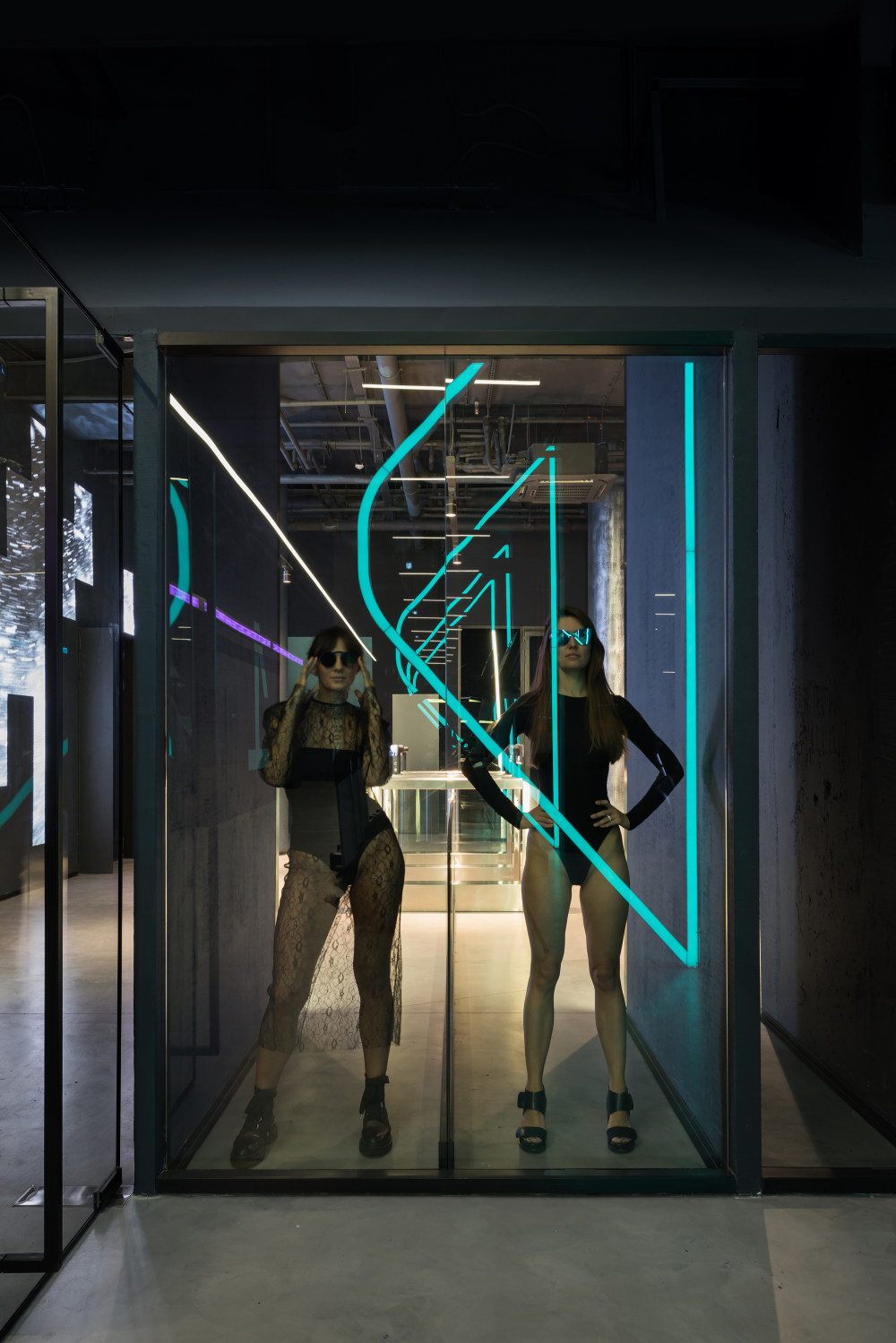
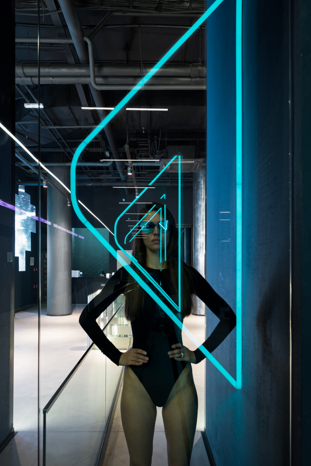
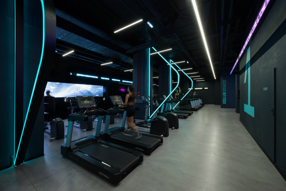
- Clients love this place and make after-exercise selfies there, which we were counting on. The spaces zoning conception is another important feature of the club. It was worked out in cooperation with our partners, Life Fitness. For example, the cardio zone features large luminous elements, tall 5-metres arches, standing between the rows of running machines. It is impossible to assign a concrete meaning to them. They are built entirely on our inner perception of the space, and we would want the clients to form their own perceptions instead of explaining things to them.
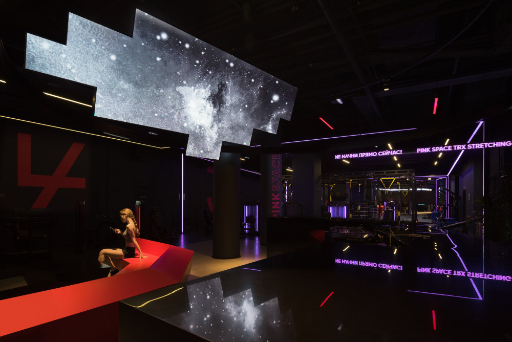
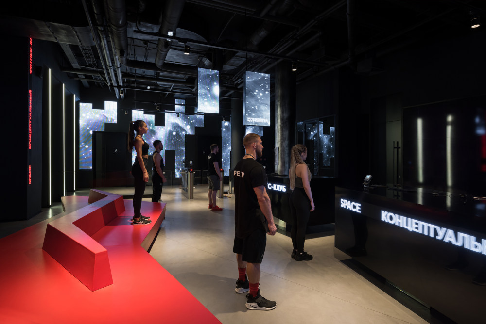
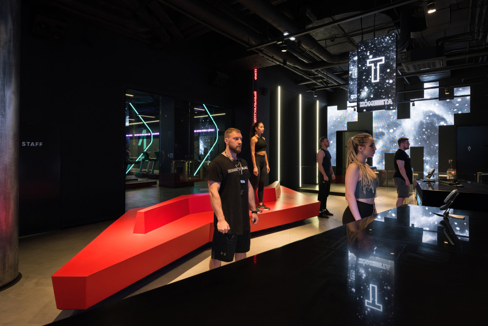
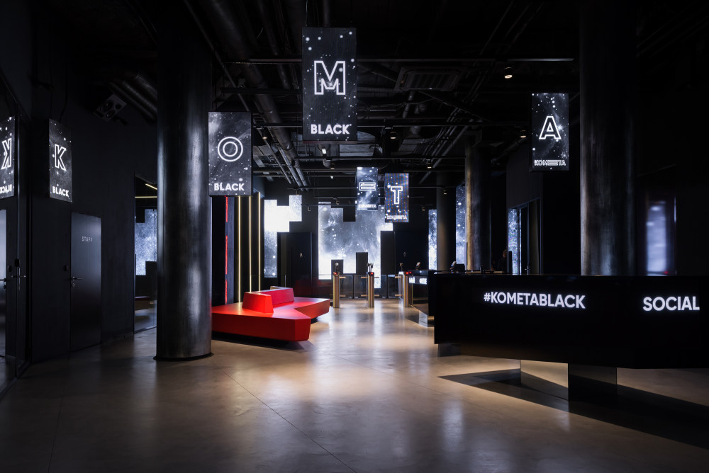
- A comet is, first of all, a moving object to us, but its trajectory turns out to be, in this case, multi-faceted. LED displays and rolling text displays are an integral part of our space. We decided to move away from the standard use of TV screens and used the panels as one of the materials for molding the interior.
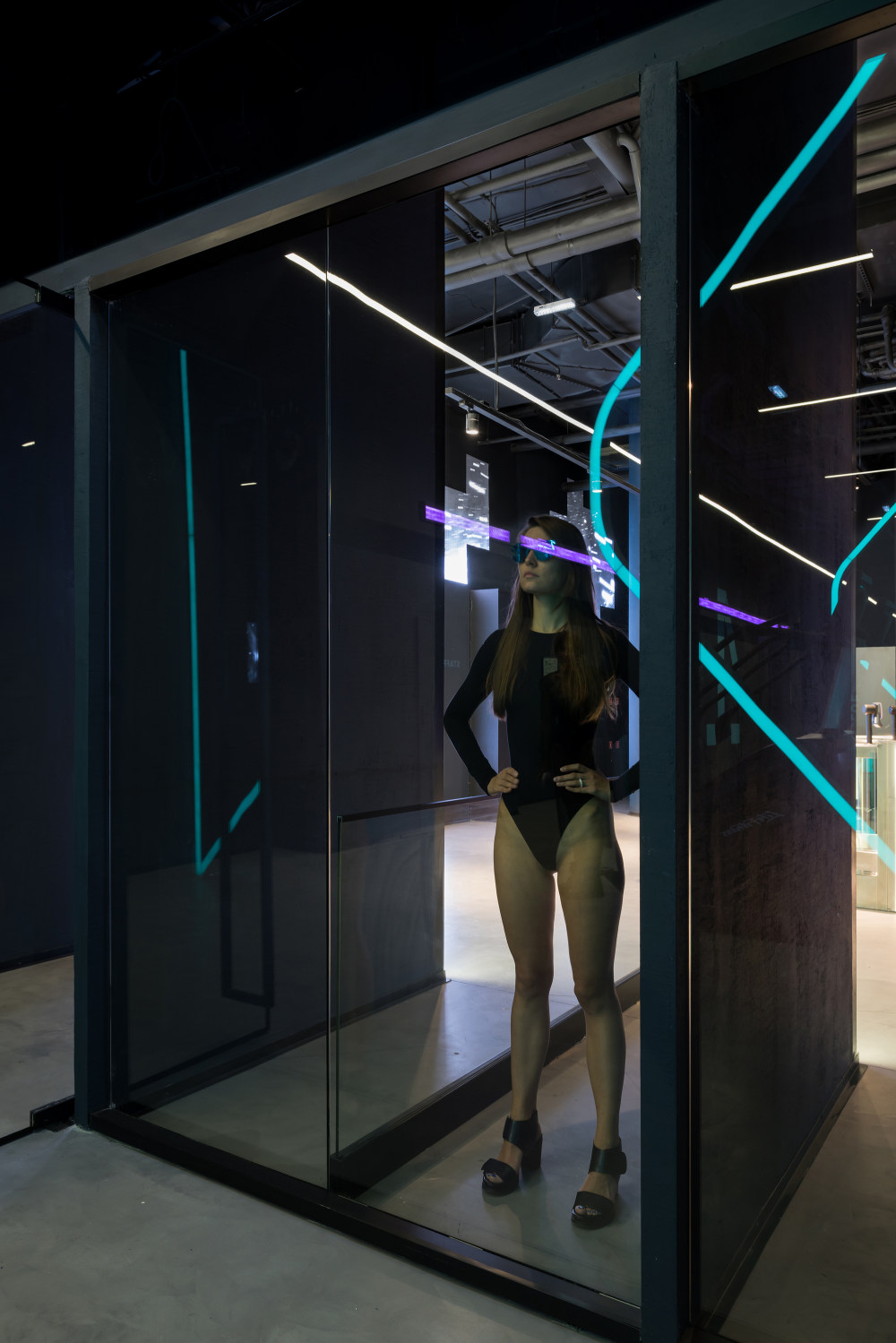
- This idea is best seen at the entrance hall, where they are situated chaotically, at different heights and different distances from each other. These panels have also found their place in the meeting point zone, but this time as a solid object. Meeting point is an important place in the club, accumulating all streams inside it. Here, the DJs play, a cyber sport corner stands next to the fitness bar.
- The zoning also was made possible by working out signage and numbers together with graphical designers. Every zone has its own sign and number; also the rolling text displays in this case serve as navigators, as the text moves in the direction of the zone needed, simultaneously translating useful information. The space is currently clean, almost too sophisticated. We like to think about it as a platform serving artists’ expression, among other things. As time goes on, we’d like for it to contain some punk vibe, too.
|
科梅塔黑色健身俱乐部(KometaBlackFitnessClub)YoYoBureau设计.rar
144.69 MB,下载次数:218
|

