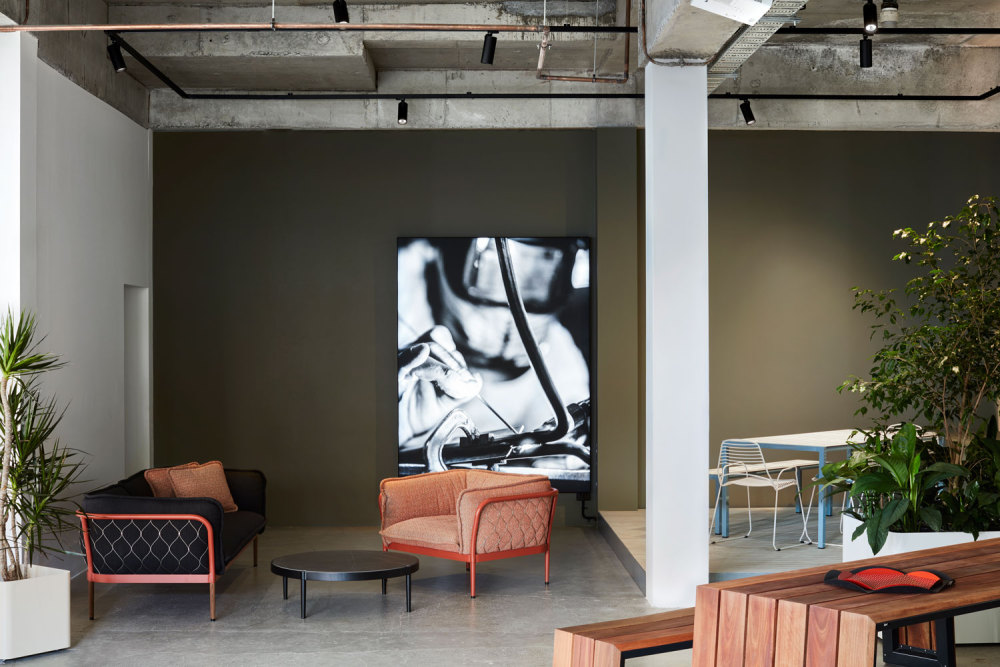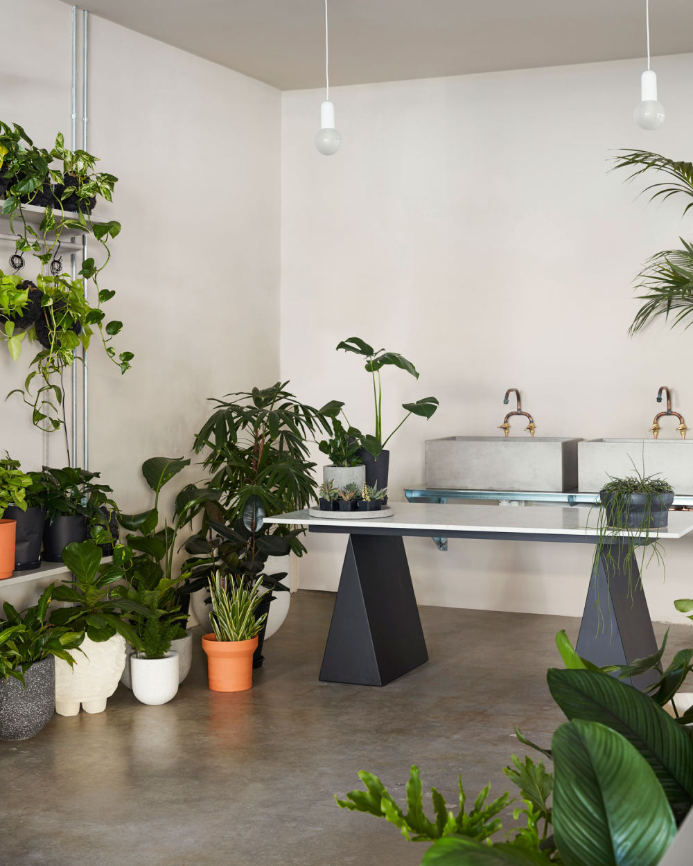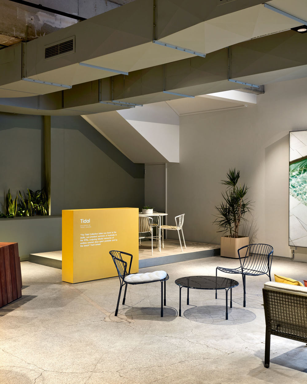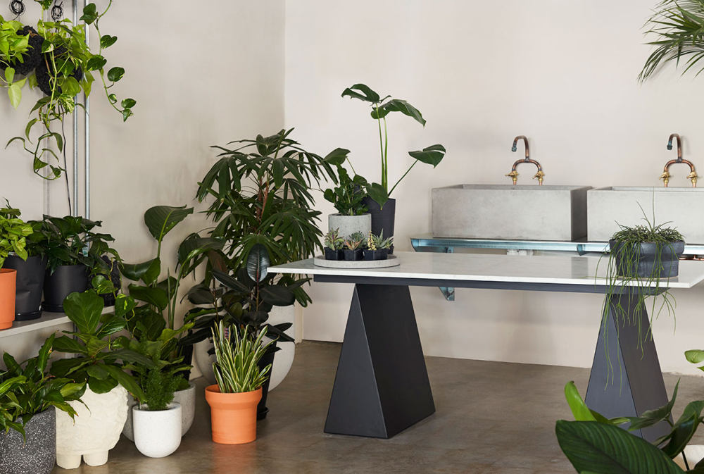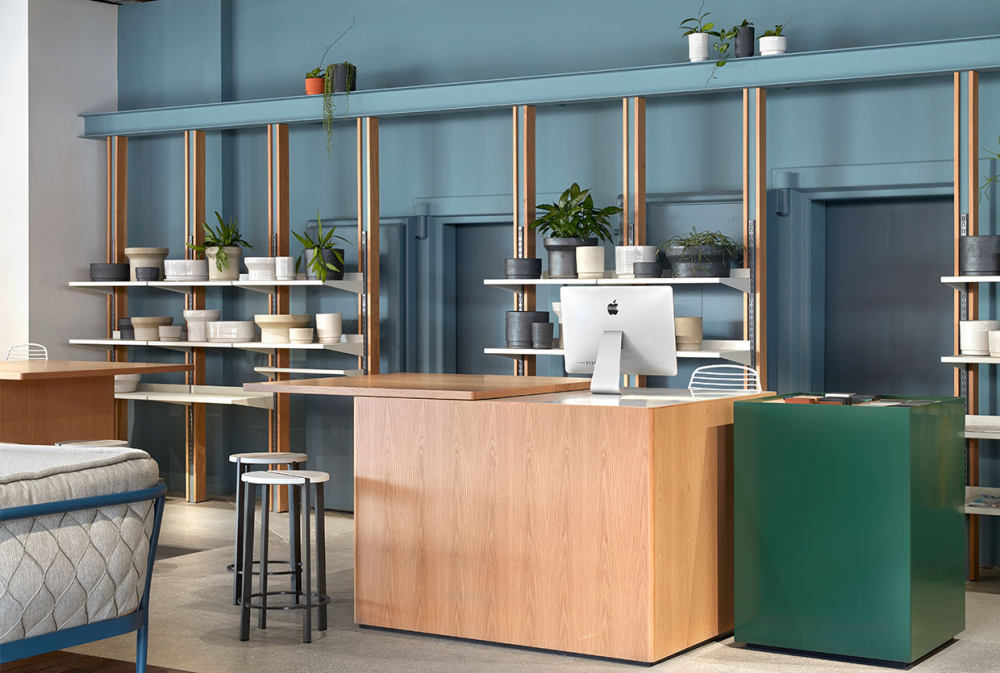


For more than 25 years, Tait has been designing and producing outdoor furniture from its Melbourne home base. With the launch of its new flagship, designed in collaboration with Damien Mulvihill and Mark Simpson of DesignOffice, Tait cleverly blurs the lines between retail experience and lived experience. “This is an exciting time for Tait – it’s our first major flagship store, designed to showcase our entire range of products and bring our ethos of ‘A Life Outside’ into full, living colour,” said Tait Creative Director, Susan Tait. The store, previously home to a major bank, has undergone an ambitious ‘inside out’ procedure which saw the building stripped back to its bare bones, utilising the raw, unrefined base to build a spacious, airy, light-filled space. In bringing the outdoor living philosophy indoors, DesignOffice has addressed the mood of the space with a series of clever design interventions. New display windows paved in Australian grey brick have been added to the showroom’s west-facing street front, while lush greenery is strategically hung to filter a dappled filigree of leafy shadows and light into the space.

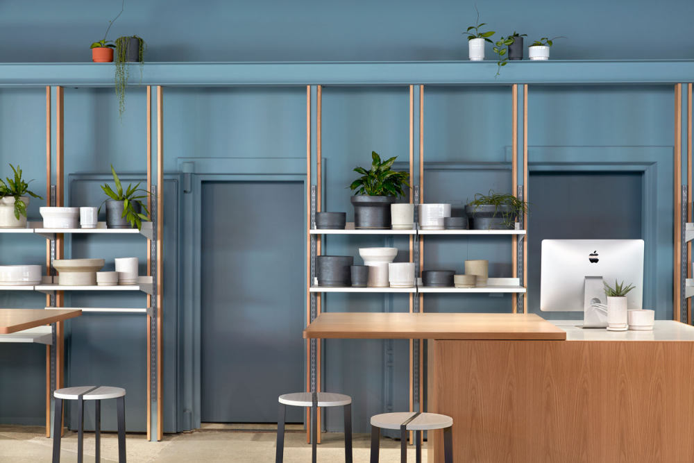
A series of architectural insertions are used to infer the outdoors. A hanging pergola structure doubles as a zoning device for display of furniture and accessories. Referencing the topography of outdoor living areas are large timber decks which operate as display plinths for Tait’s full range of furniture. Custom-made metal fixtures throughout echo the quality and detailing of Tait’s outdoor furniture and reveal Tait Managing Director and metal craftsman, Gordon Tait’s, passion for metal working. “Everything from the shelving through to the display rails has been designed and made in our Melbourne factory to reflect DesignOffice’s vision for the space and give the Tait shop-fit a unique point of difference,” comments Gordon. DesignOffice has also composed a rich palette of hues – almost 20 paint colours in all – to stimulate emotional ties to nature. Blues and greens in varying depths and tones provide contrast and keep the eye moving throughout the space. Looking to engage retail customers as well as design clients, Tait worked with DesignOffice to conceive a series of zones that would be at once enticing and relaxing. “The showroom really does have a wonderful vibe. The sense of landscape, the light from the north windows, the beautiful blue-greens of DesignOffice’s colour palette and the clever zoning: these all come together to create a very peaceful, welcoming space,” says Susan.

This Yellowtrace Promotion is sponsored by Tait. Please note that all our sponsored content is carefully curated to maintain utmost relevance to our readers. - 转载自:Yellowtrace
- 语言:English
- 阅读原文
|

 发表于 2020-8-9 23:14:54


