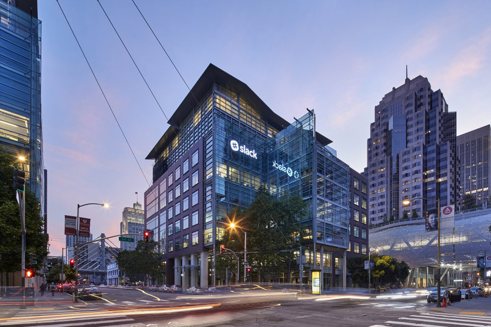
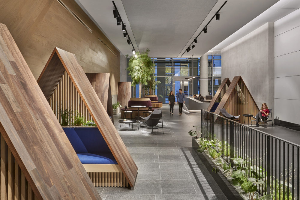
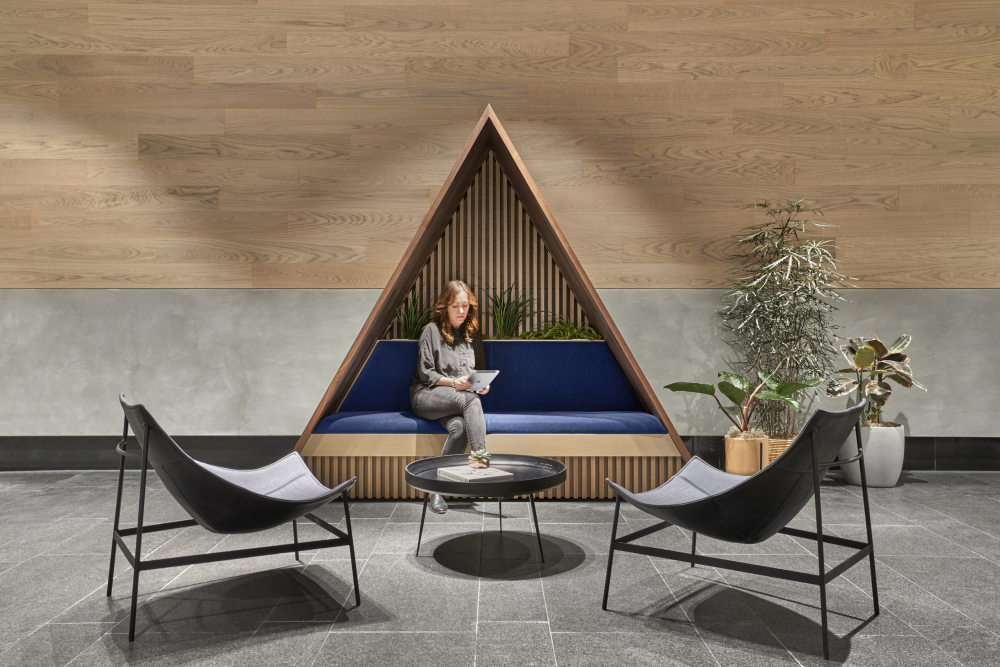
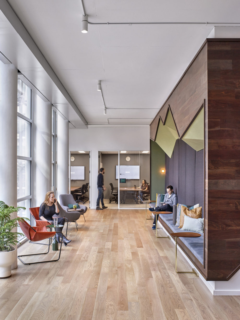
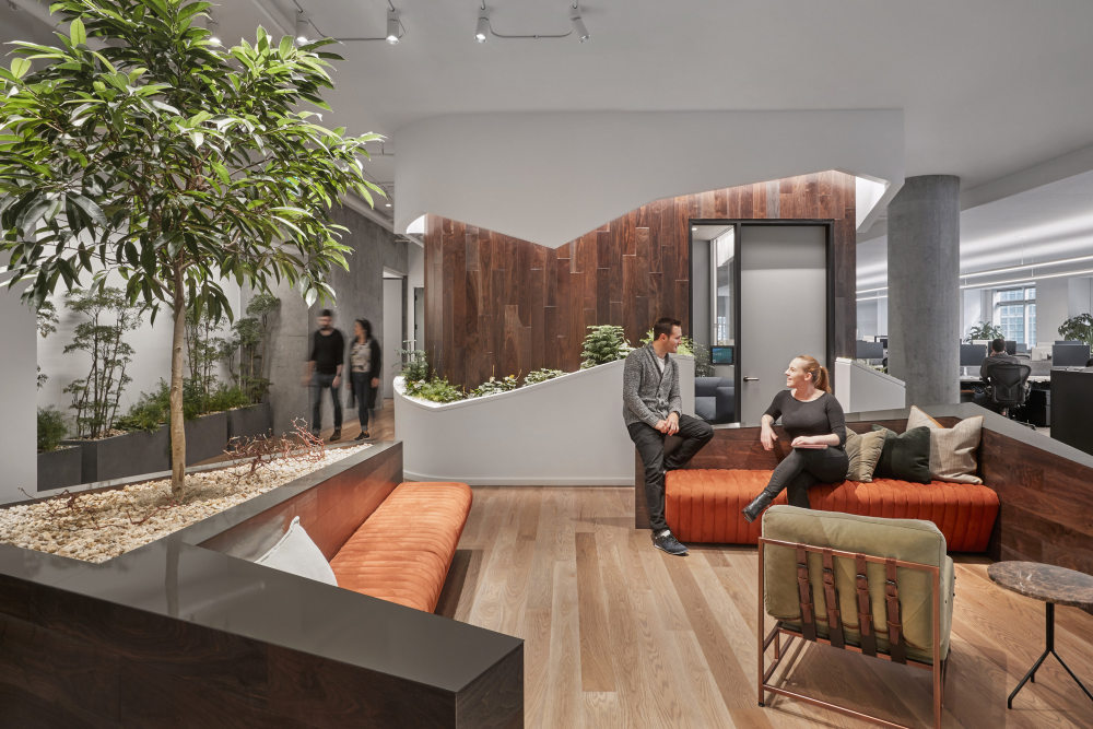
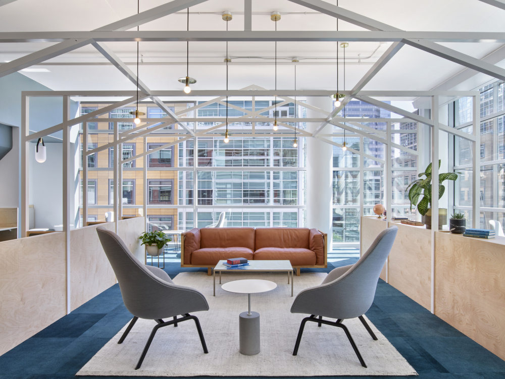
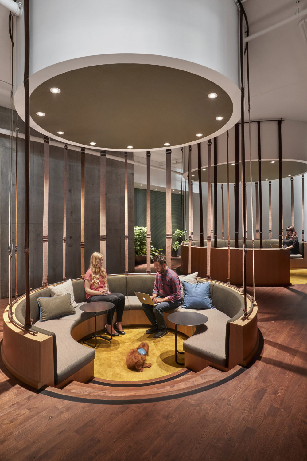
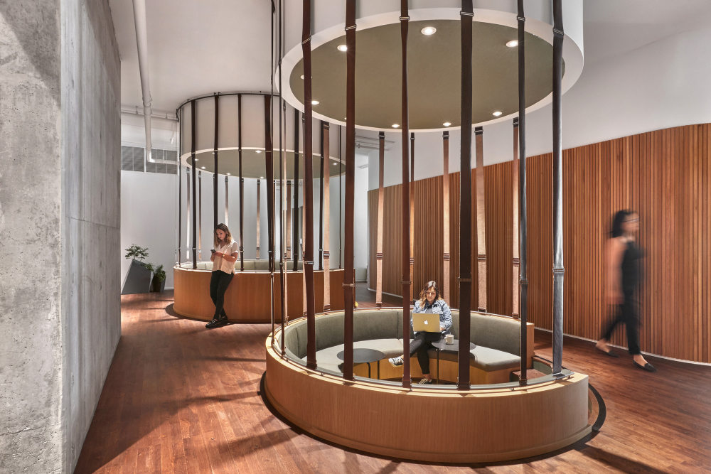
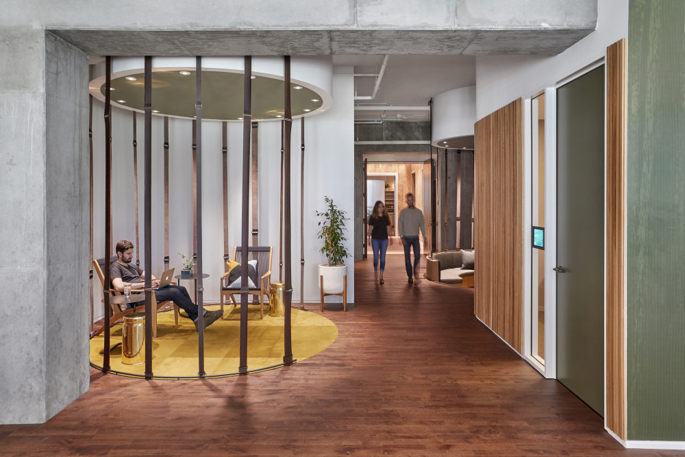
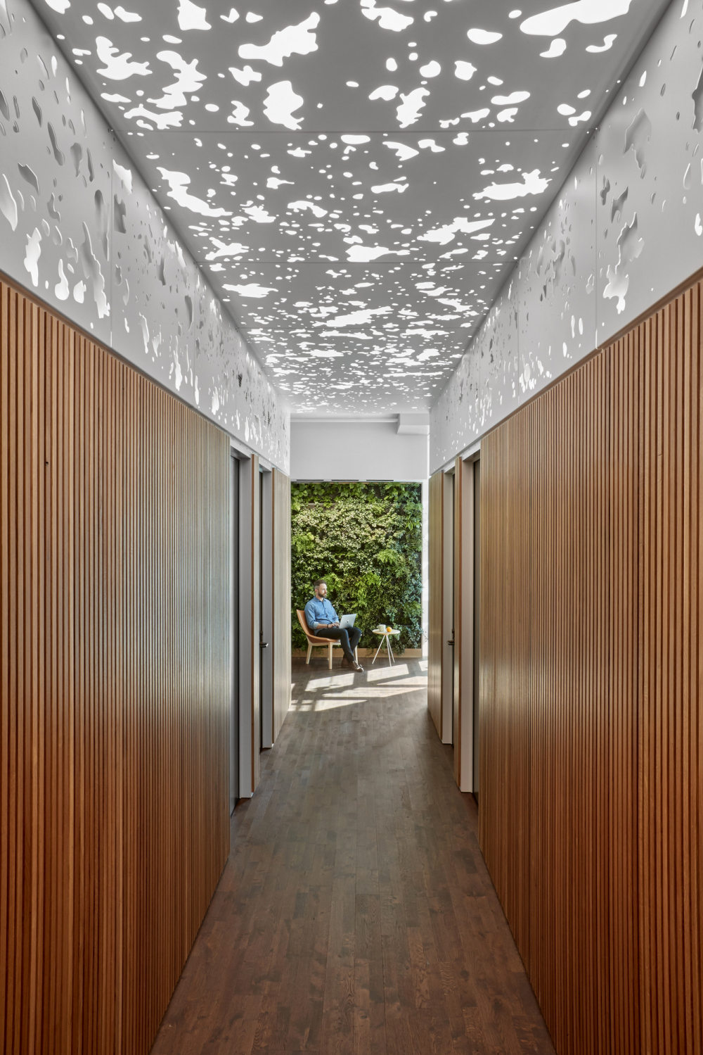
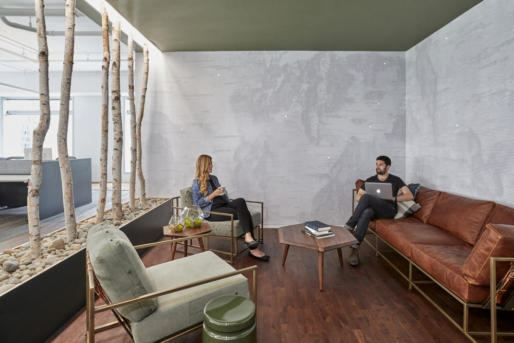
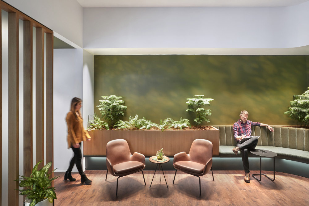
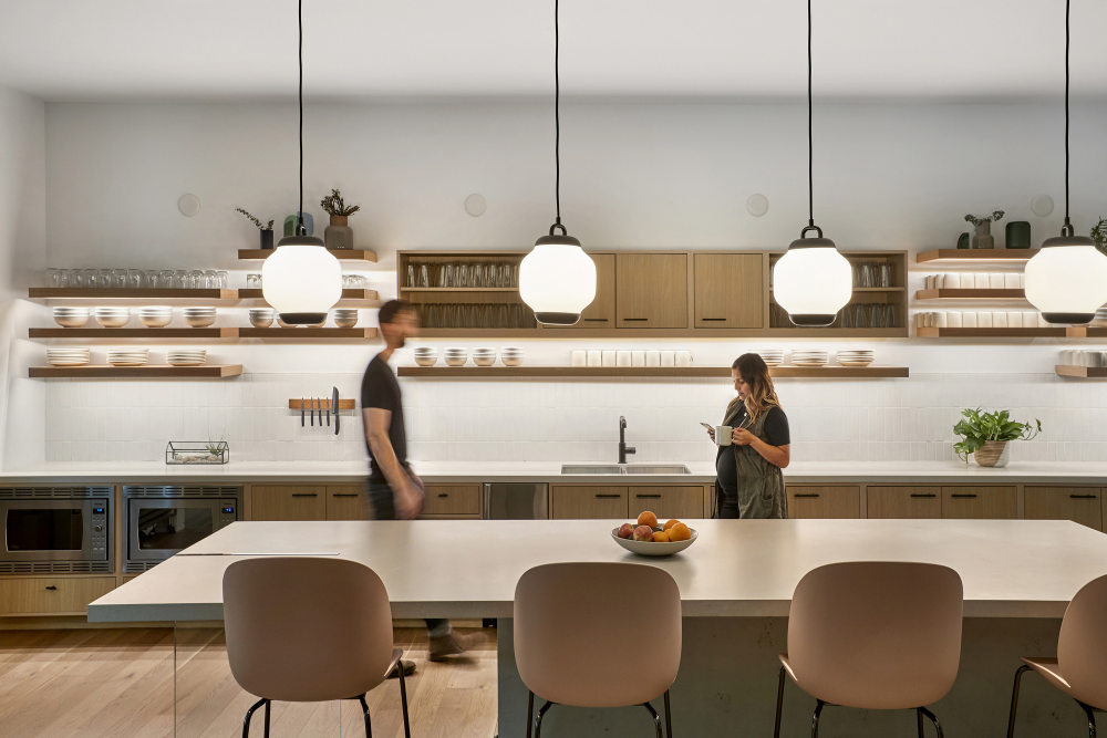
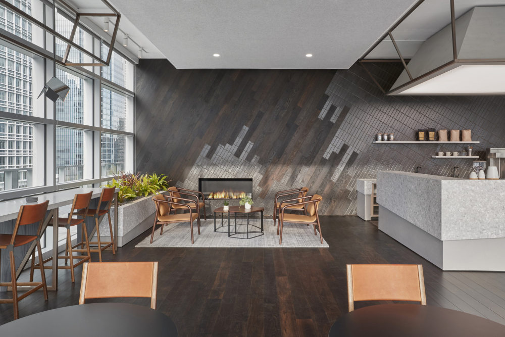
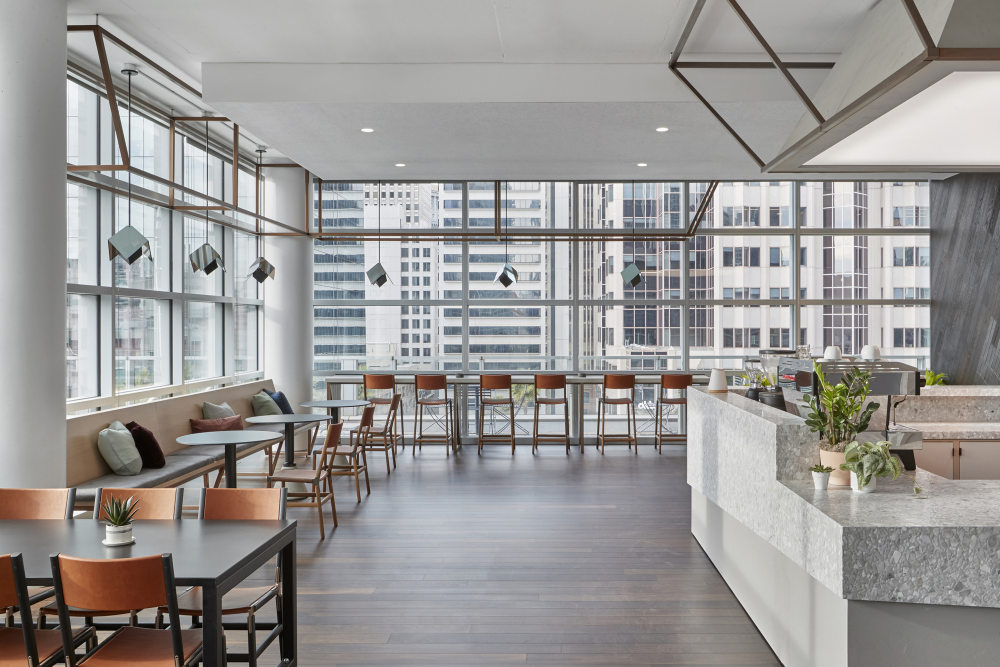
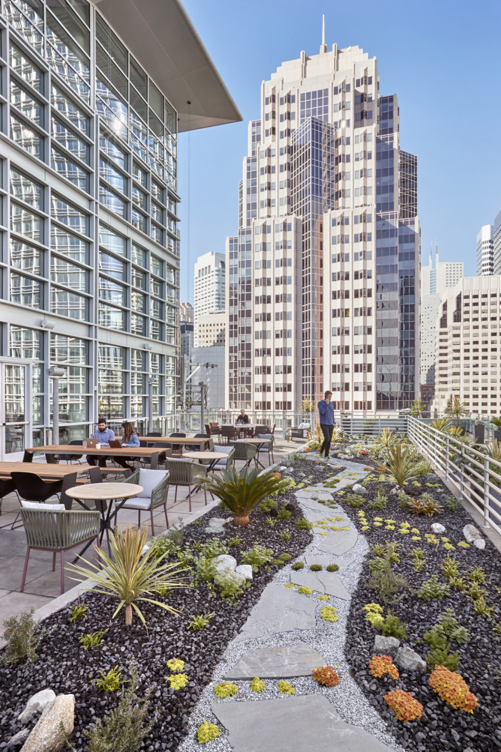
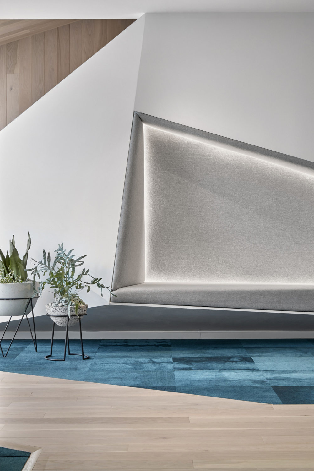
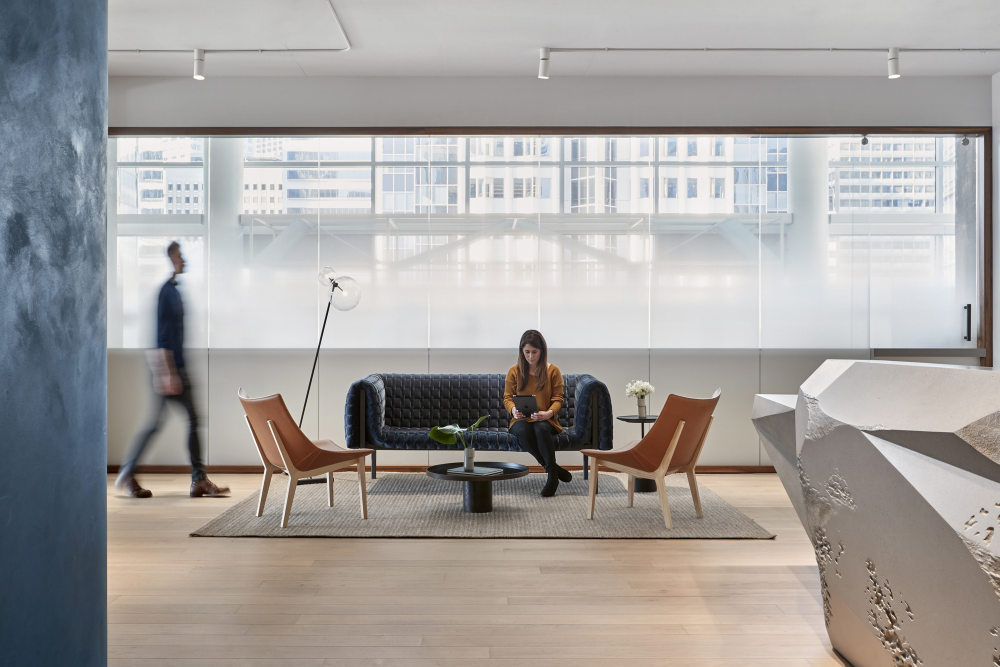
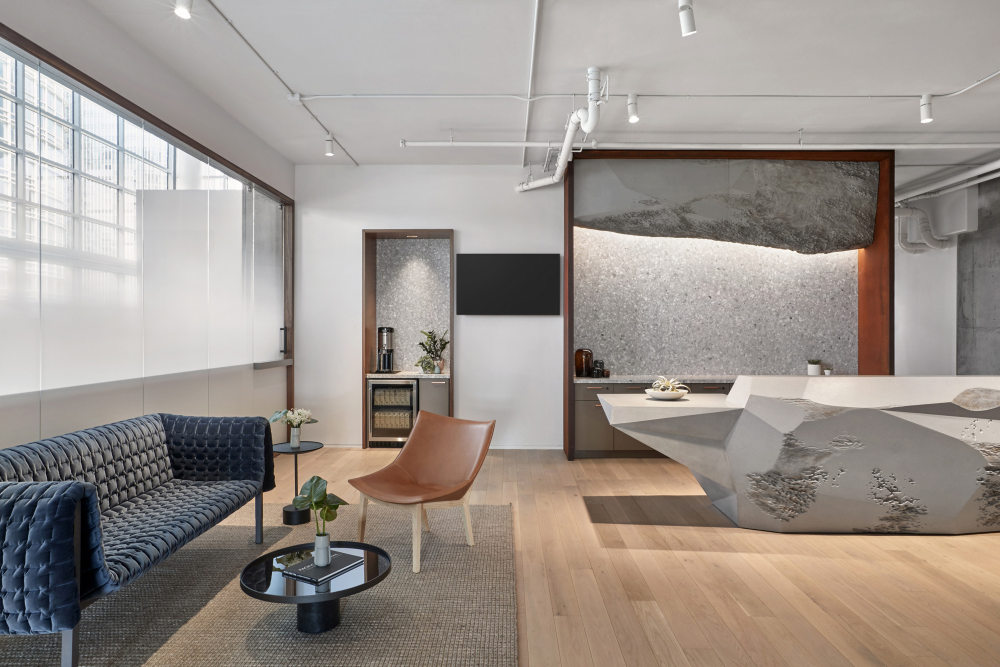
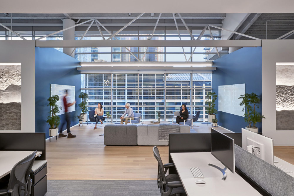
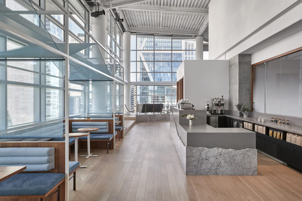
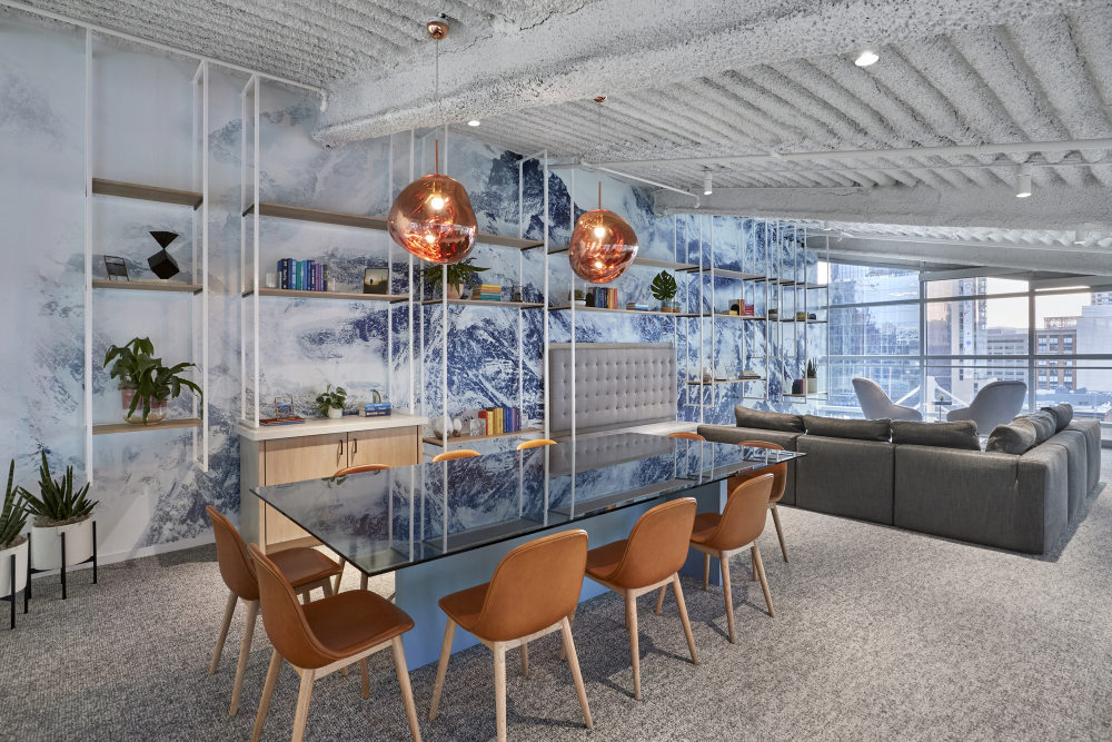
Studio O+A has implemented a nature-inspired design concept for Slack‘s new headquarters located in San Francisco, California. When Slack asked O+A to create its new multi-floor headquarters in San Francisco one design story presented itself immediately. Slack’s CEO Stewart Butterfield is an outdoorsman, a hiker who goes off grid every year and recharges in the various types of wilderness—desert, mountains, forest—that make up the Pacific Crest Trail. Because that trail forms a bridge between two of Slack’s offices in Vancouver and San Francisco it seemed a thematic link too rich to pass up. O+A’s concept was to create a floor-by-floor evocation of those landscapes—in effect to turn a trip up the elevator into a virtual trip from Baja to the Pacific Northwest. The idea was to suggest not just a variety of topographical and botanical contexts, but to capture, as well, the experiential links between hiking a wilderness trail—and work. Every Day at Work Is a New Path Taken
Slack’s team saw a value in having each floor reflect the variety and irregularity of nature. Just as wayfinding on a mountain trail, is often a matter of conferring with other hikers, every work day is an experience of collaborating with others to find your way to the next level. The unique configurations of each floor at Slack echo the mental stimulation—and need for community— that comes with taking a new path. Cracked Earth to Walls of Moss
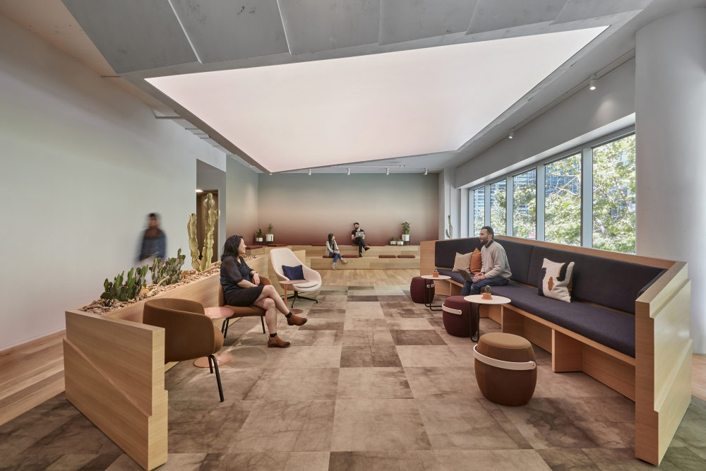
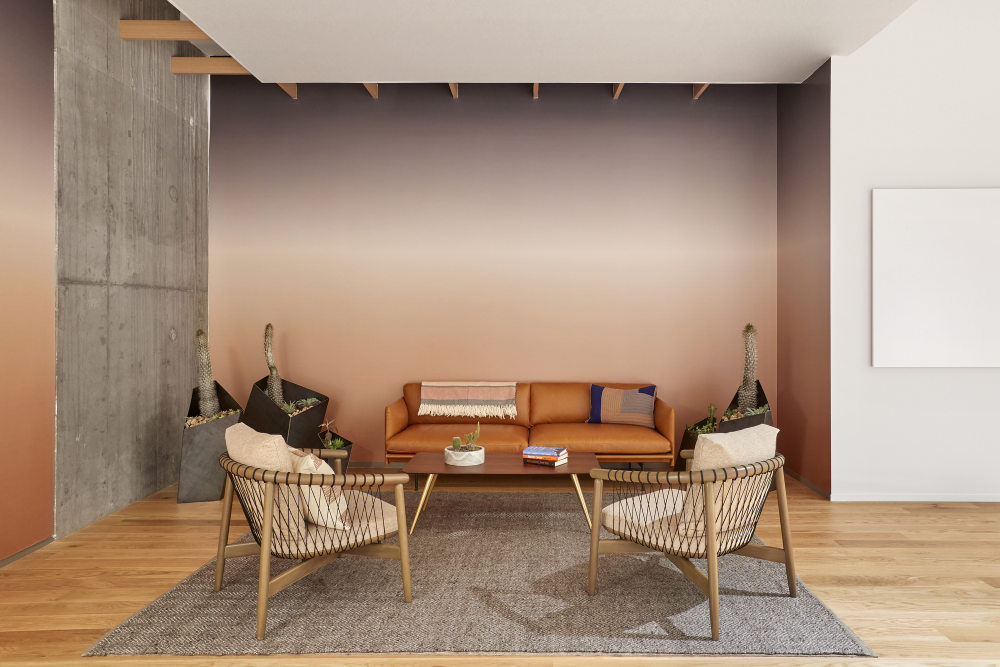
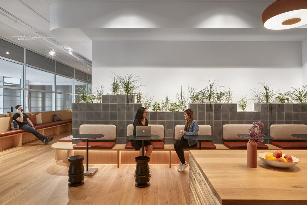
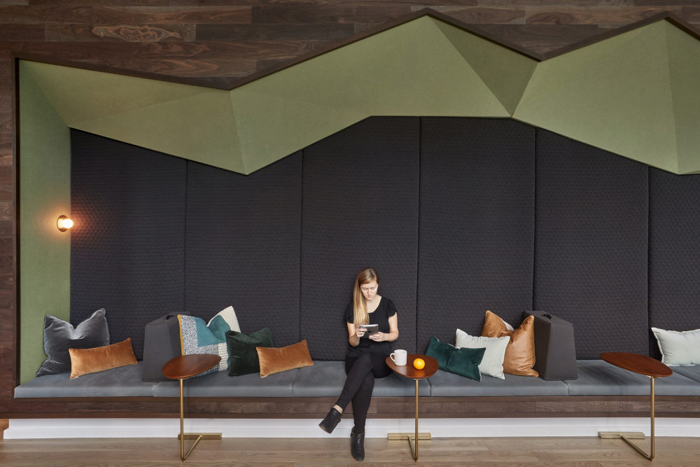
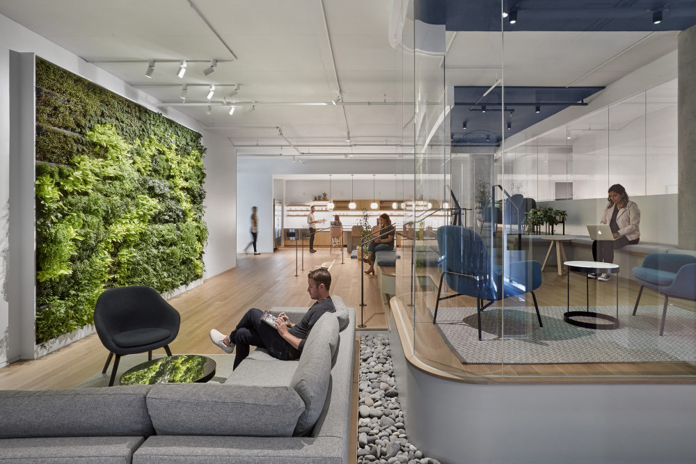
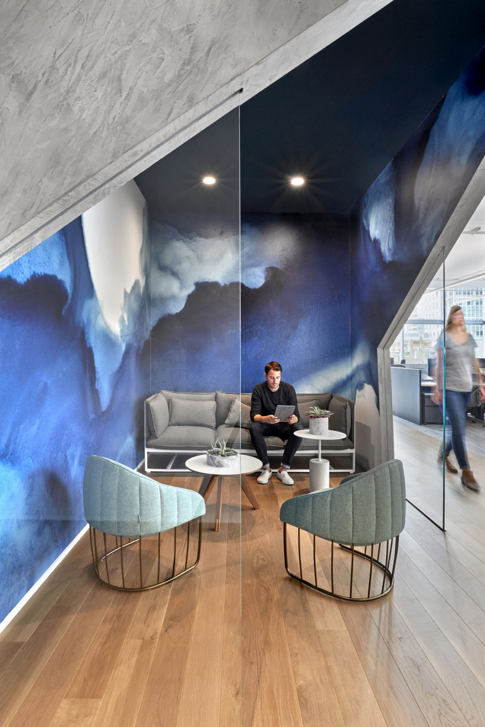
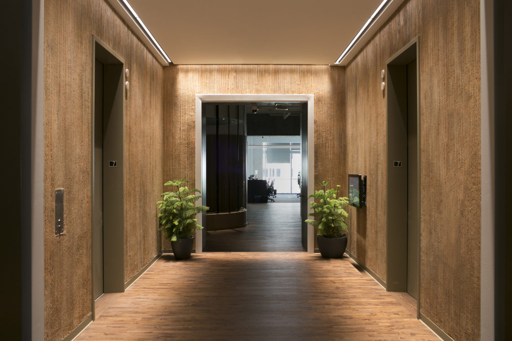
To replicate indoors the distinctly outdoor experience of the Pacific Crest Trail O+A chose a succession of finishes and palettes that subtly suggest changing landscapes. Each floor draws its look and feel from the characteristics of its natural inspiration. Floor 2’s baked earth colors and ubiquitous cacti, for example, evoke the Baja desert while Floor 5’s “quiet please” library captures the stillness of a mountain lake. This motif is sustained across 10 floors with wilderness cues as varied as old growth forests, mountain streams, volcanoes and glaciers. Every floor includes conference room wall graphics created from the wilderness photography of Slack employee Adam Torres and room names taken from the skies, the trails and the living things of the wilderness. Turn a Corner and… Oh!
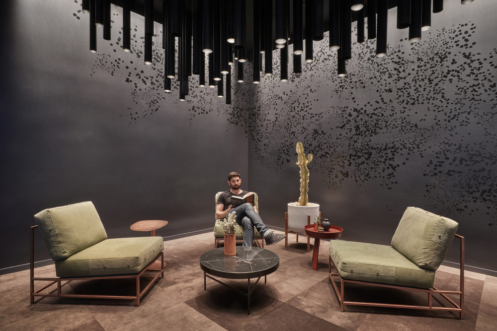
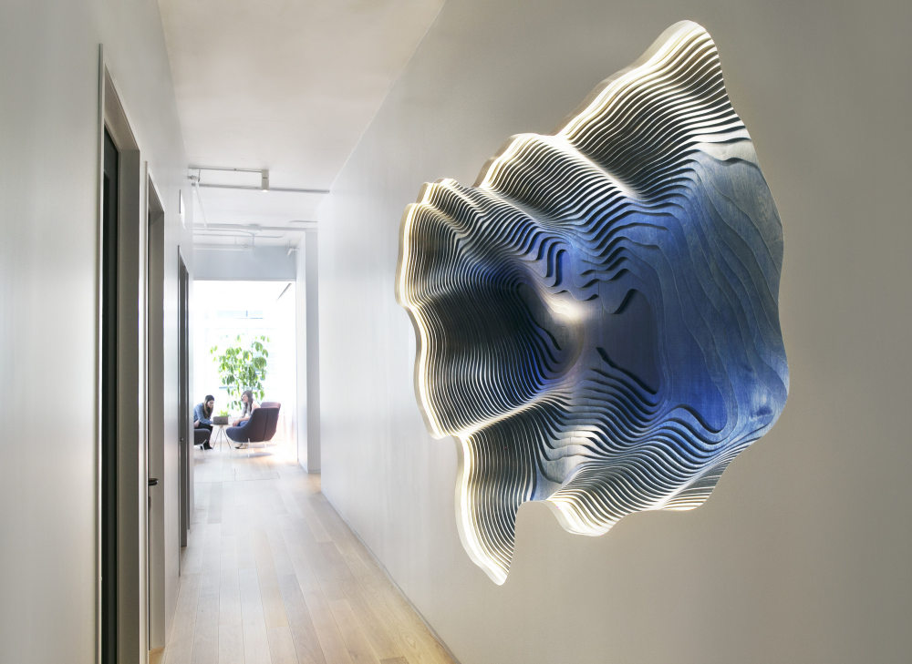
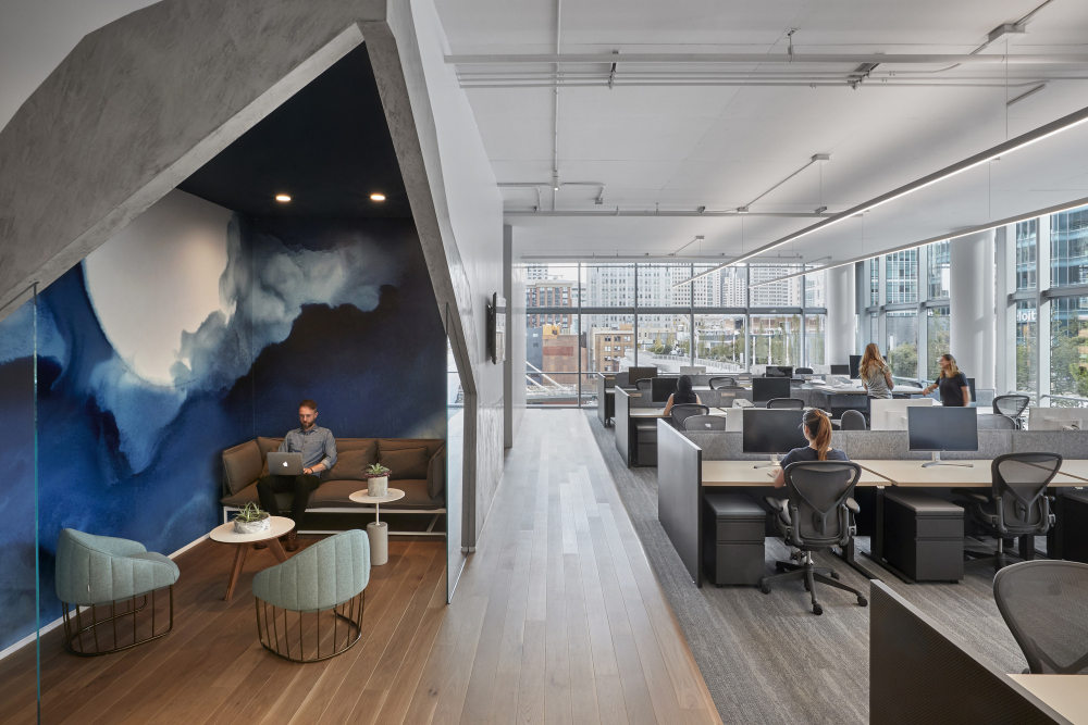
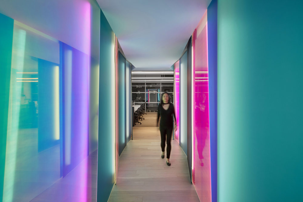
Central to O+A’s design concept was the idea that every work project, like every hike in the wilderness, is a process of discovery. Classic interior design frames large architectural moments to attract the most eyes at once. At Slack those moments come as “scenic surprises”—like an unexpected good idea. You turn a corner and there is a wall installation that replicates the topography of Lake Tahoe in a way that seems to float in space. You walk down a pathway and there is a “starry night” room like a stage set from a Sam Shepard play. You take your laptop to a lounge area and the light changes in a rhythm attuned to the time of day. In every instance the beauty is a reward for effort, a reinforcement of the idea that she who ventures away from her desk makes the most of her workday. The Trail Never Ends
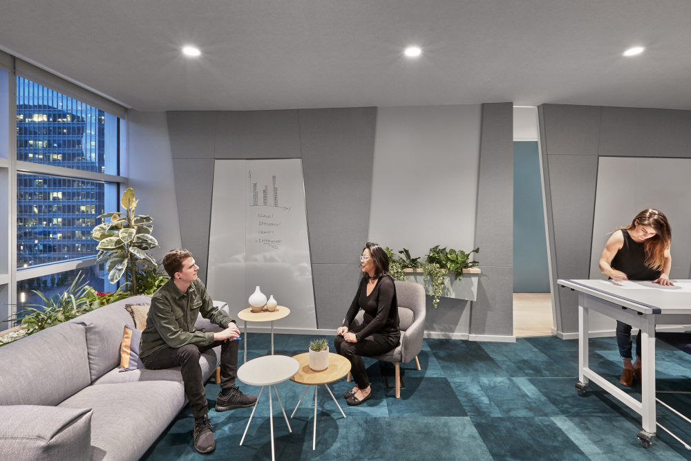
Hikers and campers know that a favorite trail or campsite is never the same place twice. At different times of year and as the years progress, it changes, offering new pleasures and new challenges every time. O+A’s design for Slack builds that capacity for change into the workspace. Every floor is equipped to adapt to the changing needs of a single work session or a months-long project. Like a natural setting, this setting inspired by nature welcomes what the day brings and reaches out to meet it.
- 设计:Studio O+A
- 客户:Slack,
- 面积:300,000 sqft
- 年份:2018
- 坐落:California, San Francisco, United States,
- 行业:Technology,
- Design: Studio O+A
- Design Team: Primo Orpilla, Dan Kretchmer, Dani Canepa, Millie Kwong, Brianna Bernstein, Amy Kwok, Nikki Hall, Marbel Padilla, Amy Young, Chase Lunt, Elizabeth Vereker, George Craigmyle, Emily Cano, Samantha Calabrese, Alex Bautista
- Contractor: SC Builders
- 摄影:Garrett Rowland, Amy Young
- 转载自:Office Snapshots
- 语言:English
- 阅读原文
|


