

“This place was pretty run down when we first came across it. The space had been rented out for some time, and hadn’t been very well looked after. A lot of the rooms hadn’t been used very often, so it felt unlived-in and unloved. I remember when we first viewed it the curtains were drawn in most of the rooms, so natural light was limited and it felt like a bit of a shell.
“Although the house wasn’t on the High Street, which is where we were looking initially, the attraction for me was that it was in central Bruton and had a shop front. We were looking for a live/work space where I could develop Caro, my lifestyle and design shop. This was an 18th-century Grade-II listed former bakery, so for me it felt perfect. The hard task was convincing my husband we should go for it!
“We’ve been here for two and a half years. I was living in an apartment in a south-London Victorian terrace before, but I’m a full Bruton convert now. My husband, Tom, is a teacher and had always refused to live in London so I’d been visiting him at weekends for six years before I took the plunge and moved myself. We live there with our five-month old son, Arlo.
Bruton is such a creative hub. Theres a strong contemporary art scene with Hauser & Wirth at its centre, and there are great food places and pubs. I love At The Chapel and The Roth Bar & Grill.
“We worked with east-London architects Emil Eve on the house. They have a really like-minded aesthetic to us, and Ross, one of the founders, has a background in conservation so is well-versed on the requirements of working with a Grade-II listed building.
“The first thing you notice about the house now is the beautiful stone façade. It was covered by a cement render when we bought it, so we stripped that back to reveal the stone underneath. Luckily the colour was lovely and the pointing was in good condition. We knocked down the conservatory at the back of the house too, and reinstated a timber-clad extension which now houses the kitchen/dining space.
“There was originally an archway that took you from the front to the back of the house. We closed this off to divide the residential area from the commercial shop space. There’s also an outbuilding which we’ve just finished renovating. It was more of a storage barn before; completely open to the elements with a tin roof and no insulation. It’s now a minimal event space with gallery lighting, large windows and a Douglas Fir staircase, so we can host exhibitions in there.
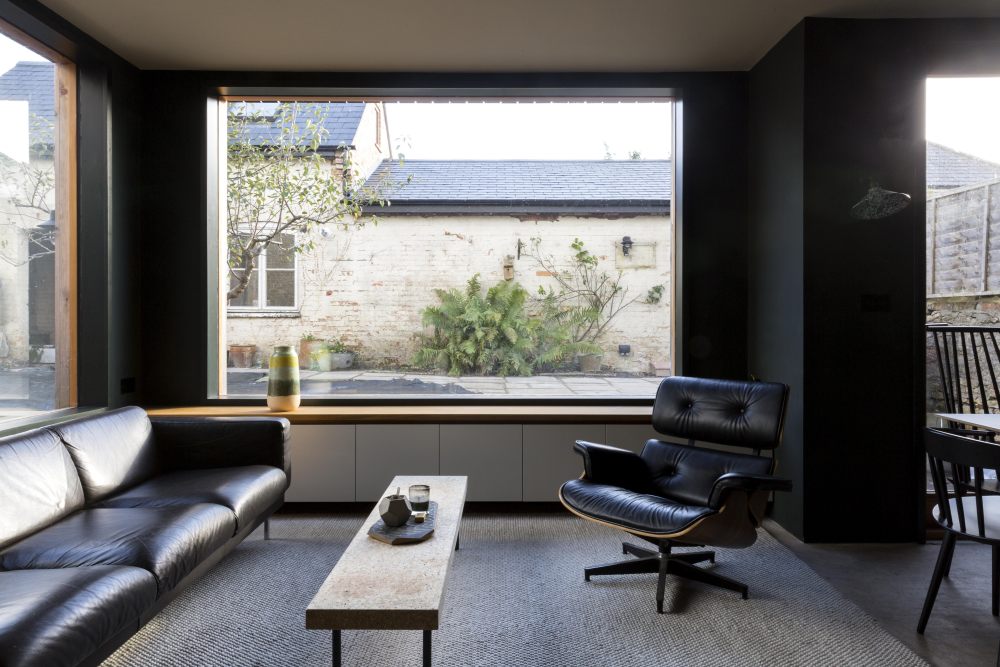
“As well as these layout changes, we re-did the interiors throughout, stripping out a lot of woodchip wallpaper as we went! We painted the kitchen ‘Studio Green’ by Farrow & Ball. I wanted to create a really dramatic space. I’d seen a lot of grey around, and wanted something that was just as calming but also a bit different. This colour seemed like a good solution. I absolutely love it (although after three years, I think I might actually be ready for white again).
“We’ve got other statement walls upstairs – the wallpaper outside the bathroom is from Feather. It’s called ‘Aluminium Weed Field by META. It’s very magical surrealist. I think owning a shop that sells homewares means there’s a constant temptation to change things and experiment!
“We spend most of our time in the kitchen-dining room. Tom and I love to cook together and we entertain in here as well. I often have my laptop open in the kitchen so I can send a few emails when Arlo’s happy or asleep, and I can work whilst keeping an eye on him.
“Caro recently moved to a new space on the High Street, having been in our house for two years. We’re renting out the shop space at the back of the house now, although I’d love to expand Caro back in there – I just need to come up with an idea of what to do with the extra space! We’re busy developing and launching our own collection at the moment – the first product being a set of chocolate bars in collaboration with The Chocolate Society, with flavours inspired by the countryside.
“Moving the shop has changed how we live in the space, too. We’ve acquired a living room and were going to install a fire in there and start to use it as a place to read in the evenings. It’s got a really cosy feel to it with ‘Pink Ground’ by Farrow & Ball, and sisal flooring. I love the idea of having a room away from TV; a retreat where you can only talk or read. My previous stock room is now up for grabs too, so were thinking about options for what we can do there.
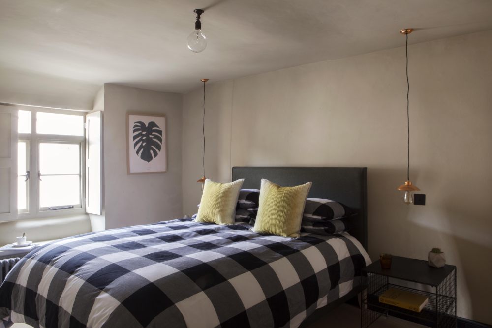
Caro hasn’t completely moved away though – we still have our B&B upstairs where people can come for short experiential stays, and were going to be hosting exhibitions, workshops and suppers in the new space outside.
Natalie, if you moved, what would be the first thing you’d take with you?
“I’ve got a lot of artwork around the house. I particularly love the photographs of apples on a table which are hanging in the dining area. They were taken by Thom Atkinson for the first art exhibition Caro hosted with Moore Gallery in Somerset.”
What do you think it means to live in a modern way?
“For me it’s all about proportion and eye lines, open spaces and the quality of materials.”
Is there a property on The Modern House website that’s caught your eye?
I love the one on Fawe Street in Limehouse. It reminds me of Tribeca, New York. The thought of living in a warehouse and being surrounded by other people in a big block really appeals to me, and the industrial history of the site is fascinating. The red brick is a beautiful backdrop to the current owner’s antique furniture and paintings, too.
Read more: Dramatic Design: how to decorate with dark colours
- 转载自:The Modern House
- 语言:English
- 阅读原文
|

 发表于 2020-8-4 04:11:54


