 Our Open House series gives you a glimpse into some of the homes we represent ahead of their sale. Here we speak to Chris Illingworth, owner and director of Loft Furniture, and his wife Sophie about restoring their brutalist family home and the joy of being bold when it comes to decoration. Check out the sales listing here.
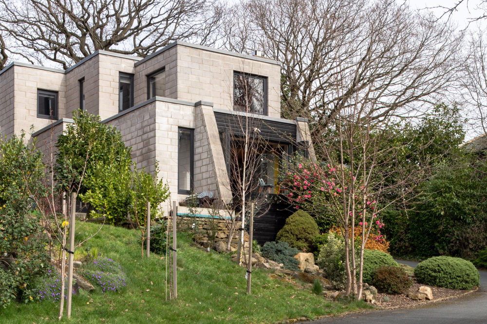
Chris: “Both this house and our one before were doer-uppers. I don’t think we could ever buy something that was ‘finished’ because we’re creative and love to put our stamp on things. What struck me about this place was how different it was to the other houses generally found in Leeds, and how brutalist and honest the façade looked. It was clearly design-led. We had to have it.”
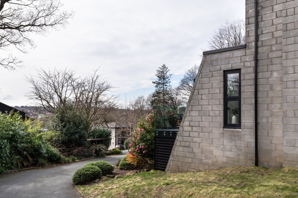
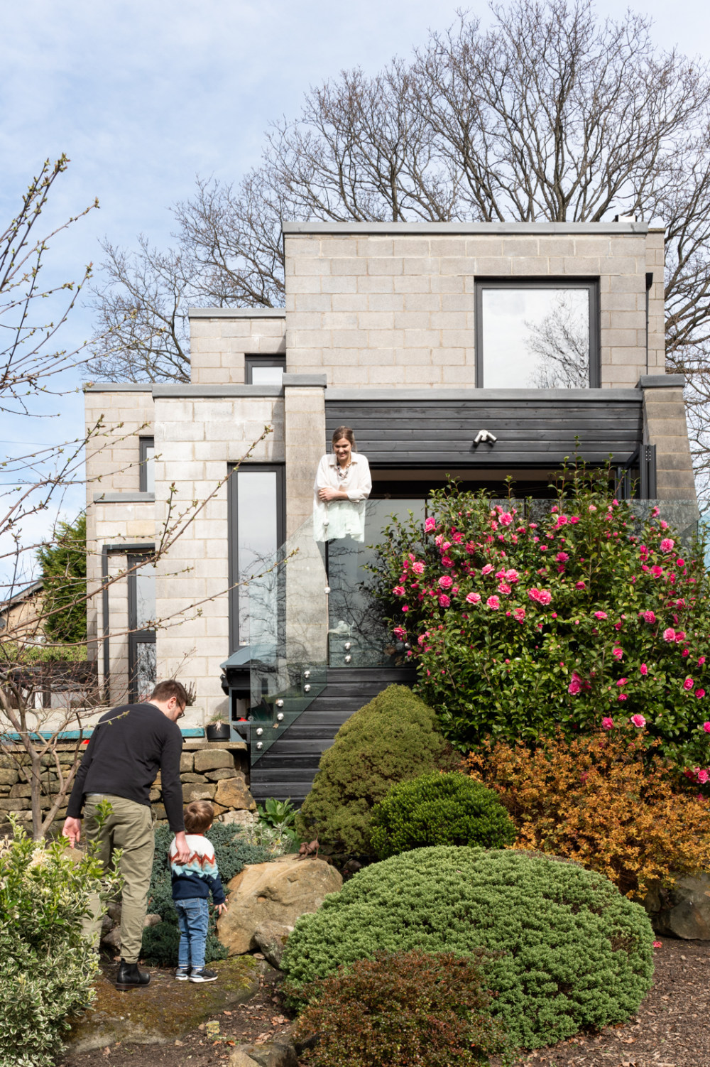
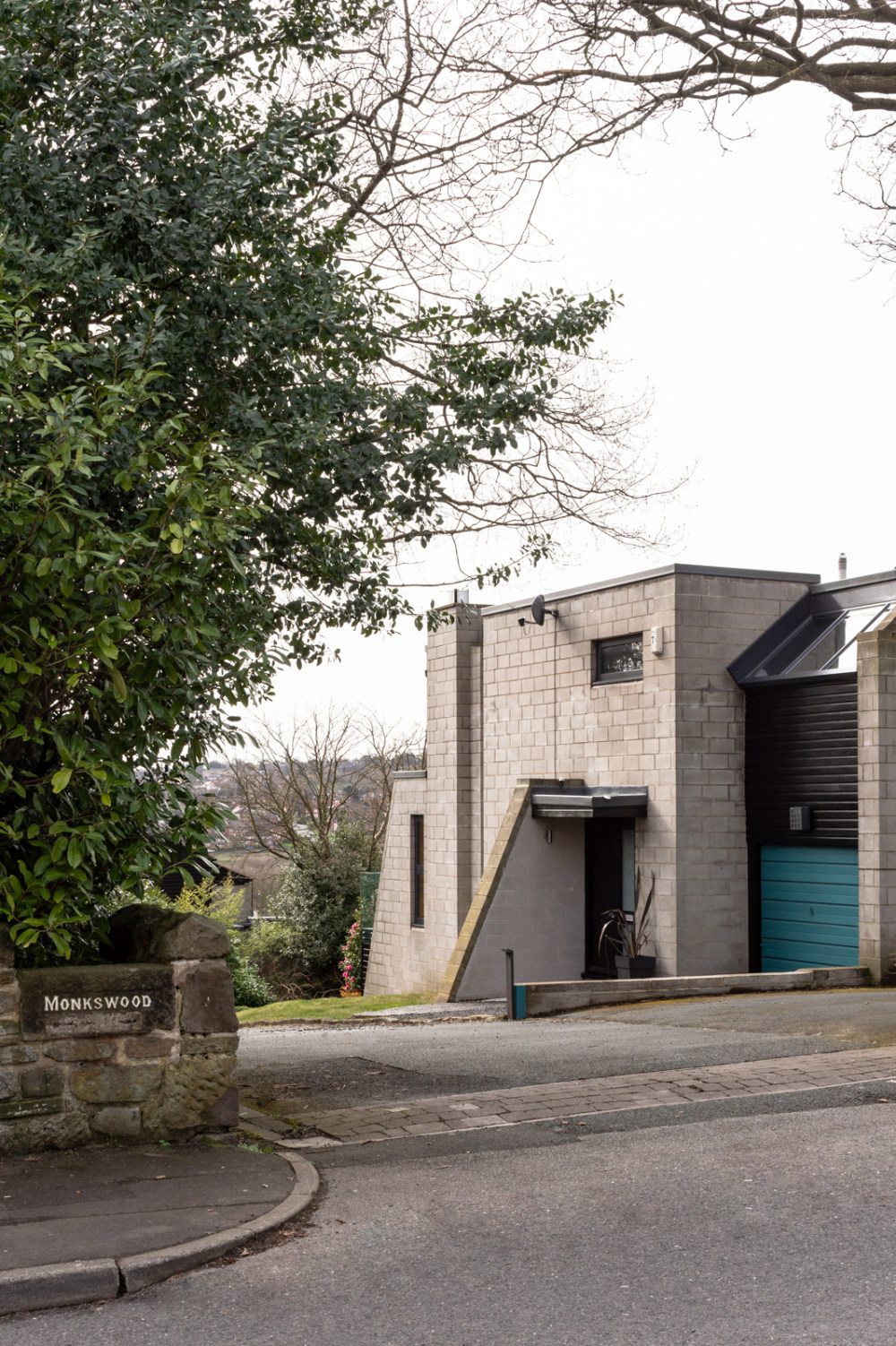
Sophie: “We bought it in 2015 and when we moved in it was a wreck, though pretty much in its original form. It’s viewed by many as an inside-out house, with a concrete-block exterior, concrete-brick interior and flat roof. It’s a modern shape, with little cubes stacked on top of one another and angular parapets – our very own brutalist bunker in Leeds. It looks different from every angle, which we love.”


Chris: “We wanted to restore the house to its former glory. When first designed and built, the houses at Monkswood were cutting edge, commissioned by YTV employees who had moved up from London, were uninspired by the Leeds housing stock and wanted to make something special.
“The house was kitted out with lighting and fixtures from TV sets, and features such as the conversation pit, but it had very much fallen into disrepair. We wanted to give the house its mojo back!”
“When we bought the house, it was quite disconnected from the outside. The grounds were uninviting, overgrown with thick shrubbery and accessed via a broken set of French doors which led onto a balcony without any railings, about six feet above the ground!
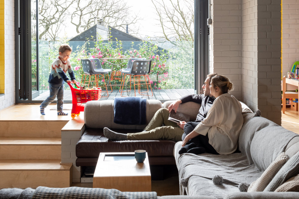
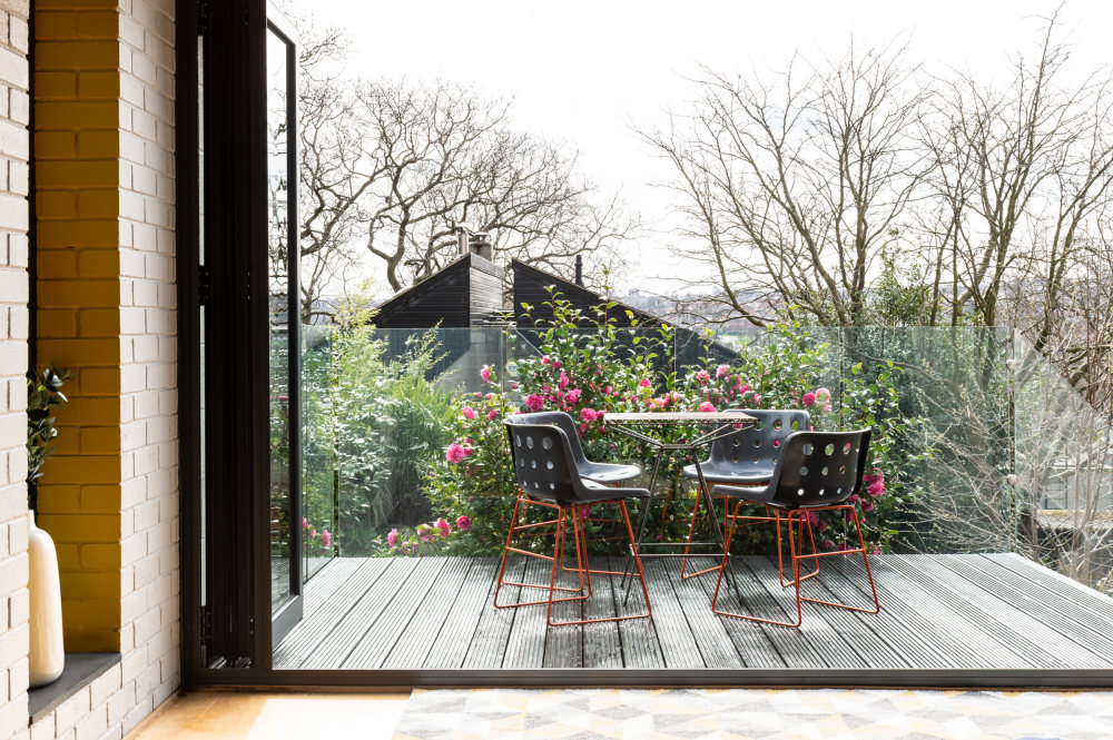
“As the house is south facing, on a hillside and surrounded by established trees with views over the valley, our first real project involved landscaping, installing a proper balcony and fitting new bifold doors. We specifically sourced doors that opened from the middle to reduce the fold on either side, maximising the useable space and essentially creating an extension of the living area – which really is something else on a summer’s day. Along the border there’s a heavily treed area where we’ve created a hollow to make a den for our son, Finley. We’re not the most green-fingered so we’ve kept it fairly low maintenance.”

Sophie: “We’ve tried to keep the building as true to the original style as possible, retaining features inside as well as out. Other than the balcony and bifold doors, the only real exterior changes are new windows and a GRP flat roof.
“Internally we removed a wall to open up the kitchen to the rest of the living space, which has made the property much more sociable and suited to modern living, entertaining and family life. There is a lovely flow to the house, with everything in proportion.
“Each area is spacious and bright, yet also comfortable and intimate. Finley loves running circular routes around the conversation pit, which is such a playful space for a child and has seated up to 12 people at one time – it really is a great house for entertaining.”
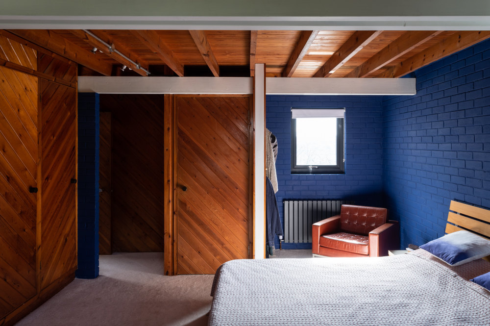
“We’ve also tried to keep the materials authentic and for the most part have renovated rather than replaced. We removed cladding in certain rooms so we didn’t feel like we were living in a sauna, but we chose a plywood floor in the living space to keep a natural finish.
“We’ve focused on simple materials, matching the texture of the house with how things have been fitted – for example, we laid the tiled living-room wall in a brick pattern to match the interior brick walls. I’m obsessed with textures and layers and this house has so many!
“One of my favourite nods to its history is the old dead tree that used to stand outside the front door and which we used to fill the decorative log store next to the open fire.”


Chris: “We’ve painstakingly completed the majority of the work ourselves, including sanding a lot of wood. This house has enabled us to express our style a bit more, and to be more playful and bold. We’ve made some fairly brave colour choices: teal floor, yellow walls and a black bathroom. I would perhaps like to adopt a more minimalist style, but this is a stretch too far with a hoarder wife and a three-year-old.”
“The interior is modernist and industrial in parts, with electric points visible. Too often the inner workings of houses are unnecessarily hidden when they should be celebrated. The majority of our furnishings have either been purchased or made for the house, with many items coming from my company Loft Furniture, which produces, among other things, licensed iconic pieces – including our beautiful 1960s Leo armchair, which once featured in the James Bond film You Only Live Twice.
“We were really excited to be able to include more mid-century furniture. I’ve also been able to express myself by designing pieces such as the coffee table, cast-concrete planter, plywood pegboard, neon lighting and our dining table, which has a mesmeric top produced from recycled plastic bottles.”
Sophie: “Most of the art is my own, a mixture of life drawings, photographs and collected ephemera. Some of the photos are from our travels or locations we love, but my favourites are a series of images from our previous home. When we started peeling back the wallpaper on the stairs it revealed layers that went back in time and showed the history of the house. When we finished redecorating we hung these images on the newly plastered and painted stairway walls, like little windows looking back in time, and now they hang on our stairs here.
“I’ve planned a new series of pictures for our next house, which will feature close-up photos of detailing from this place – areas where angles and textures and materials meet. That way we can take a little piece of this house with us on our onward journey.”


Chris: “We hope that whoever buys the house enjoys it and all of its unique features. That they are good custodians and stay faithful to the original design and style, as we’ve tried to do, for the next occupants after them. While there were 10 houses like this one designed and built by the same architect, no two houses are alike, least of all internally – so it really is one of a kind.”
Sophie: “I have two favourite places in the house: in the en suite with the large windows looking onto the treetops as you bathe, especially early morning as the sun shines through the branches, and snuggled into the corner of the conversation pit at night with a roaring fire feeling hunkered down listening to the rain on the flat roof. It’s a real contrast from day to night.
“When you come into the main living space on a sunny day the house almost glows; there’s an incredible quality of light thanks to the unobstructed large, south-facing windows and bifold doors. After dark it really does feel like a bunker, particularly downstairs; without any window dressings you can see out to the black skies and twinkling lights across the valley.”
“Home is our happy place, where great memories are made. We’ve lived here for five years, and we worked on it for three. This is our son Finley’s first house, the place where he learned to walk, talk and of course decorate.”
- 转载自:The Modern House
- 语言:English
- 阅读原文
|

 发表于 2020-8-4 01:27:43
