ANGELOT 甜品店 design by SAY architects
Angelot is a patisserie located in Xiasha Hangzhou. The original site owns multiple disadvantage, for instance, a basement shaft blocked almost 1/3 of the storefront; the store front is recessed from the architecture facade; the full height interior window is not facing a very pleasant view.
Angelot是一家位于杭州下沙的甜品店,原始的场地情况很单调并且具有很多不利现状,入口位置有地下室风口遮挡住了将近1/3的入口展示宽度,店铺的门头内凹,因此从侧面看展示面被建筑外立面的石材造型遮挡住很多,场地内部虽然是正面的落地窗,但窗外景色效果并不吸引人。
Instead of simply hiding all these disadvantages, we try to use them and connect them with a simple concept —— a gradually disclosed sense of ritual.
在设计的时候我们不想仅仅是对这些不利条件进行隐藏,而希望能够用一个想法将场地现状利用串联起来 —— 逐渐展开的仪式感空间
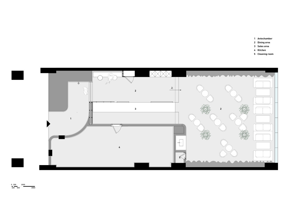
We arranged a curve entry route leading to the door, entering the store, the first space is ordering and display area, passing through this area, the most important space, the dining area, appears gradually.
在平面布置时,我们利用门头的风口形成了一个弧形入口路线,店铺门设置于弧线入口的尾端,进入店铺首先是纵向的点餐区和展示区,客人穿越这个区域时,会感受到内部最重要的空间用餐区逐渐展开在自己眼前。
Following this gesture, we make the architecture facade a frame for the storefront instead of simply become a disadvantage.
沿用这种逐渐展开的空间处理方式,在店铺门头处理上,我们利用本是劣势的建筑外立面造型石材形成了对店铺门头的框景。
The store front is covered with customized curve tile, the entry route is like an opening pushed open from the facade, gently leads guests to the patisserie.
门头全部使用弧面定制瓷砖,弧形入口路线仿佛是从门头推开的一条小径,柔和的引导客人进入室内。
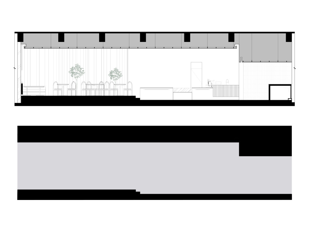
We also designed a changing clearance along the route. The entry level has the lowest height and the dining area has the highest, this changing clearance enhanced the atmosphere of entering the space. It's a path leading towards a secret garden which slowly unfolds spaces to guests.
在剖面处理上,我们也设置了三种不同的高差。入口区域高度最低,进入点餐区后高度增加,并在最终的用餐区净高最高,同时用餐区整体抬高,加剧了进入空间之前的仪式感。这种感受就仿佛穿过一条小路进入**, 通过暗示和引导将空间逐步展现给客人.。
The reception is like three clean cuts of a huge stone, represents three different area. 点餐区的吧台仿佛一整块石材的干净切割,形成了功能明确的三个分区。
The reception is like three clean cuts of a huge stone, represents three different area. 点餐区的吧台仿佛一整块石材的干净切割,形成了功能明确的三个分区。
The reception is like three clean cuts of a huge stone, represents three different area. 点餐区的吧台仿佛一整块石材的干净切割,形成了功能明确的三个分区。
In the dining area, we soften the wall with customized GRC, the semitransparent curtain block the exterior view but kept the sunlight. 4 lemon tree bring the exterior to interior, forms a soft and private dining space.
在用餐区,我们沿用了弧形元素,用曲面定制GRC软化了两侧墙体,半透明窗帘遮挡住室外景色,4棵柠檬树将室外环境带入室内,形成了一个柔软私密的用餐空间。
As the climax of the circulation, the dining area doesn’t have a nice view to see, it only filled with light to be felt. Sun light touches the GRC wall and brings out this fabric like texture out of it, the Lemon tree divides the dining area vaguely, and a peaceful and gentle space is therefore created and kept.
用餐空间作为整个空间流线的高潮和结尾,没有景观,只感受到光和材质,柔软的光线轻轻触碰曲面墙体,形成褶皱布料一般的材质感受,柠檬树限定并模糊的分隔了不同的餐位,整个空间凝固了一种平静和温柔的氛围。
chair detail 椅子细部
- 客户:私人
- 地点:杭州
- 完工日期:2019
- 面积:150平方米
|


