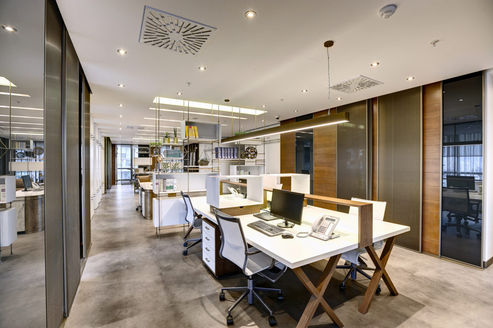
Gun+Partners Offices – Ankara
FIRM
公司
Zemberek Design
zemberek设计
CLIENT
客户端
Gun+Partners
枪+合作伙伴
SIZE
大小
3,444 sqft
3444平方英尺
YEAR
年
2016
二千零一十六
LOCATION
位置
Ankara, Turkey
安卡拉,土耳其
INDUSTRY
产业
Law Firm / Legal Services
法律公司/法律服务
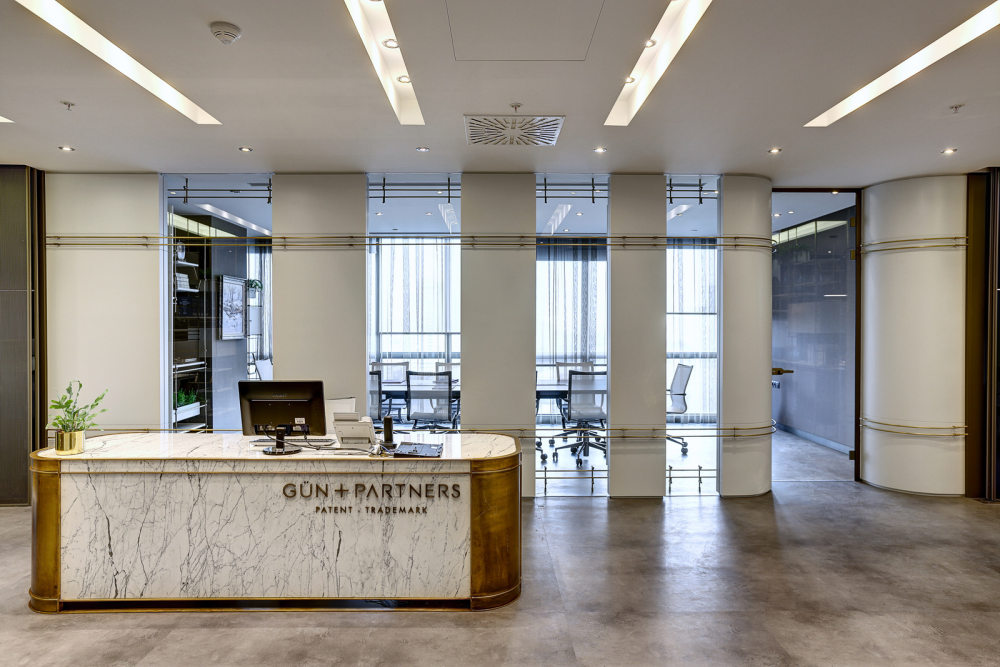
Zemberek Design has designed the new offices of law firm Gun+Partners located in Ankara, Turkey.
zemberek设计了枪+合作伙伴法律公司位于安卡拉的新办公室,土耳其。
The space, within the office, residence and mall complex, is designed as the patent-trademark office of a internationally recognized law firm.
在办公、住宅和购物中心复杂的空间,被设计为一个国际认可的法律公司的专利商标局。
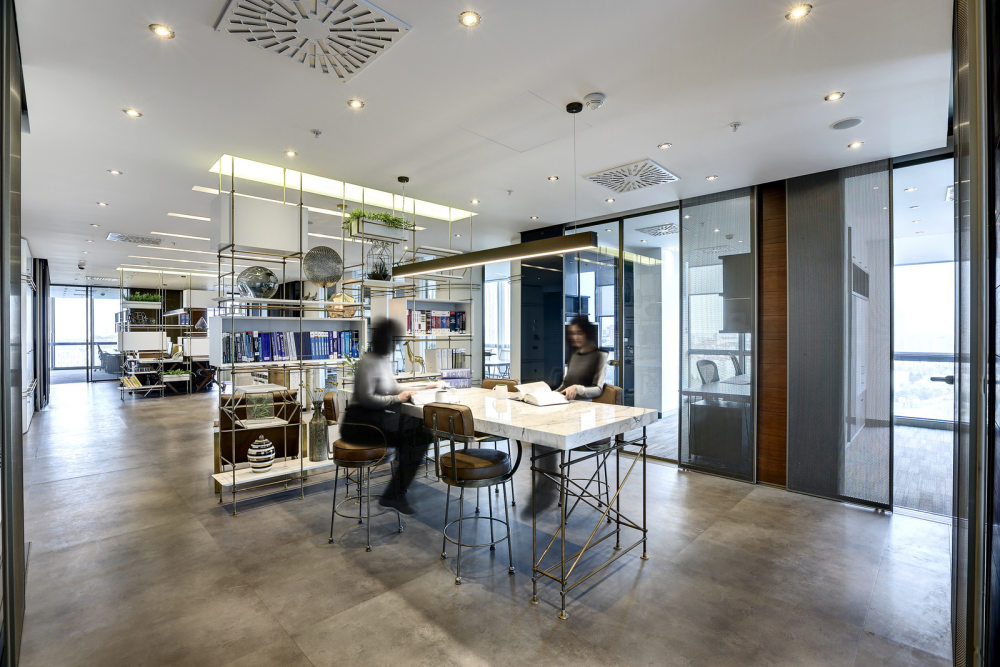
A refined but dynamic approach that users to feel sense of belonging and comfort, is one of the main decisions affect the concept. Whilst the firm’s corporate and ordered structure refers a systematic plan analysis, the flexibility in common areas formed a base for the working dynamics that supports one another in the office itself.
一种精致而动态的方式,让用户感受到归属感和舒适感,是影响概念的主要决定之一。虽然该公司的公司和有序结构是指一个系统的计划分析,在公共领域的灵活性,形成了一个基础的工作动态,支持在办公室本身的另一个。
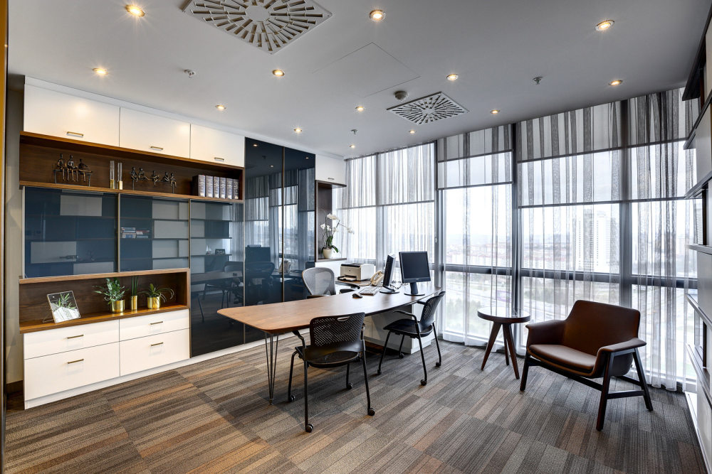
It was expected that lawyer rooms’ privacy provided flexibly and the working area of law apprentices to be positioned in a way that contacts the circulation within the office. In this context, all offices positioned in parallel with building’s main transparent facades and remaining volume turned into an area for all employees’ common use and circulation. The border between common area and offices, formed a secondary perimeter in parallel with building’s main transparent facade. This perimeter is built by using sliding panels which are designed with materials that have different opacity levels in a way that users can adjust the privacy level themselves according to circumstances. By this way, it’s provided that natural lighting is transferred to middle area in a controlled manner.
据预计,提供律师的房间的隐私法的灵活和学徒的工作区域被定位的方式,接触循环内的办公室。在这种情况下,所有的办公室与建筑的主要透明外墙平行放置,并保持体积变成了一个地区,所有员工的共同使用和流通。公共区域和办公室之间的边界,形成了一个与建筑的主要透明外墙平行的二次边界。这个周长是建立在使用滑动面板设计的材料,有不同的不透明度水平的方式,用户可以根据情况调整自己的隐私水平。通过这种方式,它的提供,自然照明转移到中间区域以控制的方式。
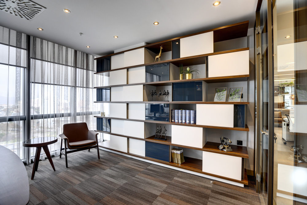
Whilst secretary’s department is specialised and separated from other areas with semi-permeable bookshelf units, it’s also aimed to sustain volumetric integrity within the middle area. The working area of law apprentices positioned in a way that contacts the circulation within the office and the small meeting unit that employees can meet, are integrated with these semi-transparent bookshelf units. The privacy of meeting room that positioned behind the secretary’s department, is also provided with sliding panels that users can adjust in a flexible way.
虽然秘书的部门是专业的,从其他地区与半透的书架单位,它的目的是维持在中间区域的体积完整性。法律学徒定位的方式,接触循环内的办公室,员工可以满足小型会议单位的工作区,与这些半透明的书架单元集成。在秘书处后面的会议室的隐私,还设置了滑动面板,用户可以灵活地调整。
With the sliding secondary perimeter is experienced and contacted by the users, the firm’s principles like productivity and transparency is reflected to the place. The sliding panels that form this perimeter is designed by using materials that have different opacity levels like glass, wood and metal mesh. It’s aimed that white dominated neutral and calm approach to make a balanced contrast with materials like green plants, wood , mesh and colored glass.
随着滑动的二次周边是经验丰富的用户接触,该公司的原则,如生产力和透明度反映的地方。通过使用具有不同透明度的材料,如玻璃,木材和金属网,形成这个周长的滑动面板设计。它的目的是白色为主的中立和冷静的方法,使一个平衡的对比与材料,如绿色植物,木材,网格和彩色玻璃。
Design: Zemberek Design
设计:zemberek设计
Photography: Safak Emrence
摄影:Safak Emrence
|


