拉博银行总部
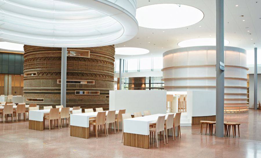
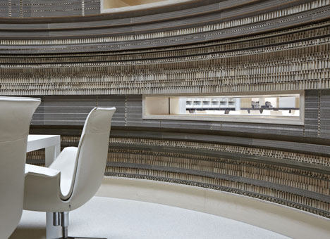
阿姆斯特丹工作室桑德Architecten设计纸板在荷兰银行内部会议室。纸板和纸巨缸括内的金融服务顾问拉博银行总部的会议室。半透明的日本纸覆盖第二个缸,以及弹性灯笼环绕圆形天窗。木材屏幕和家具填补了周围的开放计划领域。这是这个月的第二个项目功能纸或卡后,在蛇形画廊的纸板迷宫 - 在这里看到我们的故事有关纸板和有关纸张所有我们的故事。拉博银行选择桑德Architecten的二十国集团的建立和监督执行整个
室内设计(56.000平方米),其中包括二十五层楼的建筑。
由于办公室内部正在引进新的工作方法重新定义,室内建筑正面临着新的挑战。在今天的工作环境,强调的是在团队和群体动力学的合作;人去为社会方面的办公室比什么都重要。为了实现这一野心的,我们认为,作为一个现代化城市的建设。毕竟,城市是个人自由和自发的互动是重要的。这一概念的有效性是可见的广场上,位于新办公楼的基柱。员工和来访工作,吃饭,阅读,并满足在一个多样化的景观之一。
“建筑”,具有不同功能的独立空间,加入了天窗和超薄列整齐的网格。新的工作作风的基础上的自由,信任和承担责任。在客户端的看法,它的员工都是企业家,为他们自己的表现在一个固定的规则,固定时间,固定地点的环境负责。工作场所针对具体活动:人多的会议,面对面会议或写报告的最高浓度。每个活动都有其自己的空间。
在自然界中的路线是自然形成的,人们直观地找到自己的方式。建筑师艾伦桑德寻求自然,'流'。最繁忙的航线,自动升降机及楼梯,超越更加和平区自然出现的核周围形成。此外,'流'的心理概念,当需要的时刻,愿望和能力走到了一起,连接员工的幸福感与雇主的最佳结果。室内设计的指导原则,因此成为“形式如下流”。为了使垂直分区流,避免使地平线始终可见。 “办公室是我的世界,世界是我的办公室。”
与其他设计师合作设计生成。广场上的基座不能变成一个单调,同质的空间。多样性是为了激发人们,尽管规模庞大的建设,人们都没有离开四处流浪,在无菌领域失去。会议由桑德Architecten展馆设计和纸和纸板。在与中国暂停从天窗和纸灯笼的组合,创建一个独特的触觉经验是。纸板馆,功能材料的不同用途,创建有吸引力的模式,特别是邀请来触摸。
共享艺术与城市
附件玻璃墙显示的情况是广场的中心,并在出发和到达,由中国艺术家倪海峰工作的特点。垂直博物馆包含了瓷器的对象,包括剪刀,Glassex瓶和铁,涂在delftware风格。这项工作的特点是在室内,也与剧照和电影“决策”关于在落后的情况下。
Rabobank HQ
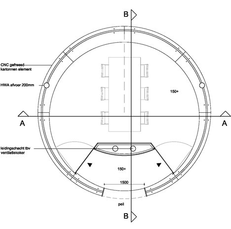
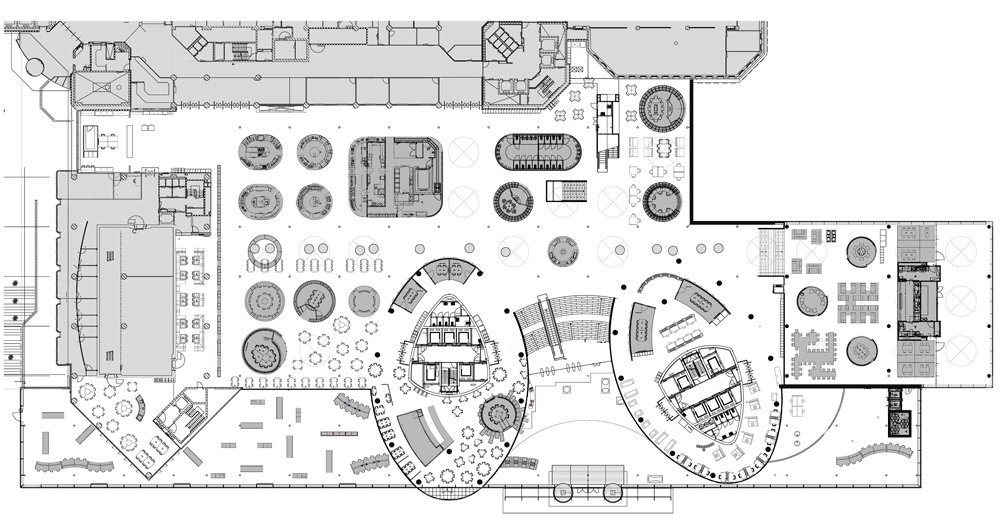
Amsterdam studio Sander Architecten designed cardboard meeting rooms inside a bank in the Netherlands. Giant cylinders of cardboard and paper enclose meeting rooms inside the headquarters for financial services advisor Rabobank. Translucent Japanese paper covers a second cylinder, as well as the springy lanterns that surround circular skylights. Timber screens and furniture fill the surrounding open-plan areas. This is the second project this month to feature paper or card, following a cardboard labyrinth at the Serpentine Gallery – see all our stories about cardboard here and all our stories about paper here. Rabobank selected Sander Architecten out of a group of twenty to create and supervise the execution of the entire interior design (56.000 m²), including the twenty-five-storey building.
As the office interior is being redefined by the introduction of new methods of working, interior architecture is facing new challenges. In today’s work environment, the emphasis is on cooperation in teams and group dynamics; people go to the office for the social aspect more than anything else. To realize this ambition, we view the building as a modern city. After all, the city is where individual freedom and spontaneous interaction are all-important. The effectiveness of this concept is visible on the Square, located at the plinth of the new office building. Employees and visitors work, eat, read, and meet one another in a diverse landscape.
The ‘buildings,’ separate spaces with different functions, join up with the uncluttered grid of skylights and slim columns. The new style of working is based on freedom, trust and taking responsibility. In the client’s view, its employees are all entrepreneurs, responsible for their own performance in an environment free of fixed rules, fixed times and fixed locations. The work spaces are tailored to specific activities: multi-person meetings, face-to-face meetings or a place to write a report with maximum concentration. Each activity has its own space.
In nature routes are formed naturally; people intuitively find their way. Architect Ellen Sander was seeking that naturalness, that ‘flow’. The busiest routes automatically formed around the cores with the lifts and staircases, beyond which more peaceful zones naturally emerged. Moreover, the psychological concept of ‘flow’, the moment when need, desire and ability come together, connects the employee’s sense of happiness with an optimum result for the employer. The guiding principle for the interior design therefore became ‘form follows flow’. To enable flows vertical partitions were avoided so that the horizon would always be visible. ‘The office is my world and the world is my office.’
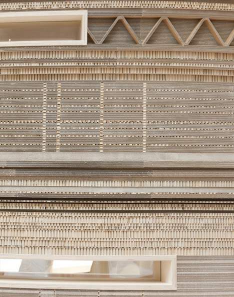
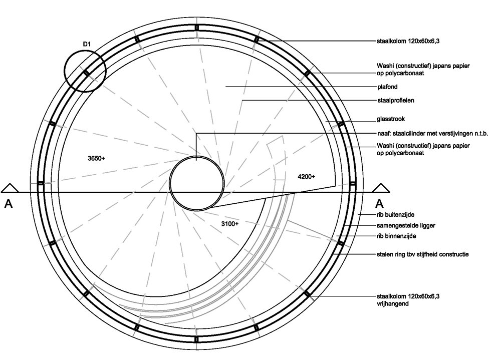
The design was generated by cooperation with a number of other designers. The Square on the plinth could not turn into a monotone, homogenous space. Diversity is required in order to stimulate people, and despite the enormous scale of the building, people are not left wandering around lost in sterile areas. The meeting pavilions designed by Sander Architecten are made from washi paper and paperboard. In combination with the Chinese lantern from washi paper suspended from the skylight, a distinctively tactile experience is created. The paperboard pavilion, which features attractive patterns created by the different uses of the material, is particularly inviting to touch.
Sharing art with the city
The wall annex glass display case is the centrepiece of the Square, and features On the departure and the arrival, a work by Chinese artist Ni Haifeng. The vertical museum contains porcelain objects including scissors, a bottle of Glassex and an iron, each painted in delftware style. The work is featured in the interior, too, with stills and a film about ‘the making of’ on view in the area behind the case.


