商店,零售室内设计,克卢日-纳波卡, 罗马尼亚- 设计师:Bogdan Ciocodeică Studio
- 面积: 90 .0m²
- 年份:2021
- 摄影:Kinga Tomos
- 供应商: Cassina, HAY
- 首席设计师:Bogdan Ciocodeica
- 团队:Bogdan Ciocodeica, Ana Porim, Adelina Cucoranu
- 室内设计:Bogdan Ciocodeica, Ana Porim, Adelina Cucoranu
- 城市:克卢日-纳波卡
- 国家:罗马尼亚
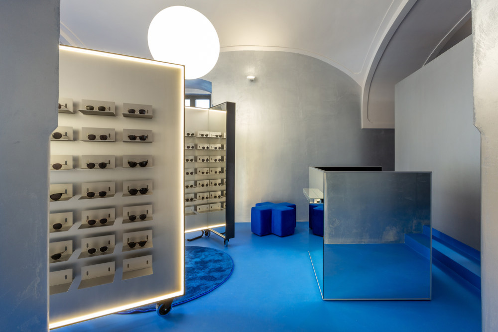
- 设计师描述 | Designer description: Lunet Flagship Store is the second space opened by the eponymous eye ware brand, a continuation of their aesthetic ethos and unconventional approach towards the entire experience of buying eyeglasses. The idea was to borrow a few of the key elements from the first store in such a manner, that it feels like you have stepped into the Lunet universe, but at the same time creating a unique and specially designed space, adapted to the new context.
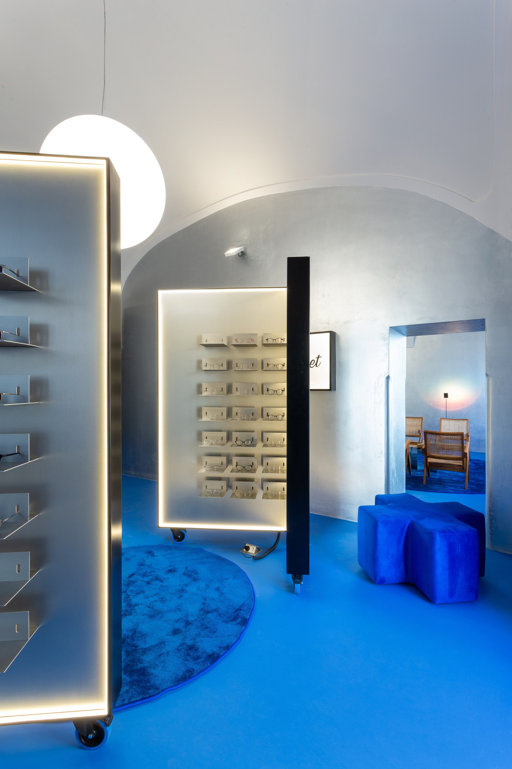
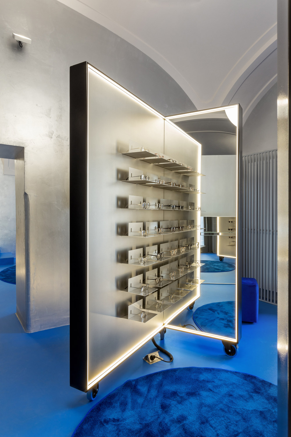
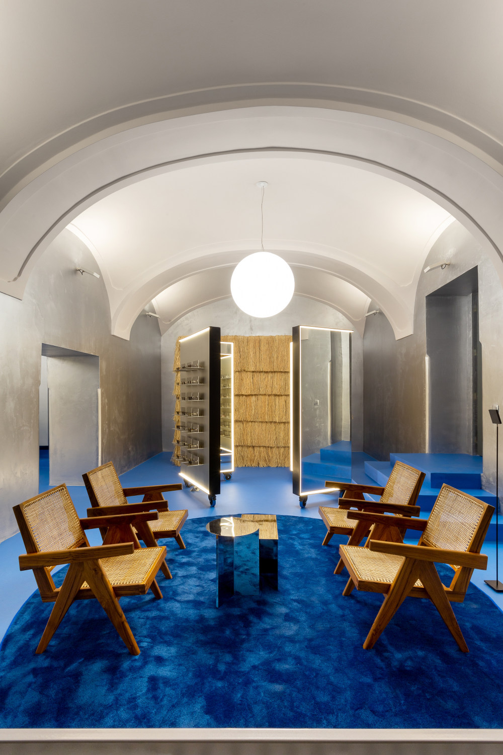
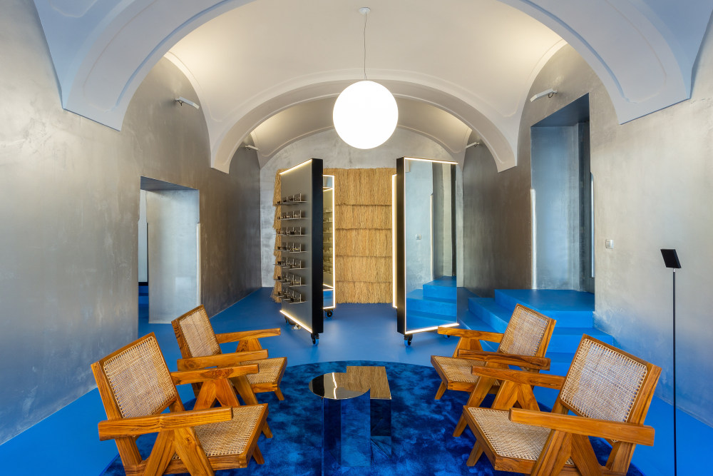
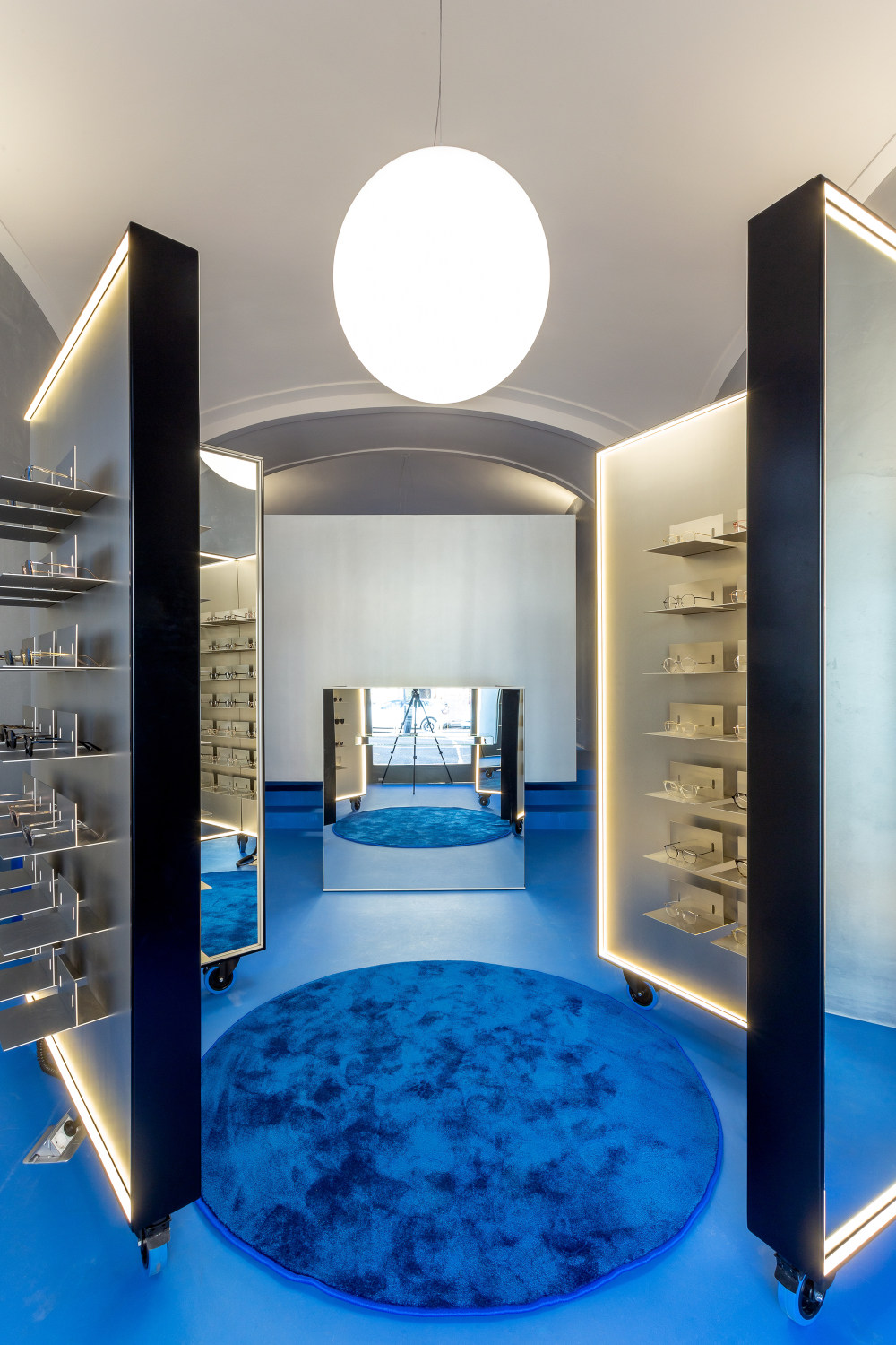
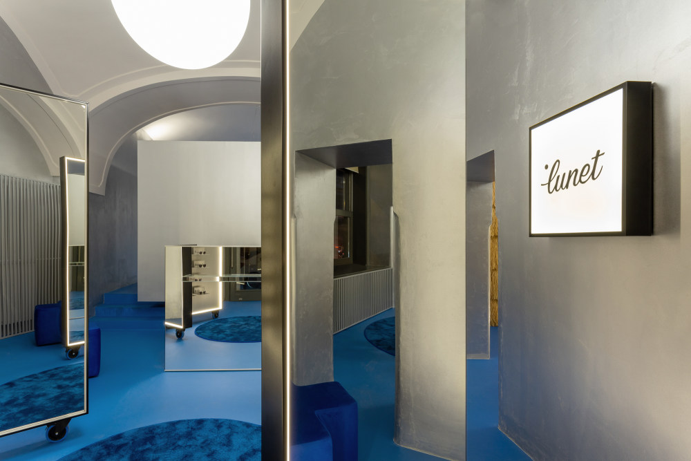
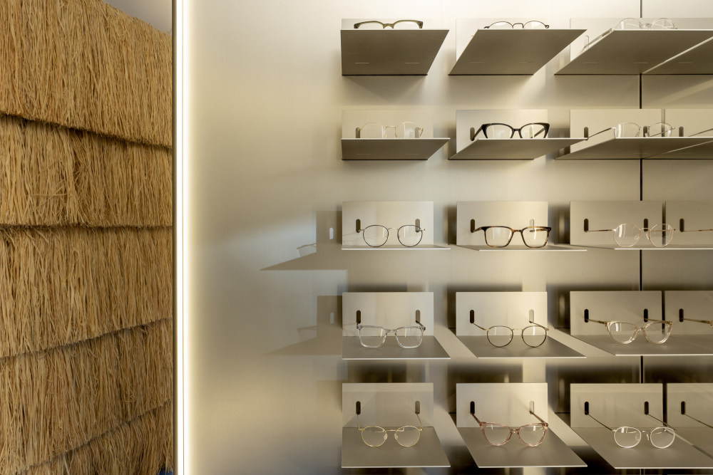
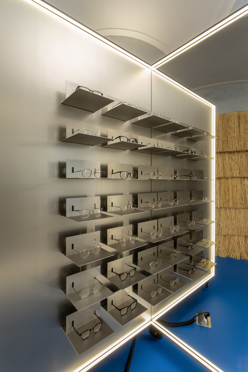
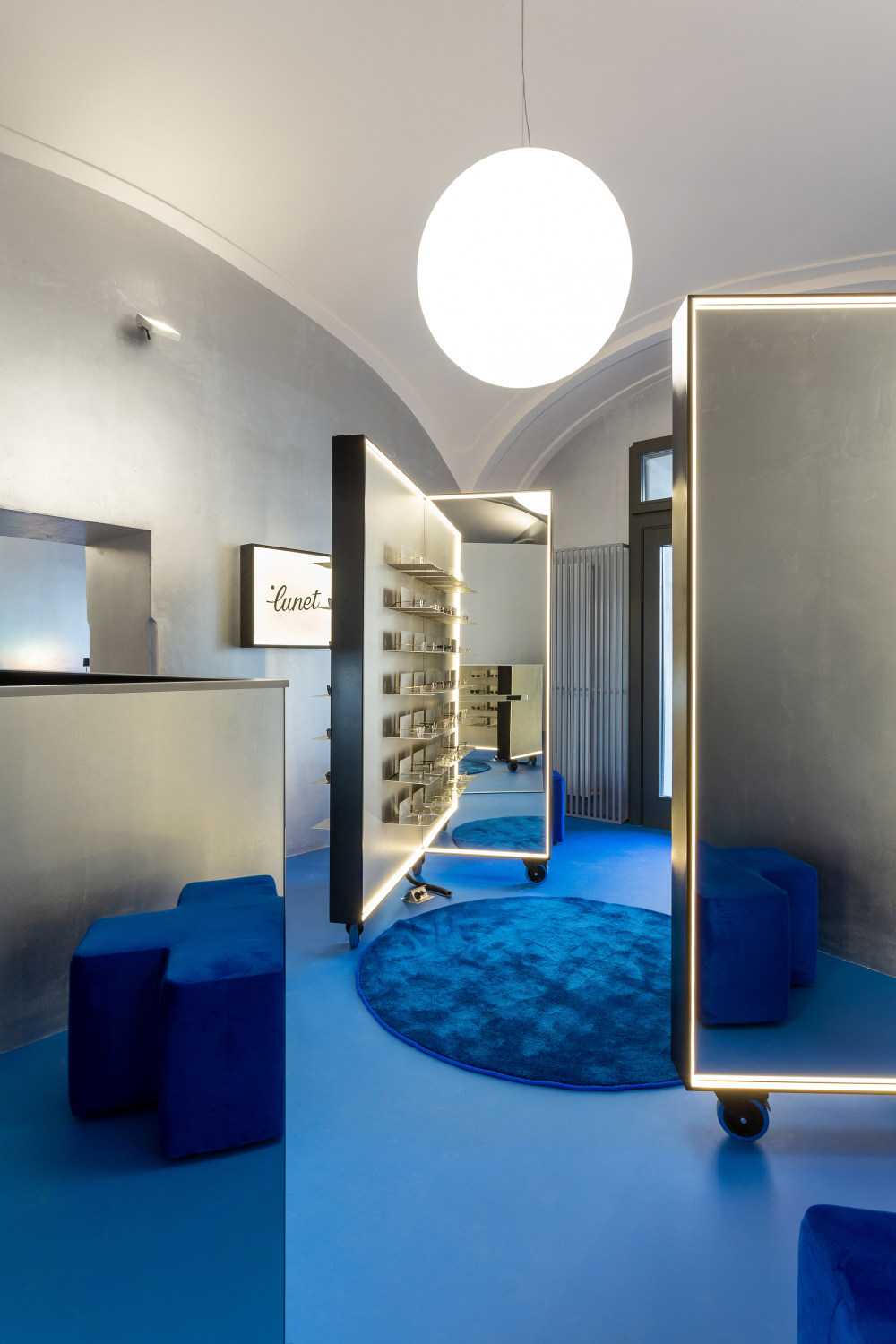
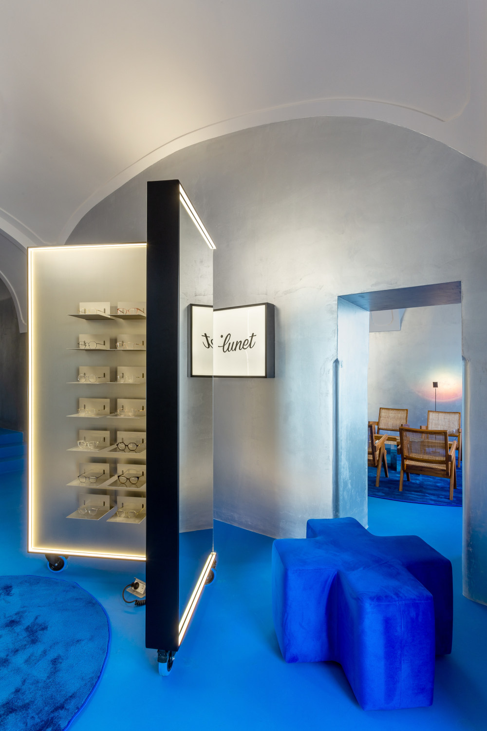
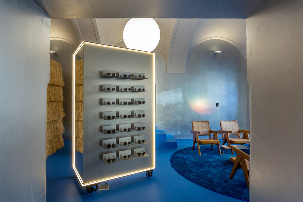
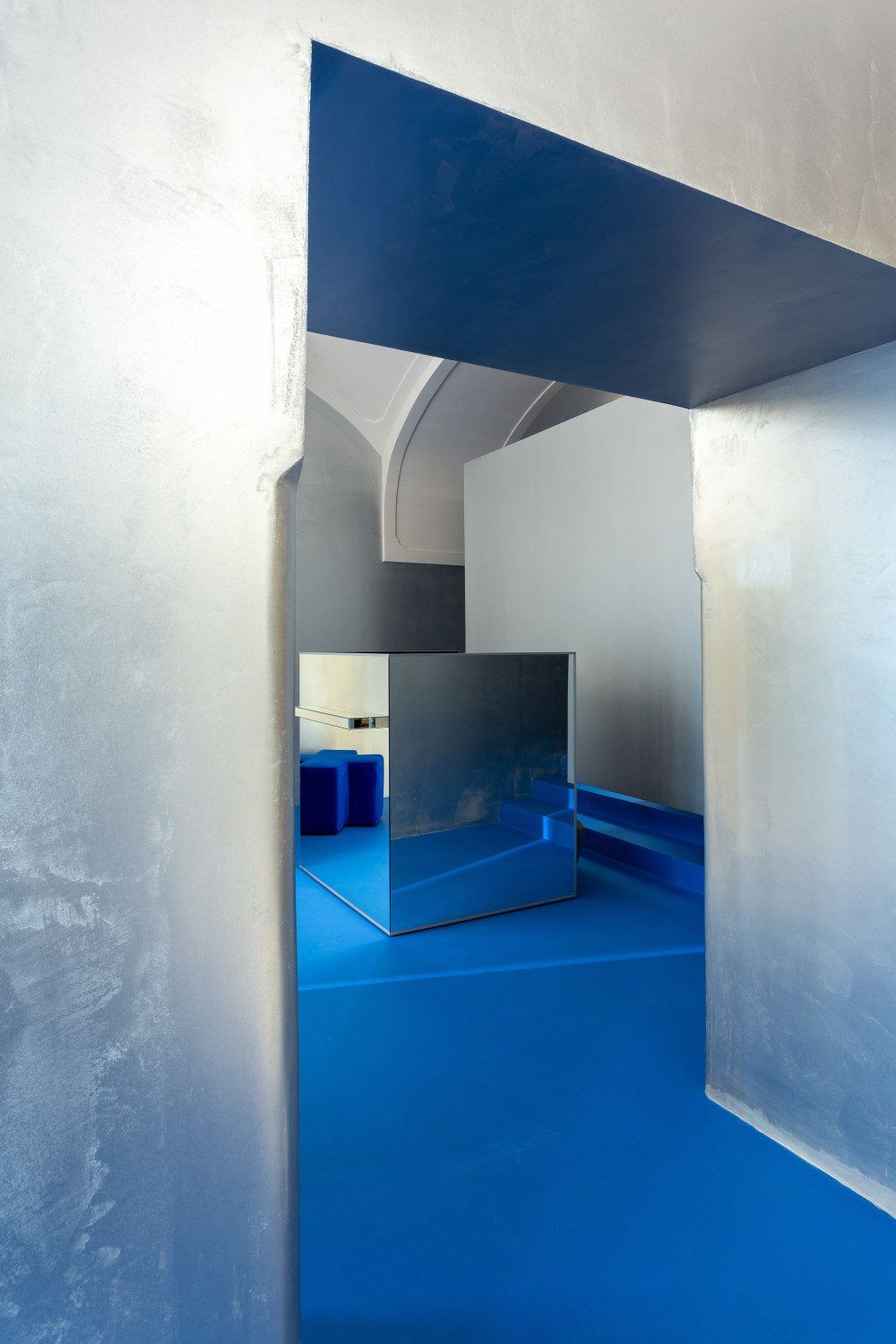
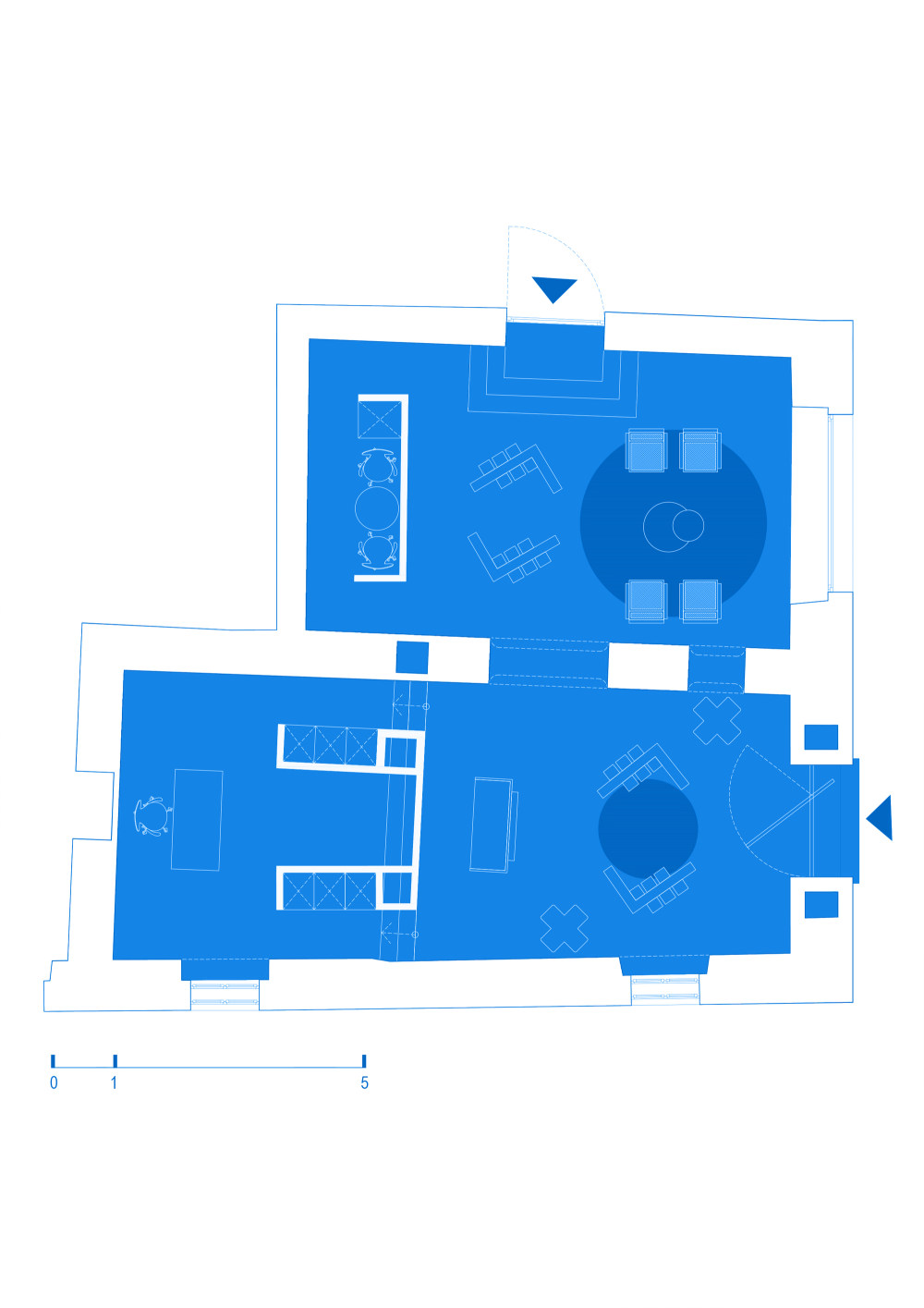
- The most important element was the glasses display, that have the same shape as the ones in the first store, creating intimate trying stations, with the possibility of multiple customers trying on glasses simultaneously and having a private area with enough personal space, adding to the tailored, client focused experience. The second element incorporated into the new design, that references the first store, are the silver walls, a reinterpretation of the original metallic curtain, that act as a gradient surface between the vivid blue floor and the creamy off-white ceiling arches.
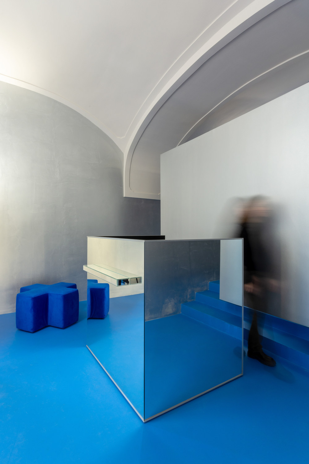
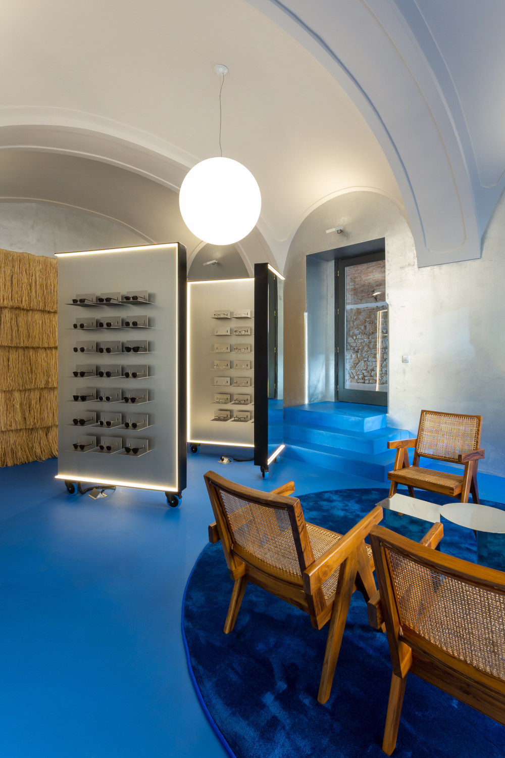
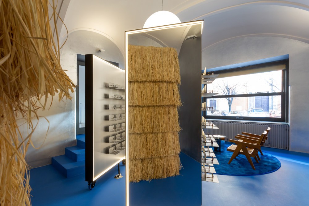
- The space is dominated by the intense color of the floor, a reference and an homage to the Majorelle Blue, on our way to creating an oasis of feel good emotions. The intense, vibrant blue is replayed in various textures from the epoxy resin to the lush carpet, offering the perfect background for all the silver metallic elements and also for the natural, sometimes raw inserts of textures. Located in an 18th century historical building, the store is designed as a conversation between old and new that aims to mitigate almost three hundred years of history with a contemporary aesthetic.
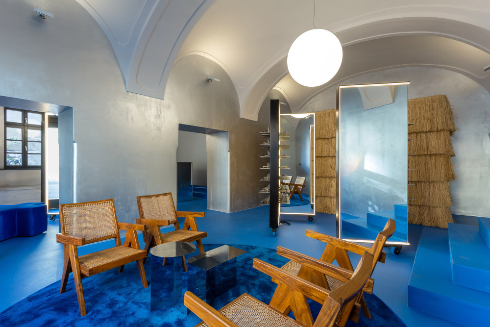
- The metallic silver walls, almost like those of a spaceship descended from the future, enhanced by the sharp aluminum eyeglasses displays, are balanced by the use of natural materials, such as raffia, that envelops the wall of the operational area of the showroom. The raffia is mounted in successive rows and trimmed to reference the traditional reed roofs and is rounded off by the chairs in the lounge area made of teak wood and woven cane. Keeping up the good tradition of their spaces, Lunet is always offering a node to great design, this time around by the use of the Easy Chair by Swiss architect Pierre Jeanneret, beautifully paired and juxtaposed with the mirror Slit tables by the Danish brand Hay.The light plays a crucial role in how the costumer perceives the product and the space.
- LED lines draw the contour of the displays offering uniform light for a better try on experience while the store basks in the light bouncing back from the arches and vaults that are directly illuminated, creating a soft, immersive atmosphere, crowned by the central luminous spheres floating in the center of it all.
- The store design is true to the brand's core values and steers away from the typical austere, clinical looking space, usually associated with eyewear locations, and aims to provide a familiar, calming experience: a serene living room that allows both socializing and intimate discovery. The space is coherent with the brand and with the customers’ need, continuing to reimagine a new type of eyewear experience, one that focuses on emotions and human connection, making the purchase of glasses a memorable, positive interaction.


- 转载自:Archdaily
- 设计师:Bogdan Ciocodeică Studio
- 图片©Bogdan Ciocodeică Studio
- 语言:英语
- 编辑:序赞网
- 阅读原文
|

 发表于 2022-1-19 22:57:03
