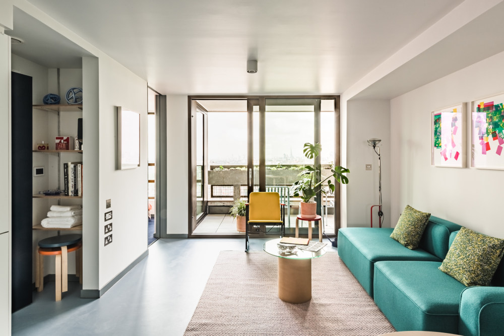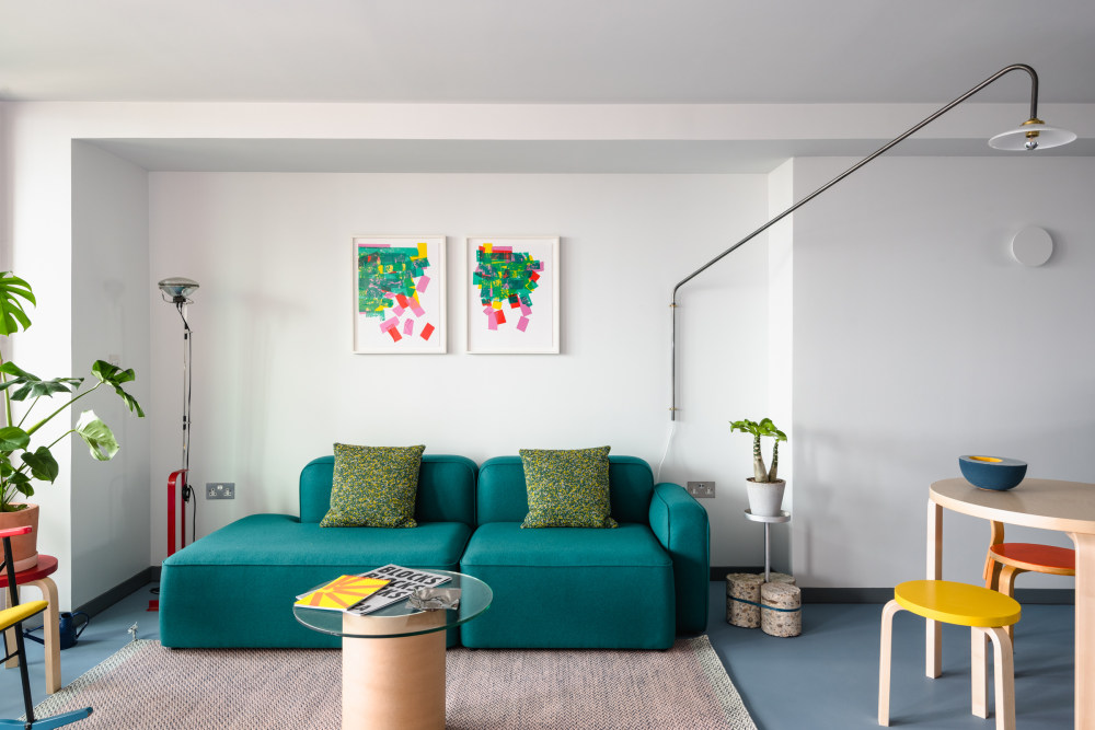


 Inside an Ab Rogers Design's apartment in Balfron Tower
 A complete renovation to the building has resulted in new spaces fit for modern living
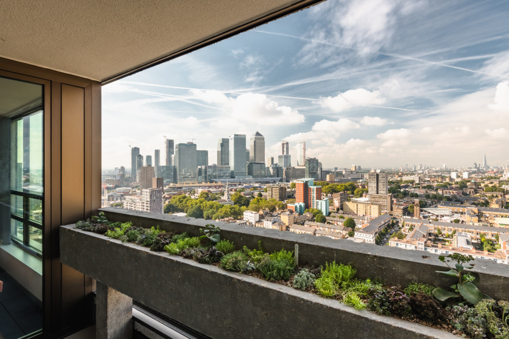
 The view from Balfron Tower
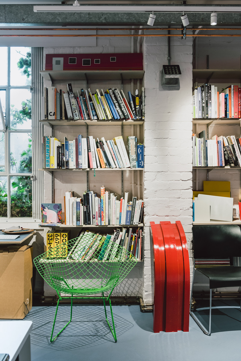
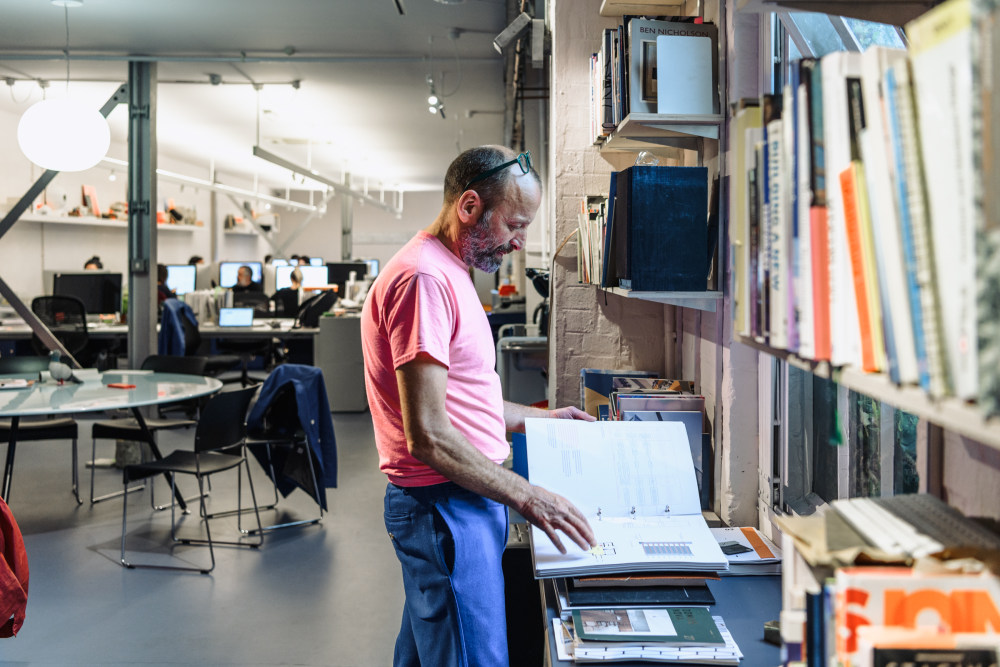
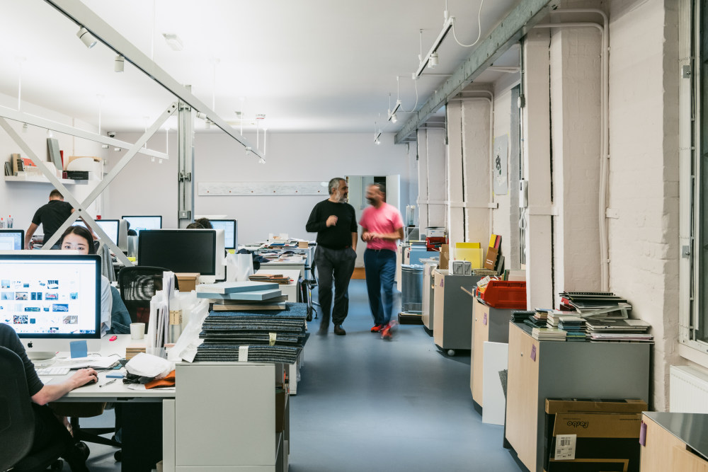
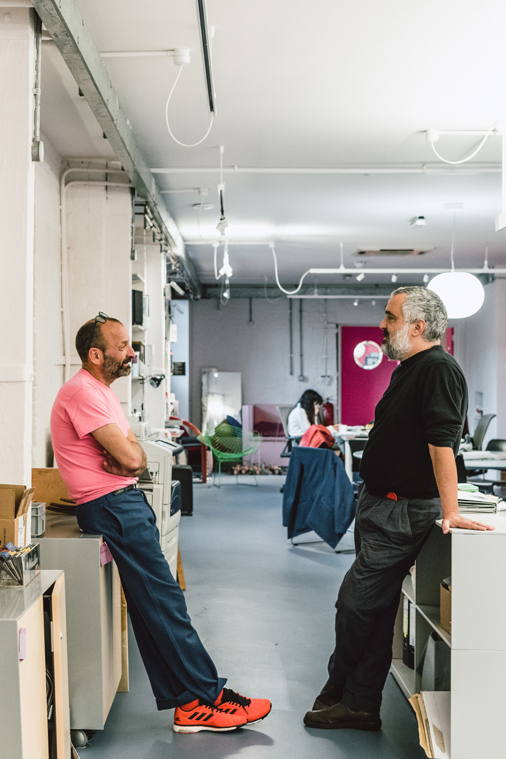
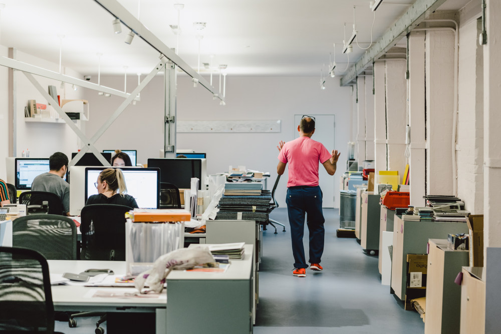
In our A to Z of Modern Living series, we meet some of the hundreds of design studios, architecture practices and interior businesses that make up our Directory, the ultimate resource with which to start designing, building and furnishing your space. Here, we meet Ab Rogers at his Cambridge Heath studio.
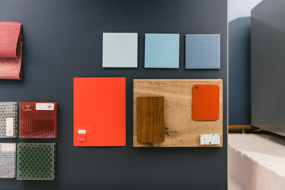
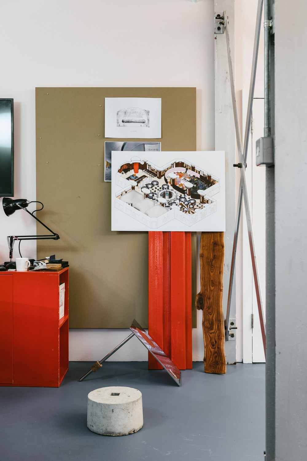
Ab’s eponymous practice, which he co-directs along with architect Ernesto Bartolini, has built its portfolio with gutsy architectural moves for clients like Comme des Garçons, Tate Modern and The Fat Duck – often treated with strong colour palettes (red is a favourite) that pay a debt to Ab’s dad, Richard Rogers – as well as whimsical experiments with names like ‘The ladder that likes the wall’.
Two of the studio’s more recent projects, Balfron Tower – originally designed by Ernö Goldfinger and recently overhauled in collaboration with Studio Egret West – and a new centre for Maggie’s in Sutton, are exercises in sensitive, human-focused architecture, in which questions about how spaces will be used by their occupants have driven the design approach from the get-go. Here, we talk to Ab about the two projects and get his take on what constitutes modernity in design today.
Ab, what was your brief for Balfron Tower and how did you respond?
Ab: “Well we developed the brief with the client, which is something we like to do as a studio. It was about bringing Balfron Tower up-to-date and we talked a lot about creating the ‘ghost of Goldfinger’.
“We wanted to have conversations with him in order to establish what he would do if he was designing now – because life is different now. And I don’t just mean in terms of lifestyle, but technology too; we can work with much bigger pieces of glass, for example.
“The other thing we really wanted to do was to, where possible, conserve the history of the building. And then I suppose the third consideration was that Balfron is this incredibly strong concrete tower, and it is as aesthetic as that. If you took everything away but the concrete, you would still know its Balfron Tower.
“So we established all these criteria, and then we tried to respond to them. We spent quite some time in the archives of RIBA looking at Goldfinger’s sketches. There is a fantastic sketch which is just a clear space looking out, and its really all about the view. A lot of what Balfron Tower is about is levitating people into streets in the sky and looking out, rather than getting too obsessed about the architecture.
“So really we wanted to restore the concrete and create new diagrams which were more relevant to today. Diagrams for living and technology. Once we created these three criterias, designing it became relatively straightforward in some ways.”
And what form does that design take?
Ab: “It has been about peeling back all the layers, removing anything thats unnecessary and then celebrating what youre left with. Its really going back to Goldfingers bones, removing the stud walls, creating this dual aspect and then creating quite a calm interior which is about texture and functions.
“We tried to capture light from the corridor, so you have light filtering in from both sides and then creating a palette of sympathetic colours that we believe Goldfinger would have had enjoyed, based on us looking not just at Balfron and Trellick towers, but also at Willow Road, and his Haggerston School. In the corridors we completely restored all the original tiles, working with Johnson to get a very close match right the way through.
“Then we took advantage of the fact that we no longer needed to use all the service areas for their intended purposes. And, in some of Goldfingers early sketches, he talked about a hobby room and a music room. So we removed the water tanks and the boilers and we filled those 12 voids with shared spaces which can be booked by the residents.
“There’s a music room, a dining room and a kitchen, a hobby room, a yoga room, a gym, and a cinema. Even though you might be living in a one-bedroom flat you can book a music room and play the drums as loud as youd like and no one will complain!
“Its interesting because, in a way, it became a comparative study in modern living, between then and now. We were very much looking to continue the conversation. We looked at contemporaries at the same time, at Alexandra Road and Neave Brown, and all these projects that tried to establish a sense of community. If you look at something like the Isokon Building, its all about just these big communal spaces.”
What did you learn from Balfron Tower?
Ab: “As a studio, I think were really interested in how people live, and how we as designers can improve that. Doing Balfron, I think we’ve learned about trying to encourage a diverse community where people from different worlds can come together.
“For us, projects go a lot further than the aesthetics of the architecture: good design is about creating communities and making sure no one is siloed. So, if when Balfron Tower opens it feels like a gated community, then we’ve really failed as designers.
“If it becomes a part of expanding, without gentrifying, the area then I think weve exceeded at getting people to live together in different ways.
We also loved working with Studio Egret West. It was an extraordinary time collaborating with them and we have no doubt that to design the flats in parallel has resulted in a better solution, higher standards and a better design than if one had done it without the other.
How are you going about that?
Ab: “Well, in addition to doing the flats, we’re working on a really gorgeous project on the corner of the estate, in the former shop designed by Goldfinger, which has been really battered by different uses over the years.
“When you look at it you think its a second rate building but once you peel back the layers, its a gem, an absolute gem. We are going to turn it into what we’re calling the Balfron Bakery.
“It will be a shop, restaurant, cafe and bakehouse, all centred around a big community bread oven. In the morning it will be used to make bread, then, when it’s hot, it will be used for pizza before being turned off and used to cook stew overnight with the residual heat.
“We’re working hard to keep the price of the food right down. And itll be somewhere which is about design in a very reductive way, where theres only whats necessary.
“And then we will work with having local apprentices from Poplar, doing bread and pizza workshops for kids at the weekends and really try to push this whole food education thing.
“Were working with Poplar Harca, who Ive been so impressed with, to make it happen. Theyve done another project with E5 Bakehouse where theyre running a kind of a charity bakery on the Poplar estate, at which people learn to bake bread or to roast coffee, so really plugging into the new food economy.”
And you have also just finished your Maggie’s centre for cancer patients. Can you tell us about that?
Ab: “That also was totally about how people are going to interact with the space – how they should feel, what they need, how they could feel the most ownership of the space.
“So, before doing the architecture we did a diagram of how people would use the space, and then we wrapped the architectural design around that. With Balfron we were working with an existing set of criteria, but with Maggie’s we defined the walls, so we could really play with light.
“Its really designed around the diagram of the sun. The double-height space is due south and as the sun comes round, it passes through all the windows and you get these different shadows forming. Every toilet has a skylight, because toilets in that context need to be places of escape and moments of sadness, potentially.
“You want calm in that space so we used a lot of white but we have moments of color that give you a bit of an injection of light. We have small spaces that are dark, big spaces which are bright. Every door handle has been sculpted so when you open a door you have this interaction with an object that’s inspired by Barbara Hepworth and by pebbles on the beach.
“We really love to try to make things as tactile as possible. Everyone thinks were just about colour but we try to engage all the senses.
“For me its important to cook in a space. We did a workshop at the centre yesterday and we cooked tomato pasta because that sends out a smell across the building. Theres a reality to it, it feels very homely. And I think that thats the same with those apartments: imagining the smell is as important as the light, the texture, the acoustics.
“As a studio, architecture comes from an interior perspective for us. We spend much more time inside the building than outside the building, so we always start from the inside, rather than thinking about grand architectural statements.”
What does modernity in design mean to you?
Ab: “Modernity as a concept gets very confusing to talk about and we very quickly get fixed on the mid-century. My dad says that he was always described as a late modernist and wondered why he was late for everything! ‘Why am I a late modernist?!’, he would say.
“I think that to design today, or be contemporary today, firstly has to be about sustainability because the world is falling apart and we have nutcases running it! As designers, we have a real responsibility to take that seriously.
“It needs to be about finding ways to future-proof buildings. We do a lot of student accommodation and my hope is that we design in an intelligent enough way that the buildings can be reused for something else afterwards.
“It needs to be about generosity, and it needs to go beyond the norm. I am really bored of slick brick facades, which Hackney is covered in, and this sort of echoing of warehouses even though the buildings being built have nothing to do with warehouses. So, I think sincerity is another thing which I think is really important.
“I think there are people doing amazing work at the moment and it’s a very exciting time. But the real modernism, if you like, is for me the buildings which are questioning their function.
“People like Jamie Fobert and Alison Brooks, doing very intelligent sensitive architecture which does not always look the same and is not about a house style. Herzog & de Meuron I find extraordinary because every time they do something different.
“For me, modernism is Junya Ishigamis pavilion at the Serpentine and the experimental playfulness that creates it. So, I think modernism hopefully today is a little bit slippery and not so concrete…”
A to Z of Modern LivingArchitecture- 转载自:The Modern House
- 语言:English
- 阅读原文
|

 发表于 2020-8-4 06:51:34

