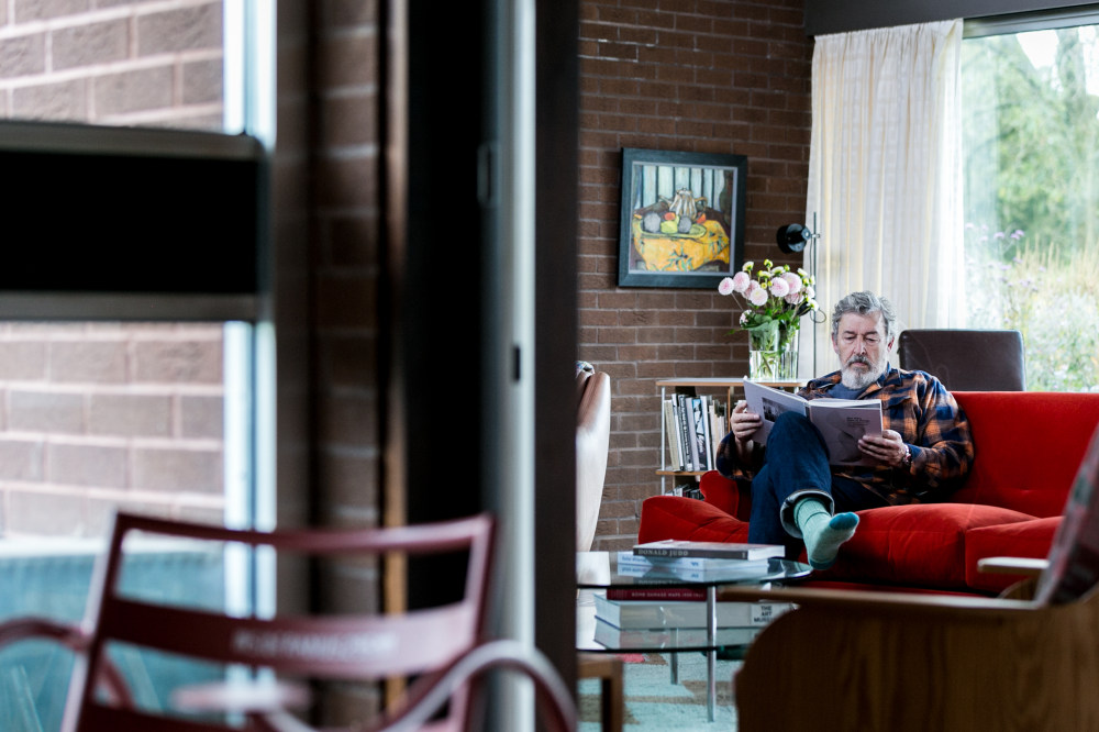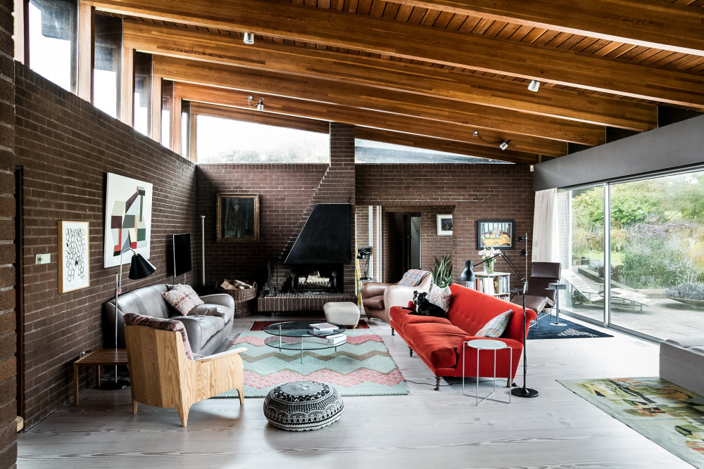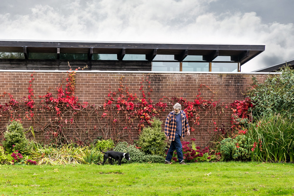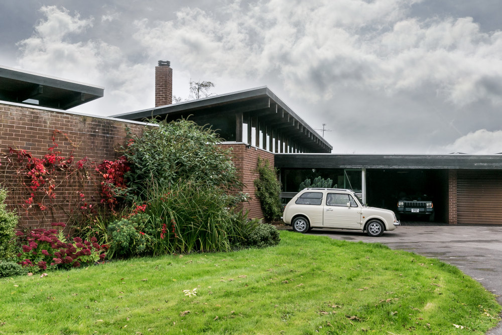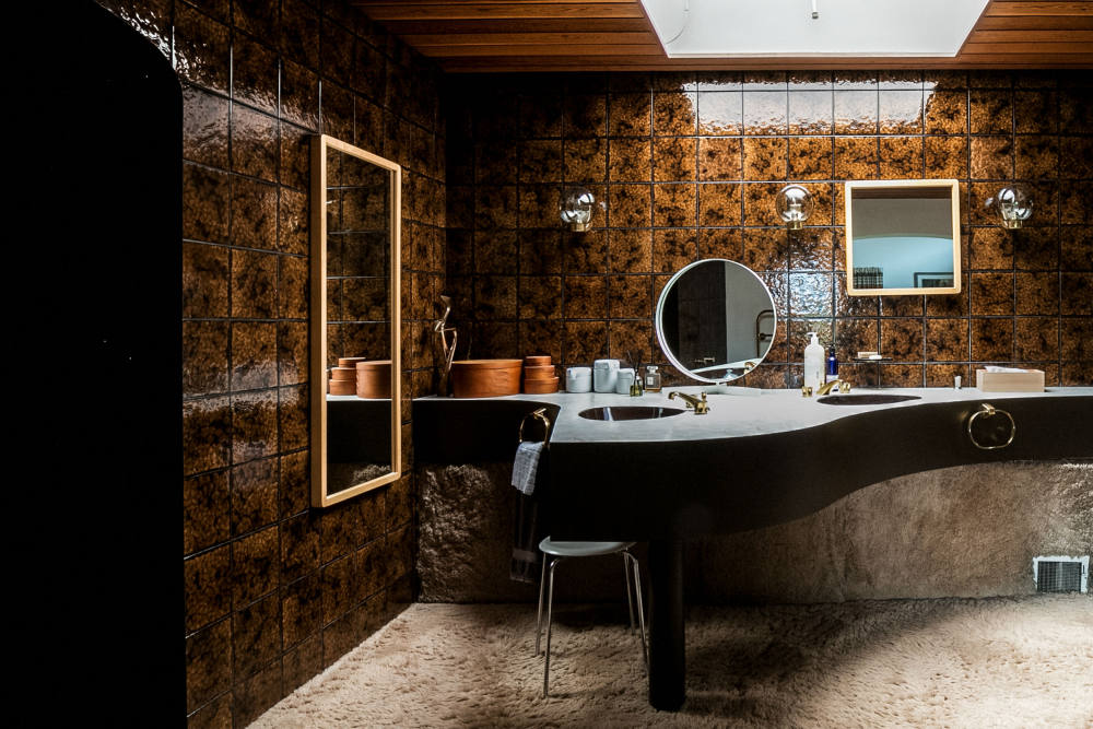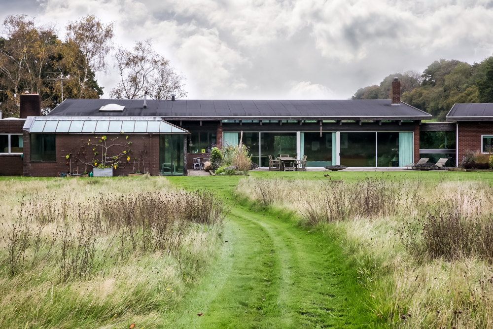


This house was designed in 1974, but we bought it 12 years ago. The original owner had designed it as a kind of fantasy mid-century-style batchelor pad with a chocolate-brown semi-circular sunken bathtub and shagpile carpet everywhere. He got married shortly after he finished it though, to a woman who unfortunately didn’t like modern houses very much! He was definitely a bit of a maverick.
That said, we’ve not really changed all that much. The house is well built from good materials. The two great things about living in a mid-century-style house are the light, and the fact there are no draughts. Having moved from an old Arts & Crafts cottage into a modern house, there’s none of that whistling cold. It’s a very comfortable space.
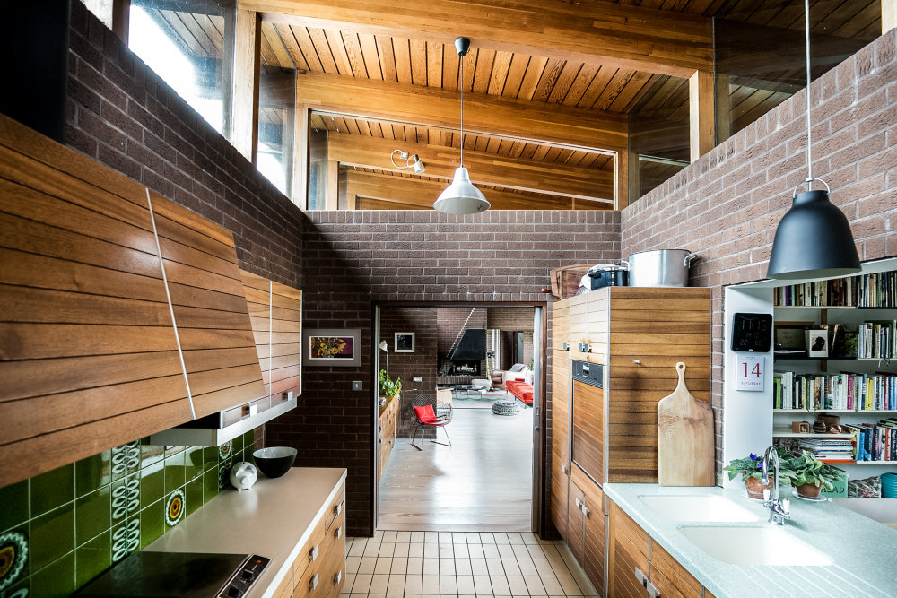
The original design allowed the owner to spend time in the living room and his bedroom wing, then the rest of the space was for his housekeeper. The kitchen had a big glass sliding door into the living room, and the idea was that cooked food was put out on the servery for him. We took that out.
We plan to update the bathrooms next, but the house has seven toilets so it’s a big task. It even has one in the car port next to the front door. Ive never quite worked out why you need a toilet a metre from where you park your car, but there you go. That one has a Barbican sink in, and it’s actually the only one were going to leave.
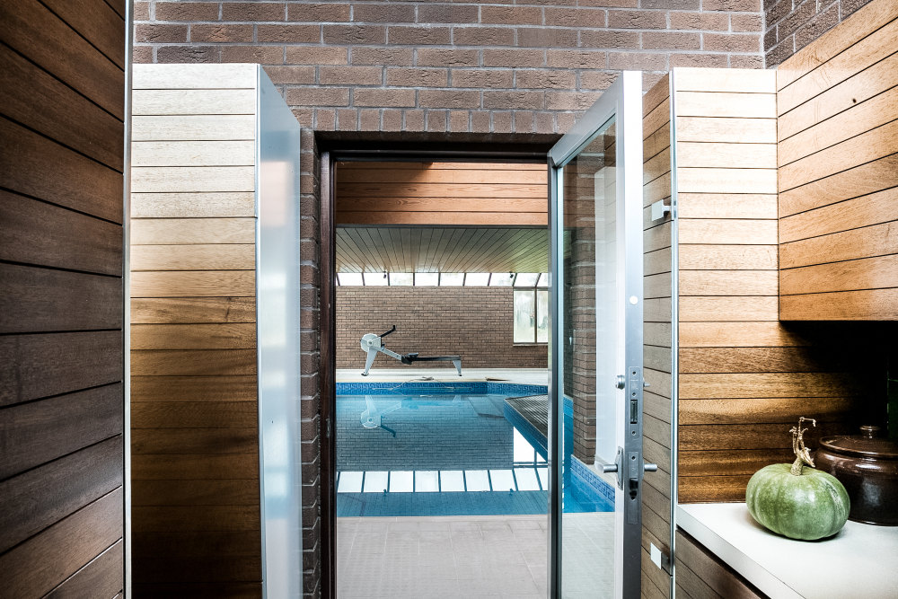
There are two sections to the house: one contains the living room, and the other is a bedroom wing. They’re linked by a glass corridor with an indoor garden. In essence it was built as a three-bed house, but in reality theres much more to it than that; there is an integrated workshop, garages and an annex. It used to have an outdoor pool, but the previous owner filled that in and built an indoor one instead.
The annex, at the back of the house, has another three bedrooms. It’s another unit which is a smaller version of the whole house. It’s great when you have people to stay – they can have their own space.
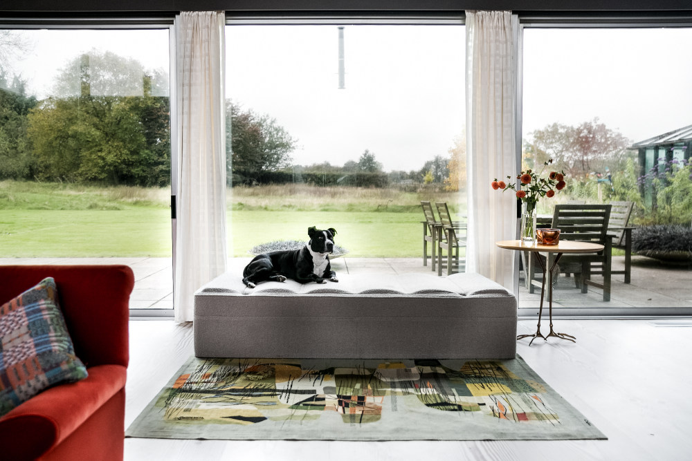
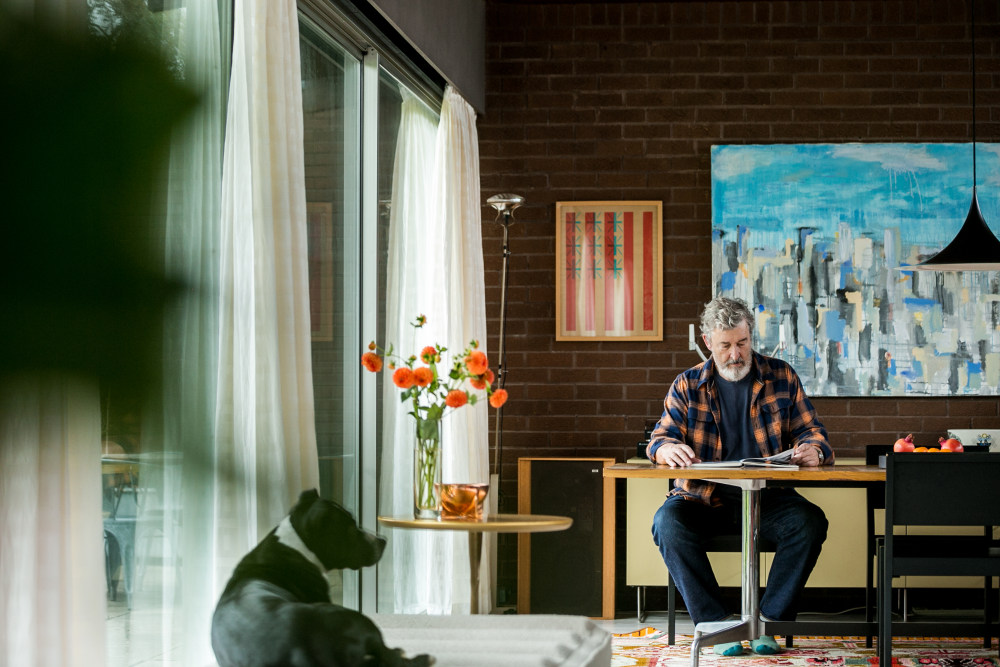
Our kids have grown up now, so it’s just me and my wife (plus my son’s dog, Bruce, who’s staying with us at the moment). Even though it’s just the two of us, it doesn’t feel like you’re rattling around.
We bought it when we moved out of London with the kids. Initially we tried to buy a site to build a modern house on, but it turned out to be pretty impossible. We ended up camping for a year in a cricket pavilion in a friend’s garden. We were about to give up looking for a plot when we stumbled across a small ad for this in a local paper. The owner, too, was having trouble selling it and had got to the point where he’d drawn up plans to knock it down and build a mock Georgian farmhouse instead. But then we turned up, and within 24 hours wed made a deal. Things were quite different 12 years ago, The Modern House hadnt really got going yet!
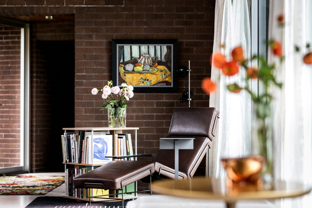
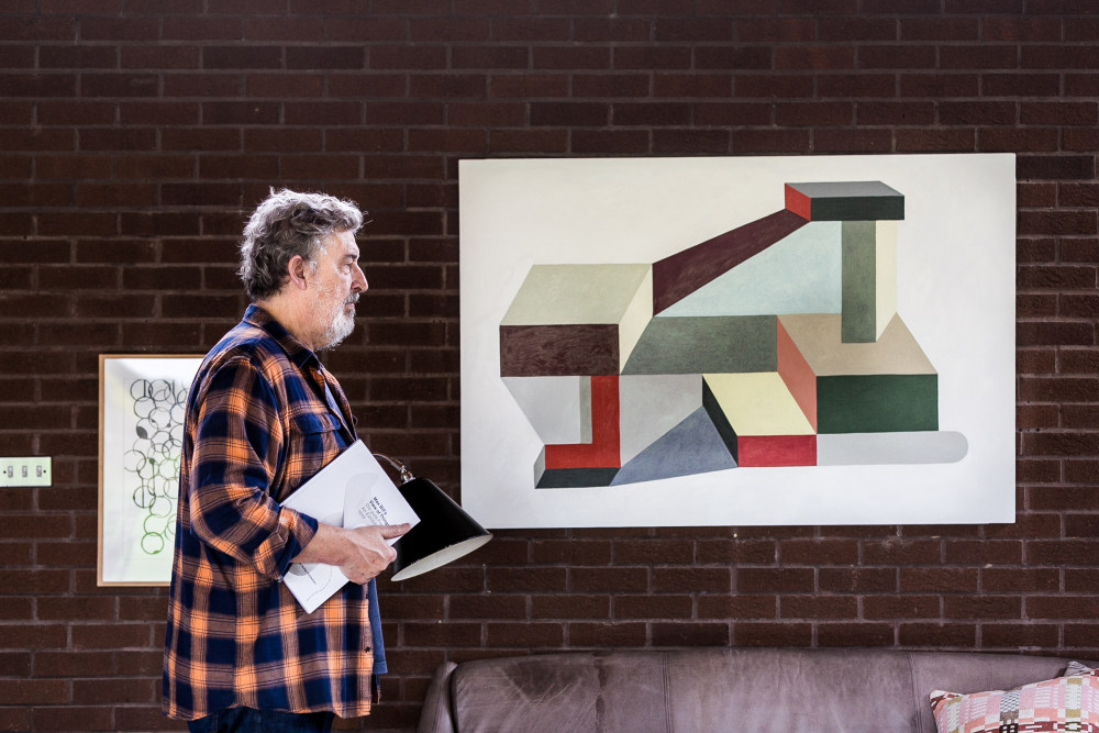
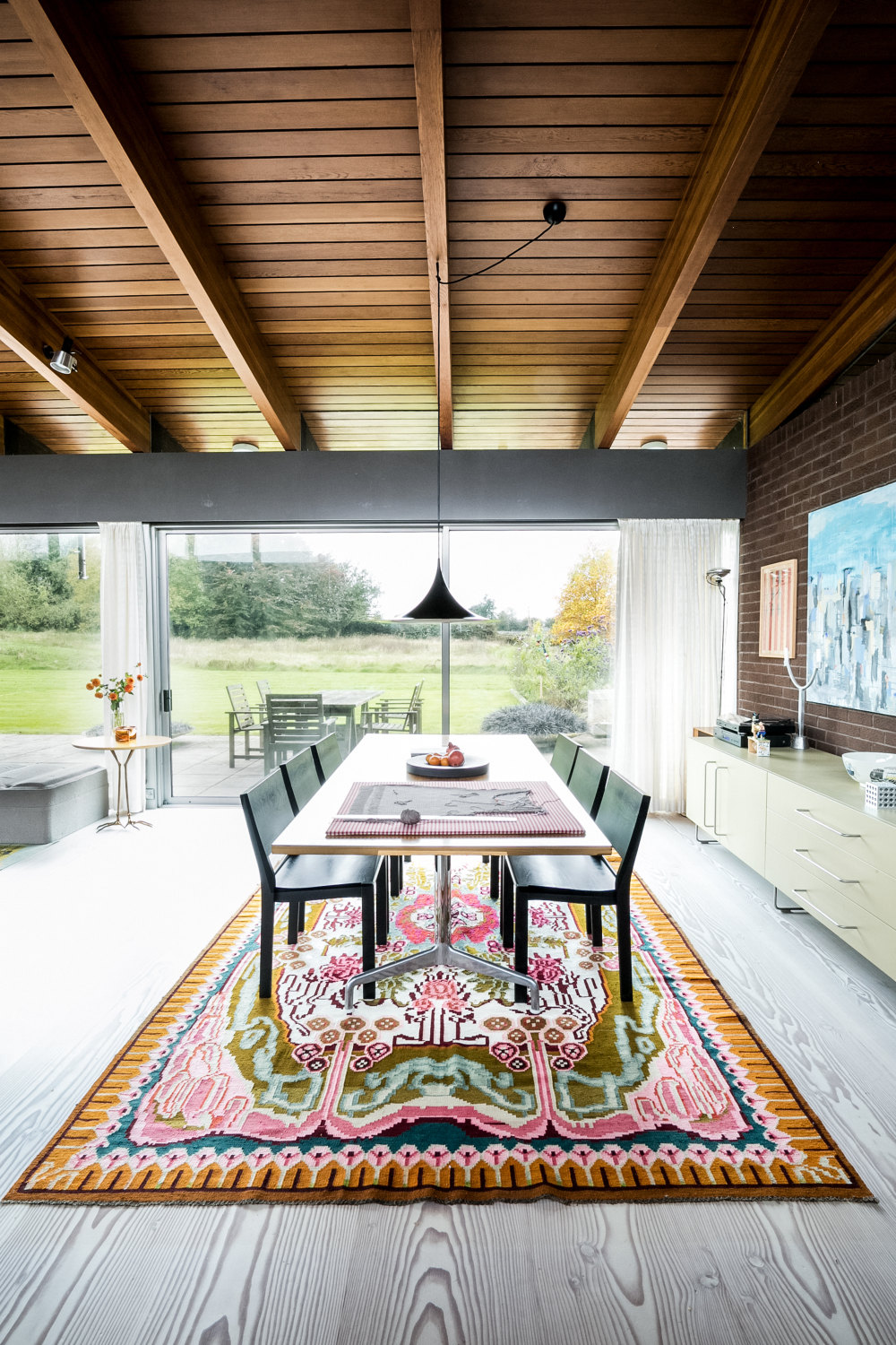
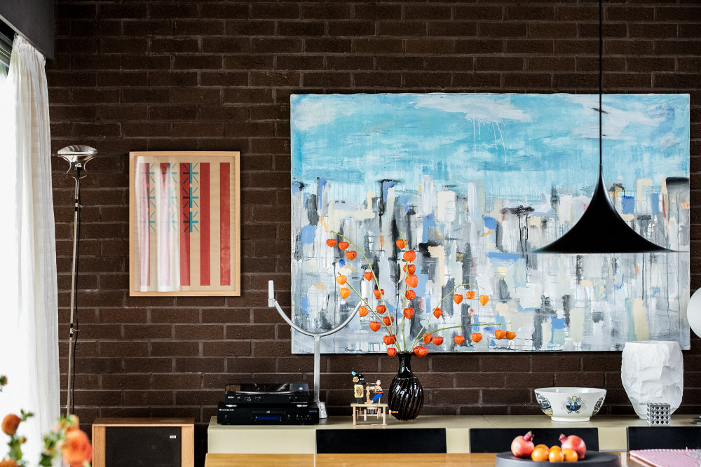
Some of the pieces of furniture are original and came with the house – the Eames dining table, for instance. All the bedroom units are 1970s Heals rosewood. The kitchen is solid mahogany and it’s incredible quality; it’s an original Poggenpohl. That came with the house too.
The Rachel Whiteread daybed in the living room is definitely one of my favourite pieces. She designed it in 1999 for SCP’s ‘Please Touch’ exhibition in Glasgow. We invited seven artists to create pieces of furniture, and I think this was the most successful one to come out of the show.
I really love the Meret Oppenheim table next to the daybed, too. That was made by Simon in Italy; I visited them in Bologna in the mid-90s, before they were taken over by Cassina. The factory owner was in his eighties or nineties, and I bought quite a bit of furniture for the shop from him.
That was about ten years or so after I started SCP in its original guise. I started it in 1985, selling vintage furniture. Initially it was more like a second-hand furniture store. I was buying and selling Arts & Crafts, Modernist and mid-century-style furniture, but I wouldn’t say people were collecting it – they just liked it and used it; it was an alternative to contemporary pieces.
It was much cheaper to buy a vintage cantilevered tubular steel chair than it was to buy a contemporary, which wasn’t very nice anyway. Furniture was going through kind of a bad phase.
I started searching for vintage tubular chairs and getting them rechromed (which sounds a little sacrilegious now, but at the time I was just thinking ‘why would you want to sit on a rusty chair?’). Then I thought, if I was rechroming everything, I might as well just make some new furniture.
So that was it. Very rapidly I found a new building on Curtain Road and moved out of my tiny shop in Notting Hill. When I opened my new space I launched it with a range of furniture by Jasper Morrison and Matthew Hilton. The workshop (which is now Lee Brooms studios) was 100 yards from the shop, so wed just walk the pieces over. Actually the side tables in my living room are the first product I ever made with Jasper – they’re the product that really launched SCP.
Sheridan, what’s your definition of modern living?
Being draught-free?! And I suppose I would say using the best materials and technologies you can get hold of, in an environmentally-conscious way.
If you were to move away, what would you miss most?
The light, and the fact it’s single-storey. I really do love this house, I’d hate to move away from it.
Is there a property on The Modern House website that’s caught your eye?
The Klein House is really stunning. I emailed a Scottish designer friend of mine to put her on to that one actually!
Were offering 10% off at SCP for all purchases made before Christmas Eve. To receive your exclusive offer, simply sign up to our newsletter here, and a discount code will be sent to your inbox.
- 转载自:The Modern House
- 语言:English
- 阅读原文
|

 发表于 2020-8-4 04:02:47
