随着“让专业的人去做专业的事”这一理念深入人心,“买手店”这一集各家之大成的新兴业态开始崛起。凭借着“Fashion buyers”灵敏的时尚嗅觉和超前审美,在众多潮流精品中进一步去粗取精,将最具时尚价值的热门单品汇集一域。
With the concept of let professional people do professional things deeply rooted in the hearts of the people, the emerging business form of buyer shop has begun to rise. With the sensitive fashion sense and advanced aesthetics of Fashion buyers, it can further refine among many fashion boutiques, bringing together the most fashionable hot items.
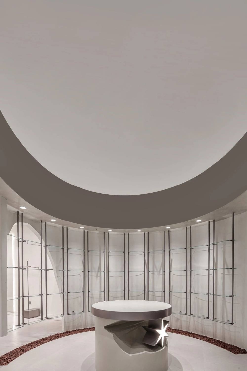
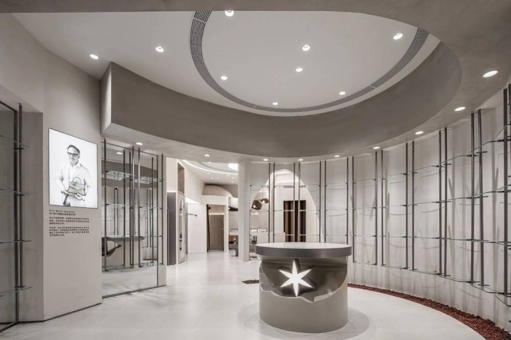
一个有设计智慧的店面如同一盏独运匠心的容器,既要其自身独具创意、内蕴丰富;也要顺应商品肌理,将“衬托作用”拉满,不自行其是,也不喧宾夺主。R.JIE买手店项目深度剖白了主理人的选择逻辑,设计团队充分深挖品牌的调性和追求,所有展示台均为极简风格,能够最大程度将商品的颜色与质感、风格与气质衬托出来,将一次发掘探索式的消费体验呈现给到访的客人。
A store with design wisdom is like a container of originality, which should be unique and rich in connotation. It should also comply with the texture of goods, play full role of the foil effect, and do not go its own way or dominate others. R. JIE Buyer Shop has deeply clarified the selection logic of the manager. The design team has fully explored the tonality and pursuit of the brand. All display stands are of minimalist style, which can set off the color and texture, style and temperament of the goods to the greatest extent, and present an exploratory consumption experience to the visiting guests.
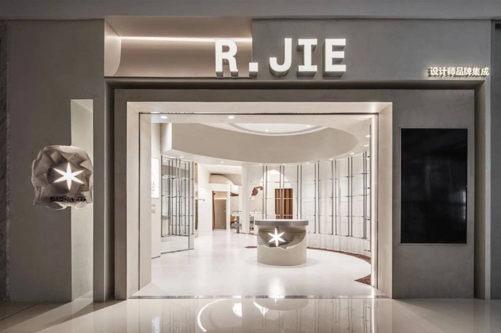
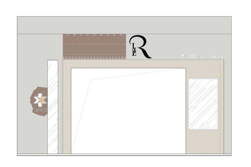
“橱窗就是主理人的杂志封面”,不同于传统品牌的设计理念,买手店门头的设计即是品牌主理人与消费者的首次精神对话。设计团队独辟蹊径,选择了大开距的门面,选色上利用深灰与米白的色彩碰撞,将入口打造成“橱窗中的世界”,主展区的陈列品在外即可一览无遗,同时又彰显了品牌独领风尚的态度和品位。
The window is the magazine cover of the manager, which is different from the design concept of traditional brands. The design of the buyer shop front door is the first spiritual dialogue between the brand manager and consumers. The design team found a unique way, chose the facade with large opening distance, and made use of the color collision of dark gray and rice white to build the entrance into a world in the window. The exhibits in the main exhibition area can be seen at a glance, while highlighting the attitude and taste of the brands unique fashion.
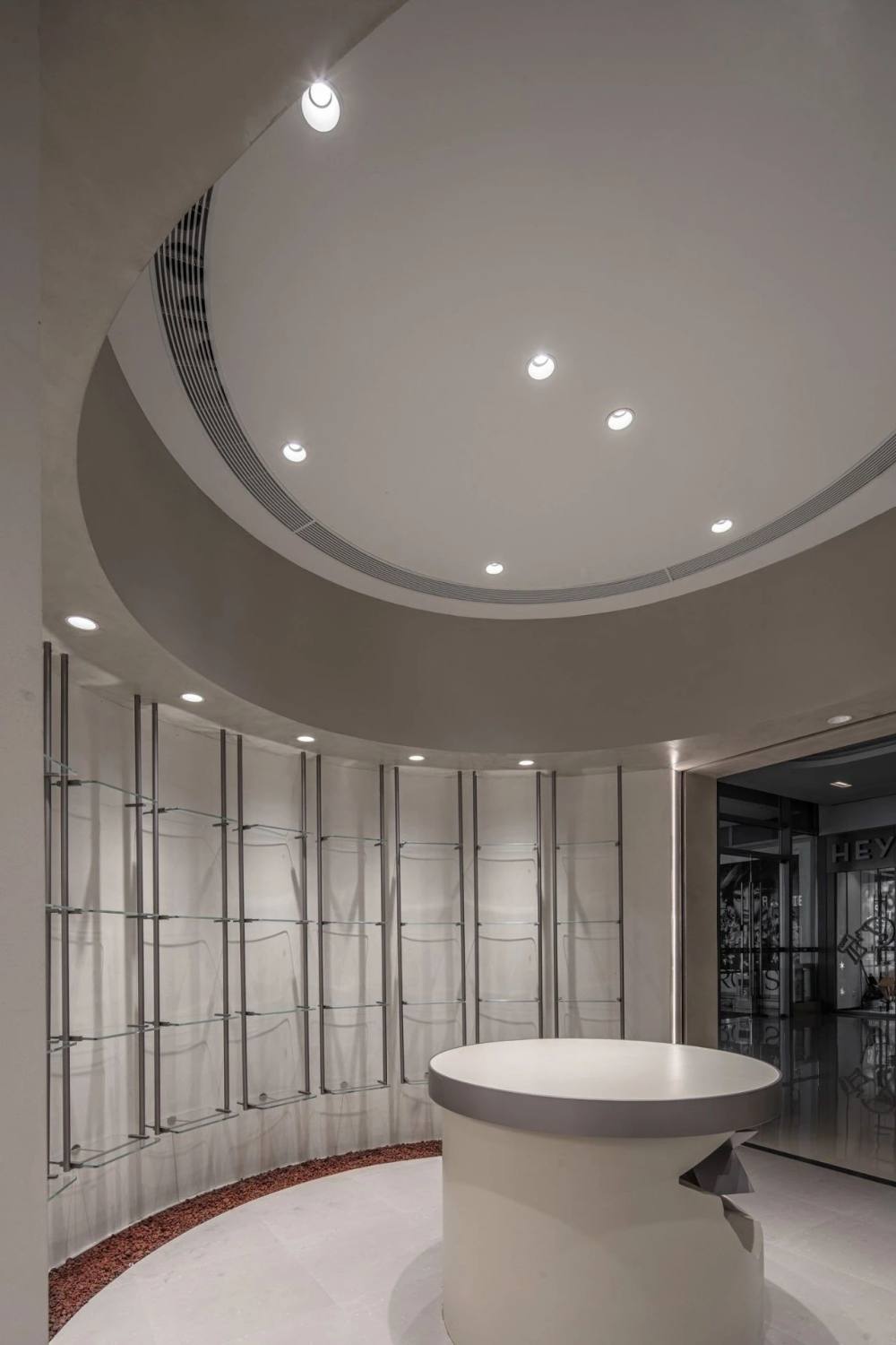
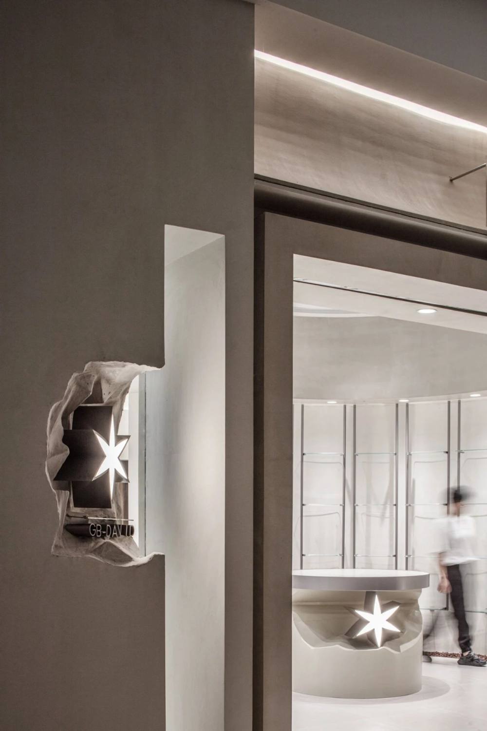
本案作为无锡首家以设计师品牌授权为主、向消费者提供独到体验的时尚设计买手店,也是第一个与GB DAVID CUBE买手项目达成合作的品牌。六芒星是GB DAVID的独特Logo,设计团队以嵌入的形式将其装饰在外墙和岛台上,并于四周打磨出雕凿的痕迹,极致的粗犷与精致在碰撞中融合,回应了品牌手工定制、不求繁杂的定位的同时,具象地阐述出主理人选品过程的严谨与细致。
This case is the first fashion design buyer store in Wuxi that focuses on designer brand authorization and provides unique experience to consumers. It is also the first brand to reach cooperation with GB DAVID CUBE buyer project. Hexagram star is the unique logo of GB DAVID. The design team decorated it on the outer wall and island platform in the form of embedding, and polished the carved traces around it. The extreme roughness and delicacy are integrated in the collision, which respond to the positioning of manual customization and no complication of the brand, as well as concretely expound the preciseness and delicacy of the selection process of the manager.


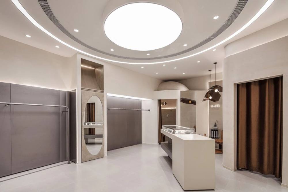
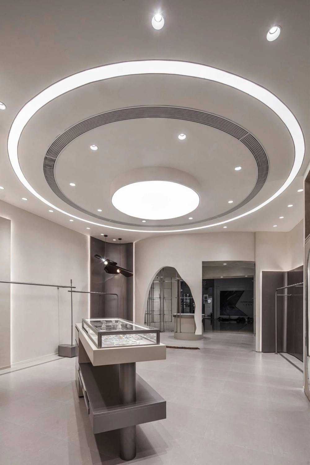
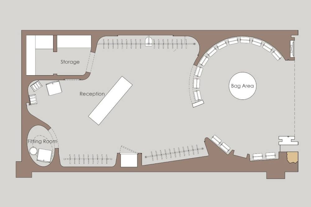
室内借由线面、体块以及色度上的调和,奠定清爽简练的空间氛围,在递进与交互之间诠释出灵动的层次之美。圆与方、曲与直、明与暗的拿捏思考,贯穿整个空间,微妙的平衡打破了棱角分明的常规逻辑,又从动态上将每个功能分区彼此连接。
The interior establishes a fresh and concise space atmosphere by the harmony of line, surface, body and color, and interprets the flexible-level beauty between progression and interaction. The round and square, curved and straight, light and dark thinking runs through the whole space. The subtle balance breaks the angular conventional logic and dynamically connects each functional partition to each other.
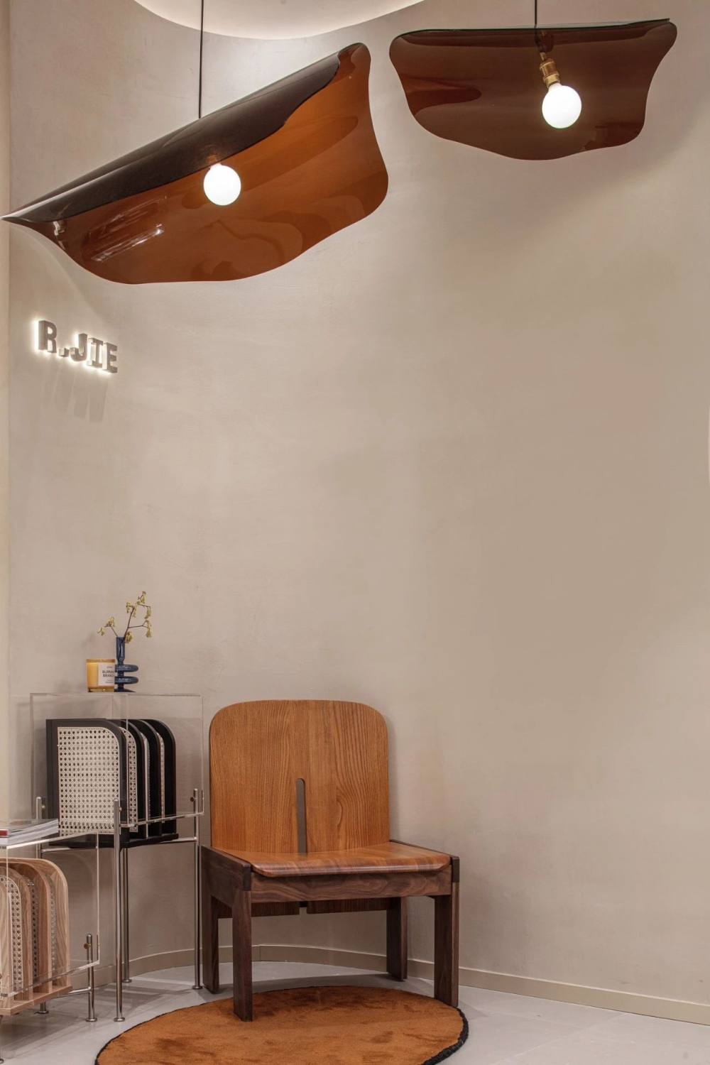
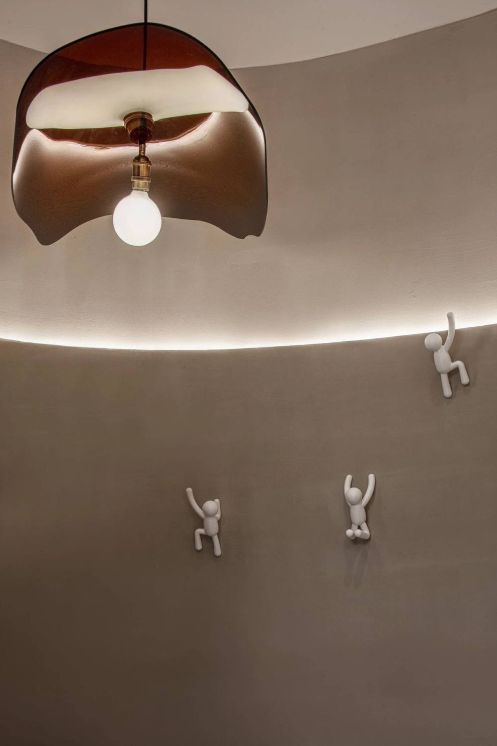
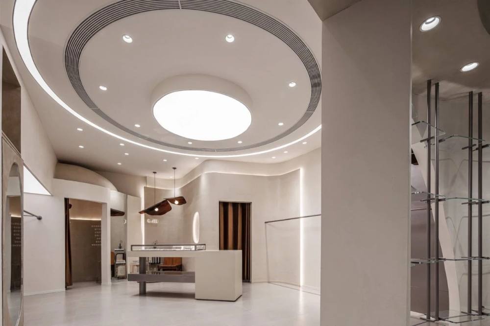
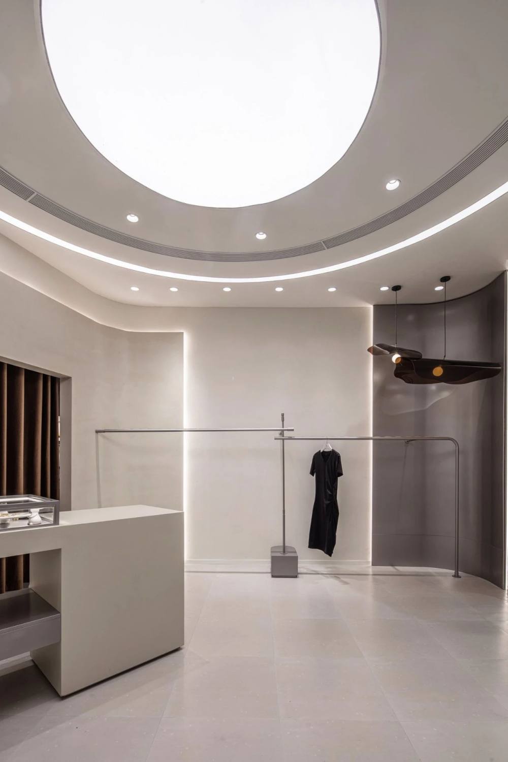
穿过GB手作包展区,服饰陈列区的天花延续了前厅流畅顺滑的线条,有秩散落的主副光源均呈饱满的圆形,柔化了空间不规则外缘带来的边界感,同时使产品本身成为唯一的焦点,自然而然地将消费者的目光吸引到中央的饰品展柜及四周的服饰陈列架上来。地面装饰及展架也同样保有一定的曲度,既能中和大量的金属材质带来的视觉冷感,又可以与天花遥相呼应,藉由多样的线条将不规则空间“化零为整”。
Through the GB Handmade Bag exhibition area, the ceiling of the clothing display area continues the smooth lines of the front hall. The scattered main and auxiliary light sources are full circles, which softens the boundary feeling brought by the irregular outer edge of the space. At the same time, the product itself becomes the only focus, which naturally attracts the attention of consumers to the central jewelry display cabinet and the surrounding clothing display racks. The floor decoration and exhibition rack also maintain a certain curvature, which can not only neutralize the visual coldness brought by a large number of metal materials, but also echo with the ceiling, and divide the irregular space into whole through a variety of lines.
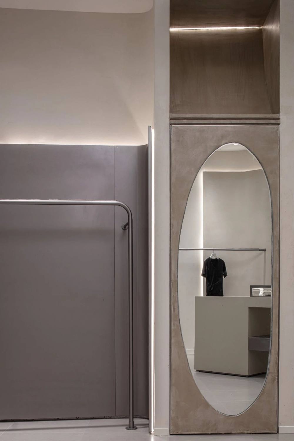

在细节的把控上,团队亦精益求精,所选的装饰灯具与饰物外观低调但质感极佳,其肌理与光泽仿佛手工精细打磨的皮具,与GB DAVID品牌坚持精工手作的理念暗合不宣。
In terms of detail control, the team also strives for perfection. The selected decorative lamps and accessories have an unpretentious appearance but excellent texture. Their texture and luster are like leather goods finely polished by hand, which coincides with the concept of precision workmanship of GB DAVID brand.

当所有商品被摆放到展架的一刻,就不再游离于空间之外,而像是这个空间原本的符号标志。OYTT Design设计团队立足全新的商业思路与时尚视角,将R.JIE买手店打造成一个精美的商品“容器”,以最真实可感的方式,将品牌的个性与理念呈现给每一位消费者。
When all goods are placed on the exhibition shelf, they are no longer outside the space, but like the original symbol of the space. Based on the brand-new business ideas and fashion perspective, the OYTT Design team built the R.JIE Buyer Store into a beautiful commodity container to present the brands personality and concept to every consumer in the most authentic and sensible way.

- Project Name: R.JIE
- 项目地址:无锡市万象城
- Location: Wuxi, China
- 设计单位:无锡欧阳跳建筑设计有限公司
- Design Company: OYTT Design
- Chief Designer: Tiao Ouyang
- 辅助设计师:郭芷萌、周丹凤
- Assistant Designer: Zhimeng Guo, Danfeng Zhou
- Area: 70 square meters
- 设计起止日期:2021年2月
- Design Cycle: February 2021
- 完工时间:2021年5月
- Completion Time: May, 2021
- 主要材料:微水泥、砖、艺术涂料
- Main Materials: Microcement, brick, art paint
- Client Name: Emma
- Light:Miwei Lighting
- Photographer:Ming Chen
|