Minimalism requires meticulousness. It’s a mindset photographer Charlie Schuck and prop stylist Natasha Felker have mastered in their Brooklyn brownstone, where their curated possessions meet a clean palette awash in natural light. Every room, including the backyard garden, is a reflection of their values—and that level of control feels worthwhile right about now.
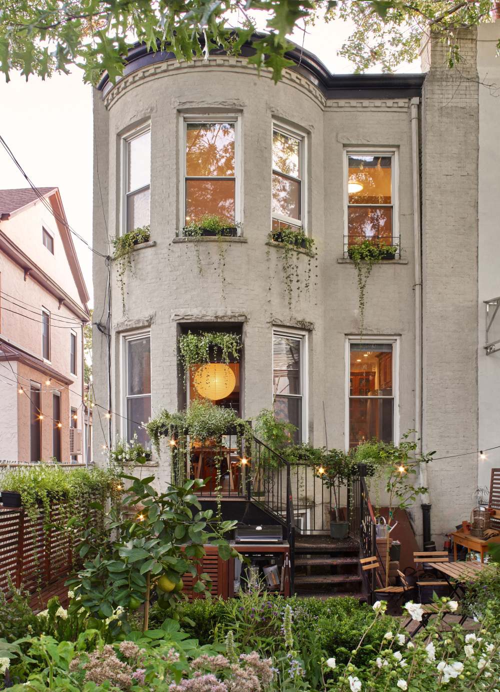
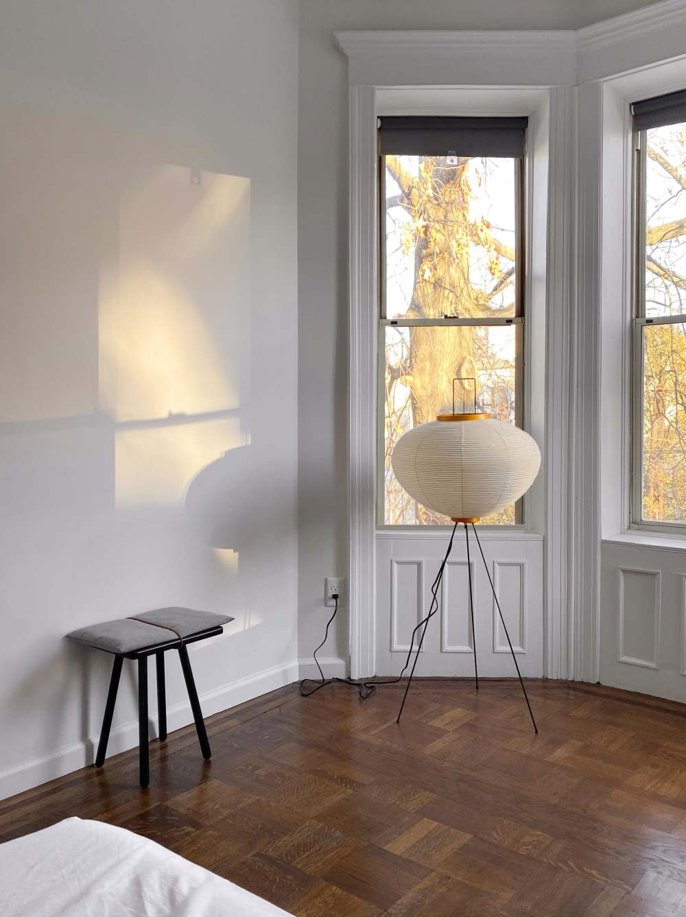
“Photography and the way we view light has a massive impact on our design philosophy and how it relates to photography,” Charlie says. “We purposefully looked for a brownstone that received light from three directions."
“We have taken some flak from friends on the sparseness of our walls,” Charlie says. “Just because there is open space does not mean that it needs to be immediately filled with art. We feel that to live well in our home is to have a dialogue with space, light, and objects.”
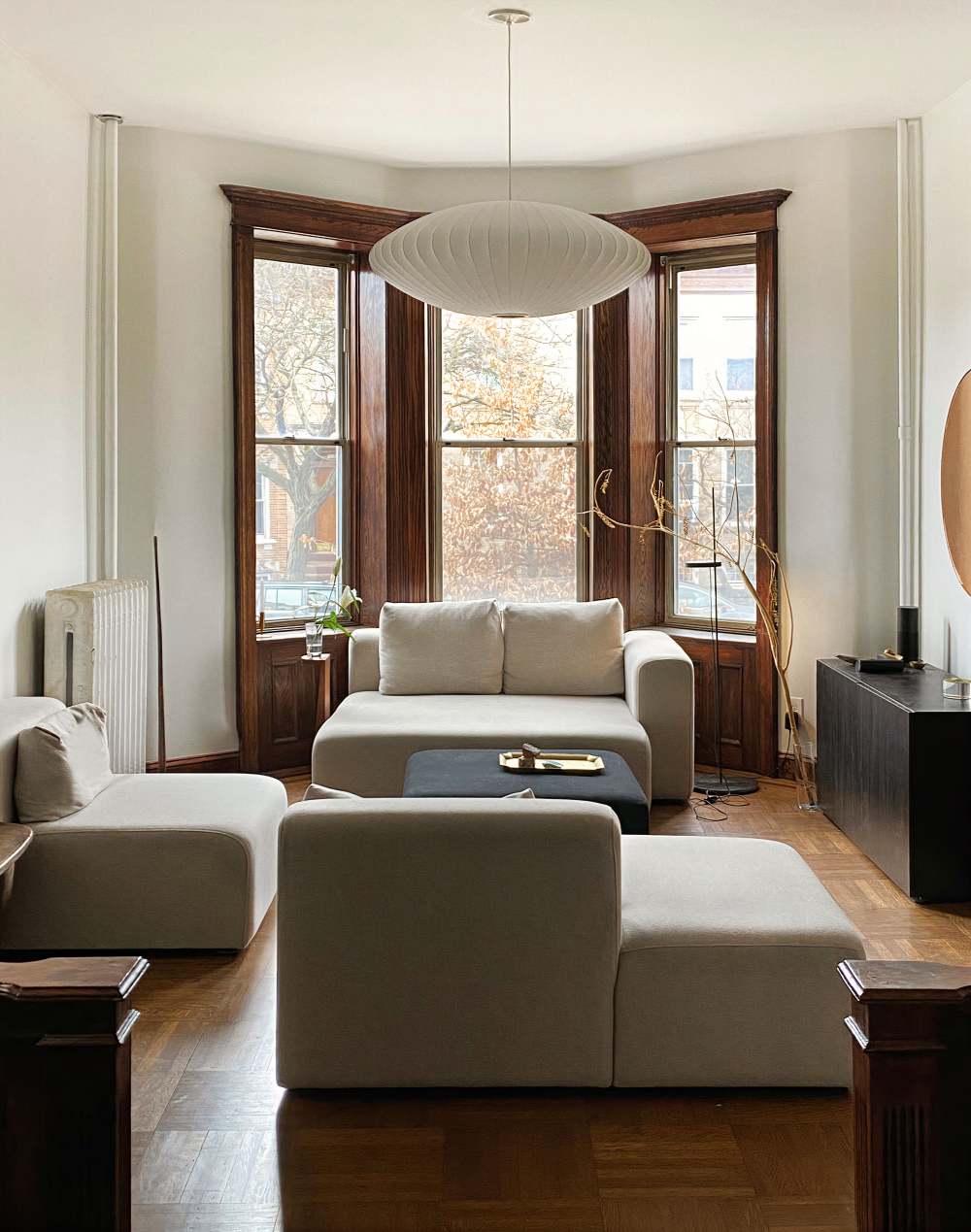
“Natural light in itself is a form of art and we view our place as a way to study it,” adds Charlie. “In the winter, the light comes through the windows differently than it does during the summer. When you study light, you realize that there are many ways for light to get from point A to point B and each way has a subtly different outcome.”
The confidence this couple has in personalizing their place started long before they moved in. They were looking for three bedrooms and a yard spread across multiple stories with windows on three sides. It had to be a rental, but it also needed to welcome a few projects. Charlie and Natasha weren’t as concerned about its location as they were about the place itself—in fact, Charlie jokes that they liked to stay home long before the pandemic. Their search uncovered this 1912 property in Bay Ridge last fall, and they knew it was the one by how horrible it looked in the photos.
“That is always a good sign, because when something is nice and well photographed it creates competition,” Charlie says, with an aside that speaks yet again to his penchant for details. “Our strategy is to prepare all of our paperwork and be ready to go when we find what we’re looking for.”
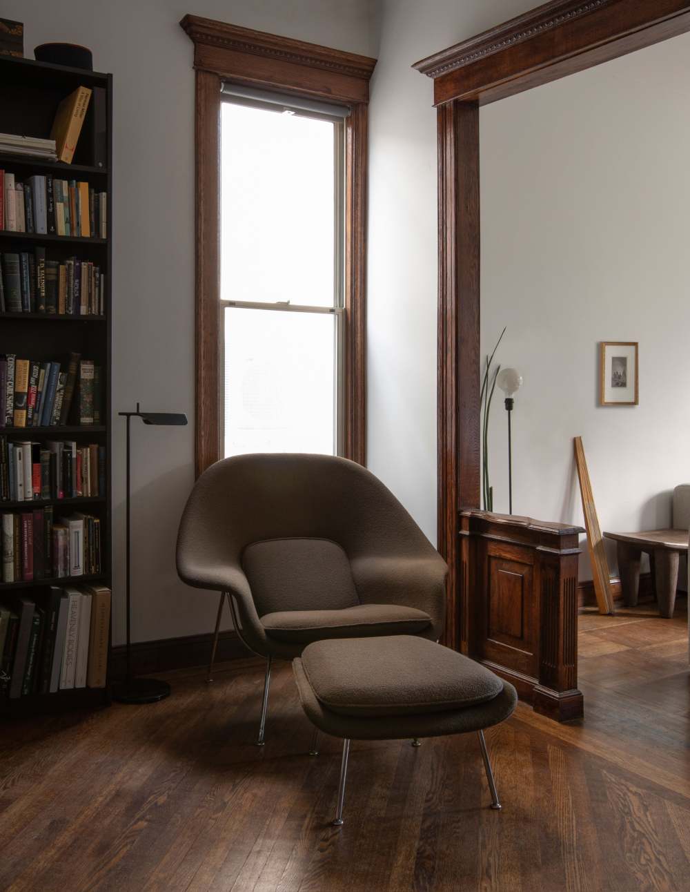
The decor is a perfect example of honoring the details and history, while also being complementary. Here, the classic Womb Chair blends seamlessly into the dark wood accents.
The property’s layout has three common rooms along a hallway leading to a kitchen, and three bedrooms upstairs. Charlie and Natasha relished a century’s worth of architectural flourishes as much as they appreciated an empty garden with no character at all. The way they saw it, this was their chance to make tarnished-yet-promising surroundings feel like home. They wanted to honor its history and speak to their personal tastes—all while sticking to a clear code of minimalist design. “Our philosophy is to create harmony and a sense of continuity by using like-minded furniture, textures, and colors,” Charlie says. “Our personal space needs to nurture and inspire us.”
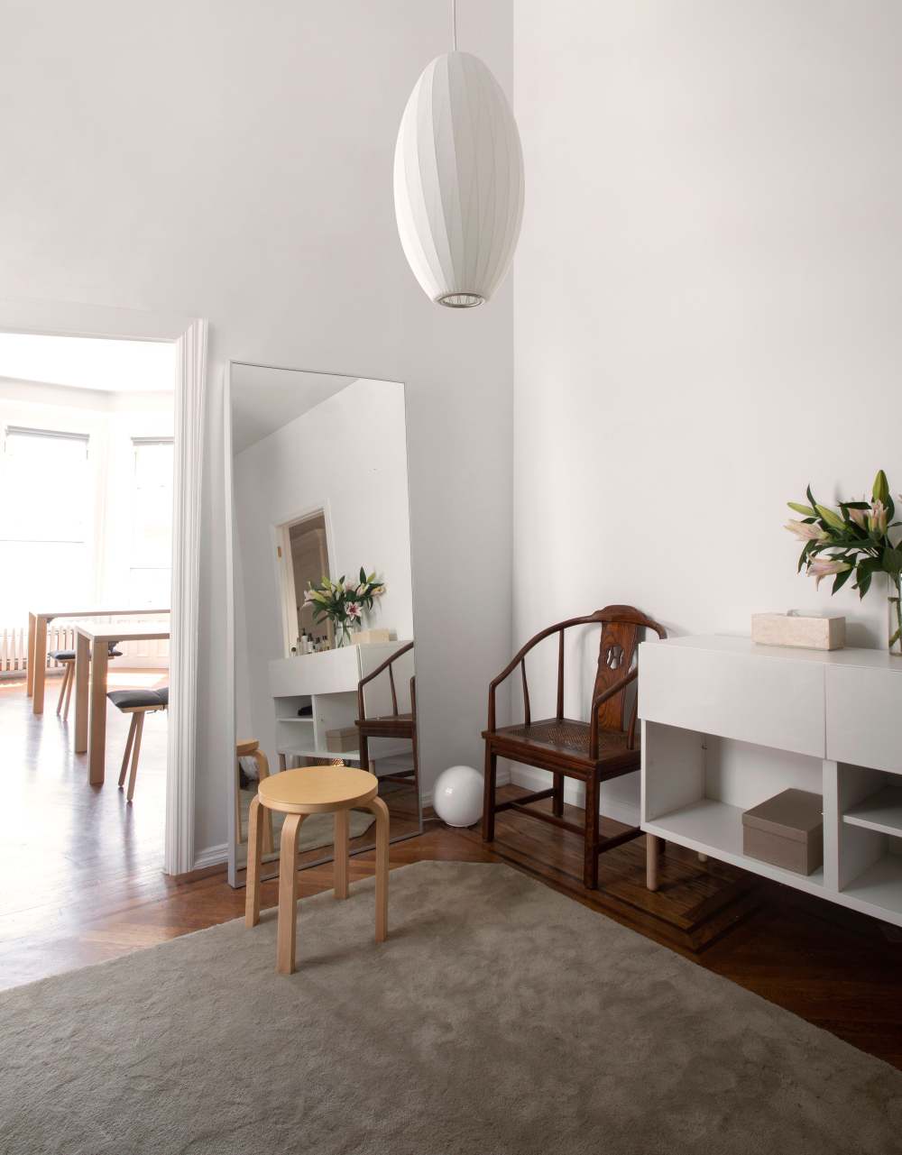
Charlie and Natasha use one of the rooms as their “dressing room” for their clothes, and the third bedroom as their office. The pendant in their dressing room mimics the one in their dining room.
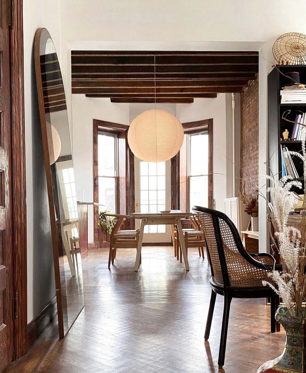
They replaced six light fixtures in the kitchen and dining room to make both spaces feel airier. “The main fixture over the dining table was swapped out for a simple circular rice paper lamp we obtained from the Finnish Design Shop,” he says. “The dining room has a brick wall and dark wood floors, so we used lighter wood items and natural objects as a contrast.”
The couple brought in furniture they already owned, learning a while back that timeless pieces beat trendy ones when budgets and aesthetics are on the line. They changed light fixtures and hardware in just about all the rooms to make them feel more modern, and removed six doors so that it all came across as more spacious. They passed over anything that didn’t conform to their rules, and found missing pieces thoughtfully. Figuring out “how to fill holes” was bound to happen, since the brownstone was 900 square feet bigger than their last apartment. “If there’s something we fall in love with, we first look to see if it can be found used, at a discount, or for a trade,” Charlie says. “If not, then we buy or commission the piece to be constructed.”
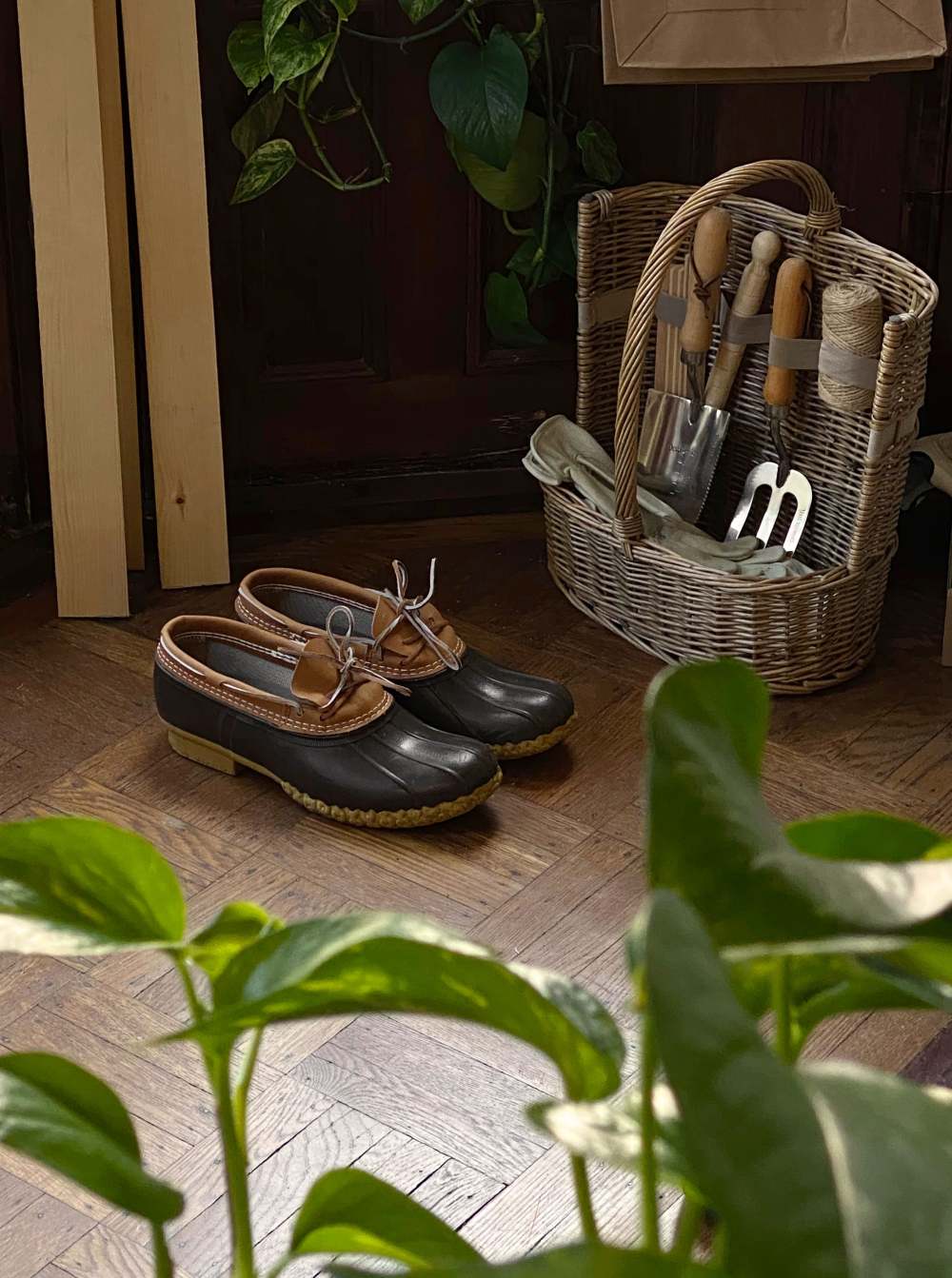
“We never had an outdoor space, and a big part of the move was to be able to garden,” Charlie says.

“There’s a giant learning curve with greenery, and we are still taking notes on what’s working and what’s not,” Charlie says. “It helped that we moved in the late fall last year. This allowed us to focus on the interior through the winter months and then work on the garden in the spring.”
The garden may not look as composed as the rest of the home, but it still showcases the couple’s foresight. “It was built around three main components, and the idea was to have the feeling of an overgrown formal garden,” Charlie says. “We first set stone trails around a hedge square and then added boxes for vegetables. In the middle of the square is a lemon tree surrounded by a bunch of different plants, and in the far corner is an outdoor daybed for naps.”
After so much careful planning, that corner seems only fair.
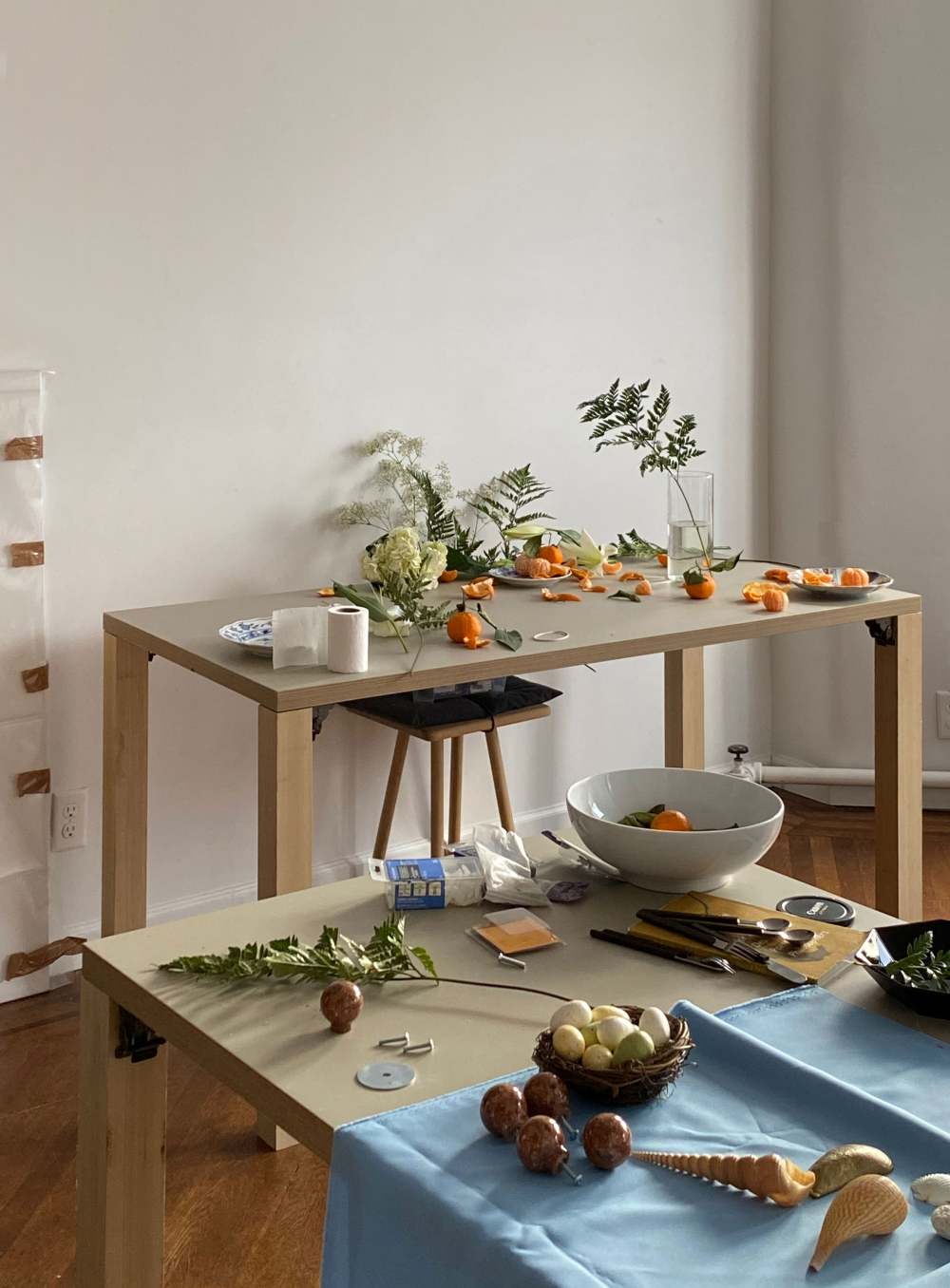
The office of a prop stylist is beautiful sight.
⚒ Do It Yourself
Swap out unsightly light fixtures and hardware “It’s relatively easy to swap out light fixtures and hardware—especially doorknobs,” Charlie says. “Or you can hire someone via TaskRabbit or Craigslist to do this for you.”
You don’t have to hate your bathroom fixtures “This is also surprisingly easy to swap out,” he adds. “Make sure to save the old one and its parts in case you need to put it back when you move.”
Cover surfaces with shoji paper “This takes a bit of patience, and make sure to order a bit more paper than you think you need,” Charlie says. “Shoji paper can effectively cover strangely colored and patterned tile, walls, or cabinets without ruining the surfaces.”
Spring for custom light shades “You can take an old lamp and make a new custom light shade in any color pattern or size you can dream up for only a few hundred dollars or less,” he says.

Thankfully, most of the tiles in the bathrooms didn’t need to be covered. In another bathroom, the tiles remained but Charlie and Natasha swapped out the hardware and lighting.
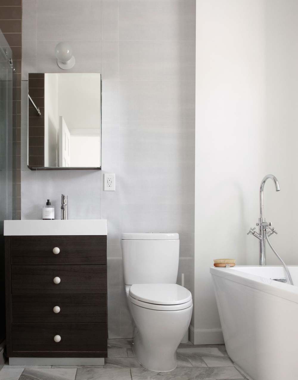
Charlie and Natasha covered mismatched tile in the master bathroom with Japanese shoji paper that they cut and adhered to the wall. “This paper is slightly transparent and easy to remove when needed,” he says.
|

 发表于 2020-10-2 02:43:13


 已绑定手机
已绑定手机


