Opening Saturday, November 21, 2020
5 STRATEGIES
CAMPUS: INTEGRAL EXPERIENCE
POROSITY: SEVEN POROUS GARDENS / SOCIAL SPACE
LIGHT: LUMINOUS CANOPY
CIRCULATION: GALLERY ROOMS AND OPEN FLOW
ARCHITECTURE: COMPLEMENTARY CONTRAST
CAMPUS: AN INTEGRAL EXPERIENCE
Today the Museum of Fine Arts, Houston, has a unique chance to expand and unite its campus as an integral experience open to the community. We envision a new horizontal extension of landscape as a unifying character of the entire Fayez S. Sarofim campus. The new 164,000-square-foot museum building shaped by gardens of horizontal porosity is open on all sides. A public plaza will be integrated with the new 93,000-square-foot Glassell School of Art, which was completed in 2018.
To realize a horizontal campus unity, all parking will be below ground. Visitors arriving by car will begin the museum experience in a lower arrival hall and sculpture court, directly connected to the new lobby and the Caroline Wiess Law Building.
The Lillie and Hugh Roy Cullen Sculpture Garden by Isamu Noguchi is horizontal and slow-moving. We envision the new Brown Foundation Plaza as a space of activity, complementing these spaces of contemplation and reflection, extending the inspiring character of the new MFAH all along Montrose Street. All the street edges of the museum building will be open and inviting, celebrating qualities of an urban campus.
POROSITY: SEVEN GARDENS / SOCIAL SPACE
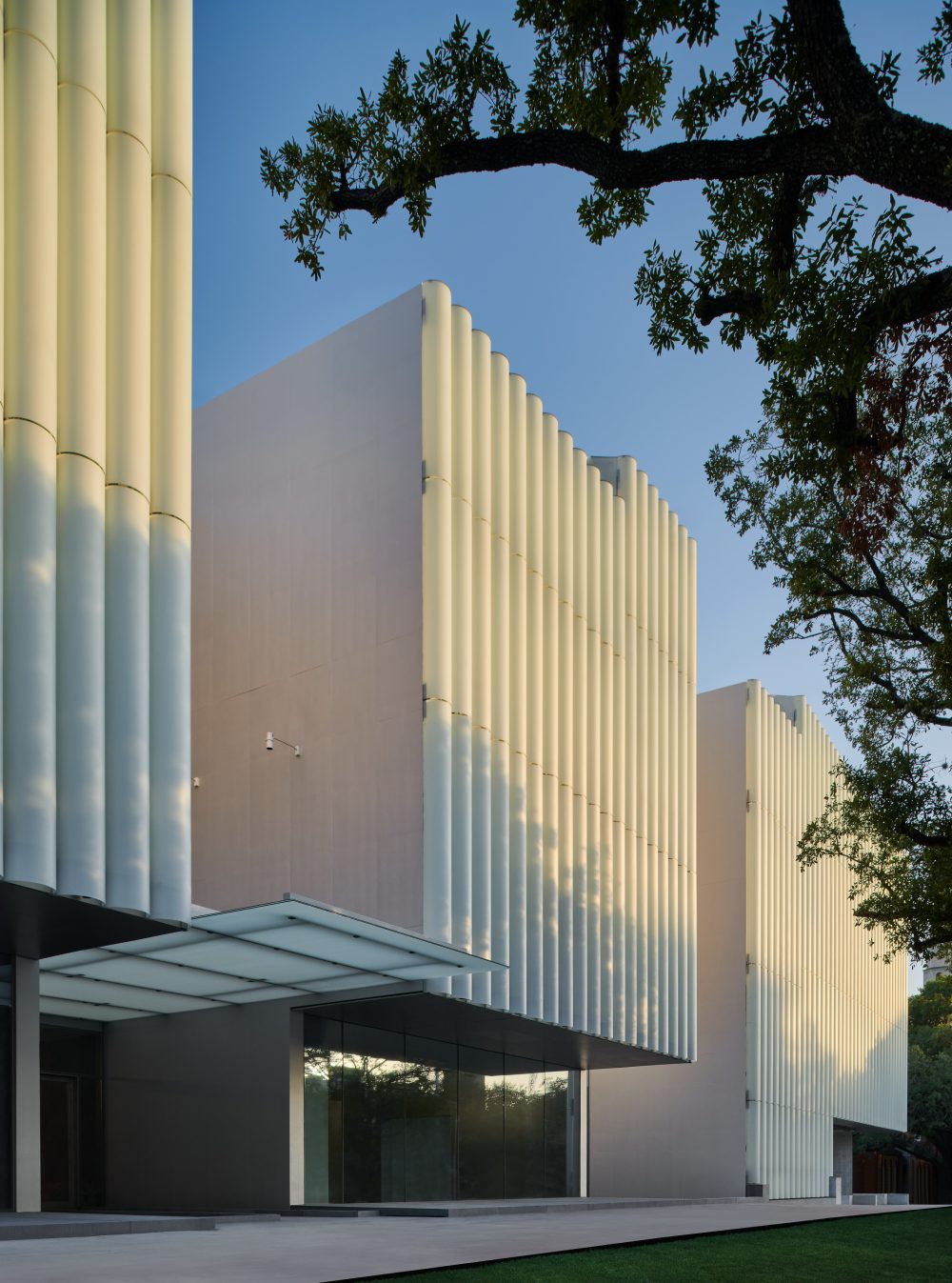
The new museum architecture of the new Nancy and Rich Kinder Building is characterized by porosity, opening the ground floor at all elevations. Seven gardens slice the perimeter, marking points of entry and punctuating the elevations. The largest garden court, at the corner of Bissonnet and Main Street, marks a central entry point on the new campus.
We envision this new ground level as an activating social space open to the community and able to stay open longer hours than the two gallery floors above. A fine restaurant opens to the Cullen Sculpture Garden, a café to Bissonnet, and galleries open to Main Street. Special performances might take place in the Brown Foundation Plaza and Glassell rooftop garden.
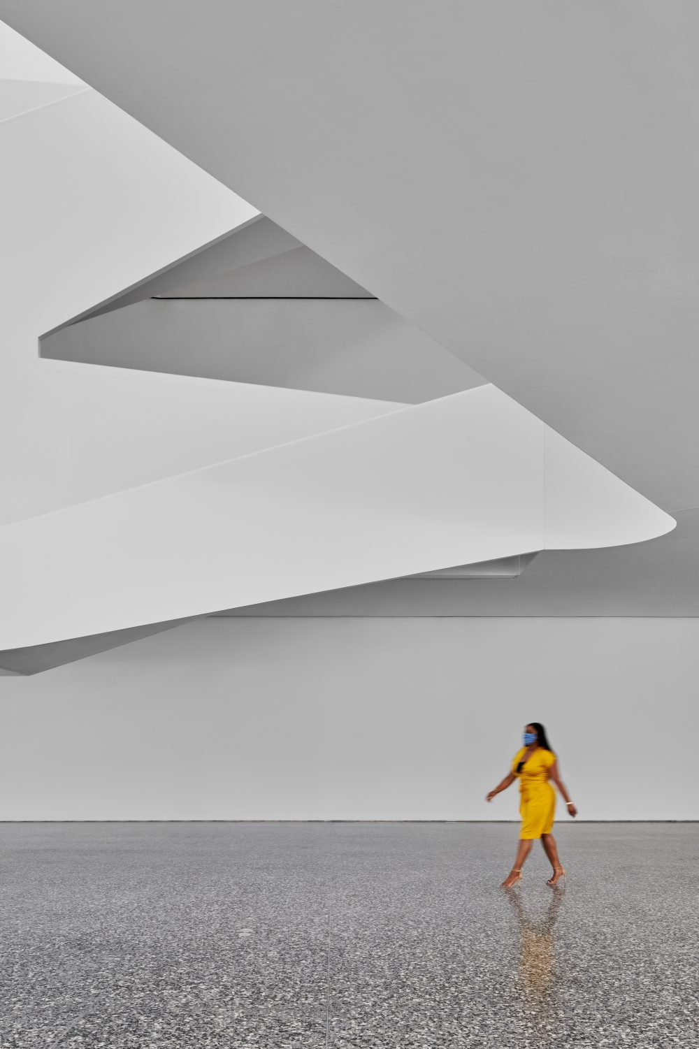
When standing in the great new entrance lobby of the Kinder Building, one can see gardens in four directions and feel the inviting energy of a new sense of openness to the community.
LIGHT: LUMINOUS CANOPY
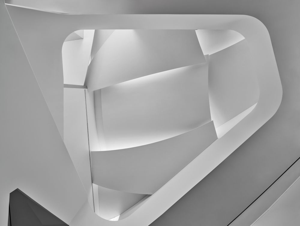
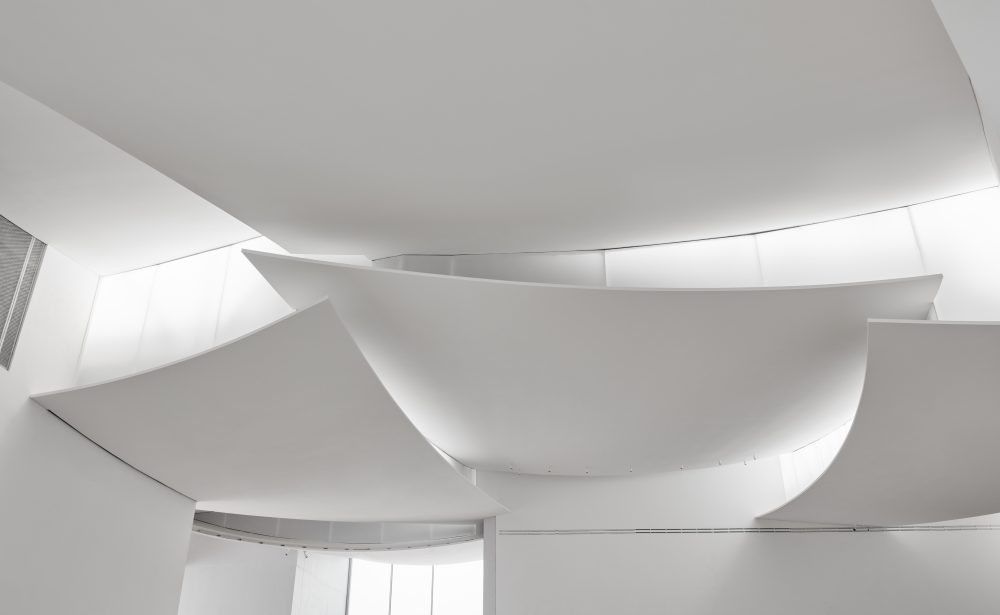
The Texas sky opens 180°overhead above a luminous canopy covering the new building. Concave curves, imagined from cloud circles, push down on the roof geometry, allowing natural light to slip in with precise measure and quality, perfect for top-lit galleries.
The undersides of the curved ceiling become light reflectors, catching and sliding the light across each unique gallery experience. These curved slices of light shape the gallery spaces organically in a unique way related to the organic qualities of the lush vegetation and water characterizing the new campus. Rather than mechanical and repetitive, the light is organic and flowing, like the movement of the galleries.
CIRCULATION: GALLERY ROOMS AND OPEN FLOW
At the heart of a great museum experience is inspiring circulation that provides orientation and visual relief. Organized horizontally on two levels, all galleries have natural light and are flexible with open flow. The gallery rooms of ideal proportions are centered around an open forum. The open flow through galleries is punctuated by views into the seven gardens with green trellises offering shade from glare. The central forum provides generous spaces for the exhibition of art and vertical circulation to the upper floors. A stepped ramp and elevators link the lobby and gallery levels for direct access to all galleries.
ARCHITECTURE: COMPLEMENTARY CONTRAST
The architecture of the existing MFAH campus is an important part of its collection. The original 1924 neoclassical stone building is of modest scale and integral to Hermann Park. The Law Building with the architecture of Ludwig Mies van der Rohe is a subtle composition of transparent glass and steel. The Audrey Jones Beck building by Rafael Moneo in stone is in contrast to the Law Building directly across the street.
Within this horizontal collection of stone (1924), steel and glass (1958, 1974), and stone (2000), we envision a horizontal architecture in translucent glass. The curved glass elements will have a soft texture, alabaster-like. At night the glowing translucent walls will be reflected in the water gardens and provide an open invitation to enter the museum. In complementary contrast, the new building will provide a strong contribution to the existing unique collection of MFAH architecture.


vsszan4309152353128.pdf
753.52 KB,下载次数:15
- 附件:1_MFAH_Kinder_Art Installations Announcement.pdf
- 转载自:Archilovers
- 设计师:Steven Holl Architects
- 坐落:Houston / United States / 2020
- 语言:English
- 阅读原文
|

 发表于 2020-9-15 22:53:56
